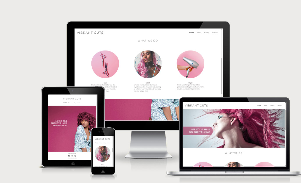
Welcome to website for Vibrant Cuts! My goal is to provide a convenient and user-friendly platform for customers to view the salons services and gallery, and to strengthen the specialisation they have in hair coloring. This website is designed to be accessible to all, with an intuitive layout and easy navigation.
With the website, you can easily view Vibrant Cuts range of hair services, read about their experience, and get contact information so you can book your next appointment with just a few clicks. The gallery showcases their talented team's work and the variety of styles they offer.
- The navigation bar of the salon website is designed to provide a seamless user experience for our customers
- The navigation bar is fixed at the top to always be easily accessible and will let us skip having a "back-buttong"
- It´s fully responsive and includes the links to Logo, Home page, Prices, Gallery and Contact page.
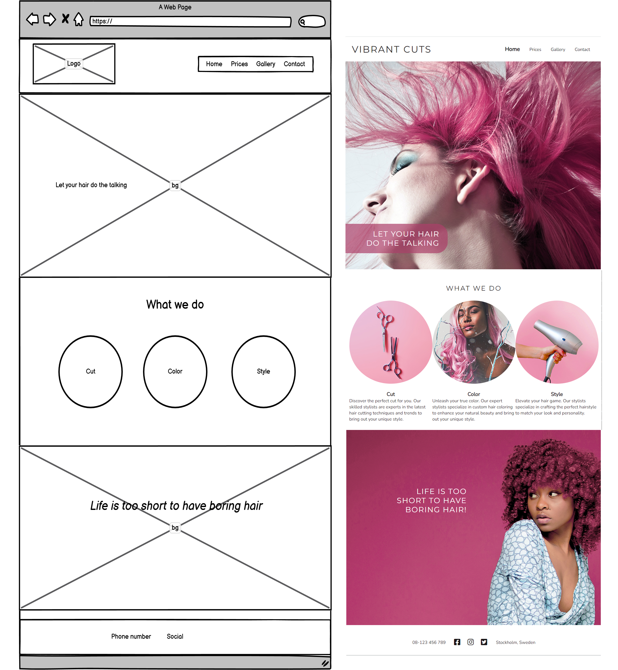
- The landing page has a background image with a very vibrant color pink to not only catch the eye, but to also directly show the viewer the salons strength - hair coloring.
- text overlay with statement to show exactly what this webpage is about.
- We can see that we have more information below directy on landing page to make people scroll down.
- When scrolled down to the next section we see 3 images and short text about the services that Vibrant Cuts offer.
- Here we place another eye catching image with a strong statement to encourage the viewer to contact the salon. This message is placed together with with the footer
- On top of the page still have the fixed header with links.
- Gives quick information of the phone number and social media links.
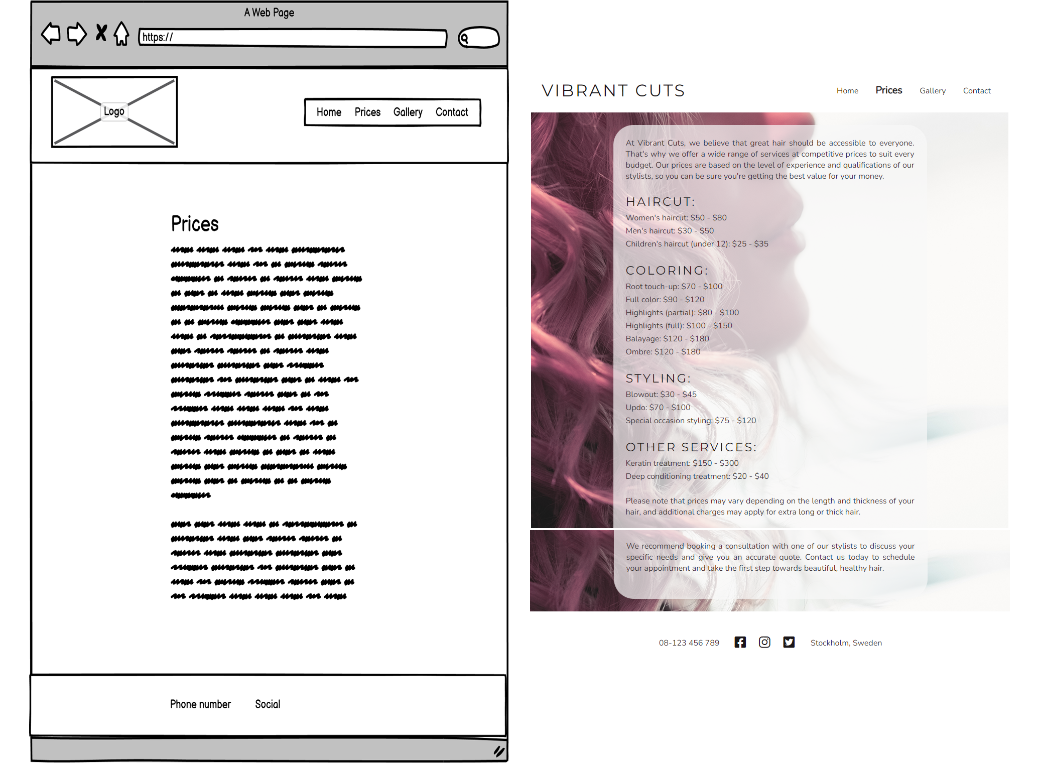
- Outlines the various hair and beauty services offered by the salon and the price range the client can expect.
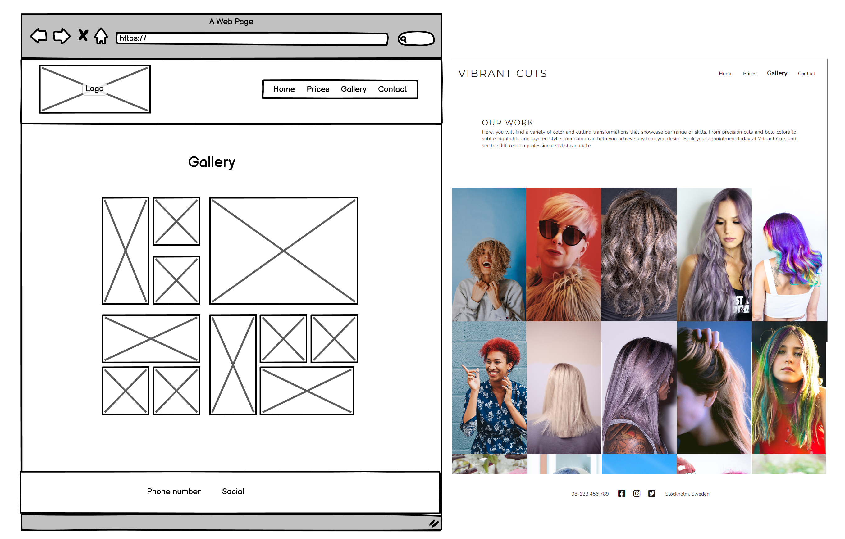
- Showcases the salon's portfolio in a scrollable page.
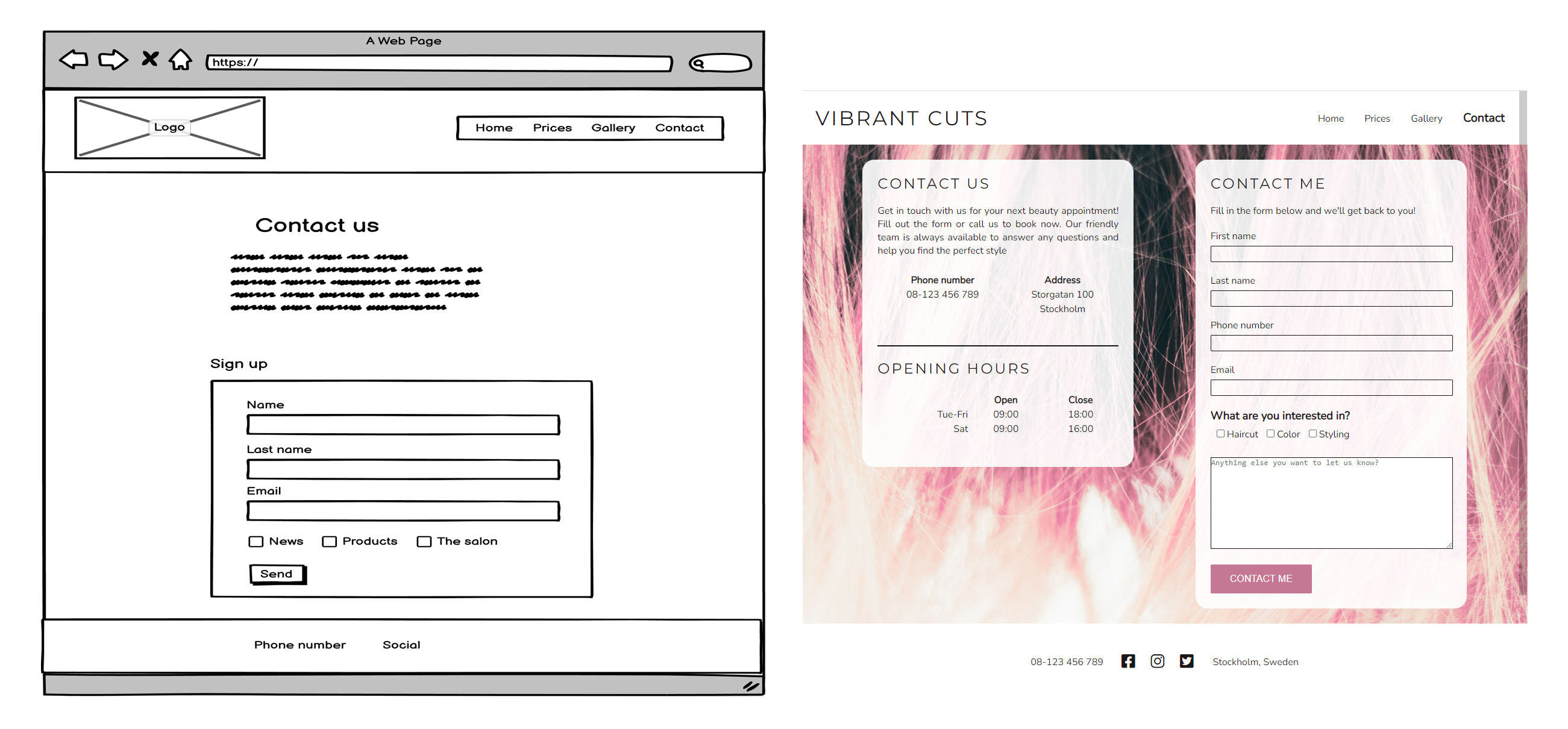
- Allows customers to easily get in touch with the salon and make appointments or fill in the form to get contacted by the salon.
- Section "What we do" should be linked to information pages about the services.
- Booking system.
The webiste is tested in Chrome and Firefox on a PC. On phones/tablets I have tested both iOS and Android.
All internal links are ok. All external links work ok and open in a new browser. Form in Contact page is working ok and will demand name, lname and email to be able to submit.
- Pink background image at the bottom on Home page is not showing in iOS.
-
Column count i gallery shows only 2 columns in large screens.
*Adjusted place for a "}". -
form action is not working.
*Removed ">" at the end of the action link. * -
Hero image a bit large (height) on table and mobile.
Fixed with background-size: cover -
Background image 2 furthest down at Home page is a bit large (height) on table and mobile.
Fixed with background-size: cover -
h2 disappear from section What we do on Home page.
Probably disappeared when I re-made that section. Added new h2 -
When deployed none of the images in the gallery is working in any screen or system. It workes fine in Gitpod, but not when deployed to Github.
*Removed firs "/" in img-link. So instead of "/assets/images/..." I changed to "assets/images/...". -
What we do section on Home page not responsive.
I re-made the whole section and put the content in a flexbox to have a better control over it -
Text under images in What we do section on Home page is not placed under the associated image.
I restructured the content and used a flexbox nested in a flexbox to get control over the text and its placements with the associated image -
Pricelist needs to be centered on smaller screens.
Fixed with media query -
Checkboxes in form at Contact page seem to have a strange padding on the left side that pushes it out of the actual form.
I re-structured the form with flexbox instead and got better control over the checkboxes. Now they are a tiny bit indented which I want since it seperates the checkboxes a bit from the rest of the form. I also removed the checkbox "Other" and instead added a text area below so user can put in more information if wanted. -
Footer not responsive
I re-structured the footer and used a flexbox to get better control -
White overlay text at the bottom om Home page is not showing in iOS. Added background color pink to show when image is not working.
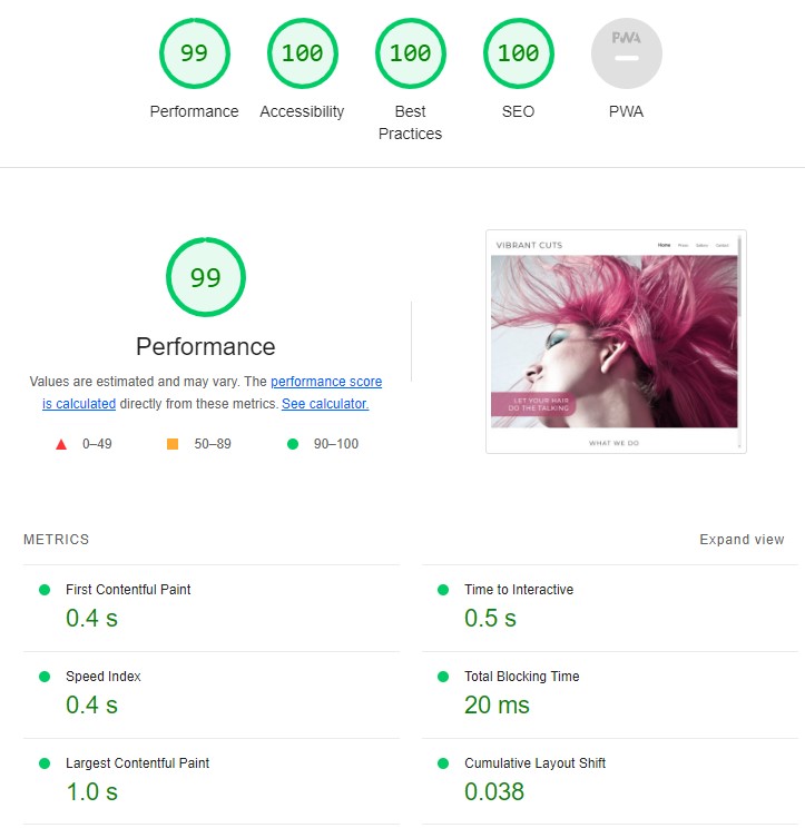
All pages tested with the offical W3 Validator.
Checked with W3 Validator
The site was deployed to Github pages. The steps where:
- In the github repositary, navigate to Setting tab
- Navigate to Pages on the left
- Select Master Branch in the source section drop down list.
- The page will automatically be updated and give you a link where you also have the information with the latest deployment.
The link is: https://sandrabergstrom.github.io/PP1/
I would like to extend my gratitude to Code Institute for providing me with the education and resources needed to develop my skills in HTML and CSS. Their lessons have been instrumental in helping me understand the fundamentals of web development.
Special thanks to my mentor at Code Institute, who encouraged me to dive deeper into flexbox and its capabilities. Their guidance has allowed me to bring my projects to the next level and has been invaluable in my growth as a web developer.
Thank you, Code Institute and my mentor, for all your support and guidance!
The text for the webpage was written together with ChatGPT
Instructuions and help about flexbox I have gotten from CSS Tricks and W3 Schools
Instructions and help about form I have gotten from W3 Schools
Icons in the footer is from Fontawesome
Fonts is taken from Google Fonts
The photos used throughout the webpage is coming from Unsplash, Pexels and Pixabay
The aim from the outset was to create a minimalist website with strong, vivid colors to provide contrast. This decision was based on several key factors:
- To align with the salon's interior and branding, which features a clean and minimal design with a clinical feel, rather than a traditional hair salon atmosphere.
- To emphasize the salon's expertise in hair coloring.
- The salon is well-known for its expertise in pink hair color, which is reflected in the use of pink as a contrast color.
- The website structure was designed to be clear and minimal, consistent with the overall design aesthetic.
Below you can see the initial wireframes compared to the final result.
