Stat
Graph any set of datasets into frequency plots and box plots
Usage
Upload a JSON file containing an array of JSON objects, paste the JSON array, or use a URL that points to a JSON file. Then, choose the quantitative variable (the variable to graph), the categorical variable (that identifies the name of the dataset). In the header, choose either Frequency or Box Plot in the Plots dropdown.
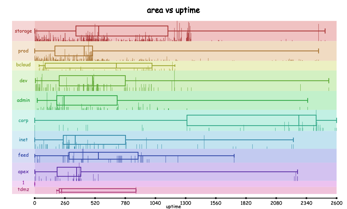
Use https://raw.githubusercontent.com/SarangMohaniraj/Stat/master/data/BloombergDummyData.json as an example. Choose uptime as the categorical variable and area as the categorical variable.
On the plots page, select which datasets you want to graph using the quantitative variable. You are able to compare as many as preferred. Select pooled to view a combined distribution. You can also select the range of the quantitative variable. You are given the option to choose the number of intervals on the horizontal axis and the scale of the vertical axis. Overlap renders the box plot on top of the frequency plot for enhanced visualization. Click Filter to apply changes, Reset to reset changes, and Export to download the chart.
You can see a statistical summary of each dataset by hovering over its respective section on the chart.
