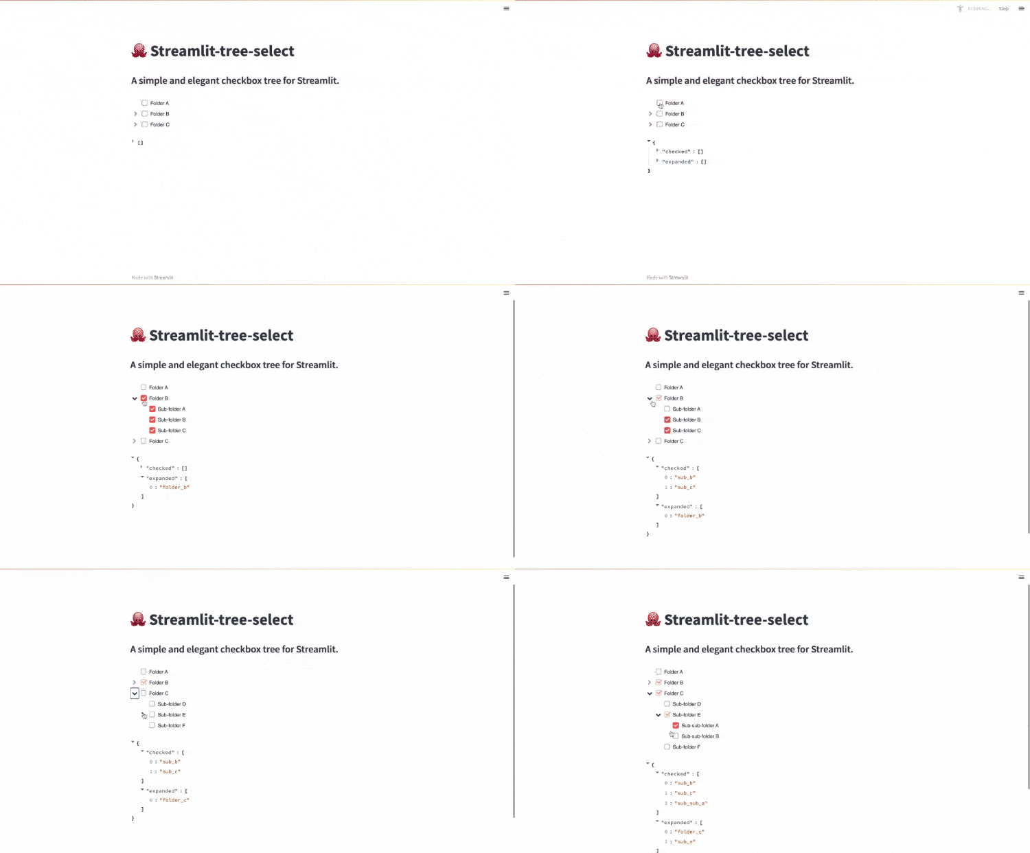
A simple and elegant checkbox tree for Streamlit. Build on react-checkbox-tree.
streamlit-tree-select is distributed via. PyPi:
pip install streamlit-tree-select
Using streamlit-tree-select is as simple as importing tree_select and passing a list of nodes.
import streamlit as st
from streamlit_tree_select import tree_select

st.title("🐙 Streamlit-tree-select")
st.subheader("A simple and elegant checkbox tree for Streamlit.")

# Create nodes to display
nodes = [
    {"label": "Folder A", "value": "folder_a"},
    {
        "label": "Folder B",
        "value": "folder_b",
        "children": [
            {"label": "Sub-folder A", "value": "sub_a"},
            {"label": "Sub-folder B", "value": "sub_b"},
            {"label": "Sub-folder C", "value": "sub_c"},
        ],
    },
    {
        "label": "Folder C",
        "value": "folder_c",
        "children": [
            {"label": "Sub-folder D", "value": "sub_d"},
            {
                "label": "Sub-folder E",
                "value": "sub_e",
                "children": [
                    {"label": "Sub-sub-folder A", "value": "sub_sub_a"},
                    {"label": "Sub-sub-folder B", "value": "sub_sub_b"},
                ],
            },
            {"label": "Sub-folder F", "value": "sub_f"},
        ],
    },
]

return_select = tree_select(nodes)
st.write(return_select)The tree select can be customized using the following parameters:
| Property | Type | Description | Default |
|---|---|---|---|
nodes |
list | A list containing tree nodes and their children. A need needs to include a label and a value. Furthermore, a list of children can be added. Further possible parameters: className (A class Name to add to the node, default None), disabled (Whether the node should be disabled, default False), showCheckbox (Whether the node should show a checkbox, default True), title (A custom title attribute for th node, default None). |
[] |
check_model |
str | Specifies which selected nodes should be returned. Possible inputs: "all", "leaf". | 'all' |
checked |
list | A list of selected nodes. | [] |
direction |
str | Specify the direction of the component. Left-to-right ('ltr') or right-to-left ('rtl'). | 'ltr' |
disabled |
bool | If True, the component will be disabled and cannot be used. | False |
expand_disabled |
bool | If True, nodes cannot be expanded. | False |
expand_on_click |
bool | If True, nodes will be expanded by clicking on the labels. | False |
expanded |
list | A list of expanded node values. | [] |
no_cascade |
bool | If True, toggling a parent node will not cascade its check state to its children. | False |
only_leaf_checkboxes |
bool | If True, checkboxes will only be shown for leaf nodes. | False |
show_expand_all |
bool | If True buttons for expanding and collapsing all parent nodes will appear in the tree. | False |
tree_select returns a dictionary containing the keys checked node values as well as expanded node values.
| Property | Type | Description | Default |
|---|---|---|---|
checked |
list | A list of expanded node values. | [] |
expanded |
list | A list of expanded node values. | [] |
