In this assessment, you will become more proficient at:
- breaking down a monolithic component into smaller, composable components
- writing JSX and interpolating JavaScript values into HTML fragments
- passing props to different components
Fork and clone this repository: https://gitlab.com/kenzie-academy/se/fe/react/assessment---react-cards
The two key files in this project are:
- src/index.css: Contains all the CSS
- src/App.js: Contains the monolithic
Appcomponent that needs to be broken down. You should only modify this file, but knowing aboutindex.cssmay help you gain an understanding of how things are wired together.
Next, install project dependencies. You should now be able to run npm start from a
terminal and a page should automatically open in your browser:
Note: Please see the rubric on Canvas for detailed breakdown on how this assessment is being graded. The information below is provided for your convenience.
We've already written a CardGroup component for you. You might however, have
noticed that we aren't using it anywhere. That is your first task. Take a look
at the implementation for CardGroup and create an instance of it inside of
App, replacing the necessary HTML as you do.
Hint: Take a look at class names.
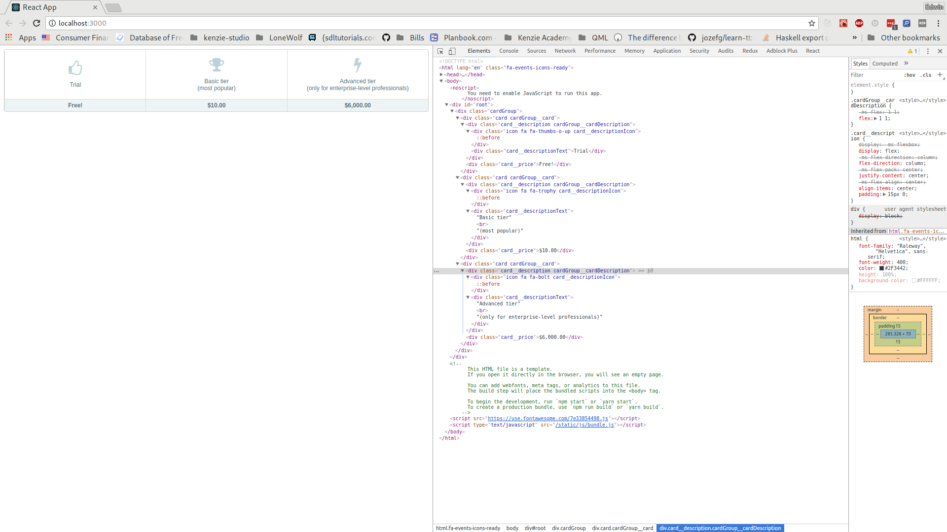
We've stubbed out a dummy implementation for the Card component. Replace the
div with a proper implementation. That implementation should take the
following props:
description: A string which is the text to appear in the.card__descriptionTextdiv. Example: "Trial".hint: An optional string which is the text to appear in parentheses after a description. Example: "most popular"icon: A string which is the font-awesome class to use for the.card__descriptionIcondiv. Example: "fa-trophy".price: A string which is the price to be listed on the card. Example: "$6,000.00"
Hint: Conditional rendering will be covered in detail later, but here's an example of conditionally showing text if it's provided:
const Hello = props => (
  <div>
    <h1>Hello, there!</h1>
    {props.message && <p>{props.message}</p>}
  </div>
);

const App = () => (
  <div>
    <Hello />
    <Hello message="Pleased to meet you!" />
  </div>
);
The above would result in the following HTML:
<div>
  <div>
    <h1>Hello, there!</h1>
  </div>
  <div>
    <h1>Hello, there!</h1>
    <p>Pleased to meet you!</p>
  </div>
</div>
Here's a runnable version if you'd like to play around with it.
The line with && in it basically reads as: "If there's a message, render a
paragraph with that message". You can use the same trick in this assessment to conditionally render
a <br> tag and a hint after it only if a hint is provided for a particular Card.
You should now be able to replace all of the cards inside the CardGroup
component that you used in step 1 inside of App. When it's all said and done,
you should see 1 instance of the CardGroup component and 3 instances of the
Card component. There should be no elements with className left inside
of the App component. In other words, all those divs with classNames in
them should be encapsulated inside of the Card and CardGroup components.
Here are a few hints to help you along the way.
You'll notice in App.js that we've changed the import line from this:
import React, { Component } from "react";To this:
import React from "react";(you may want to review ES6 import syntax)
Component only needs to be used when we are creating a class based component.
As you look at src/App.js, you'll notice that not a single class is defined. The reason for this is that none of the components take state. As such, a component that looks like this:
class Text extends React.Component {
  render() {
    return (
      <h1>
        Hello,{" "}
        <span style={{ color: this.props.color }}>{this.props.value}</span>
      </h1>
    );
  }
}
Can be rewritten as:
const SomeComponent = props => (
  <h1>
    Hello, <span style={{ color: props.color }}>{props.value}</span>
  </h1>
);
By utilizing ES6 destructuring assignment we can reduce that further, still:
const SomeComponent = ({ color, value }) => (
  <h1>
    Hello, <span style={{ color }}>{value}</span>
  </h1>
);You may have also noticed that some tags are self closing. Something like this:
<div className="icon fa fa-bolt card__descriptionIcon" />The reason for this is that if you have an element that doesn't have children
(such as this empty div), then you should prefer to instead write it as a
self-closing tag when writing JSX.
Because JSX is technically JavaScript, all reserved words
are off-limits for use as props. As such, class has been renamed className.
Another common one that you may see in the future is htmlFor, which replaces a
label's for attribute. See Differences In Attributes
for a more exhaustive list of differences.
Pay attention to the terminal after running npm start. It'll display errors
and warnings with your code, which is a convenient way to get feedback without
having to switch to a browser first.
If you find yourself with extra time (e.g., don't have other assessments to catch up on), you may consider improving the quality in a number of ways:
- The
Cardcomponent can be broken down into further components that useprops.childrenlikeCardGroupdoes. Experiment with doing so. - Now that they are broken down, compare/contrast benefits of having done so.
Does using smaller components lead to more boilerplate when using the
comopnents? Are there any benefits to taking
childrenover regularprops? - At the moment, the three cards are hard-coded. See if you can work out how to
take an array of objects consisting of a description, icon, and price, and
generate
Cardcomponents dynamically from them. Hint. Array.prototype.map will be your friend here.
Once you finish the assessment, you then must submit 2 links: one for your deployment and one for your repository. If you instead submit only a link to a repository (that is, only code), you will not receive any points.