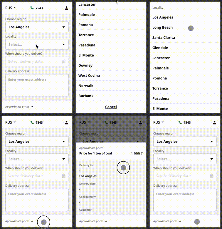
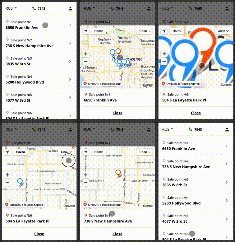
Swipeable bottom sheet implementation, that uses react-swipeable-views.
Open a Terminal in the project root and run:
npm install @sergeymyssak/swipeable-bottom-sheetor
yarn add @sergeymyssak/swipeable-bottom-sheetBottomSheet.js
import React, { memo } from "react";
import classNames from "classnames";
import SwipeableBottomSheet from '@sergeymyssak/swipeable-bottom-sheet';
import '@sergeymyssak/swipeable-bottom-sheet/lib/min.css';
import "./index.css";

const BottomSheet = ({
  isOpen,
  disableSwipe = false,
  onChange,
  children,
  containerClassName,
  bodyClassName
}) => (
  <SwipeableBottomSheet
    isOpen={isOpen}
    onChange={onChange}
    swipeableViewsProps={{ disabled: disableSwipe }}
    containerClassName={classNames("custom-bottom-sheet", containerClassName)}
    bodyClassName={classNames("custom-bottom-sheet__body", bodyClassName)}
  >
    {children}
  </SwipeableBottomSheet>
);

export default memo(BottomSheet);
index.css
.custom-bottom-sheet {
  z-index: 8;
  display: none;
  background-color: "white";
}

.custom-bottom-sheet__body {
  border-top-left-radius: 4px;
  border-top-right-radius: 4px;
}

@media only screen and (max-width: 767px) {
  .custom-bottom-sheet {
    display: unset;
  }
}
You can see the example here
The top margin applied to the top of the sheet when open. Defaults to 0.
Height(px) of the visible part when the bottom sheet is closed. Defaults to 0.
Use this property to control the state of the bottom sheet.
If true, the bottom sheet will stretch to the full height of the window.
If true, content scrolls to the top when the bottom sheet will be closed.
Classname applied on the container of the bottom sheet.
Classname applied on the body of the bottom sheet.
Classname applied on the overlay of the bottom sheet.
Use react-swipeable-views (v0.13.9) props.
See props
SwipeableViews.propTypes = {
  /**
   * This is callback property. It's called by the component on mount.
   * This is useful when you want to trigger an action programmatically.
   * It currently only supports updateHeight() action.
   *
   * @param {object} actions This object contains all posible actions
   * that can be triggered programmatically.
   */
  action: PropTypes.func,
  /**
   * If `true`, the height of the container will be animated to match the current slide height.
   * Animating another style property has a negative impact regarding performance.
   */
  animateHeight: PropTypes.bool,
  /**
   * If `false`, changes to the index prop will not cause an animated transition.
   */
  animateTransitions: PropTypes.bool,
  /**
   * The axis on which the slides will slide.
   */
  axis: PropTypes.oneOf(['x', 'x-reverse', 'y', 'y-reverse']),
  /**
   * Use this property to provide your slides.
   */
  children: PropTypes.node.isRequired,
  /**
   * This is the inlined style that will be applied
   * to each slide container.
   */
  containerStyle: PropTypes.object,
  /**
   * If `true`, it will disable touch events.
   * This is useful when you want to prohibit the user from changing slides.
   */
  disabled: PropTypes.bool,
  /**
   * This is the config used to disable lazyloding,
   * if `true` will render all the views in first rendering.
   */
  disableLazyLoading: PropTypes.bool,
  /**
   * If `true`, it will enable mouse events.
   * This will allow the user to perform the relevant swipe actions with a mouse.
   */
  enableMouseEvents: PropTypes.bool,
  /**
   * Configure hysteresis between slides. This value determines how far
   * should user swipe to switch slide.
   */
  hysteresis: PropTypes.number,
  /**
   * If `true`, it will ignore native scroll container.
   * It can be used to filter out false positive that blocks the swipe.
   */
  ignoreNativeScroll: PropTypes.bool,
  /**
   * This is the index of the slide to show.
   * This is useful when you want to change the default slide shown.
   * Or when you have tabs linked to each slide.
   */
  index: PropTypes.number,
  /**
   * This is callback prop. It's call by the
   * component when the shown slide change after a swipe made by the user.
   * This is useful when you have tabs linked to each slide.
   *
   * @param {integer} index This is the current index of the slide.
   * @param {integer} indexLatest This is the oldest index of the slide.
   * @param {object} meta Meta data containing more information about the event.
   */
  onChangeIndex: PropTypes.func,
  /**
   * @ignore
   */
  onMouseDown: PropTypes.func,
  /**
   * @ignore
   */
  onMouseLeave: PropTypes.func,
  /**
   * @ignore
   */
  onMouseMove: PropTypes.func,
  /**
   * @ignore
   */
  onMouseUp: PropTypes.func,
  /**
   * @ignore
   */
  onScroll: PropTypes.func,
  /**
   * This is callback prop. It's called by the
   * component when the slide switching.
   * This is useful when you want to implement something corresponding
   * to the current slide position.
   *
   * @param {integer} index This is the current index of the slide.
   * @param {string} type Can be either `move` or `end`.
   */
  onSwitching: PropTypes.func,
  /**
   * @ignore
   */
  onTouchEnd: PropTypes.func,
  /**
   * @ignore
   */
  onTouchMove: PropTypes.func,
  /**
   * @ignore
   */
  onTouchStart: PropTypes.func,
  /**
   * The callback that fires when the animation comes to a rest.
   * This is useful to defer CPU intensive task.
   */
  onTransitionEnd: PropTypes.func,
  /**
   * If `true`, it will add bounds effect on the edges.
   */
  resistance: PropTypes.bool,
  /**
   * This is the className that will be applied
   * on the slide component.
   */
  slideClassName: PropTypes.string,
  /**
   * This is the inlined style that will be applied
   * on the slide component.
   */
  slideStyle: PropTypes.object,
  /**
   * This is the config used to create CSS transitions.
   * This is useful to change the dynamic of the transition.
   */
  springConfig: PropTypes.shape({
    delay: PropTypes.string,
    duration: PropTypes.string,
    easeFunction: PropTypes.string,
  }),
  /**
   * This is the inlined style that will be applied
   * on the root component.
   */
  style: PropTypes.object,
  /**
   * This is the threshold used for detecting a quick swipe.
   * If the computed speed is above this value, the index change.
   */
  threshold: PropTypes.number,
};


