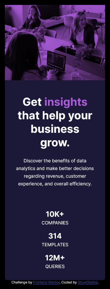
This is a solution to the Stats preview card component challenge on Frontend Mentor. Frontend Mentor challenges help you improve your coding skills by building realistic projects.
Users should be able to:
- View the optimal layout depending on their device's screen size
- Solution URL: Add solution URL here
- Live Site URL: Add live site URL here
I started with the HTML first. I am very particular about accessibility, so my first concern was to ensure that I have an HTML that was meaningful without any styling.
This influenced how I approached the hero image. I was going to insert the image as a url() background-image via CSS and then use an rgba() to add the purple overlay as a background-color but I realised it would pass no meaning to persons using screen readers. Additionally realized that I would not be able to use multiple sources for the image if inserted as a background. So I used the srcset attribute with the img tag.
So I included the hero image as an img tag, added an alt text and achieved the pink overlay using mix-blend-mode instead. Now everyone can appreciate the page and not just visual users.
- Semantic HTML5 markup
- CSS custom properties
- Flexbox
Learnt to use the srcset attribute of the img tag
<article class="hero-image">
  <img
    srcset="
      ./images/image-header-desktop.jpg 540w,
      ./images/image-header-mobile.jpg  654w
    "
    sizes="(min-width: 40em) 540px,
                  654px"
    alt="women in business meeting"
  />
</article>.hero-image {
background-color: var(--clr-lightpurple);
}
.hero-image img {
object-fit: cover;
height: 100%;
mix-blend-mode: multiply;
}- E-mail - Olutimilehin Olushuyi
- Frontend Mentor - @ShuyiOlutimi
- Twitter - @ShuyiOlutimi

