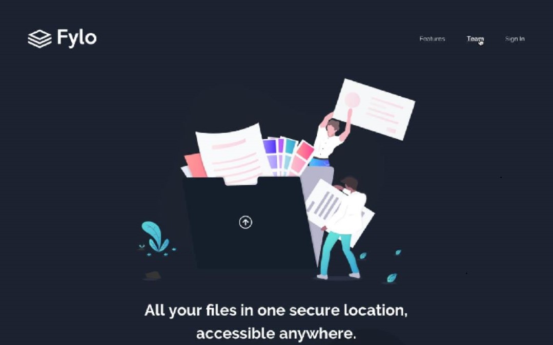
Solution to the challenge by frontendmentor.io
The challenge is to build out this landing page and get it looking as close to the design as possible.
Users should be able to:
- View the optimal layout for the site depending on their device's screen size
- See hover states for all interactive elements on the page
- Semantic HTML5 markup
- CSS custom properties
- Flexbox
- Vanilla JS
- Mobile-first workflow
At first, I was apprehensive about creating responsive websites that could work across multiple devices. Looking at other people's code for mobile views only added to my anxiety. However, I decided to tackle this challenge head-on by taking on a project, and I am proud to say that I have successfully created a fully responsive website.
Although it was not an easy task and required some time, the experience helped me learn many small details that I used to overlook or make mistakes in.
- For instance, I now understand the distinction between padding and margin, and how they can achieve the same layout changes while having different effects on the design.
- I also realized the importance of reviewing each section of the website after completion, even if it seemed satisfactory at first glance. This approach helped me identify mistakes and enhance the overall quality of the site.
- I made a conscious effort to avoid adding unnecessary pieces of code that did not contribute much to the page and focused on making the code more readable so that anyone could understand any segment easily.
- Furthermore, I learned about small features that could enhance the accessibility of the website for screen readers and other assistive technologies. I incorporated these features into my project to make it more inclusive and accessible to everyone.
- Continuing to work on responsive design projects will help me refine my skills and learn new techniques.
- I aim to explore advanced CSS concepts such as CSS animations, transitions, and transforms to improve the user experience further.
- Additionally, I plan to focus on accessibility features and improve the overall accessibility of my websites, so that my website is not only limited to screen readers.
- W3 Schools - This website offered solutions to a wide range of problems, making it a one-stop-shop for all my design needs. It helped me incorporate all the small features I needed, including hover effects, alignments, and more.
- Scroll Bars - This resource helped me customize the scroll bar on my website. The code provided was clear and easy to understand, and covered a wide range of styles. This reference helped me enhance the visual appeal of my website and create a more engaging user experience. Highly recommend it to others looking to customize their website's scroll bar.
- Website - Sikta Mohanty
- Frontend Mentor - @Sikta2002
- Twitter - @moonsikta
I will be thankful to anyone who takes the time to provide me with feedback and suggestions on this project. Your insights and recommendations will undoubtedly be invaluable in helping me improve my skills and understanding of web development. I will make sure to incorporate your feedback in my future projects.
