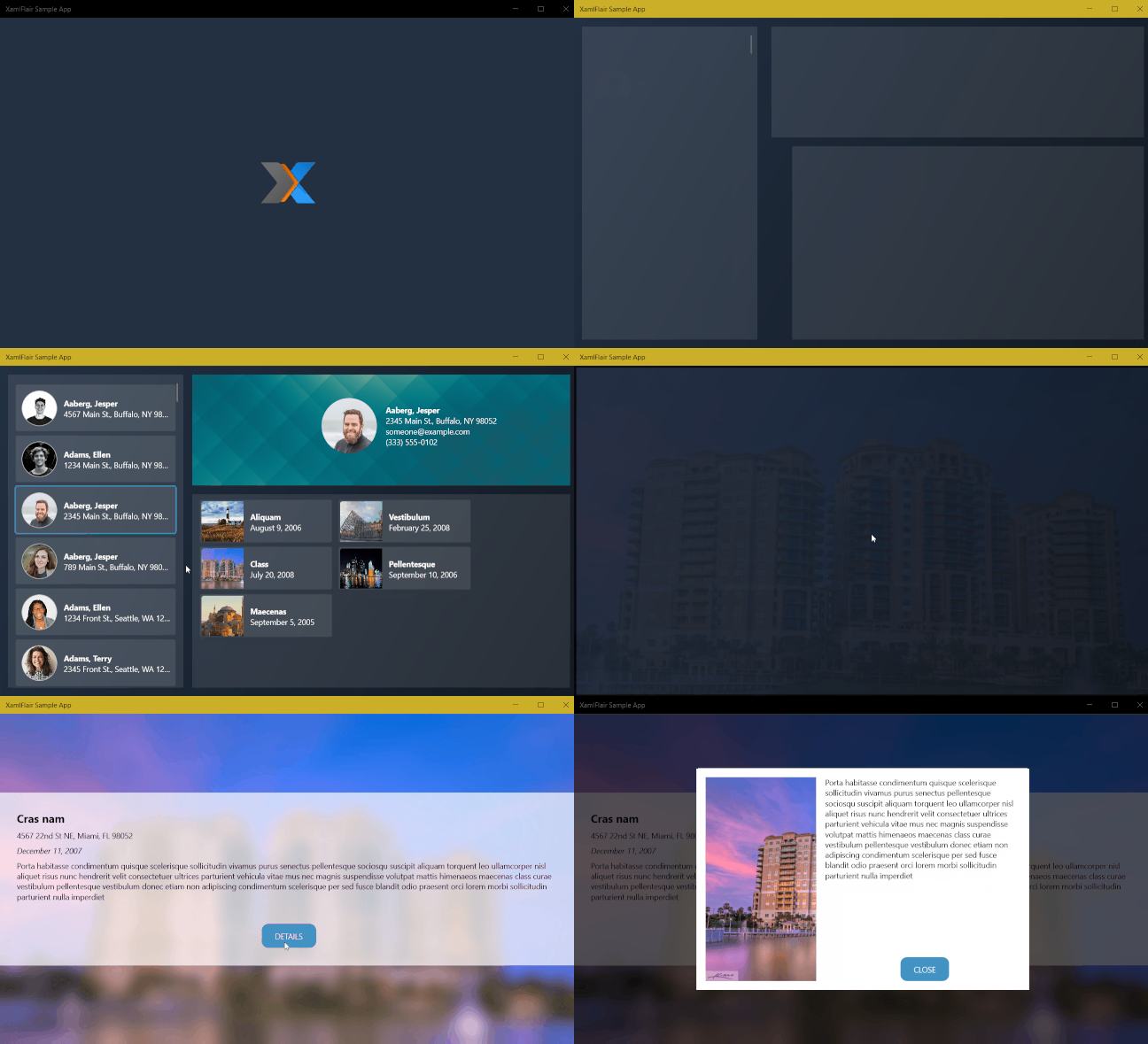
The goal of the XamlFlair library is to ease the implementation of common animations and allow a developer to easily add a single or combined set of animations with just a few lines of Xaml.
| Sekuence Puzzle Game |
|---|
 |
If you would like to support my work with a few coffees, you can do it here: Buy Me A Coffee. Your help allows me to continue to spend time on this project and continue to maintain and update it with new features when possible. Thanks in advance!
| Platform | Package | NuGet |
|---|---|---|
| UWP | XamlFlair.UWP |  |
| WPF | XamlFlair.WPF |  |
| Uno | XamlFlair.Uno |  |
To install XamlFlair, run the following command in the Package Manager Console:
UWP:
Install-Package XamlFlair.UWP
Your app must target a minimum of Windows 10 version 1809 (build 17763)
WPF:
Install-Package XamlFlair.WPF
Uno:
Install-Package XamlFlair.Uno
Your UWP app must target a minimum of Windows 10 version 1809 (build 18362)
| Feature | UWP | WPF | UWP (Uno) | iOS (Uno) | Android (Uno) | Wasm (Uno) EXPERIMENTAL |
|---|---|---|---|---|---|---|
| Animation System | Composition | Storyboards | Storyboards | Storyboards | Storyboards | Storyboards |
| Transform Type | N/A | TransformGroup | CompositeTransform | CompositeTransform | CompositeTransform | CompositeTransform |
| DefaultAnimations.xaml | - | ✔ | - | - | - | - |
TransformOn |
- | ✔ | - | - | - | - |
| Compound Animations | ✔ | ✔ | ✔ | ✔ | ✔ | ✔ |
| Relative Translations | ✔ | ✔ | ✔ | ✔ | ✔ | ✔ |
| Repeating Animations | ✔ | ✔ | ✔ | ✔ | ✔ | ✔ |
| Events & Bindings | ✔ | ✔ | ✔ | ✔ | ✔ | ✔ |
| Primary/Secondary Completion Commands | ✔ | ✔ | ✔ | ✔ | ✔ | ✔ |
StartWith |
✔ | ✔ | ✔ | ✔ | ✔ | ✔ |
AllowOpacityReset |
- | ✔ | - | - | - | - |
ClipToBounds |
✔ | N/A | ✔ | ✔ | ✔ | ✔ |
| Animated Lists | ✔ | ✔ | ✔ | ✔ | ✔ | ✔ |
| Blur Effect | ✔ | ✔ | - | - | - | - |
| Saturation Effect | ✔ | - | - | - | - | - |
| Tint Effect | ✔ | - | - | - | - | - |
| Color Animations | - | ✔ | ✔ | ✔ | ✔ | ✔ |
| Perspective Rotations (Swivel) | ✔ | - | - | - | - | - |
| Debugging Animations | ✔ | ✔ | ✔ | ✔ | ✔ | - |
The basic concept of XamlFlair is based on animations that are categorized as From and To. Any UI element that consists of a From animation will start with one or more arbitrary values, and complete using the default value of the corresponding property. Any UI element that consists of a To animation will start in its current state and animate to one or more arbitrary values.
Example of a From animation (a UI element translating to the default value of a Translation (0)):
Example of a To animation (a UI element sliding away from its current state):
Note: It's important to note there is an exception to this rule for Color Animations, which is explained in the Base Animation Types section.
To begin, you need to have the following Xaml namespace reference:
UWP and Uno:
xmlns:xf="using:XamlFlair"WPF:
xmlns:xf="clr-namespace:XamlFlair;assembly=XamlFlair.WPF"From here on, it's a simple matter of setting an attached property to any FrameworkElement that needs an animation:
<Border xf:Animations.Primary="{StaticResource FadeIn}" />Note: If your
FrameworkElementdefines aCompositeTransformin your Xaml, it will be altered during the animation process.
Note: The use of
StaticResourceis to reference global common animations, which is discussed in the next section.
Warning: Be careful when animating
FadeTosince the element remains in the Visual Tree if theVisibilityisVisible. There may be cases where you'll need to manually manageIsHitTestVisibleto allow the user to tap through the element.
Note: It's important to note when animating a color using a From animation, the color will animate from a specified value to its current state instead of a default value.
Note: Read the section Perspective Rotations (UWP Only) for further details.
The following lists some notable default values when working with XamlFlair:
- Kind: FadeTo
- Duration (milliseconds): 500
- Easing: Cubic
- Easing Mode: EaseOut
- TransformCenterPoint: (0.5, 0.5)
- Event: Loaded
- InterElementDelay (milliseconds): 25 (List controls only)
- TransformOn: Render (WPF only)
- Saturation: 0.5 (UWP only)
- Tint: Transparent (UWP only)
Color animations require some attention since they are slightly different than the other base type animations. When using either ColorTo and ColorFrom, the following must be done:
- You can only animate the following properties:
Control.Background,Control.Foreground,Control.BorderBrush,Border.Background,Border.BorderBrush,TextBlock.Foreground,Shape.Fill,Shape.Stroke - Make sure to set a brush on the corresponding property you intend to animate
- You must also specify the target property using
ColorOn
The following example will animate the Rectangle's Fill from RoyalBlue to DarkGreen:
<xf:AnimationSettings x:Key="SampleColorAnimation"
                      Kind="ColorTo"
                      Color="DarkGreen"
                      ColorOn="Fill" />

<Rectangle Fill="RoyalBlue"
xf:Animations.Primary="{StaticResource SampleColorAnimation}" />If you have the need to globally change one of the default animation values (for example, having a default Duration of 750 instead of 500), you can call the OverrideDefaultSettings function in your app's initialization code. The following example changes the default values for Duration and Easing:
XamlFlair.Animations.OverrideDefaultSettings(
    duration: 750,
    easing: EasingType.Quadratic);
Therefore, with the sample code above, every animation will run for 750ms with a quadratic easing.
All common animations should be placed in a global ResourceDictionary (ex: Animations.xaml) and used where needed throughout the app. The goal is to consolidate all the animations into one file with meaningful names so that any developer can understand exactly what animation is applied to a FrameworkElement. Here's a small example of what it looks like:
<ResourceDictionary xmlns="http://schemas.microsoft.com/winfx/2006/xaml/presentation"
                    xmlns:x="http://schemas.microsoft.com/winfx/2006/xaml"
                    xmlns:xf="using:XamlFlair">

    <x:Double x:Key="PositiveOffset">50</x:Double>
    <x:Double x:Key="NegativeOffset">-50</x:Double>
    <x:Double x:Key="SmallScaleFactor">0.75</x:Double>
    <x:Double x:Key="LargeScaleFactor">1.25</x:Double>

    <xf:AnimationSettings x:Key="FadeIn"
                          Kind="FadeFrom"
                          Opacity="0" />

    <xf:AnimationSettings x:Key="FadeOut"
                          Kind="FadeTo"
                          Opacity="0" />

    <!-- Scale to a larger value -->
    <xf:AnimationSettings x:Key="Expand"
                          Kind="ScaleXTo,ScaleYTo"
                          ScaleX="{StaticResource LargeScaleFactor}"
                          ScaleY="{StaticResource LargeScaleFactor}" />

    <!-- Scale from a larger value -->
    <xf:AnimationSettings x:Key="Contract"
                          Kind="ScaleXFrom,ScaleYFrom"
                          ScaleX="{StaticResource LargeScaleFactor}"
                          ScaleY="{StaticResource LargeScaleFactor}" />
    .
    .
    .
    </ResourceDictionary>
To setup this set of pre-configured AnimationSettings already available in your app, perform the following steps:
- Right-click on your project, then click Add > New Item...
- Choose Resource Dictionary and name it
Animations.xaml - In your
App.xaml, add the following:
    <Application.Resources>
        <ResourceDictionary>
            <ResourceDictionary.MergedDictionaries>
                <ResourceDictionary Source="Animations.xaml" />
            </ResourceDictionary.MergedDictionaries>
        </ResourceDictionary>
</Application.Resources>- In
Animations.xaml, copy & paste the contents from the corresponding links below:
Your app now has a global set of common animations ready to use.
Alternatively to creating your own ResourceDictionary containing your custom AnimationSettings, XamlFlair provides some Default Animations.
To reference these Default Animations in your application, perform the following steps in your App.xaml:
- Define the
XamlFlair.WPFnamespace at the top:
xmlns:xf="clr-namespace:XamlFlair;assembly=XamlFlair.WPF"- Update your Application Resources:
    <Application.Resources>
        <ResourceDictionary>
            <ResourceDictionary.MergedDictionaries>
                <xf:XamlFlairResources />
            </ResourceDictionary.MergedDictionaries>
        </ResourceDictionary>
    </Application.Resources>
Your application now has a global set of Default animations ready to use.
If Visual Studio Intellisense does not work when using <xf:XamlFlairResources />, you may want to try the following instead:
    <Application.Resources>
        <ResourceDictionary>
            <ResourceDictionary.MergedDictionaries>
                <ResourceDictionary Source="pack://application:,,,/XamlFlair.WPF;component/DefaultAnimations.xaml"/>
            </ResourceDictionary.MergedDictionaries>
        </ResourceDictionary>
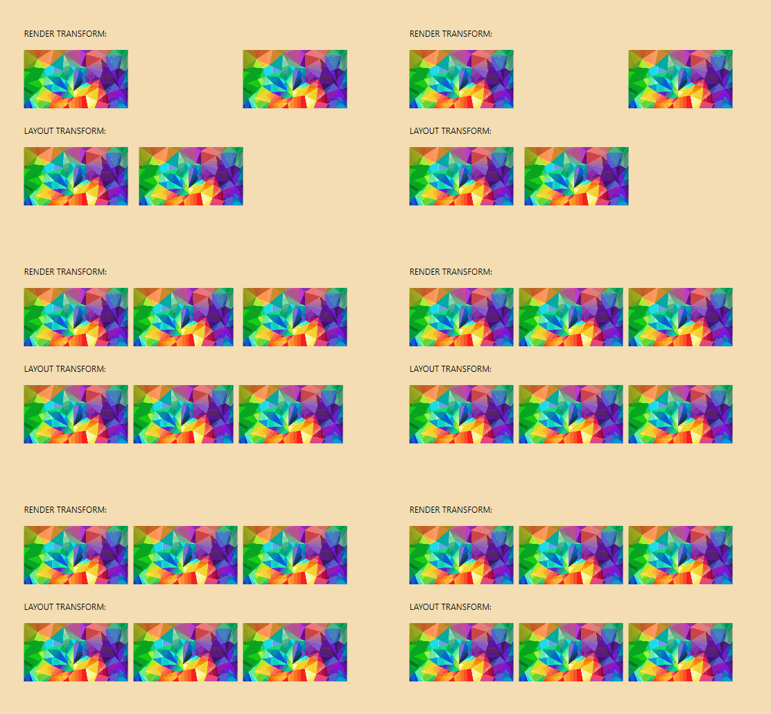
</Application.Resources>Using the TransformOn property, you can target which type of RenderTransform to apply to your animation. Available options are Render and Layout. When nothing is specified, the default vale is Render. Here's an example of the two:
Note: Very important to note that WPF's
LayoutTransformdoes not support anyTranslateTransform, therefore translate animations will never work. You can read more about it in the Remarks section here.
It is important to note that to apply a perspective rotation (also referred to as Swivel) to a target element, it is required that it be wrapped in a container with the layout properties applied to the container element. Therefore, consider the following simple perspective rotation:
<xf:AnimationSettings x:Key="PerspectiveVerticalRotation"
                      Kind="SwivelYFrom"
                      SwivelY="-45" />
Instead of animating the element as such:
<Rectangle Fill="RoyalBlue"
           Width="200"
           Height="200"
           HorizontalAlignment="Center"
           VerticalAlignment="Center"
           xf:Animations.Primary="{StaticResource PerspectiveVerticalRotation}" />
The element should be placed in a container for the animation to work correctly:
<Border Width="200"
        Height="200"
        HorizontalAlignment="Center"
        VerticalAlignment="Center">
    <Rectangle Fill="RoyalBlue"
           xf:Animations.Primary="{StaticResource PerspectiveVerticalRotation}" />
</Border>Animations can be combined, and as previously mentioned, any of these combined animations that are commonly used should be placed in the global ResourceDictionary (ex: Animations.xaml):
<ResourceDictionary xmlns="http://schemas.microsoft.com/winfx/2006/xaml/presentation"
                    xmlns:x="http://schemas.microsoft.com/winfx/2006/xaml"
                    xmlns:xf="using:XamlFlair">
    .
    .
    .
    <xf:AnimationSettings x:Key="FadeInAndSlideFromLeft"
                          Kind="FadeFrom,TranslateXFrom"
                          Opacity="0"
                          OffsetX="{StaticResource NegativeOffset}" />

    <xf:AnimationSettings x:Key="FadeInAndSlideFromTop"
                          Kind="FadeFrom,TranslateYFrom"
                          Opacity="0"
                          OffsetY="{StaticResource NegativeOffset}" />

    <xf:AnimationSettings x:Key="FadeInAndGrow"
                          Kind="FadeFrom,ScaleXFrom,ScaleXFrom"
                          Opacity="0"
                          ScaleX="{StaticResource SmallScaleFactor}"
                          ScaleY="{StaticResource SmallScaleFactor}" />

    <xf:AnimationSettings x:Key="FadeInAndGrowHorizontally"
                          Kind="FadeFrom,ScaleXFrom"
                          Opacity="0"
                          ScaleX="{StaticResource SmallScaleFactor}" />
    .
    .
    .
    </ResourceDictionary>
This demonstrates a combined animation of a FadeFrom and TranslateFrom:
This demonstrates a combined animation of a FadeFrom, TranslateFrom, and ScaleFrom:
Animations can have their settings overridden directly on the FrameworkElement. This is commonly done to alter values for Delay and Duration so that we don't over-populate the Animations.xaml file with repeated resources. To achieve overriding, use the Animate markup extension paired with the BasedOn property:
<Border xf:Animations.Primary="{xf:Animate BasedOn={StaticResource ScaleFromBottom}, Delay=500}" />Since hard-coded values for OffsetX and OffsetY can be limiting (such as in cases when dealing with resizable windows), both OffsetX and OffsetY support star-based values:
<Border xf:Animations.Primary="{xf:Animate BasedOn={StaticResource SlideFromLeft}, OffsetX=1.5*}" />A star-based value will calculate the offset based on the current
ActualWidthand/orActualHeightvalue(s) of theFrameworkElement, therefore it's important that the element has executed itsLoadedevent. IfActualWidthand/orActualHeightare not yet calculated, the offset value will try to be based onWidthand/orHeight.
A compound animation is simply a multi-step animation using the CompoundSettings class. Each inner animation executes once the previous one completes, hence they're sequential animations:
<xf:CompoundSettings x:Key="Compound">
    <xf:CompoundSettings.Sequence>
        <xf:AnimationSettings Kind="ScaleXTo"
                              ScaleX="1.25"
                              Duration="1250" />
        <xf:AnimationSettings Kind="ScaleXTo"
                              ScaleX="1"
                              Duration="1250" />
        <xf:AnimationSettings Kind="RotateTo"
                              Rotation="360"
                              Duration="1250" />
    </xf:CompoundSettings.Sequence>
</xf:CompoundSettings>Note:
CompoundSettingssupport theEventproperty, which is discussed in a later section.
An animation can be repeated by using the IterationBehavior and IterationCount properties (default values of Count and 1 respectively).
The following demonstrates how to run an animation only 5 times:
<Border xf:Animations.Primary="{StaticResource FadeIn}"
        xf:Animations.IterationCount="5" />
The following demonstrates how to run an animation indefinitely:
<Border xf:Animations.Primary="{StaticResource FadeIn}"
        xf:Animations.IterationBehavior="Forever" />
Also note that it is also possible to repeat a Compound animation. For example, using the compound animation (named Progress) from the previous section:
<Border xf:Animations.Primary="{StaticResource Progress}"
xf:Animations.IterationCount="5" />Warning: When using repeating animations, you cannot set a
Secondaryanimation on the element.
It's important to note that all XamlFlair animations are "kick-off" animations, in other words, they start and only stop when they complete (or when the associated element unloads), except repeating animations. A repeating animation can be stopped when supplying a false value to the PrimaryBinding property (bindings are covered in the next section):
<CheckBox x:Name="SampleCheckBox"
          IsChecked="False" />

<Rectangle xf:Animations.PrimaryBinding="{Binding IsChecked, ElementName=SampleCheckBox}"
           xf:Animations.Primary="{xf:Animate BasedOn={StaticResource FadeIn}, Event=None}" />
When a false is set on the binding, the animation's current iteration will run until it finishes and then the repeating animation will stop.
By default, all animations execute when the animated element fires its Loaded event. This behavior can be overridden by setting the Event property. Event can be any event that is exposed from the element being animated. For example, to execute an animation on a button when it is clicked, the Click event can be used:
<Button xf:Animations.Primary="{xf:Animate BasedOn={StaticResource FadeOut}, Event=Click}" />Some examples of common events that can be used:
- Loaded (default value)
- Visibility (triggers only when Visibility == Visible)
- DataContextChanged (triggers when the value is not null)
- PointerOver
- PointerExit
- GotFocus
- LostFocus
There are some special cases to take note of. The first special case is the DataContextChanged event. When using the DataContextChanged event, it will fire when the DataContext value changes, except for cases where a null value is set, null is filtered out and would not trigger an animation.
Another special case is Visibility. Although no event VisibilityChanged exists on a FrameworkElement, the Visibility property has been treated like an event when the value changes since it can be useful to animate an element when it becomes visible on the UI. If an animation is triggered with Event=Visibility, it will only be triggered whenever a value of Visibile is set.
One of the most important values for Event is None, which is a value used to cancel any event-based animation trigger. When specifying None, you will need to manually trigger your animations using the PrimaryBinding or SecondaryBinding properties. These properties are of type bool and expect a value of True in order to execute the corresponding animation. The following is an example of triggering an animation based off the IsChecked of the CheckBox control:
<CheckBox x:Name="SampleCheckBox"
          IsChecked="False" />

<Rectangle xf:Animations.PrimaryBinding="{Binding IsChecked, ElementName=SampleCheckBox}"
           xf:Animations.Primary="{xf:Animate BasedOn={StaticResource FadeIn}, Event=None}" />
The above animation will only execute when the IsChecked is True. If None was not specified for Event, the animation would then execute on Loaded and on the binding.
When working with both PrimaryBinding and SecondaryBinding together (based on the same boolean value), it may be cleaner and simpler to use CombinedBinding. CombinedBinding simply acts as both PrimaryBinding and SecondaryBinding together. Instead of the following:
<CheckBox x:Name="SampleCheckBox"
          IsChecked="False" />

<Rectangle xf:Animations.PrimaryBinding="{Binding IsChecked, ElementName=SampleCheckBox}"
           xf:Animations.Primary="{xf:Animate BasedOn={StaticResource FadeIn}, Event=None}"
           xf:Animations.SecondaryBinding="{Binding IsChecked, ElementName=SampleCheckBox, Converter={StaticResource InverseBoolConverter}}"
           xf:Animations.Secondary="{xf:Animate BasedOn={StaticResource FadeOut}, Event=None}"
           xf:Animations.StartWith="{StaticResource FadeOut}" />
You would use it as such:
<CheckBox x:Name="SampleCheckBox"
          IsChecked="False" />

<Rectangle xf:Animations.CombinedBinding="{Binding IsChecked, ElementName=SampleCheckBox}"
           xf:Animations.Primary="{xf:Animate BasedOn={StaticResource FadeIn}, Event=None}"
           xf:Animations.Secondary="{xf:Animate BasedOn={StaticResource FadeOut}, Event=None}"
           xf:Animations.StartWith="{StaticResource FadeOut}" />
By using CombinedBinding in this way, it saves on having to use a converter for the inverse boolean value, which is handled internally.
There may be scenarios where you may want to execute an ICommand when an animation completes. In such a case, two properties exist: PrimaryCompletionCommand and SecondaryCompletionCommand.
In the following example, the command named MyCustomCommand will execute once the primary animation completes:
<TextBlock Text="Example of a completion command"
           xf:Animations.Primary="{StaticResource FadeInAndSlideFromBottom}"
xf:Animations.PrimaryCompletionCommand="{x:Bind MyCustomCommand}" />There will be cases when you will need your UI element to start in a specific state, for example, the element needs to be shrunk before its animation executes. This is achieved using the StartWith property:
<Rectangle xf:Animations.Primary="{xf:Animate BasedOn={StaticResource ScaleFromBottom}, Delay=500}"
           xf:Animations.StartWith="{StaticResource ScaleFromBottom}" />
In the above example, since the element is scaling from the bottom, but with a delay, we need to start in the scaled position, so we use the StartWith property to set its initial state. What StartWith essentially does is setup the initial values on the element as soon as it has loaded.
The .Net documentation states the following:
In some cases, it might appear that you can't change the value of a property after it has been animated. ...you must stop the animation from influencing the property.
There may be cases when you animate the opacity, in which the opacity animation suddenly resets it's value instead of animating, or doesn't behave as you intend. In cases, you may need to set AllowOpacityReset = False (the default value of AllowOpacityReset is True) to achieve the intended behavior:
<Image xf:Animations.Primary="{StaticResource FadeInThenFadeOut}"
       xf:Animations.AllowOpacityReset="False"
Source="/Assets/..." />A helpful property that exists in WPF, ClipToBounds is a helpful property that exists in WPF, but unfortunately not in UWP. Therefore, it has been added in XamlFlair due to its ease of use and handiness. To clip child content to the bounds of the containing element, simply set ClipToBounds to True on the containing element:
<Border xf:Layout.ClipToBounds="True">
.
.
.
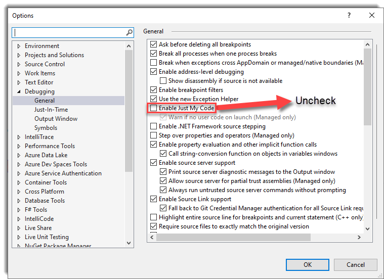
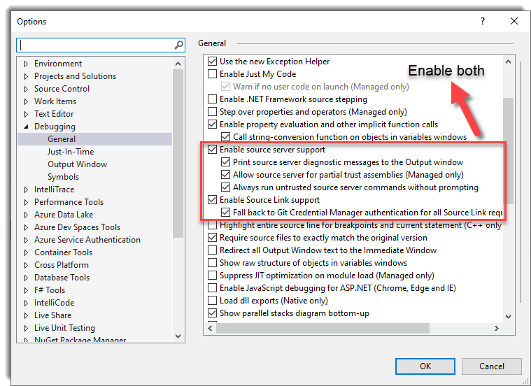
<Border>In order to debug an animation and step into the code, use the EnableDebugging property. Debugging is possible due to the inclusion of the SourceLink library. Please be sure to do the following:
<Rectangle xf:Animations.EnableDebugging="InitializeElement"
           xf:Animations.Primary="{StaticResource SlideFromLeft}" />
The following tables explains the enumeration values:
| Enum Value | Description |
|---|---|
None |
Default value. No debugging will occur. |
InitializeElement |
Breaks the debugger in the InitializeElement function of XamlFlair. |
RunAnimation |
Breaks the debugger in the RunAnimation function of XamlFlair. |
The XamlFlair library abstracts its logging using Microsoft.Extensions.Logging.Abstractions. Below is a logging example using Serilog in a UWP app:
public App()
{
    this.InitializeComponent();
    .
    .
    .
    // Setup the Serilog logger
    Log.Logger = new LoggerConfiguration()
        .MinimumLevel.Debug()
        .WriteTo.Debug()
        .CreateLogger();

    // Initalie the XamlFlair loggers using the LoggerFactory (with Serilog support)
	XamlFlair.Animations.InitializeLoggers(new LoggerFactory().AddSerilog());
}
To output the values of one or more animations, simply set Debug to the EnableLogging property on the target FrameworkElement:
<Rectangle xf:Animations.EnableLogging="Debug"
           xf:Animations.Primary="{StaticResource SlideFromLeft}" />
Doing so will provide you with the following similar console output (differs slightly for WPF):
Element = Windows.UI.Xaml.Controls.Button
Kind = FadeFrom, TranslateFrom
TargetProperty = Translation
Duration = 500
Delay = 0
Opacity = 0
OffsetX = 0
OffsetY = 50
OffsetZ = 0
ScaleX = 1
ScaleY = 1
ScaleZ = 1
Rotation = 0
Blur = 0
TransformCenterPoint = 0.5,0.5
Easing = Cubic
EasingMode = EaseOut
As each storyboard executes, it's kept in an internal list until it completes (or gets stopped). To output this internal list, temporarily add the following in your app startup code:
Animations.EnableActiveTimelinesLogging = LogLevel.Debug;Doing so will provide you with the following similar console output:
---------- ALL ACTIVE TIMELINES --------
Active timeline removed at 12:42:26:43222

Element = Button,  Key = d69f826a-1978-4a4e-b516-4a6b0469238b,  ElementGuid = 195d8c13-1dd7-4fef-a7f3-fc78bdab1cd7
    State = Running,  IsSequence = False,  IsIterating = False,  IterationBehavior = Count,  IterationCount = 0
------------------------------------

---------- ACTIVE TIMELINE --------
Guid d69f826a-1978-4a4e-b516-4a6b0469238b - Updated state to: Completed at 12:42:26:88616
------------------------------------

---------- ALL ACTIVE TIMELINES --------
Active timeline removed at 12:42:26:89614

NO ACTIVE TIMELINES!
------------------------------------
Currently, all the logging in XamlFlair mentioned above is logged at
LogLevel.Debug
In order to properly implement item animations on list items, it was not enough to simply create attached properties against the ListViewBase (UWP) and ListBox (WPF) controls. Instead, inherited controls were created: AnimatedListView and AnimatedGridView for UWP, and AnimatedListView and AnimatedListBox for WPF, all available from the XamlFlair.Controls namespace:
UWP and Uno namespace:
xmlns:xfc="using:XamlFlair.Controls"WPF namespace:
xmlns:xfc="clr-namespace:XamlFlair.Controls;assembly=XamlFlair.WPF"Animating items in lists is slightly different than animating a typical UI element. The main reason for this difference is that the Event value on the corresponding AnimationSettings cannot be changed from its default value. Therefore the following is invalid:
<xfc:AnimatedListView ItemsSource="Binding SampleDataList"
                      xf:Animations:Items="{xf:Animate BasedOn={StaticResource FadeIn}, Event=Visibility}" />
List item animations, by default, animate based on the Loaded event of each visible item, and also based on an update to the ItemsSource property of the list control. In order to disable these default behaviors, the following two properties can be used independently:
<xfc:AnimatedListView ItemsSource="Binding SampleDataList"
                      xf:Animations.AnimateOnLoad="False"
                      ... />

<xfc:AnimatedListView ItemsSource="Binding SampleDataList"
                      xf:Animations.AnimateOnItemsSourceChange="False"
                      ... />
By default, item animations have a delay of 25 milliseconds between each item. This value can be changed using the InterElementDelay property:
<xfc:AnimatedListView ItemsSource="Binding SampleDataList"
                      xf:Animations.InterElementDelay="50"
                      ... />
Just like PrimaryBinding and SecondaryBinding, item animations can be triggered by a binding with the use of the ItemsBinding property:
<xfc:AnimatedListView ItemsSource="Binding SampleDataList"
                      xf:Animations.AnimateOnLoad="False"
                      xf:Animations.ItemsBinding="{Binding MyViewModelProperty}"
                      xf:Animations:Items="{xf:Animate BasedOn={StaticResource FadeIn}}" />
Warning (UWP only): Be aware that if you have any
ItemContainerTransitionsset on theAnimatedListVieworAnimatedGridView, they will be cleared. This is done to avoid conflicting item animations.
Note (Uno only): To avoid any flickers on item animations, there is currently a constraint in place:
Itemsanimation must contain aFadeFrom.


