A ready-to-use and lightweight CSS Library for developing fast and responsive web interfaces!
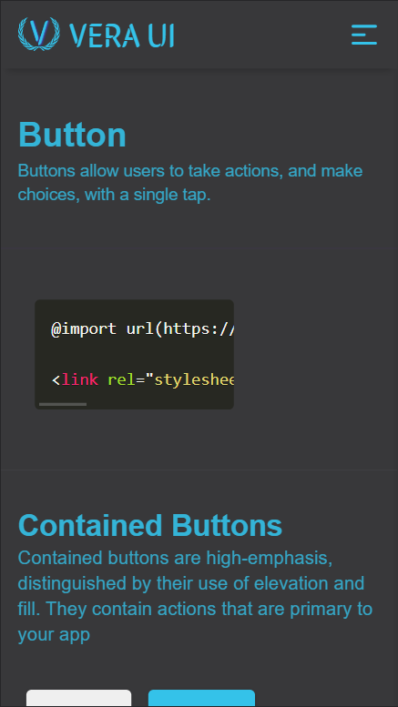
Just copy-paste the stylesheet <link> into your <head> to load our CSS.
<link rel="stylesheet" href="https://vera-ui.netlify.app/css/main.css" />Some of our components require the use of JavaScript to function. Place our script at the end of your page content, right before the closing <body> tag, to enable them.
<script src="https://vera-ui.netlify.app/js/main.js"></script>Check out our documentation website.
- Semantic HTML5 markup
- SCSS
- CSS3
- Flexbox
- Mobile-first workflow
- VanillaJS
SCSS is awesome! I did use it once before but not on such a big scale. I learned that css can be optimized and it that is clean and reusable. Large projects can really benefit from using SASS or SCSS.
One of the things that I loved about SCSS is how easy it is to nest elements. Also we can group various classes and tap them as a whole.
.btn {
  padding: 1rem;
  cursor: pointer;
  color: red;
}
.btn:hover {
  background-color: blue;
}
.btn.btn-icon {
  padding: 1rem 1.5rem;
}
.btn.btn-icon span {
  padding: 0 0.5rem;
}
.btn.btn-primary {
  background-color: red;
  color: blue;
}
.btn.btn-primary:hover {
  background-color: blue;
}
.btn.btn-primary-outline {
  background-color: black;
}
.btn.btn-primary-outline:hover {
  background-color: red;
}
The above CSS code can be written in SCSS as below:
.btn {
  padding: 1rem;
  cursor: pointer;
  color: red;

  &:hover {
    background-color: blue;
  }
  &#{&}-icon {
    padding: 1rem 1.5rem;

    span {
      padding: 0 0.5rem;
    }
  }
  &#{&}-primary {
    background-color: red;
    color: blue;
    &:hover {
      background-color: blue;
    }

    &-outline {
      background-color: black;
      &:hover {
        background-color: red;
      }
    }
  }
}- Light Mode
- Add new components
- Structured code in a better way
- Learn more about functions and mixins in SCSS
- Try to optimize more of the code
-
SCSS - This helped me greatly in learning SCSS and its variety of features. I really liked the examples given in SCSS documentation which helped me a lot to transition from writing CSS to SCSS.
-
SCSS to CSS - This helped me to figure out how to write some stuff in SCSS when I had a idea how to write in CSS.
- Website - Sobhan dash
- LinkedIn - sobhandash
- Twitter - @Neo_kaizerr
A big thanks to NeoGrammers for giving me an inspiration to create something on my own, even if I'm not a part of it. Its really great to see these guys build amazing stuff and put out content to get inspired from!


