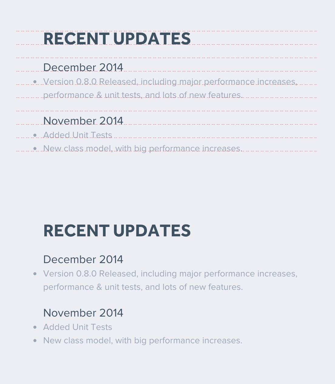
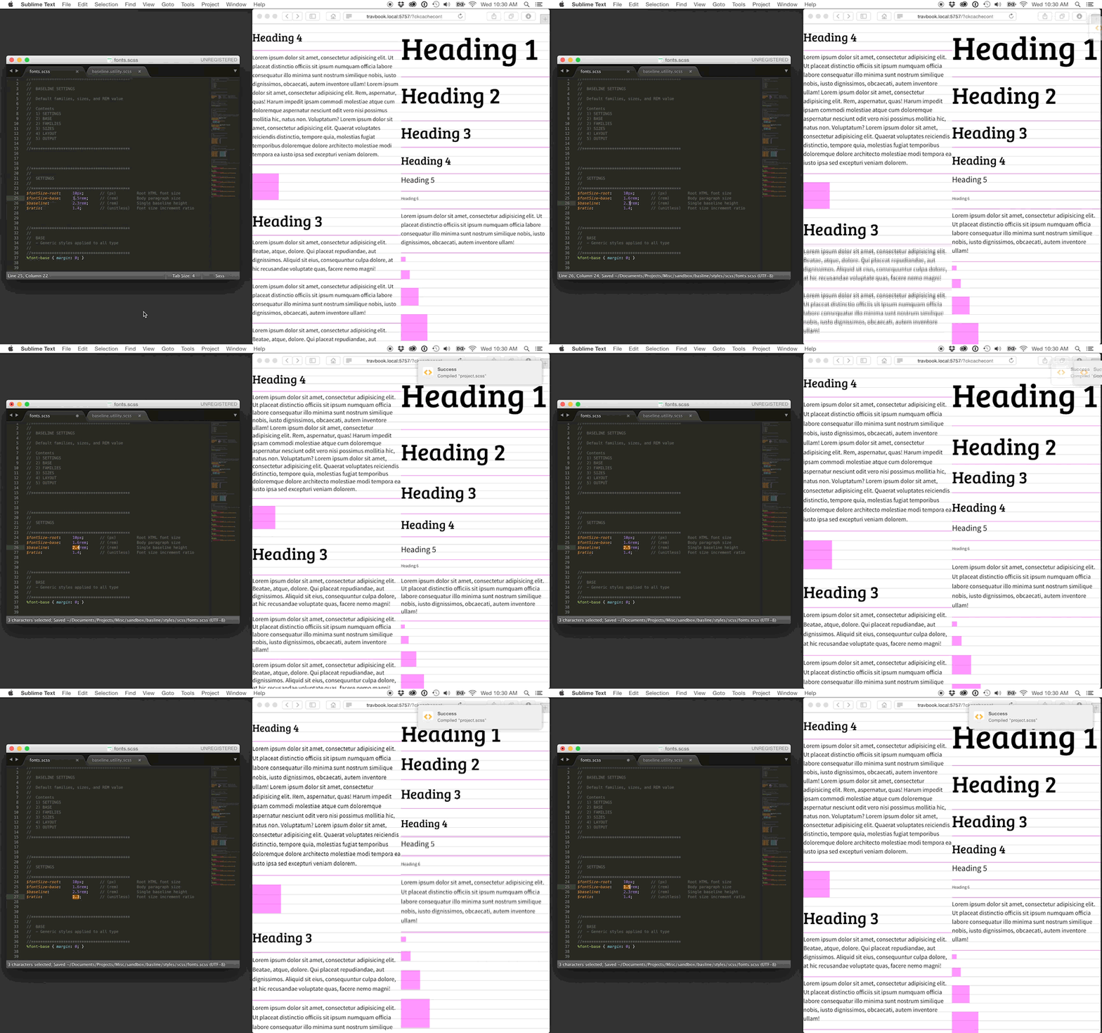
Automatically calculated font sizes and spacing based on a customizable ratio and baseline grid for your chosen typeface. The implementation is reductive and highly customizable to suit the needs of your project.
- Body size
- Unit height
- Scale ratio
These are the main settings to set up your grid. They can be adjusted at any time.
//*******************************************
//
// SETTINGS
//
//*******************************************
$fontSize-root:   10px;     // (px) Root HTML font size - 10px default
$fontSize-base:   1.5rem;   // (rem) Body paragraph size
$baseline:        2.3rem;   // (rem) Single baseline height
$ratio: 1.4; // (unitless) Font size increment ratioIn order to align type to its visible baseline, the baseline position needs to be known to the utility. Use the demo files to find the “Shift Ratio” value for your selected fonts. This is essentially stating how far down the font the baseline is from its vertical center. This point can vary between fonts and requires a small amount of trial and error to find the correct value. The font face will not align to its baseline grid without this value determined accurately.
//*******************************************
//
// BASE
// - Generic styles applied to all type
//
//*******************************************
%font-base { margin: 0; }

//*******************************************
//
// FAMILIES
// - Font families, weights, and styles
//
// SHIFT RATIO
// - (unitless)
// - Different for each font
// - This value describes the location of the font's baseline as a percentage
// - Using an accurate value for each font is essential to proper alignment
//
//*******************************************
$fontFamily-primary: 'Bree Serif', serif;
$shiftRatio-primary: 0.37;
%fontFamily-primary {
    @extend %font-base;
    font-family: $fontFamily-primary;
    font-style:  normal;
    font-weight: normal;
}

$fontFamily-secondary: 'Source Sans Pro', sans-serif;
$shiftRatio-secondary: 0.32;
%fontFamily-secondary {
    @extend %font-base;
    font-family: $fontFamily-secondary;
    font-style:  normal;
    font-weight: normal;
}These values specify which ratio increments you plan on using. This way, you are not required to use consecutive intervals in the ratio. Layout settings can be applied to sizing and spacing properties throughout the project to keep containers aligned with the baseline grid as well.
//*******************************************
//
// SIZES
// - Font size ramp ratio increments
// - Should be unitless
//
//*******************************************
$fontSize-smallest: -1;
$fontSize-smaller:   0;
$fontSize-small:     1;
$fontSize-default:   2;
$fontSize-large:     3;
$fontSize-larger:    4;
$fontSize-largest:   5;

//*******************************************
//
// LAYOUT
// - Layout size ramp baseline increments
// - Should be unitless and used with the baseline-grid function
//
//*******************************************
$gridUnit-smallest: baselineGrid(0.5);
$gridUnit-smaller:  baselineGrid(1);
$gridUnit-small:    baselineGrid(2);
$gridUnit-default:  baselineGrid(3);
$gridUnit-large:    baselineGrid(4);
$gridUnit-larger:   baselineGrid(6);
$gridUnit-largest:  baselineGrid(8);
Create your selectors, extend your font families, and select your font-size settings and shift ratio variables. These settings can be extended throughout the project, ensuring consistency and the ability to update preferences easily. Vertical spacing can be fine-tuned by adding or subtracting the $baseline using the top or bottom margin.
h6,
.font-smallest,
%font-smallest {
    @extend %fontFamily-secondary;
    @include baselineFont( $fontSize-smallest, $shiftRatio-secondary );
}
p,
.font-smaller,
%font-smaller {
    @extend %fontFamily-secondary;
    @include baselineFont( $fontSize-smaller, $shiftRatio-secondary );
}
h5,
.font-small,
%font-small {
    @extend %fontFamily-secondary;
    @include baselineFont( $fontSize-small, $shiftRatio-secondary );
}
/* ... */What you get is easily accessible presets to use throughout the project. They include font-family choices with automatically-calculated sizes and spacing that adhere to a custom ratio and baseline grid. The implementation is reductive and highly customizable to suit the needs of any project.
 The baseline utility, as used on CreateJS.com.
If you found this tool useful or interesting I would be happy to hear from you via @travismillerdes on twitter.
Check out the full article on the gskinner blog for more information!
