We're building an NFT rental marketplace for P2E games 🕹️
marketplace.candide.site ⚠️ site under active development ⚠️
🔥 First round of beta testing: complete
🟣 Note: The project files are hosted in a private repo on Gitlab
The Candide marketplace will allow users to rent p2e NFTs for their favorite NFT games.
- When renting an NFT you gain access to its utility without risking your capital
- When lending an NFT you put it to work generating passive income
- Nuxt/Vue 2
- Tailwind
- Assorted utility libraries (date-fns, js-cookie, fontawesome, etc.)
- No front-end component libraries
I fill the role of sole designer & front-end engineer. I built the UI and all of the components from scratch.
A video tour of the Candide marketplace.
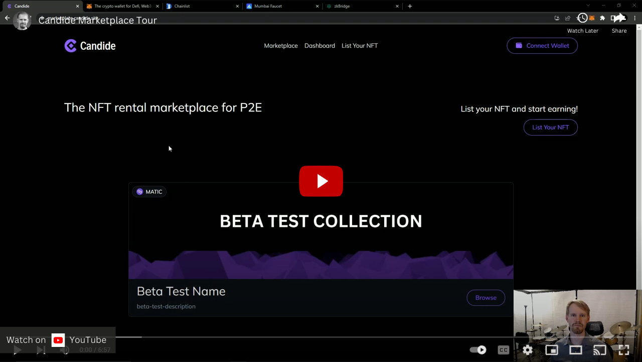
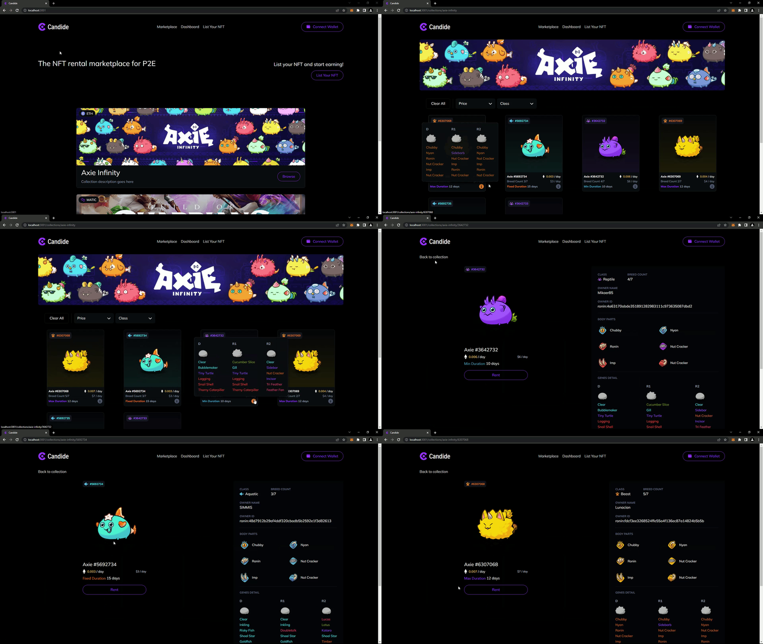
🚨 The following images demonstrate features & functionality I built for the site. These demos are populated with static data and assets used in development and may not accurately represent the current state of the project. 🚨
- All the components are dynamic and reusable
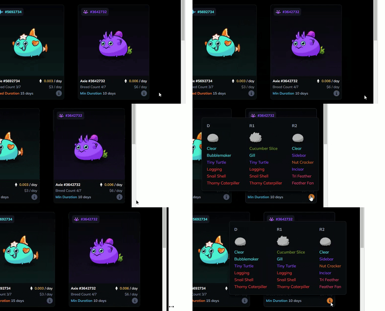
- Each axie's stats, traits, and icons, in both the popover and on the details page, are dynamically selected and styled.
-
The popover is "staged" for display when the mouse enters the border of the card component i.e.
display: noneexchanged fordisplay: flex -
getBoundingClientRectis used to get the appropriate coordinates of the popover and the containing window -
If the coordinates of the popover exceed the limit of the window then the position of the popover is adjusted to be within the appropriate boundaries
-
The
🛈icon is hovered and the popover transitions into view usingopacityandscale -
Reverse steps for fade-out and "unstaging" of the popover
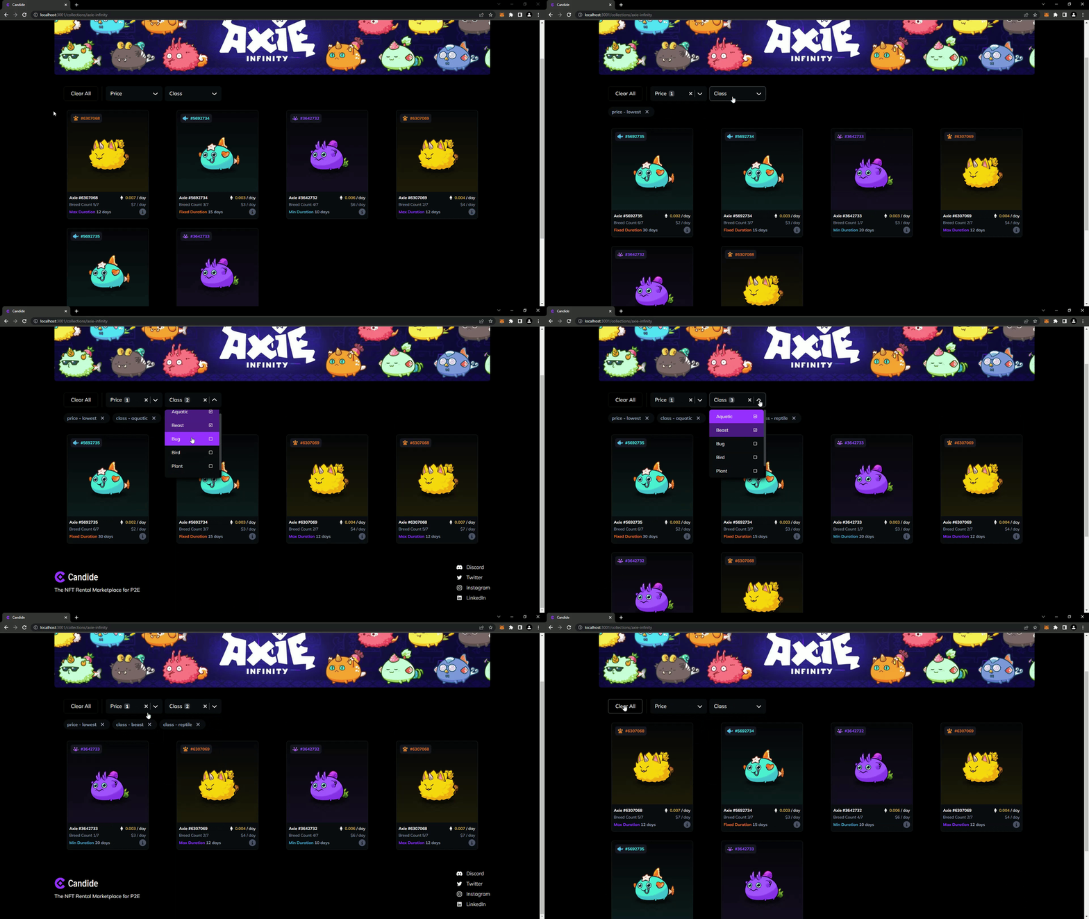
- Custom select box components built from scratch along with filter chips which display all filters currently being applied
- Active filters are displayed both in the filter chip row and also as highlighted options within each select box
- When a filter is deleted (which can originate from four different user actions) All relevant components are updated to reflect the change
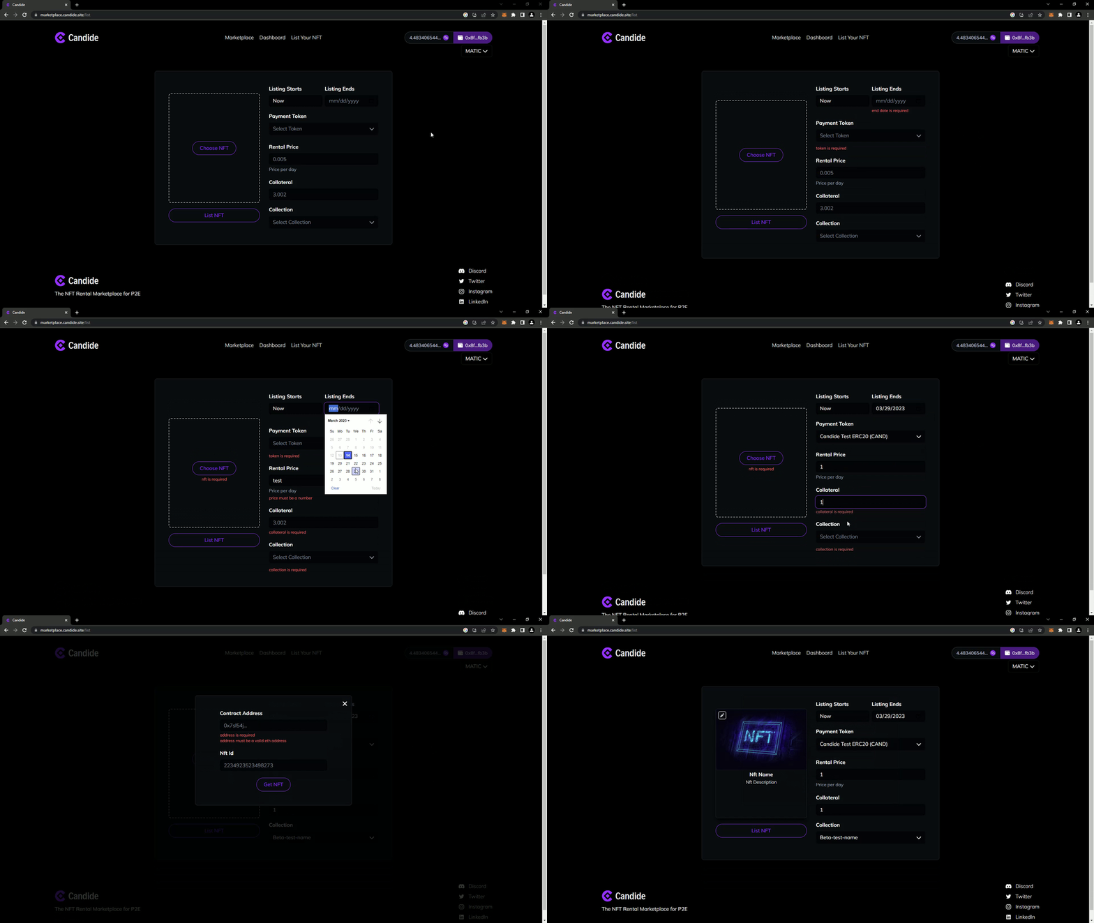
- Custom from components and validation built from scratch
- Error messages prompt the user to enter valid information
- Form state prevents an incomplete form from being submitted.


