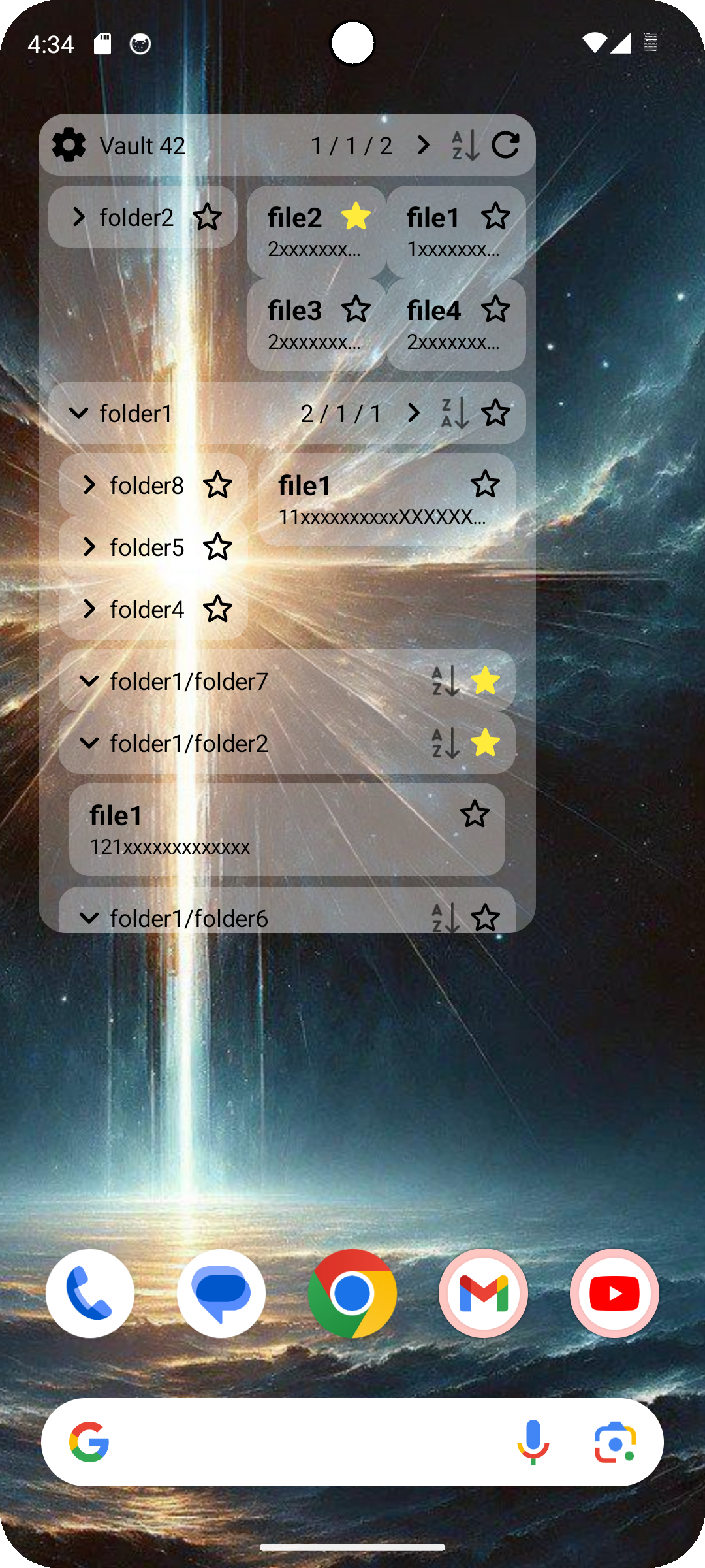
A widget allowing you to browse note entries of a Obsidian vault, on home screen
-
This widget is responsive but some devices provides incorrect widget dimensions to the widget, in this case you need to set a width correction factor. Enable debug line in configuration and adjust the factor until the line is as long as the width of the widget.
-
It won't observe file changes at realtime. It scans the vault periodically(period could be set, default is 60s); It also scans once you interact with it.
-
After scanning 10 times observing no changes, it will cold down and slows the period of scanning(also could be set, default is 3600s).
-
It is super wierd that we cannot read the files & folders in the vault, but only a ".obsidian", even after granting permissions using "Choose Folders" interface. so we'd have to do what our neighbour obsidian-todo-widget does --- sorry but you need to grant the permission of "All Files Access". Well I swear it will do nothing sensitive. Source code's just here.
-
This widget is still not fully developed --- Actually it's my first time to make a Android project; There's still too much I don't know about Android. This work is still a beta of beta, with many parts still not following the best practices I've known or dont know for architecting a real project. (Why is it just so hard to determine a structure in Android???)
If you found any strange design pattern in my codebase, like "Why don't you abstract out a data source?" or "Why do you put scanning work inside repository layer?" --- My response will all be "I don't know.""I'm not sure.""I haven't learned that yet." There should be hardly any architecture designs made with any so-called "underlying deep meaning". (and I found Gemini-Pro is still not very smart on Android architectureing.) Instead, I really need the insights from Android professionals. You are very very welcomed to help me point out where could be better redesigned/refactored. Also art/ui-designing recommendations are very welcomed.
Plus, I'm afraid I could only spare a small amout of time on the enhancements of this project for the next months to come.... So this project really needs your valuable feedback, your valuable insights and suggestions, or even your valuable collaboration to be developed further. In a word this project really needs your help.
-
I find the naming pattern "onXXX" for composable functions' callbacks are sometimes just wierd.
In some cases it is the low-level component itself already able to process the interaction tasks, and the use of this callback is just to notice the upper-level to do something.
Upper level observing/listening to lower-level's events, in this case it's good to call it "onXXXX".
However in other cases it is not the lower-layer component to process the business tasks, it needs to pass to the upper layer which is capable to do the job.
In this case I propose to name it as "toXXXX". This name means the low-level component needs this passed-in lambda to know how to do the job,
or it also means the low-level gotta call the upper level to do that job.
So now there will be two kinds of naming pattern. The key is whether the definition of callback business is literally defined for the upper-level or the lower-level.
In this project there sometimes exists thorough callback passes up-to-down and down-to-up. Distinguishing them will help us understand what they're doing. But I'm still doubting whether the passing chain is a good practice.
-
(1) Add a create note button for each
expandedFolderBar -
(2) Add support for multiple widgets to display multiple vaults or multiple sub-folders
-
Cleanup:
- Extract common logic of circle icon buttons
- Combine RootBar & ExpandedFolderBar and provide a parameter
isRootto display in different ways; Then use ExpandedFolder to replace separated layout for root in WidgetContent - What else?
-
Relayout the AppConfigActivity:
- (1) Less Chiglish in settings & Proper layouts for explanations of each options
- Make a preview of the widget after the codebase is stable, (and gotta think how to sync UI changes with least effort?)
- (After that) allow user to customize size parameters for each widget. This needs a preview of the widget.
- (After that) Use fragments / navigation to separate settings into 2+ categories: The General Configs (scan strategies, debug line & correction coefficient) & widget-specific configs (Path & Size Parameters). After supporting multiple widgets the number of categories will be 1+N.
-
Responsive design:
- Smartly set the column numbers of file grid
- (1) Integrate all size information, like first-view height & file-grid width & folder-grid width, into
PageParams - (1) (After that) More flexible layout - allow folded folders to be laid with multiple columns when the files are too few to fill up file grid's assigned space.
- Combine Navigator and title when width is tight
-
Data & Architecture Optimization:
- Start to use the unused state-checking methods
- Thorough understand Flows & StateFlows in Data Layer
-
WidgetStateRepositoryprovide thoroughStateFlows -
MainActivityfully adapt to flow ofAppConfig
-
Now the widget is still a bit laggy --- it needs a long-time loading after boot & a short-time updating after user's interaction...Why?
- Add delay and test the time consuming operations
-
idk what else...refactor my spaghetti codes?
- Gemini-Pro & Poe
- Obsidian
- YukiGasai/obsidian-todo-widget for some references and inspirations
but why, no one of the Obsidian users all over the world had even thought to made it.......
......
ASCENSION MUST BE MADE. WHATEVER IT COSTS.
