This is a demo Android application and explanation of creating dynamically colorized Material Design applications supporting Android 4.0 (API 15) and up. The app shows the most common user interface elements tinted using an adjustable runtime theme as well as static themes. This is done with simple theme and style setup in conjunction with the v7 AppCompat Support Library, allowing apps to brand the user interface without needing to generate assets. If you just want the code, here are quick links to the user interface elements covered:
- Buttons
- Borderless Buttons
- Floating Action Buttons
- Text Fields
- Radio Buttons
- Checkboxes
- Switches
- Dropdown Spinners
- Sliders
- Progress Indicators
- Icons
- Dialogs
- Snackbars
- Custom Selectable Items
Android was built with the concept that almost every user interface element of an app should be customizable, allowing apps to adjust their look and feel to express their brand while keeping the common behaviors that users already understand. To support this, Android has styles, which are defined in XML as collections of attributes that can be applied to Views. A single style can adjust colors, dimensions, spacing, fonts, and any other customizable attributes that a View supports. By grouping these attributes together, a single style can be applied to many Views. If that style is updated, all of the Views using the style will update as well, without needing to adjust each and every View. Styles also support inheritance, with the ability to override and add new attributes to create multiple variations of a style.
Now that you understand the basics of styles, what are themes in Android? A theme is a collection of global attributes that are applied to an Activity or entire Application. These attributes define default colors, sizes, and styles for the standard Views, setting up the overall look of an application. The theme's global attributes can then be referenced within the layouts of the Activity or Application they are applied to, which will be covered later. So to sum it up: a style is a collection of attributes applied at a local, individual component level, while themes are applied at a per screen or entire application level.
I've mentioned that styles and themes set attributes, but what really is an attribute? Basically, you can think of attributes just like variables, that represent properties that can be set, changed, and applied to the user interface to define look and behavior. Attributes are defined in XML as one of a few types: boolean, number, text, enum, or a reference to another resource. These attributes can then be referenced when defining user interface elements in code or XML. The Android SDK defines its own attributes under the android: namespace, which are used by the default user interface elements and themes. the full list be found in R.attr. These default Android attributes are useful for styling the default user interface, but apps can add their own custom attributes in attrs.xml to be used with custom themes and Views.
Now let's start with an example of how an attribute can be used. The simplest use case for an attribute is an explicit property that a View will apply. For example, TextView supports the attribute android:textColor, which sets a specific color for its text. In Java terms, you are basically setting the textColor variable to a specific value.
int textColor = 0x00FF00; In XML, you would create a simple text style that sets android:textColor to a color. This style could then be applied to TextViews in an app, and if the standard text color needed to change, only the style would need to be updated, rather than every layout.
<style name="TextStyle" parent="TextAppearance.AppCompat">
	<item name="android:textColor">#00FF00</item>
</style>
Just like variables, attributes can reference other attributes. This enables a more complex use for attributes, where they do not correspond to explicit View properties, but are instead global theme properties that can be referenced by other attributes that do set explicit View properties. For example, the default Android theme sets the attribute android:textColorPrimary, which is a color, but not an explicit property of any View. However, it can be used by TextView and applied to the attribute android:textColor. In Java terms, you are now setting the textColorPrimary variable to a placeholder, which is then being set to textColor.
int textColorPrimary = 0x00FF00;
int textColor = textColorPrimary;
In XML, you would use a theme that sets android:textColorPrimary to a color, and a text style that sets android:textColor to android:textColorPrimary. Alternatively, this text color could be directly applied to TextViews in an app, but using the reference makes it flexible if the text color needed to change, the theme is updated, or another theme sets android:textColorPrimary in XML or at runtime.
<style name="AppTheme" parent="Theme.AppCompat.Light.DarkActionBar">
	<item name="android:textColorPrimary">#00FF00</item>
</style>

<style name="TextStyle" parent="TextAppearance.AppCompat">
	<item name="android:textColor">?android:textColorPrimary</item>
</style>
Now you should see the delineation between styles and themes starting to surface with how they use attributes. Styles are great for applying explicit View attributes, and directly applying them to Views. Likewise, themes can set global theme attributes, which can then in turn be used by styles and Views. Putting this all together, themes can create a palette of theme attributes, which styles use when applying explicit View attributes. This way, themes set the overall brand for an app, while styles use that brand to create the look and feel in variations that are applied to Views. When setup this way, an app can change its theme without editing a single style or layout file, and have its entire look update.
In theory, themes and styles are a simple solution to make a completely dynamic user interface that can be updated and maintained with ease; however, in practice this is much easier said than done. Before Android 5.0 (API 21), themes were useful for settings backgrounds, layout spacing and sizes, font sizes and colors, divider sizes and colors, and other basic elements of the user interface. However, the primary user interface elements (buttons, text boxes, switches, images, icons, etc) were much more difficult to style. This was because these elements were raster graphics (png, jpeg, etc.), which have set dimensions and colors, and are not dynamic in any way. This meant a button could not easily reference a theme color and colorize itself. Instead, a colored version of the button had to be created and included as a resource in the app. In order to handle every button state (5) and screen density bucket (6) that Android supports, 30 (5 states x 6 screen densities) assets would need to be generated for that single button. That's just one button, if a new color of the button was needed, another set of assets was needed. Even if the color of an existing button needed to be updated, the full set of assets would need to be updated and replaced. So you can see how this quickly became a very tedious chore, making it difficult to update and maintain themes and styles for control elements because they had to be generated manually.
However, raster images were not the only option for user interface elements. Android does support ShapeDrawables, which are vector shape assets that can scale without losing fidelity, removing the need for multiple density versions for an asset. They can also reference color and dimension resources, and dynamically colorize themselves. So why not just reference theme attributes from ShapeDrawables? Unfortunately, before Android 5.0 referencing theme attributes in ShapeDrawables would compile, but throw an Exception at runtime. ShapeDrawables got closer to a more dynamic set of user interface elements, but ultimately had a similar limitation as raster images, where a separate asset for each color was needed. This allowed for slightly easier theming of controls, but still took a lot of work from the developer to create any non-trivial user interface elements.
Google was aware of the painpoints of theming and styling apps, and in Summer 2014 it unveiled Material Design alongside Android 5.0. The material theme was a strong divergence from the Holo theme that had been around since Fall 2011 with Android 4.0 (API 14). Material design added new animations, user interface controls, touch feedback, and a bright new color palette. But more importantly, Android 5.0 added new features critical to theming almost every aspect of material user interfaces.
- Color tinting support for
DrawablesandViews - Theme attribute access in Drawable Resources
- Ability to theme individual
Views
This finally opened the door to dynamically colored user interface elements without having to make multiple versions for each color. Color tinting allowed icons and images to be colored on the fly, while ShapeDrawables could reference color theme attributes to dynamically color user interface elements. Lastly, being able to apply themes at the View level allowed Views in the same layout to use completely different themes.
This all sounded great, but what about legacy devices that didn't have the new features of Android 5.0? Google's solution was the v7 AppCompat Support Library, which included "tint-aware" material design user interface elements that support all the way back to Android 2.1 (API 7).
The AppCompat Support Library is very useful, allowing apps to use the new material user interface elements with dynamic color tinting on any device running Android 2.1+. However, documentation on how to properly take advantage of these features is sparse. AppCompat relies on a few things in order to work as intended:
- Any
Activityin use must extend fromAppCompatActivityor implementAppCompatDelegate - Apply themes and styles that extend from AppCompat versions
- Set the custom theme attributes for AppCompat themes and styles
So what is AppCompat actually doing with all of this? First, AppCompatActivity intercepts layouts on inflation, and wraps Views that it can support with AppCompat versions. These AppCompat versions will then read the custom AppCompat theme attributes and dynamically colorize the Views, handling backwards compatibility automatically. If any theming or tinting needs to happen at runtime, the View just needs to be cast to the proper AppCompat class.
Now that you know how AppCompat is designed to work, let's put it all together. Google has setup AppCompat to use a set of custom theme attributes, which set the color palette to be used by the AppCompat styles. With the ability to theme at the View level, different themes can be set on the same layouts to colorize them in different ways. To start, you need an app theme, a dialog theme, and an alert dialog theme.
<!-- Green App Theme -->
<style name="AppTheme.Green" parent="Theme.AppCompat.Light.DarkActionBar">
    <item name="windowActionBar">false</item>
    <item name="windowNoTitle">true</item>

    <!-- AppCompat Attributes -->
    <item name="colorPrimary">@color/material_green_500</item>
    <item name="colorPrimaryDark">@color/material_green_700</item>
    <item name="colorAccent">@color/material_green_a700</item>

    <!-- AppCompat Control Attributes -->
    <!-- Other control states (not in this example)
    <item name="colorButtonNormal">@color/material_green_500</item>
    <item name="colorControlNormal">@color/material_green_500</item>
    <item name="colorControlActivated">@color/material_green_500</item>
    <item name="colorControlHighlight">@color/selector_green_pressed</item>
    -->

    <!-- AppCompat Dialog Attributes -->
    <item name="dialogTheme">@style/AppTheme.Dialog.Green</item>
    <item name="alertDialogTheme">@style/AppTheme.Dialog.Alert.Green</item>
</style>

<!-- Green Dialog Theme -->
<style name="AppTheme.Dialog.Green" parent="Theme.AppCompat.Light.Dialog">
    <item name="colorPrimary">@color/material_green_500</item>
    <item name="colorPrimaryDark">@color/material_green_700</item>
    <item name="colorAccent">@color/material_green_a700</item>
</style>

<!-- Green Alert Dialog Theme -->
<style name="AppTheme.Dialog.Alert.Green" parent="Theme.AppCompat.Light.Dialog.Alert">
    <item name="colorPrimary">@color/material_green_500</item>
    <item name="colorPrimaryDark">@color/material_green_700</item>
    <item name="colorAccent">@color/material_green_a700</item>
</style>Now that you have a colored theme, you can set it for your entire Application or Activity and it will set your custom AppCompat attributes to be used by all AppCompat Views. However, you can also theme an individual View or ViewGroup using the android:theme attribute, which AppCompatActivity handles reading and setting properly when it intercepts layouts as they are inflated. Let's assume you have set your green theme at the Application level, and you don't need to set your theme on each element.
<View
	android:layout_width="wrap_content"
	android:layout_height="wrap_content"
android:theme="@style/AppTheme.Green"/>Use @style/Widget.AppCompat.Button (default if not set), which sets the button color to colorButtonNormal, using colorControlHighlight as an overlay for focused and pressed states.
<Button
	android:layout_width="wrap_content"
	android:layout_height="wrap_content"
	android:text="Green Theme"/>
To get a colored version, use @style/Widget.AppCompat.Button.Colored, which sets the button color to colorAccent, using colorControlHighlight as an overlay for focused and pressed states.
<Button
	style="@style/Widget.AppCompat.Button.Colored"
	android:layout_width="wrap_content"
	android:layout_height="wrap_content"
android:text="Green Theme"/>Use @style/Widget.AppCompat.Button.Borderless, which uses colorControlHighlight as an overlay for focused and pressed states.
<Button
	style="@style/Widget.AppCompat.Button.Borderless"
	android:layout_width="wrap_content"
	android:layout_height="wrap_content"
	android:text="Green Theme"/>
To get a colored version, use @style/Widget.AppCompat.Button.Borderless.Colored, which sets the text color to colorAccent, using colorControlHighlight as an overlay for focused and pressed states.
<Button
	style="@style/Widget.AppCompat.Button.Borderless.Colored"
	android:layout_width="wrap_content"
	android:layout_height="wrap_content"
android:text="Green Theme"/>Use the FloatingActionButton from the design support library with @style/Widget.Design.FloatingActionButton (default if not set), which sets the button color to colorAccent, using colorControlHighlight as an overlay for focused and pressed states.
<android.support.design.widget.FloatingActionButton
	android:layout_width="wrap_content"
	android:layout_height="wrap_content"
android:src="@drawable/ic_palette"/>Use the TextInputLayout from the design support library with @style/Widget.Design.TextInputLayout (default if not set), which sets the label text color to colorAccent. Wrap this around a TextInputEditText from the design support library with @style/Widget.AppCompat.EditText (default if not set), which sets the control colors to colorAccent when activated.
<android.support.design.widget.TextInputLayout
	android:layout_width="match_parent"
	android:layout_height="wrap_content"
	android:hint="Green Theme">

	<android.support.design.widget.TextInputEditText
	    android:layout_width="match_parent"
	    android:layout_height="wrap_content"/>
</android.support.design.widget.TextInputLayout>Use @style/Widget.AppCompat.CompoundButton.RadioButton (default style if not set), which sets the radio button color to colorAccent when activated, using colorControlHighlight as an overlay for focused and pressed states.
<RadioButton
	android:layout_width="wrap_content"
	android:layout_height="wrap_content"
android:text="Green Theme"/>Use @style/Widget.AppCompat.CompoundButton.CheckBox (default if not set), which sets the checkbox color to colorAccent when activated, using colorControlHighlight as an overlay for focused and pressed states.
<CheckBox
	android:layout_width="wrap_content"
	android:layout_height="wrap_content"
android:text="Green Theme"/>Use @style/Widget.AppCompat.CompoundButton.Switch (default if not set), which sets the switch color to colorAccent when activated, using colorControlHighlight as an overlay for focused and pressed states. Note, due to the significant different in appearance of the Material switch vs the Holo switch, you must use android.support.v7.widget.SwitchCompat explicitly as AppCompat will not automatically replace Switch elements on pre Android 5.0 (API 21).
<android.support.v7.widget.SwitchCompat
	android:layout_width="wrap_content"
	android:layout_height="wrap_content"
android:text="Green Theme"/>Use @style/Widget.AppCompat.Spinner (default if not set) or @style/Widget.AppCompat.Spinner.Underlined, which sets the underline color to colorAccent when activated, using colorControlHighlight as an overlay for focused and pressed states.
<Spinner
    style="@style/Widget.AppCompat.Spinner.Underlined"
	android:layout_width="match_parent"
	android:layout_height="wrap_content"
android:spinnerMode="dropdown"/>Use @style/Widget.AppCompat.SeekBar (default if not set), which sets the slider color to colorAccent when activated, using colorControlNormal for the unset area and colorControlHighlight as an overlay for focused and pressed states.
<SeekBar
	android:layout_width="match_parent"
android:layout_height="wrap_content"/>Use @style/Widget.AppCompat.ProgressBar (default if not set) or Widget.AppCompat.ProgressBar.Horizontal, which sets the progress color to colorAccent.
<LinearLayout
    android:layout_width="match_parent"
    android:layout_height="wrap_content"
    android:gravity="center_vertical"
    android:orientation="horizontal">

    <ProgressBar
        android:layout_width="wrap_content"
        android:layout_height="wrap_content"
        android:indeterminate="true"/>

    <ProgressBar
        style="@style/Widget.AppCompat.ProgressBar.Horizontal"
        android:layout_width="match_parent"
        android:layout_height="wrap_content"
        android:indeterminate="true"/>
</LinearLayout>Set android:tint to tint the icon to a solid color. More advanced tinting is supported using DrawableCompat.setTint() in code.
<LinearLayout
    android:layout_width="match_parent"
    android:layout_height="wrap_content"
    android:gravity="center_vertical"
    android:orientation="horizontal">

    <ImageView
        android:layout_width="36dp"
        android:layout_height="36dp"
        android:adjustViewBounds="true"
        android:src="@mipmap/ic_launcher"
        android:tint="?colorAccent"/>

    <ImageView
        android:layout_width="36dp"
        android:layout_height="36dp"
        android:adjustViewBounds="true"
        android:src="@drawable/ic_palette"
        android:tint="?colorAccent"/>
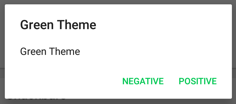
</LinearLayout>Set dialogTheme and alertDialogTheme in the applied theme (shown earlier above), or just pass the dialog theme in the AlertDialog.Builder from the support library, which sets the button text color to colorAccent.
Use the Snackbar from the design support library, which uses colorAccent of the current applied theme to set the action button text color, or use Snackbar.setActionTextColor() to change the color.
Using what you've learned about styles, themes, and attributes, you can create your own custom elements that use theme attributes to colorize themselves, and are backwards compatible. A common use case is to need to show pressed states on arbitrary layouts.
Use @style/SelectableItemStyle.Rect on a ViewGroup to get a rectangular pressed selection.
<LinearLayout
    style="@style/SelectableItemStyle.Rect"
    android:layout_width="wrap_content"
    android:layout_height="wrap_content"
    android:gravity="center_vertical"
    android:orientation="horizontal">

    <ImageView
        android:layout_width="42dp"
        android:layout_height="42dp"
        android:adjustViewBounds="true"
        android:src="@mipmap/ic_launcher"/>

    <TextView
        android:layout_width="wrap_content"
        android:layout_height="wrap_content"
        android:text="Green Theme"/>
</LinearLayout>
To get a colored rectangular version, use @style/SelectableItemStyle.Rect.Colored.
To get a rounded rectangular version, use @style/SelectableItemStyle.RoundedRect.
To get a colored rounded rectangular version, use @style/SelectableItemStyle.RoundedRect.Colored.
Making backwards compatible material design Android applications is much easier with AppCompat, especially when you understand how its styles and themes are working together to dynamically tint the user interface. With AppCompat, you should spend less time fiddling with assets and backwards compatibility, and more time focusing on actually building your application.
Copyright 2016 Steven Byle

Licensed under the Apache License, Version 2.0 (the "License");
you may not use this file except in compliance with the License.
You may obtain a copy of the License at

http://www.apache.org/licenses/LICENSE-2.0

Unless required by applicable law or agreed to in writing, software
distributed under the License is distributed on an "AS IS" BASIS,
WITHOUT WARRANTIES OR CONDITIONS OF ANY KIND, either express or implied.
See the License for the specific language governing permissions and
limitations under the License.


