Week 2 Day 4 - Data Visualization (dataviz) using Python (matplotlib and seaborn)
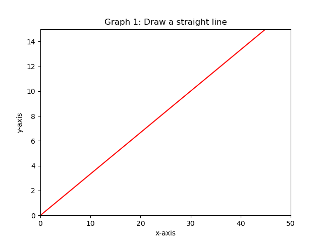
Create a graph with two axes. The x-axis goes from 0 to 50 and is called "x-axis". The y-axis is labeled "y-axis".
Draw the line of equation: x = 3y. With x ranging from 0 to 50.
The graph has the following title "Draw a straight line" and the line is red.
For the following graphs, we will use the sales data from a cosmetics company, from the file "company_sales_data.csv".
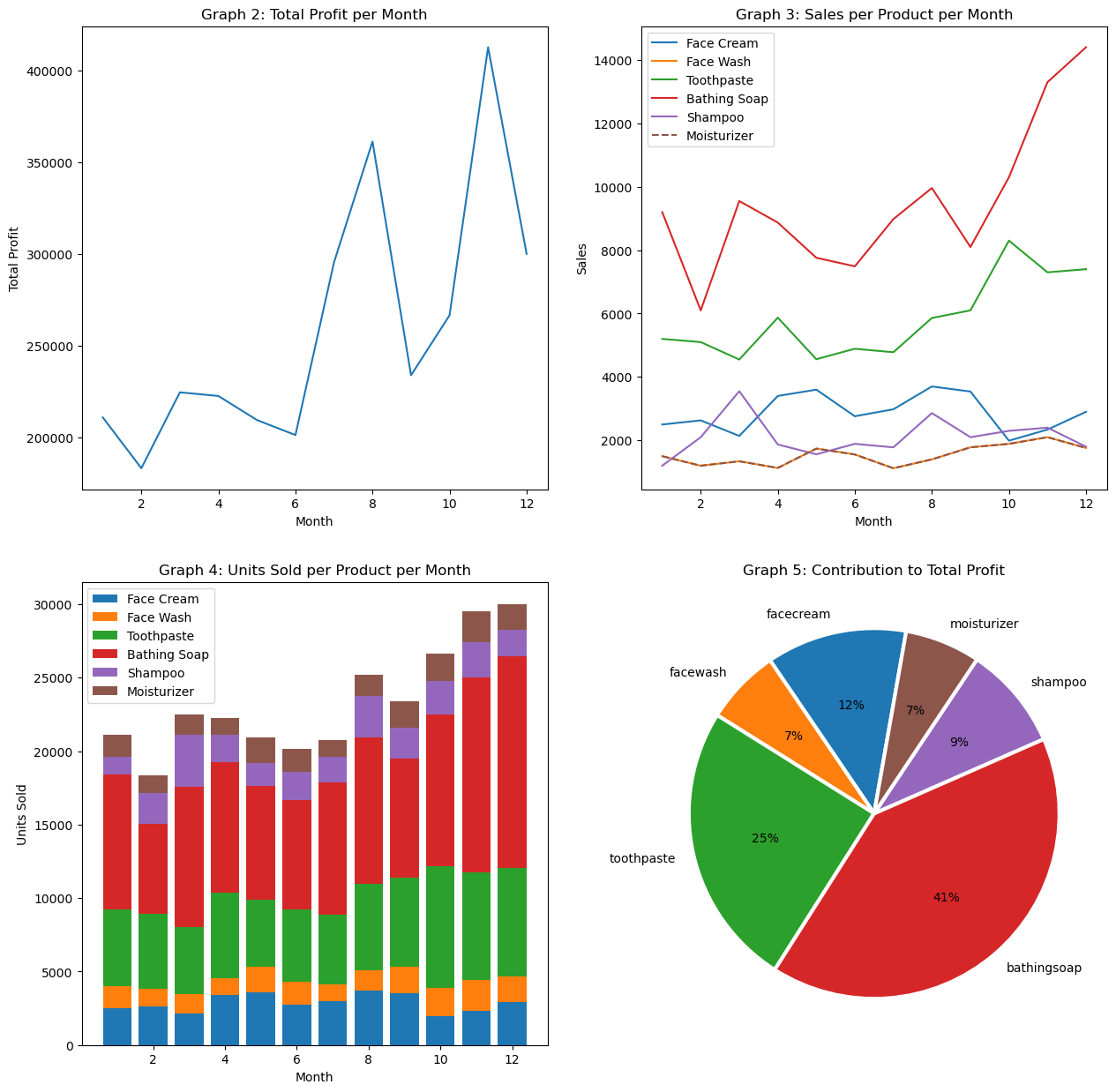
First, we want a graph that gives the curve of total profit realized per month.
Next, we want a graph that gives the profit curve for each product, as a function of time. Each curve will have a different color and we want a legend that indicates which color corresponds to which product.
We want a graph that compares, each month, the number of units sold for each product. It's up to you to choose the best representation to know the best-selling product per month.
We want a graph that gives the contribution of each product in the total profit (over the year studied). Please add the percentage for each product.
Now, we are going to change the data source. And we're going to come back to yesterday's project, using the 3 csv files which give the sales, the list of customers and the list of products.
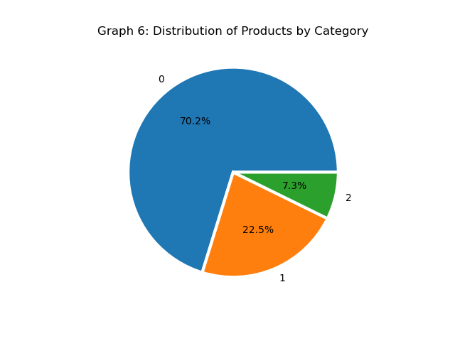
First, we want to have a pie chart that gives the distribution of products by category. Please indicate the percentage per product (nb of products of such category / nb of total products).
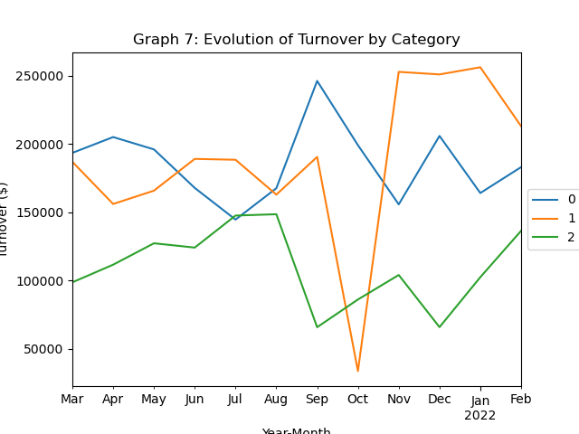
We want a graph that gives the evolution of turnover for each category (as a function of time).
We want a graph that gives a boxplot of the price distribution of a product for each category. Clearly, the graph shows 3 boxplots (one corresponding to category 0, one to category 1 and one to category 2).
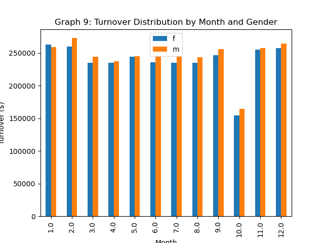
We want a graph that gives the distribution of turnover, for each month, according to the gender of the customer.
We want a graph which, for each transaction, links the age group of the customer and the amount of the transaction.
We want a graph which, for each item, links price and number of items sold during the period.
We want a graph that gives the distribution of the average basket (for each transaction).
Find 3 other graphs that can be useful in understanding the sales of the bookstore chain.
