Over here you're going to find all kind of webrpojects such as the small ones and the big ones done with HTML / CSS and JS!
These are an ideal opportunity to improve the coding skills for me a bit. Enjoy!
-
Be sure to check out these funny games to learn HTML, CSS and JS: https://codepip.com/games/ (membership for pro)
-
Still some of the best tutorials for beginners: https://www.w3schools.com/ (sign up for tracked courses)
-
The Wiki for coders: https://developer.mozilla.org/en-US/docs/Learn
- Tools like CSS Generator, Image Tools, Text Conversion or Android Dveleoptment Tools are you going to find HERE via ANGRYTOOLS
| PROJECT | TITLE | CONTENT |
|---|---|---|
| 00 | CSS | Important CSS topics such as working with Selectors, Positioning, the display- and box sizing property |
| 01 | BIRTHDAY CARD | Animated Birthday Card for a friend (HTML, CSS) |
| 02 | RESPONSIVENESS | All about resonsive topics such as flexbox, grid, media queries, tables, navigations and sliders (HTML,CSS) |
| 03 | SCSS / SASS | A small onepager website to test the basic structures of SCSS / SASS, Mixins, Extend; Nesting, Devide and Conquer |
| 04 | Navigation | A primary example of a responsive navigation bar with a hamburger menu (HTML, SCSS, JS) |
| 05 | Bootstrap | The very basics of using Bootstrap |
| 06 | Onepager | Basic examples of onepager websites |
| 07 | Gradients | Some examples of radial and other variants of gradients ("Farbverläufe") |
| 08 | Hover and Keyframes | Basic animations which you can do by using :hover and @keyframes{} |
GRID (some notes):
-
IMPORTANT: GRID LAYOUT-IT GENERATOR for a quick and easy way to create a grid layout!
-
GRID LAYOUT is a two-dimensional system, meaning it can handle both columns and rows, unlike flexbox which is largely a one-dimensional system. Grid tends to be better for larger applications, while flexbox is better for smaller components.
-
If you want to play games to learn grid, check out CSS Diner and CSS Grid Garden.
FLEXBOX (some notes):
-
IMPORTANT: ANGRYTOOLS FLEXBOX GENERATOR for a quick and easy way to create a flexbox layout!
-
FLEX BOX is a one-dimensional layout method for laying out items in rows or columns. It helps you distribute space among items in an interface and align them neatly.
-
If you want to play games to learn flexbox, check out Flexbox Froggy and Flexbox Defense.
CSS RESET (small one):
-
CSS Reset is a small CSS file that resets the default styling of all HTML elements to a consistent baseline. This makes it easier to build websites because you don't have to spend time overriding the default styling of every element.
-
The tinest version down below can be added at the very top of your CSS file:
/* === Small CSS Reset === */
*{
  margin: 0;
  padding: 0;
}
*, *::after, *::before{
  box-sizing: border-box;
  text-decoration: none;
}

/* If you set box-sizing: border-box; on an element, padding and border are included in the width and height */
CSS STYLE VARIABLES (some notes):
- CSS Variables are a way to store values that can be used in multiple places throughout a stylesheet. They are defined using the --custom-property syntax, and are accessed using the var() function:
:root {
  --main-bg-color: #f00;
  --main-text-color: #0f0;
  --main-border-color: #00f;
}

body {
  background-color: var(--main-bg-color);
  color: var(--main-text-color);
}
LINEAR GRADIENTS (some notes):
-
Linear gradients are defined using the linear-gradient() function. This function takes a number of arguments, the first of which is the direction of the gradient. The direction can be specified using a number of different units:
-
Syntax is like: background-image:
linear-gradient(direction, color-stop1, color-stop2, ...);- Example:
#grad {
  background-image: linear-gradient(to bottom right, red, yellow);
}
LINEAR GRADIENTS with TRANSPARENCY (some notes):
#grad {
  background-image: linear-gradient(to right, rgba(255,0,0,0), rgba(255,0,0,1));
}- For more details, check out: CSS Gradient
UNITS and their use case:
| TYPE | USE CASE | EXPLENATION |
|---|---|---|
| PX | Font Sizes | Typical FIXED SIZE mesurement of legth - 1px is always the smallest with to make a line / object visible (16PX is the default size popular browsers) |
| EM | Paddings, margins, widths | Relative to the font-size of the PARENT-element (2em means 2 times the size of the current font) |
| REM | Font Sizes | - Relative to the font-size of the ROOT-element - Typical RESPONSIVE SIZE mesurement of legth |
| % | Sizing relative to parent, for widths and heights | Always relative to the parent element (like 50% width of the parental element) |
| VW / VH | Sizing relative to viewport for widths and heights | Relative to the viewport width and height (not to their parent element), which means child elements can overflow the actual element |
| CH | Character limits | Instead of using breaks, you can use CH to limit the amount of characters in a line. (Perfectly in text boxes) |
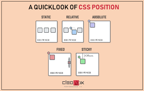
POSITIONING (check out the visible example at 00_CSS):
| TYPE | ATTRIBUTES |
|---|---|
| STATIC | By default, the position property for all HTML elements in CSS is set to static. This means that if you don't specify any other position value or if the position property is not declared explicitly, it'll be static. The element is positioned according to the normal flow of the document. The top, right, bottom, and left as well as z-index properties have no effect. |
| ABSOLUTE | Elements that are declared as absolute are "removed" in the normal flow of the document. The top, right, bottom, and left properties have an effect! The element (e.g. "Item") will address the parent element (e.g. "Container") if the parent was positioned with RELATIVE. Otherwise it is always passed on the next parental element and moves on if there is no assignment until the "body". With "Z-Index" we can position it over or under other items! |
| RELATIVE | Elements REMAIN in the normal flow of the document with. If you use it in a parent element, it will decisive for the child element. The top, right, bottom, and left as well as z-index properties are effective. |
| FIXED | Same as ABSOLUTE but the element is always positioned relative to the viewport, which means it always stays in the same place even if the page is scrolled (header or footer, which means top:0 or bottom:0 can be used) |
| STICKY | Elements are positioned based on the user's scroll position. A sticky element toggles between relative and fixed, depending on the scroll position. It is positioned relative until a given offset position is met in the viewport - then it "sticks" in place (like a fixed position). |
DISPLAY Properties (check out the visible example at 00_CSS):
| TYPE | DEFAULT | ATTRIBUTES |
|---|---|---|
| BLOCK | div | "As wide as possible, as high as necessary": Elements do have full width, height and margin can be defined. Block elements take up the whole web page, they are always below each other and cannot be arranged next to each other. Block elements always have a new line. |
| INLINE | span and text | "As wide as necessary, as high as necessary": Elements are as wide as the content, height and margin cant be adjusted unless you use "line-height", "font-size" or in our case into "display: inline-block" |
| INLINE-BLOCK | Images, divs, buttons, text etc. | They behave like block elements (can be adjusted in height and margin) but these are still as wide and as high as necessary like the inline variant |
Some Notes about SASS / SCSS:
- SASS is a CSS preprocessor, which means that it extends the CSS language, adding features that allow variables, nested rules, mixins (*), inline imports, and more. It also helps to keep things organised and allows you to create style sheets faster.
- SASS is completely compatible with all versions of CSS but needs to be compiled into CSS before it can be used in a browser.
How to start:
- Go to Extensions in VSC and search for "Live Sass Compiler" and install it (optionally as well as SASS Syntax Highlighting)
- Create a new file with the extension .scss (like style.scss)
- Then go to the bottom right corner and click on "Watch Sass" and you're good to go (generates a .map file as well which has a function to map the compiled CSS to the source code) -> You will receive two more files: style.css and style.css.map
How to continue:
- SCSS is "super" and stronger than CSS, which means all the changes you make in like "style.SCSS" will be compiled into "style.CSS" and will be applied to your website. It does everything automatically for you.
What's the difference between SASS and SCSS?
- SCSS still uses {} like:
$main-color: #ff0000;

h1 {
  color: $main-color;
}
...while SASS uses indentation without {} as Python does like:
$main-color: #ff0000;

h1
  color: $main-color;
1) MIXINS:
- Mixins are a way to reuse styles. They are similar to functions in that they take arguments and return a value. They are different in that they are not limited to returning a single value. They can also output multiple lines of CSS.
// Mixin example 1 without arguments
@mixin rightCorner() {
  position: absolute;
  bottom: 0;
  right: 35vw;
}

// Mixin example 2 with arguments
@mixin circle($size, $bgColor: #ff8a98) {
  width: $size;
  height: $size;
  background-color: $bgColor;
  border-radius: 50%;
}

// Class which uses the mixin 1 and 2
.circle {
  @include rightCorner();
  @include circle(600px); // $size = 600px. Order is crucial!
}
2) EXTEND:
- Extend is a way to share a set of CSS properties from one selector / classes to another. It helps keep your Sass / Scss very DRY.
.button-main {
  @extend .button; // extend the .button class (Additionally receive all basic values from .button)
  background-color: $main-color;
  margin-right: 10px;
  color: white;
}
3) NESTING:
- Nesting with & is a way to write CSS more efficiently. It allows you to nest your CSS selectors in a way that follows the same visual hierarchy of your HTML. It helps keep the DRY principle.
li a {
  display: block;
  text-decoration: none;
  color: white;
  // Nesting: With the & symbol, we can nest the pseudo-class inside the selector
  &:hover {
    color: $main-color;
  }
}
4) DIVIDE AND CONQUER:
- Divide and Conquer is a way to split your CSS into multiple files. It helps keep your code DRY and organised.
// 1) Create new folder and name it "scss" (or whatever you want)
// 2) Create a new file like fonts.scss and add some code (there will be a .css and .css.map generated as well)
// 3) Go to your main file (style.scss) and import the new file like:
@import "scss/company-colors";
@import "scss/fonts";
// 4) To see live-server changes just save the main style.css file and the changes will be applied to your website
5) More about SASS and SCSS:
SASS / SCSS Documentation: https://sass-lang.com/documentation
Some Notes about Bootstrap:
- Bootstrap is a free and open-source CSS framework directed at responsive, mobile-first front-end web development. It contains CSS- and (optionally) JavaScript-based design templates for typography, forms, buttons, navigation and other interface components.
- In Bootstrap, we use ready-made components, so they don't have to be programmed from scratch. We can take them and then adapt and combine them to suit our needs.
1) INSTALL Bootstrap
- The fastes way is to include it by CDN (Content Delivery Network) on their official website at https://getbootstrap.com/ like:
<!-- When you only need to include Bootstrap’s compiled CSS or JS, you can use jsDelivr. If you need the full package when you work with Angular for example, be sure to take the NPM-Installment (also on their website) -->

<!-- In the <head> -->
<link href="https://cdn.jsdelivr.net/npm/bootstrap@5.3.0/dist/css/bootstrap.min.css" rel="stylesheet" integrity="sha384-9ndCyUaIbzAi2FUVXJi0CjmCapSmO7SnpJef0486qhLnuZ2cdeRhO02iuK6FUUVM" crossorigin="anonymous">

<!-- In the <head> with "defer" -->
<script src="https://cdn.jsdelivr.net/npm/bootstrap@5.3.0/dist/js/bootstrap.bundle.min.js" integrity="sha384-geWF76RCwLtnZ8qwWowPQNguL3RmwHVBC9FhGdlKrxdiJJigb/j/68SIy3Te4Bkz" crossorigin="anonymous" defer></script>
2) DOCS Bootstrap
- Go to https://getbootstrap.com/docs/5.3/getting-started/introduction/ and check out the documentation to see how to use Bootstrap and how to implement it into your project.
A) Breakpoints
<!--
  The BREAKPOINT sizes are (sm, md, lg, xl, xxl)
  We start with the smallest phone size without class infix and go up while reading to the right side -->

<div class="row row-cols-1 row-cols-sm-2 row-cols-md-3"></div>
B) Text Colour
<!-- TEXT COLOUR: Google it like "Bootstrap text color" and play with it -->
<s class="price text-black-50">$ 429.-</s>
<!-- Give it an extra touc-->
<style>
  .price {
    font-size: 1.5rem;
  }
</style>
C) Gap and Spacing
<!-- g-3 = Gap of three down the element -->
<div class="row g-3 row-cols-1 row-cols-sm-2 row-cols-md-3">
<div class="col" repeat="5"> <!-- a column gap on the right hand side -->Feel free to contact me if you've seen something wrong, found some errors or struggled on some mistakes! Always happy to have a clean sheet here! :)
0 Questions have been asked, 0 answers have been given, 0 changes have been made.
| Questions | Anwers | Changes |
|---|---|---|
| 0 | 0 | 0 |


