  Note, some sites in chromosome 21 are not bi-allelic SNPs. Please only use biallelic
  SNPs. These are sites where the entry in the REF column is a single letter in this set
  [A,T,C,G] AND the entry in the ALT column is also a single letter in this set [A,T,C,G]

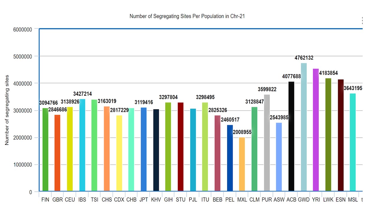
  1. Compute the number of segregating sites per population for chromosome 21.
    Plot the results. Does the trend follow the trends from Figure 1b from the 1000 Genomes paper?

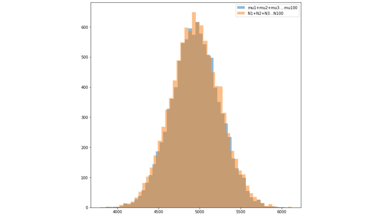
  2. Show with simulations, that if you have 100 Poisson independent random
  variables with means mu1, mu2,…,mu100 (you pick values for the mus), then
  the sum N1 + N2 + N3 + … + N100 is Poisson with parameter (mu1 + mu2 +…
  + mu100).

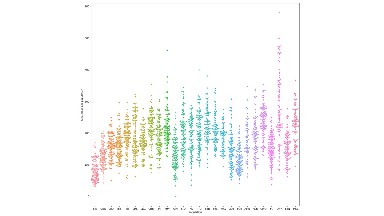
  3. Identify the singletons in the global sample (in the row, only one individual
  is 0|1 or 1|0 and everyone else is 0|0). From that set, find the number of
  singletons per genome per population. Do a scatter plot similarly
I removed first 252 rows, which started with “#, using this bash command: sed -e '1,252d' ALL.chr21.phase3_shapeit2_mvncall_integrated_v5a.20130502.genotypes.vcf > sample_file.txt
The input file was ready after the 1st step.
First of all, a dictionary was made to store all the individual IDs as key and population name as their value
Second dictionary was created as an empty dictionary, which will be storing all the Individual IDs as Key and the total number of segregating sites as its value
The first line of VCF consisted of Individual IDs, which was sored in the second Dictionary as key.
Then for each line some conditions were checked:
If the position not is bi-allelic
If the genotype is 0|1 or 1|0
If both above conditions were true, a counter was added to the second Dictionary in front of the individual ID
After finishing the loop, the total number of Segregating sites were printed along with its population in a file.
After plotting the segregation sites, I found the plot followed same trend as figure 1-b in 1000 genome paper.
    personCountryHash = {}
    with open("dict.txt") as dict:
        for line in dict:
            (key, val) = line.split()
            personCountryHash[str(key)] = val
            #print(key, val)
    dict.close()
    countryCountHash = {}

    personArray = [] * 2513
    arry = []

    with open("sample_file.txt", "r") as f:
        with open ("output.txt", "w") as g:
            lineCount = 0
            for line in f:
          if (lineCount == 0):
                    lineCount = lineCount + 1
                    continue

                if(lineCount == 1):
                    lineCount = lineCount + 1
                    personArray = line.split('\t')
                    continue

                lineCount = lineCount + 1
                arry = line.split("\t")
                #personArry = line.split("\t")
                #
                l = len(arry)
                c = 0
                onlyValidLength = False
                if ((len(arry[3]) == 1) and (len(arry[4]) == 1)):
                        if((arry[3] == 'A' or 'G' or 'T' or 'G') and (arry[4] == 'A' or 'T' or 'G' or 'C')):
                            c = 0
                            for i in range(l):
                                if(i<9):
                                    continue
                                x = arry[i]
                                if (x == ("0|1") or x == ("1|0")):
                                    person = personArray[i]
                                    country = personCountryHash[person]
                                    if (country in countryCountHash):
                                        countryCountHash[country] = countryCountHash[country] + 1
                                    else:
                                        countryCountHash[country] = 1

            for j in countryCountHash:
                combo = j +"\t" + str(countryCountHash[j]) + "\n"
                g.write(combo)
        g.close()
    f.close()
First of all 100 random numbers were generated which were treated as means
Poisson distribution was generated for each of the 100 means.
From each Poisson distribution one value was fetched, which will be treated as Poisson independent random variables (N1, N2, N3 etc)
Sum of the Means was computed
Sum of Poisson independent random variables were computed
These above steps was iterated 10,000 times over a loop
Two Histogram plots were made each showing distribution of means and Poisson independent random variables.
Both of the histograms were then overlapped to see the differences
      import random
      import numpy as np
      import pylab
      import scipy.stats as stats
      from matplotlib import pyplot
      lst1 = []
      lst2 = []
      for i in range (10000):
          sm_of_poisson = 0
          sm_of_means = 0
          means = np.random.randint(100, size=100)
          s = np.random.poisson(means, 100)
          sm_of_means = sum(means)
          sm_of_poisson = sum(s)
          lst1.append(sm_of_means)
          lst2.append(sm_of_poisson)

      plt.figure(figsize=(10,10))
      pyplot.hist(lst1, 50, alpha=0.5, label='mu1+mu2+mu3....mu100')
      pyplot.hist(lst2, 50, alpha=0.5, label='N1+N2+N3...N100')
      pyplot.legend(loc='upper right')
      pyplot.show()
sed -e '1,252d' ALL.chr21.phase3_shapeit2_mvncall_integrated_v5a.20130502.genotypes.vcf > sample_file.txt
    First of all the input file was read line by line
    Each line was split using ‘\t’ and it was stored in an array
    Few conditions were checked on each line:
    If that genotype position is not bi-allelic
    If the genotype is either 0|1 or 1|0
    If both of the above conditions were true, then that row was copied to a different array.
    The final array was printed in a file, which has all the rows having singletons
      lst = [] * 2513
      arry = []
      with open("sample.txt", "r") as f:
          with open ("output.txt", "w") as g:
              for line in f:
                  arry = line.split("\t")
                  l = len(arry)
                  c = 0
                  for i in range (l):
                      onlyValidLength = False

                      if ((len(arry[3]) == 1) and (len(arry[4]) == 1)):
                          onlyValidLength = True

                          if(onlyValidLength == True):
                              onlyValidChars = False
                              if((arry[3] == 'A' or 'G' or 'T' or 'G') and (arry[4] == 'A' or 'T' or 'G' or 'C')):
                                  onlyValidChars = True

                              if(onlyValidChars == True):
                                      x = arry[i]
                                      if (x == ("0|1") or x == ("1|0")):
                                          c = c+1
                  if (c== 1):
                      lst = arry
                      #print (line, "\n")
                      g.write(line)

      f.close()
      g.close()
   File was read line by line
   Each line was split through ‘\t’
   A condition was checked at each position, whether that genotype has a 0|1 or 1|0 or not
   If the condition was fulfilled, counter was added to a variable and it was stored in a list
   List was printed to a file which contained the total sum of the singletons in each genome

   ### This is the code I wrote:
        lst = [0] * 2513
        arry = []
        with open("total_rows_having_singletons.txt", "r") as f:
            with open("added_singletons_percolumn.txt", "w") as g:
                for line in f:
                    arry = line.split("\t")
                    l = len(arry)
                    for i in range (l):
                        x = arry[i]
                        if (x == ("0|1") or x == ("1|0")):
                            lst[i] = lst[i]+1
                        else:
                            lst[i] = lst [i]+0
                for item in lst:
                    g.write("%s\n" % item)
            #print (lst)
        f.close()
        g.close()
    import numpy as np
    from matplotlib import pyplot as plt
    %matplotlib inline
    import seaborn as sns
    import pandas as pd
    plt.figure(figsize=(15,15))

    d = pd.read_csv('pop.csv')
    sns.swarmplot(x='Population', y='Singletons per population', data=d)


