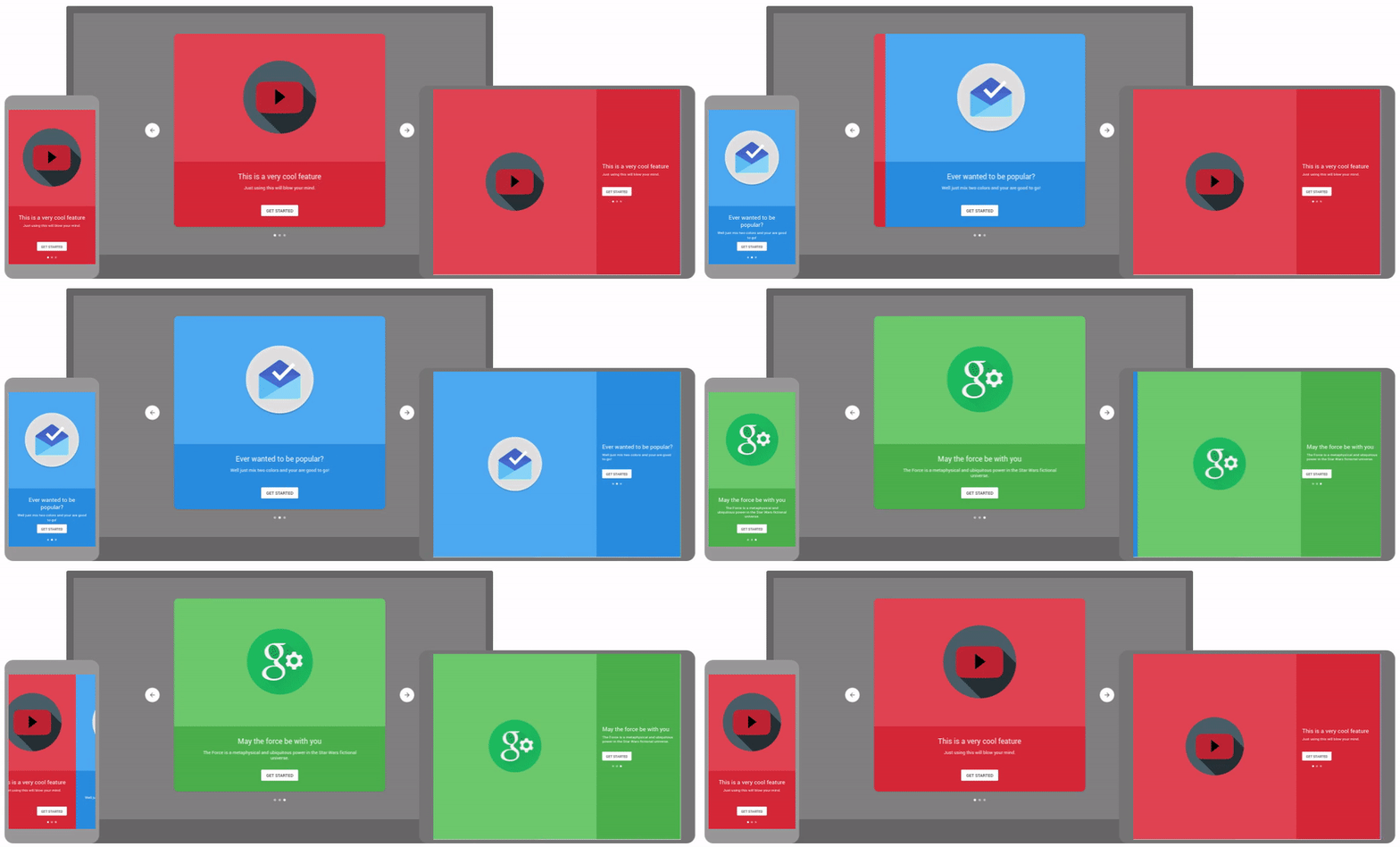
So you wrote a great app and deployed it and everything. But how do you introduce new users to your app? Well, the Material design guidelines have a solution: Displaying the top benefits in a beautiful auto-rotating carousel!
This project implements such a carousel for Material-UI. Visit the styleguide for an interactive demo.
npm i --save material-auto-rotating-carousel
npm i --save react-swipeable-views
Note: This is the version for Material-UI 1.0.0 or later. If you are using Material-UI 1.0.0-beta, you should update to the latest version. If you are still using Material-UI 0.x, you can use our legacy version.
| Name | Type | Default | Description |
|---|---|---|---|
| autoplay | bool |
true |
If false, the auto play behavior is disabled. |
| ButtonProps | object |
Properties applied to the Button element. | |
| classes | object |
Object for customizing the CSS classes. | |
| containerStyle | object |
Override the inline-styles of the carousel container. | |
| hideArrows | function |
If true, the left and right arrows are hidden in the desktop version. |
|
| interval | integer |
3000 |
Delay between auto play transitions (in ms). |
| label | string |
Button text. If not supplied, the button will be hidden. | |
| landscape | bool |
If true, slide will adjust content for wide mobile screens. |
|
| mobile | bool |
false |
If true, the screen width and height is filled. |
| ModalProps | object |
Properties applied to the Modal element. | |
| open | bool |
false |
Controls whether the AutoRotatingCarousel is opened or not. |
| onChange | function |
Fired when the index changed. Returns current index. | |
| onClose | function |
Fired when the gray background of the popup is pressed when it is open. | |
| onStart | function |
Fired when the user clicks the getting started button. |
| Name | Type | Default | Description |
|---|---|---|---|
| classes | object |
Object for customizing the CSS classes. | |
| landscape | bool |
If true, slide will adjust content for wide mobile screens (automatically set by AutoRotatingCarousel). |
|
| media* | node |
Object to display in the upper half. | |
| mediaBackgroundStyle | object |
Override the inline-styles of the media container. | |
| mobile | bool |
If true, the screen width and height is filled (automatically set by AutoRotatingCarousel). |
|
| style | object |
Override the inline-styles of the slide. | |
| subtitle* | string |
Subtitle for the slide. | |
| title* | string |
Title for the slide. |
* required property
The files included in this repository are licensed under the MIT license.


