In this course, we'll be building interactive data visualizations on the web. While there is a pre-requisite of a web-programming course, this module provides a basic review of some foundational concepts. If you're feeling at all rusty, I strongly suggest you fine-tune your HTML and CSS skill before moving forward. This module will cover the following skills:
- Basic page layout with HTML
- Types of HTML elements
- Using Cascading Style Sheets to add styles to pages
- Introduction of the Grid system with the CSS framework Bootstrap
Contents
There are limitless resources on the web regarding web-programming (shocking), but here are a few to get you started:
- HTML5 General Reference
- HTML Attribute Reference
- DOM Intro
- CSS Selector Reference
- CSS Properties Reference
- CSS Units Reference
- Bootstrap Framework
- w3shools Bootstrap Tutorial
- Materialize Framework
- Font Awesome icons
HyperText Markup Language is a programming language for describing how to display web documents. It uses <tags> to mark up plain text, and provide rendering instructions to a web-browser. Even the most beautiful and complex data visualizations on the web are simply HTML elements arranged into what people perceive as charts, plots, and maps.
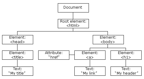
In an HTML document, you'll arrange different HTML elements into a tree structure which defines how your page is laid out. Your web-browser will parse the HTML you write and create a visual representation of that information known as the Document Object Module, or DOM. The DOM expresses your content as a series of objects which you will later learn how to manipulate, add, and remove from your page.
The tree structure that you create places elements inside of larger (containing) elements. For example, if you wanted two paragraph elements (<p>) inside of a division (<div>) or your page, it would look like this:
<div>
  <p>This is the first paragraph</p>
  <p>This is the second paragraph</p>
</div>
In order to render visual tags such as circle or rect elements, we'll need to wrap them in a Scalable Vector Graphic tag (<svg>). For example, you could render a circle:
<!-- Create an svg element -->
<svg width="100" height="100">

  <!-- Render a circle element -->
  <circle cx="50" cy="50" r="40" stroke="green" stroke-width="4" fill="yellow" />
</svg>
All visual element that you want to render fall in the <body> section of your page. You may want to read in other files, or set certain properties of you page, which would happen in the <head> section of your .html file. Here is an example file:
<!-- This is a comment: your browser will not interpret it -->
<!-- Declare the document type -->
<!DOCTYPE html>

<!-- Start the html section of the document -->
<html>

  <!-- Head section: set meta properties, read in files -->
  <head>
  <!-- Set the page title -->
  <title>Page Title</title>

  <!-- Read in the D3 library -->
  <script type="text/javascript" src="http://d3js.org/d3.v3.min.js"></script>

  <!-- Read in the bootstrap CSS file -->
  <link href="https://maxcdn.bootstrapcdn.com/bootstrap/3.3.5/css/bootstrap.min.css" rel="stylesheet" type="text/css" />


  </head>

  <!-- Body section: render content -->
  <body>
    <h1>My First Heading</h1>
    <p>My first paragraph.</p>
  </body>
</html>
The following image from w3schools shows how the <head> and <body> sections both fall within the same tree structure of your DOM:
Cascading Style Sheets provide you with a syntax for manipulating the styles with which HTML elements are rendered. For example, you may want to specify the color, background-color, font-size, or font-face of an element. As a best practice, CSS styles should be written in a separate .css file and read into your .html file in the <head> section of a document:
<!DOCTYPE html>
<html>
  <head>
  <!-- Read in a local CSS file -->
  <link href="css/main.css" rel="stylesheet" type="text/css" />
  </head>
</html>
In your CSS file, you'll apply a variety of styles to selected elements (more on this below). Each style that you wish to apply will be written as a property:value pair, where the property is the style you wish to manipulate (i.e., color) and the value is the specific value you wish to apply (i.e., blue). Here is some css pseudo-code:
selector1 {
  property:value;
  property-2:value2;
}

selector2 {
  property:value;
  property2:value2;
}In order to apply a style to an element, you must select that element on the page. This is a common task in web-development, and multiple libraries (d3 and jquery included), follow these conventions. Here are some basic ways in which you can select elements (way more):
| Syntax | Example | Selection |
|---|---|---|
#element-id |
#my-chart |
Select the element with id my-chart |
.class-name |
.axis |
Selects all elements with class axis |
element-type |
p |
Selects all paragraph (<p>) elements |
:hover |
a:hover |
Selects all links that are being hovered over |
element-type element-type |
svg g |
Selects all <g> elements inside of <svg> elements |
Elements naturally arrange themselves on the page based on the size of the elements, and if they naturally align with other elements.
Block level elements: take up 100% of the width, and will not be in the same horizontal alignment as other elements. Examples include
<div>,<h1>-<h6>, and<form>.
Inline level elements: only take up as much width as their contents, and will share a horizontal position with other elements if they fit within the width of the page. Examples include
<svg>,<a>, and<span>.
Inline-block elements: permit multiple elements to align horizontally (like inline), while allowing you to set a desired width and height (like block).
Note: You can change the default display property of any element to assign it the characteristics you desire. However, these defaults are specified for a reason -- rather than change the display property, you may want to choose another type of element.
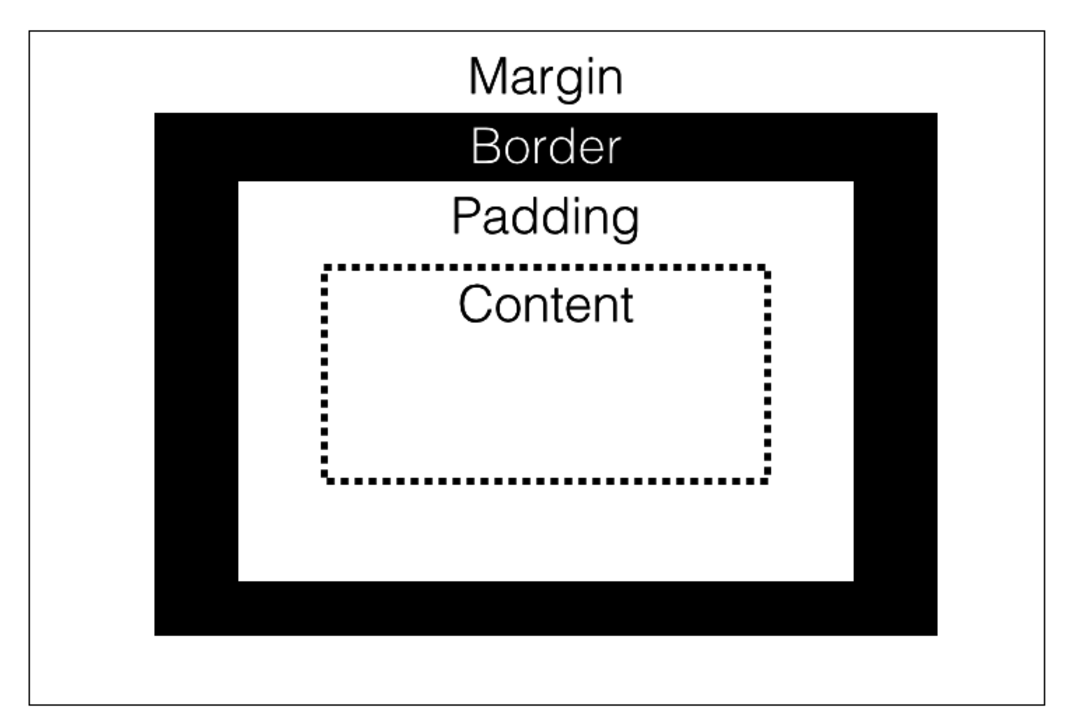
The amount of space taken up by each element is best explained by the box-model. Think of each HTML element as some content in a box. The amount of space occupied by that box depends on:
- The amount of space between the content and the outsize of the box (
padding) - The thickness of the box (
border) - The desired distance between the box and other boxes (
margin)
Manipulating these properties allows you to specify how your content should be arranged on the page:
To practice your HTML and CSS skills, head over to exercise-1.
Even for basic tasks, it makes sense to use a CSS framework to structure your code. A CSS framework is a pre-written set of CSS files that apply styles to your elements. They are particularly useful for making sites responsive based on screensize. The most popular CSS framework on the web is Bootstrap, which was developed by Twitter. However, Materialize (by Google) appears to be gaining traction, and is a nice break from the ubiquity of default Bootstrap styles (you'll start to notice them everywhere once you use them). To use a CSS framework, you simply read the file(s) into the head section of your .html file. Note, some frameworks leverage JavaScript files for more advanced interactivity -- these are only required for certain elements (such as modals, which are like fancy dialog boxes) to render properly:
<head>
  <!-- Compiled and minified CSS -->
  <link rel="stylesheet" href="https://cdnjs.cloudflare.com/ajax/libs/materialize/0.97.5/css/materialize.min.css">

  <!-- Compiled and minified JavaScript -->
  <script src="https://cdnjs.cloudflare.com/ajax/libs/materialize/0.97.5/js/materialize.min.js"></script>
</head>
It would be a mistake to make common HTML elements (forms, buttons, navigation bars, etc.) without using a framework for applying modern styles.
The real power of frameworks is in their responsive design. These are made possible by CSS media queries which act as conditional styles based on screensize:
/* Styles to be applied to screens 300px or smaller */
@media screen and (max-width: 300px) {
    body {
        background-color: lightblue;
    }
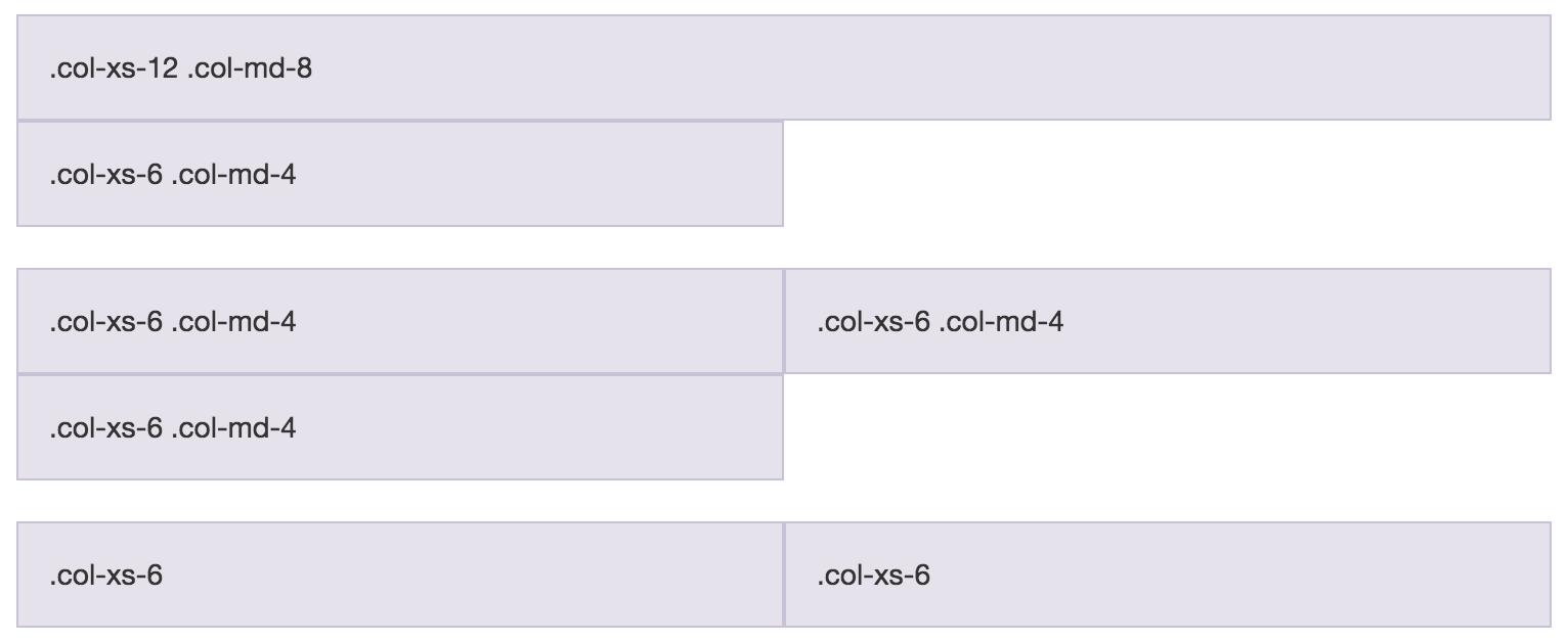
}While you can write media queries yourself, it is much more powerful to leverage the pre-defined styles that are written in the CSS files of your framework. Both bootstrap and materialize operate in a grid system to arrange elements on the screen. The premise is that any screen is 12 columns wide, and depending on the width of the screen, you can define how many columns an element occupies. This example from w3schools shows spans taking up multiple widths:
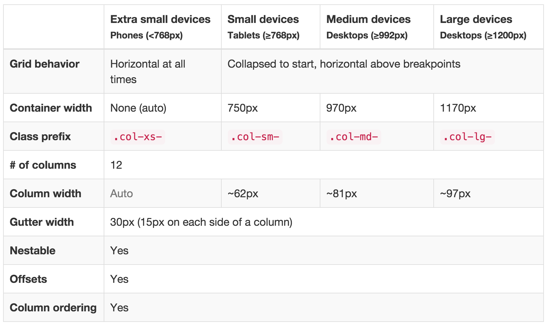
Here is the table from bootstrap which specifies the pixels associated with each class:
For example, a div with class .col-md-6 would take up 6 columns on a medium size screen.
To practice your working with Bootstrap, head over to exercise-2.


