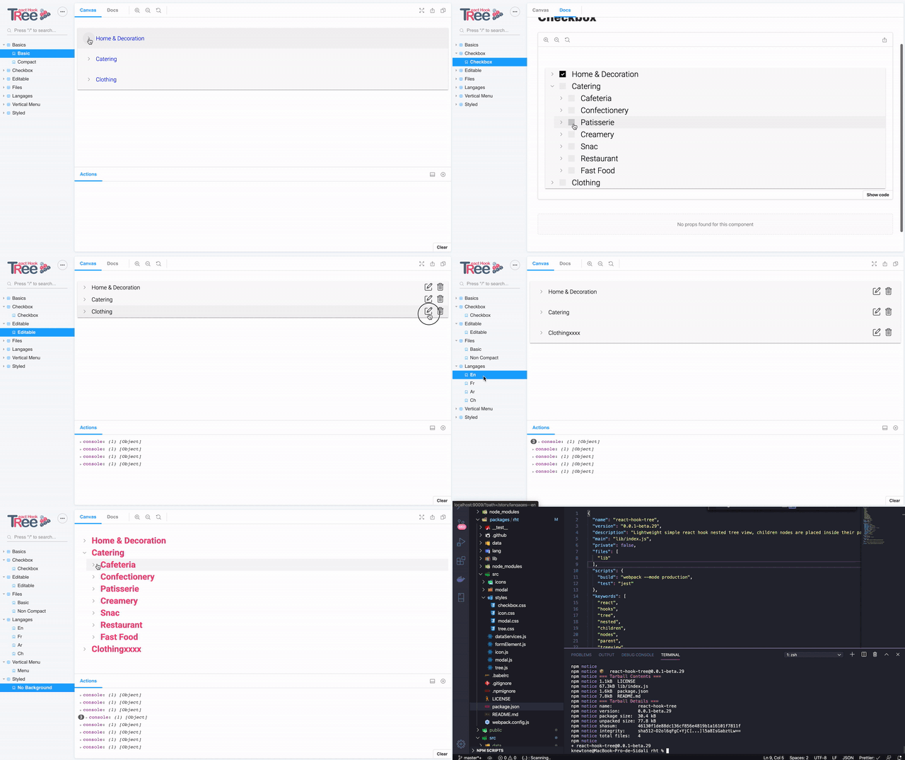
Get started with React Hook Tree. the most powerful Tree View React Component for building responsive, mobile-first lightweight Trees.
- Display hierarchical data in a tree-view structure.
- Edit, Add and Delete nodes
- Expand/Collapse
- Custom & multiple node object attributes
- Unlimited nesting
- Fully customizable text content (you can deploy in any language)
- RTL support
- Fully customizable style
Demo and documentation : rht.now.sh
npm install --save react-hook-tree
yarn add react-hook-tree
import data from "./treeData.json";
import Tree from "react-hook-tree";

<Tree treeData={data} />
| Option | types | required | default | Description |
|---|---|---|---|---|
| treeData | Json Object | yes | - | the data to render (please see json file in data folder) |
| checkbox | Boolean | no | - | Show check box and add select support for nodes |
| count | Boolean | no | - | Show children count on each node |
| lang | Json Object | yes | - | Text content, please see Lang Object Attribute |
| node | Json Object | no | - | Node object attributes Attribute, please see Data Object Attribute |
| edit | Boolean | no | false | Show the edit button |
| add | Boolean | no | false | Show the add button |
| remove | Boolean | no | false | Show the remove button |
| onChange | Function | no | - | Return the modified json data, if actions (edit, delete) are are enabled |
{
    tree: [
	    {
	    _id: "",
	    children: []
	    item: { name: "", ... }
    }
]
See data example files in Data folder
{
    "rtl":true,
    "modal": {
				"add": {
					"title": "Add Modal",
					"warning": "Check carfully your data before saving !",
					"content": "You are Adding a new node",
					"button": "save"
				},
	    "edit": {
		    "title": "Edit Modal",
		    "warning": "Check carfully your data before saving !",
		    "content": "You are editing the %1 node",
		    "button": "save"
	    },
	    "delete": {
		    "title": "Are you absolutely sure?",
		    "warning": "Unexpected bad things will happen if you don’t read this!",
		    "content": "This action cannot be undone. This will permanently delete the %1, and remove all children associations. Please type confirmed to delete.",
		    "confirmation": "please type %1 to delete",
		    "verification": "confirm",
		    "button": "delete this node"
	    }
    }
}
See Lang example file in Lang folder
Each node has a name which is an unchanging attribute.
with node prop you can add more attribute to each node, here for example i will add a title and a checkbox.
Each node will be editable over an edit button which triggers a popup modal where you can edit node's data.
you can configure what ever data you want in these types : input text and checkbox, more data types will be available in next updates.
each data configuration have these attributes : name, type, placeholder
[
    {
	    name: "title",
	    type: "text-input",
	    placeholder: "Title",
    },

    {
	    name: "active",
	    type: "checkbox",
	    value: 0,
	    datatype: "int",
	    label: "activé le type",
    },

]
as you can see the attributes are used to dynamically create a form to edit the node's data.
Each node can be removed,
by setting the remove props to true,
if a node is deleted all its children will be deleted, This action cannot be undone. This will permanently delete the node, and remove all children associations.
| Option | types | required | Description |
|---|---|---|---|
| iconType | String | no | one of ("folder","rounded","thick") or leave empty for simple arrow |
| style | React Style Props | no | Global container inline style |
| lineStyle | React Style Props | no | Line inline style |
| iconStyle | React Style Props | no | Icon inline style |
| compact | Boolean | no | add padding to line |
all the text used have to be added using a JSON object, so you can deploy the component in any language you want. you can also add the attribute "rtl" as true, to deploy in any rtl languages.
to get the data modified if you use the onChange props, you can simply do :
const [data, setData] = useState(json);

useEffect(() => {
    console.log(data);
}, [data]);

...

<Tree treeData={data} onChange={setData} lineStyle={{color: "blue" }} />
- Add Json language files
- Add storybook for better documentation
- Jest test
- Css module
- Checkbox select
- Add new nodes
- Add Multiple node selection
- Drag and drop in React Tree View/Tree List
- Sorting tree nodes
- Tree node with custom icons
- Delete & Edit animation
- Style modal
- Lazy loading
- Better Readme and fix the spelling errors :)
- Create a dedicated website
- Create a slack and provide free support
- Codes & Algorithmes optimisation
- Writing contributing guidelines
- Pull request template
- Issue templates
feel free to ask for any feature or report a bug buy add in a new issue add new issue
Copyright (c) 2020 Temkit Sidali. Licensed under the MIT license.
Icons from www.flaticon.com From :
Dependencies :


