Resources:
Table of Contents:
- Terms
- Part 0 - Explore Flexbox on Youtube
- Part 1 - Flex Containers and Flex Items
- Part 2 - Demo Styling a Navbar using Flexbox Container Properties
- Part 3 - Flexbox Main and Cross Axes
- Part 4 - Growing and Shrinking
- Part 5 - Examples!
- Flexbox - a
displaytype that arranges flexible elements in rows (or columns) - Flex Container - the element with
display:flex. Its children are "flex items" - Flex Item - an element inside of a flex container. It's size can flex based on the CSS settings of the flex container.
- Main Axis — the direction that flex items flow in
- Cross Axis — the direction perpendicular to the main axis
- The essential flex container properties are:
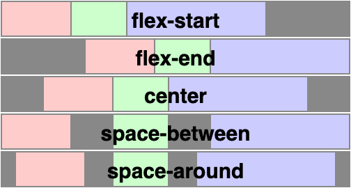
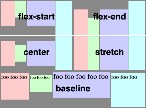
justify-content— defines alignment along the main axisalign-items— defines alignment along the cross axisgap— controls spacing between flex items (not on outer edges)flex-direction- defaults torowbut can be set tocolumnto arrange flex items vertically.
- The essential flex item properties are:
flex-grow- defines the amount a flex item will grow relative to its siblingsflex-shrink- defines the amount a flex item will shrink relative to its siblingsflex-basis- defines the starting size of a flex itemflex- used as shorthand for the above 3 properties
Open https://www.youtube.com/ and see how elements shift in size as you resize the window.
Q: Look at a row of video "cards". Are they display:inline, display:block or something else? Guess, then inspect the page!
- Flexbox is used for organizing children elements inside of a parent element.
- The parent element gets the
display: flexpropert, making it a flex container. - The children of the flex container automatically become flex items
- The parent element gets the
Flexbox does two things to a parent element:
- puts its children horizontally in a row (or vertically in a column)
- makes those elements stretchy (we can control how much they stretch though!)
See how this is implemented in 0-flexbox-demo/!
/* Flex makes it easy to put things in a row with beautiful spacing */
.flex-container {
  display: flex;
  justify-content: space-between;
  gap: .5rem;
}

.flex-item {
  flex-grow: 1;
}

.flex-item:hover {
  flex-grow: 3;
}One of the most common uses of flexbox is to style a navigation bar. Open up 1-navbar and look at the <header> element:
<!-- Often, the header contains a logo and a nav component -->
<header>
  <p id="header-logo">Ben's Blog</p>
  <nav>
    <!-- It is common to put a ul inside with links as list items -->
    <ul id="nav-links">
      <li><a href="#">Home</a></li>
      <li><a href="#">About</a></li>
      <li><a href="#">Contact</a></li>
    </ul>
  </nav>
</header>
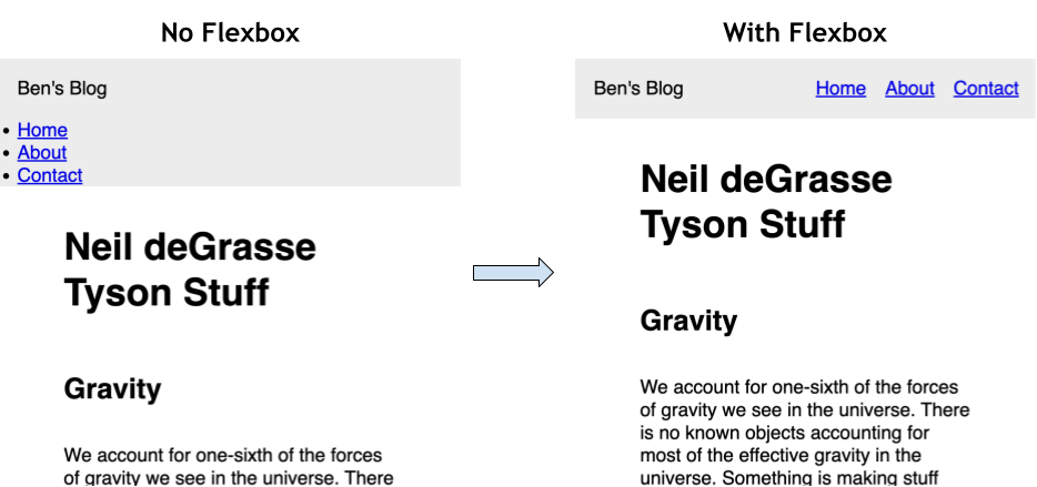
Below, you can see what the header currently looks like (left) and what we want it to look like (right). What is different?
Q: How do we fix this?
- Most elements are
display: blockwhich means they are stacked on top of each other. - We can apply
display: flexto a parent element to put its children in a row horizontally
header {
  display: flex; /* Makes the header a flex container */
  justify-content: space-between; /* main-axis spacing */
  align-items: center; /* cross-axis spacing */
}

ul {
  display: flex;
  gap: 1rem; /* increasing spacing between flex items */
}- The essential flex container properties are:
justify-content— defines alignment along the main axisalign-items— defines alignment along the cross axisgap— controls spacing between flex items (not on outer edges)flex-direction- defaults torowbut can be set tocolumnto arrange flex items vertically.
- Flexbox has two axes, the main axis and the cross axis
justify-contentaffects the positioning of flex items along the main axis
align-itemsaffects the positioning of flex items along the cross axis
flex-direction: columnchanges the orientation of the main and cross axes.- The main axis is now vertical
- The cross axis is now horizontal
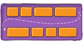
The flex-wrap, flex-basis and flex-grow properties all control how flex items behave when space is limited.
- By default, flex items will all try to fit onto one line.
.container {
  flex-wrap: nowrap | wrap | wrap-reverse;
}flex-growdefines the ability for a flex item to grow if necessary.
- It accepts a unitless value that serves as a proportion.
- It dictates what amount of the available space inside the flex container the item should take up.
.flex-item { flex-grow: 1 }
.flex-item:nth-child(2) {
  flex-grow: 2
}- If all items have flex-grow set to 1, the remaining space in the container will be distributed equally to all children.
- If one of the children has a value of 2, that child would take up twice as much of the space either one of the others (or it will try, at least).
- To achieve equal columns, we need to ensure that each flex item starts with the same size (
flex-basis: 0%) and will grow/shrink at the same rate (flex-grow: 1andflex-shrink: 1).
.flex-item {
  flex-grow: 1;
  flex-shrink: 1;
  flex-basis: 0;
  /* flex: 1 1 0; */
  /* flex: 1; */
}- The
flexproperty can serve as a short-hand for all three:flex: 1 1 0% - The default is
0 1 auto, but if you set it with a single number value, likeflex: 5;, that changes theflex-basisto0%, so it’s like settingflex-grow: 5; flex-shrink: 1; flex-basis: 0%;.
flex-basisoften causes confusion since it is similar (but different) from setting thewidthof each flex item.
- Check out the
3-photo-gallery/directory for a cool example of using flexbox to make a wall-to-wall flexible photo gallery based on this post: Adaptive Photo Layout With Flexbox - 19 CSS Flexbox Examples


