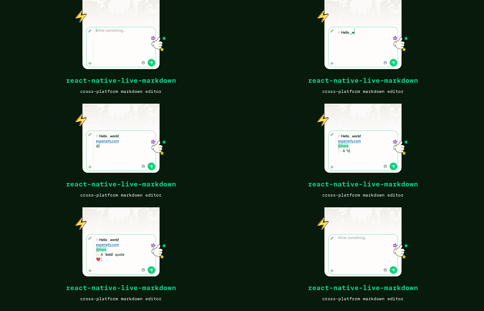
- ⚛️ Drop-in replacement for
<TextInput>component - ⌨️ Live synchronous formatting on every keystroke
- ⚡ Fully native experience (selection, spellcheck, autocomplete)
- 🎨 Customizable styles
- 🌐 Universal support (Android, iOS, web)
- 🏗️ Supports New Architecture
First, install the library from npm with the package manager of your choice:
yarn add @expensify/react-native-live-markdown
npm install @expensify/react-native-live-markdown --save
npx expo install @expensify/react-native-live-markdown
Then, install the iOS dependencies with CocoaPods:
cd ios && pod installThe library includes native code so you will need to re-build the native app.
Note
The library does not support Expo Go, you will need to setup Expo Dev Client (see here).
import {MarkdownTextInput} from '@expensify/react-native-live-markdown';
import React from 'react';

export default function App() {
  const [text, setText] = React.useState('Hello, *world*!');

  return (
    <MarkdownTextInput
      value={text}
      onChangeText={setText}
    />
  );
}MarkdownTextInput can be styled using style prop just like regular TextInput component.
It is also possible to customize the styling of the formatted contents of MarkdownTextInput component. The style object supports all color representations from React Native including PlatformColor and DynamicColorIOS according to the color reference. Currently, a limited set of styles is customizable but this is subject to change in the future.
import type {MarkdownStyle} from '@expensify/react-native-live-markdown';

const FONT_FAMILY_MONOSPACE = Platform.select({
  ios: 'Courier',
  default: 'monospace',
});

const markdownStyle: MarkdownStyle = {
  syntax: {
    color: 'gray',
  },
  link: {
    color: 'blue',
  },
  h1: {
    fontSize: 25,
  },
  emoji: {
    fontSize: 20,
  },
  blockquote: {
    borderColor: 'gray',
    borderWidth: 6,
    marginLeft: 6,
    paddingLeft: 6,
  },
  code: {
    fontFamily: FONT_FAMILY_MONOSPACE,
    fontSize: 20,
    color: 'black',
    backgroundColor: 'lightgray',
  },
  pre: {
    fontFamily: FONT_FAMILY_MONOSPACE,
    fontSize: 20,
    color: 'black',
    backgroundColor: 'lightgray',
  },
  mentionHere: {
    color: 'green',
    backgroundColor: 'lime',
  },
  mentionUser: {
    color: 'blue',
    backgroundColor: 'cyan',
  },
};
The style object can be passed to multiple MarkdownTextInput components using markdownStyle prop:
<MarkdownTextInput
  value={text}
  onChangeText={setText}
  style={styles.input}
  markdownStyle={markdownStyle}
/>
Tip
We recommend to store the style object outside of a component body or memoize the style object with React.useMemo.
Currently, react-native-live-markdown supports only ExpensiMark flavor. We are working on CommonMark support as well as possibility to use other Markdown parsers.
MarkdownTextInput inherits all props of React Native's TextInput component as well as introduces the following properties:
| Prop | Type | Default | Note |
|---|---|---|---|
markdownStyle |
MarkdownStyle |
undefined |
Adds custom styling to Markdown text. The provided value is merged with default style object. See Styling for more information. |
react-native-live-markdown requires React Native 0.71 or newer.
MIT

