Custom card enabling Heat maps in Home Assistant.
Will pick a hopefully useful color scale out of the box based on your type of data (Device Class), but you can override most aspects of the card to suit your needs.
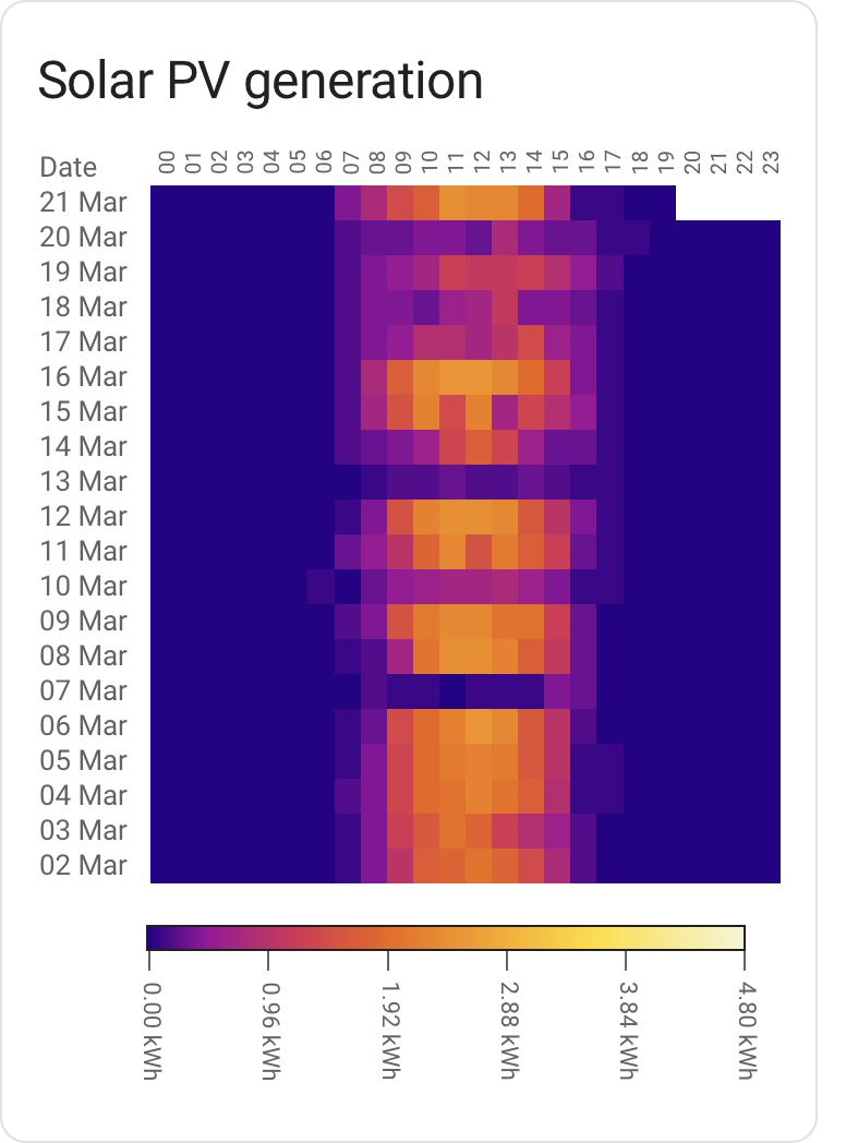
Quickly spotting patterns in data. On your left is the last few weeks worth of my solar energy generation; darker colors means less energy generated, brighter colors more energy.
You can quickly see that the cloud cover hasn't been favourable the last week or so. It's also evident that the days overall getting longer.
There are certainly other ways to visualise the same data, but few that offer quite as much information at a glance.
- Working but not really extensively tested in the real world.
- Still need a decent chunk of work in terms of built-in color scales for various sensor types. Expect the scales to change
If you use HACS as-is, this card can be added as a custom repository.
(As always, you should be careful with software which lets you pull random code from the Internet and run it)
- Download
heatmap-card.js, place it in yourconfig/wwwdirectory. - Add
/local/heatmap-card.jsin your Resource config, type ofJavaScript Module.
Given a minimal config, the card will try to figure out how to present data in a somewhat sane way:
type: custom:heatmap-card
entity: sensor.aranet_uppe_temperature
It'll pick a card title based on the name of the entity, present the default 21 days worth of
data and pick a color scheme and scale based on the entity device type.
It's a bit opinionated in what a "good" scale will be, and may give you something that's not really fit for your usage (for instance by assuming that temperature sensor data refers to indoor temperature).
Currently, the number of data types is also rather limited. The intent is that for a lot of data types, it should eventually give you something workable out of the box.
A slightly more involved example, setting the number of days to present as well as
defining the max value. Setting a max value is important in order to make the display
consistent across different time periods; ensuring that the same shade of color always
translates to the same consumption.
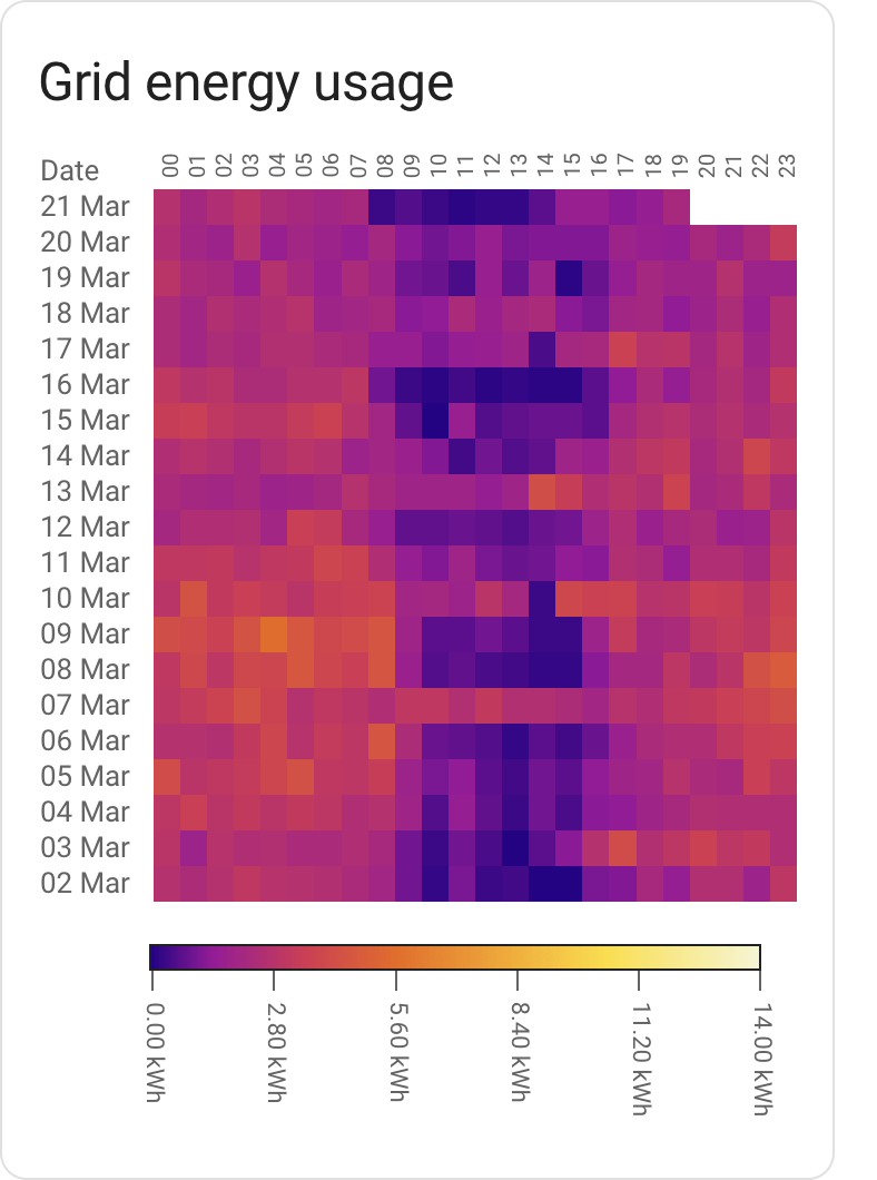
In the case of energy type entities, setting max to f.x the total production
capacity in kW of a PV install or the main fuse capacity of your house would make
sense.
title: Grid energy usage
type: custom:heatmap-card
entity: sensor.elforbrukning_lb
data:
  max: 14
days: 20
Some common fuse sizes and the corresponding maximum power draw:
| Fuse size | kW / data.max |
|---|---|
| 16A | 11 |
| 20A | 14 |
| 25A | 17 |
| 35A | 24 |
Relative scales, generally usable for most sensors:
-
iron red(default) - Blue-purple-red-yellow-white'ish scale, often used in thermal imaging. This is the default unless the configuration specifies another scale.
Absolute scales, generally usable for specific sensor types:
-
carbon dioxide- green-yellow-red-purple, with yellow, red and purple representing the general badness of co₂ concentration on human cognition and health. Picked automatically forcarbon_dioxidesensors unless overridden.
-
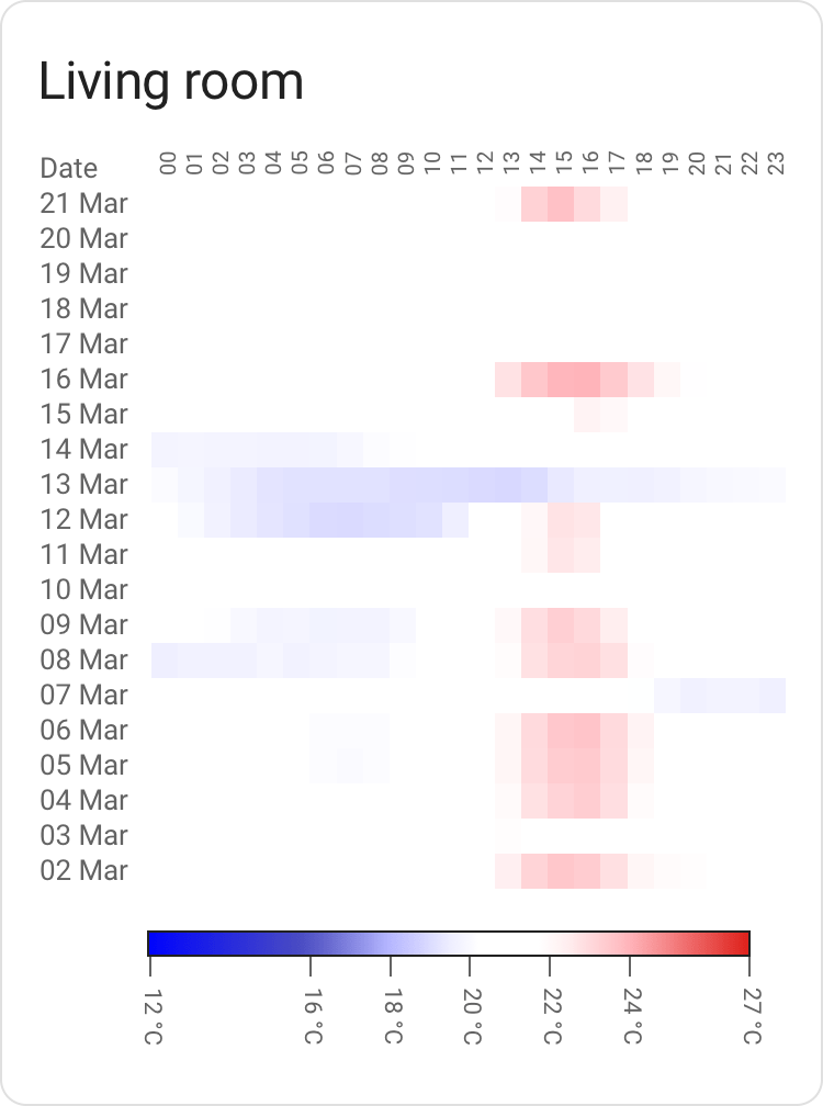
indoor temperature- blue-white-red, where white and near white translates to what's generally considered to be comfortable indoor temperatures. Rather northern hemisphere centric, may not map well to your local preference (see Custom color scales below). Picked automatically fortemperaturesensors unless overridden.
Don't fancy the out of the box color scales? Bring your own!
A color scale contains steps. Each step has a value and
a color attached to it; these are used to create a gradient.
A scale also has a type, which is either relative or absolute.
Relative scales stretch from 0 to 1 and will scale automatically from your min value (default 0) to your max value; you bring the colors, the code will figure out the range. This is useful for any scale where the numbers aren't known in advance.
Absolute scales map to the values defined in the scale itself. These are good for when you need to map a color to a specific value; for instance, 420 ppm worth of co₂ is good (by some measure of good), 1000 ppm is getting hairy. This isn't going to be relative to your data; thus, absolute.
A relative scale example:
# This is an energy sensor
type: custom:heatmap-card
entity: sensor.total_pv_generation
data:
  max: 4.8
scale:
  type: relative
  steps:
    - value: 0
      color: '#000000'
    - value: 0.5
      color: '#FFFF00'
    - value: 1
      color: '#FF00FF'
An absolute scale example:
# This is a temperature sensor
type: custom:heatmap-card
entity: sensor.aranet_uppe_temperature
scale:
  type: absolute
  steps:
    - value: 10
      color: '#000000'
    - value: 20
      color: '#FFFF00'
    - value: 30
      color: '#FF00FF'
- Home Assistant is nifty and I appreciate the work that has gone into making sure that data is standardized and decorated in a sane way. A gadget like this card would be much harder without that effort as a foundation.
- chroma-js for the heavy lifting of color related operations.


