svelte-range-slider-pips @ npm
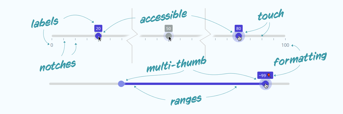
A reactive, accessible, multi-thumb, range slider with the ability to display "pips" or "notches" along the range. Importable as a svelte-component, or used directly in any javascript application.
| 📔 | External | Full Documentation & Examples |
|---|---|---|
| 💲 | REPL | Svelte component demo |
| ❤ | Codepen | Plain JS component demo |
- ✨ fully customisable, stylable & accessible
- 👍🏽 multi-thumb
- 🎚 range (min/max)
- 🏷 floating labels
- 📏 ruler notches
- 🏷 labels for notches
- 🧮 step function
- 🖍 formatter
- 🎭 animated
Open your project and use the command line to install the package;
yarn add svelte-range-slider-pips --dev          # or
npm install svelte-range-slider-pips --save-dev # if you prefer npmIf you're not building a svelte-app, you can use the /dist/
version of the script /dist/svelte-range-slider-pips.js and include it
either with a regular <script> tag. This should even work with jQuery.
<script src="./js/vendor/svelte-range-slider-pips.js" />

<div id="my-slider"></div>

<script>
  var mySlider = new RangeSliderPips({
    target: document.getElementById("my-slider"),
    props: { /* props as js object */ }
  });
</script>Assuming you have a Svelte app up and running;
<script>
  import RangeSlider from "svelte-range-slider-pips";
</script>

<RangeSlider />If you're building a bleeding-edge JS application (not svelte), you might
want to use js imports (import)
import RangeSlider from "./node_modules/svelte-range-slider-pips/dist/svelte-range-slider-pips.mjs";

var mySlider = new RangeSlider({
  target: node, // js reference to a DOM element
  props: { /* props as js object */ }
});| prop | type | default | description |
|---|---|---|---|
| values | Array |
[50] |
Array of values to apply on the slider. Multiple values creates multiple handles. (note: A slider with range property set can only have two values max) |
| min | Number |
0 |
Minimum value for the slider |
| max | Number |
100 |
Maximum value for the slider |
| step | Number |
1 |
Every nth value to allow handle to stop at |
| range | Boolean/String |
false |
Whether to style as a range picker. Use range='min' or range='max' for min/max variants |
| pushy | Boolean |
false |
If range is true, then this boolean decides if one handle will push the other along |
| float | Boolean |
false |
Set true to add a floating label above focussed handles |
| vertical | Boolean |
false |
Make the slider render vertically |
| pips | Boolean |
false |
Whether to show pips/notches on the slider |
| pipstep | Number |
1/10/20 |
Every nth step to show a pip for. This has multiple defaults depending on values property |
| first | Boolean/String |
false |
Whether to show a pip or label for the first value on slider. Use first='label' to show a label value |
| last | Boolean/String |
false |
Whether to show a pip or label for the last value on slider. Use last='label' to show a label value |
| rest | Boolean/String |
false |
Whether to show a pip or label for all other values. Use rest='label' to show a label value |
| all | Boolean/String |
false |
Whether to show a pip or label for all values. Same as combining first, last and rest. Use all='label' to show a label value |
| prefix | String |
"" |
A string to prefix to all displayed values |
| suffix | String |
"" |
A string to suffix to all displayed values |
| disabled | Boolean |
false |
Determine if the slider is disabled, or enabled (only disables interactions, and events) |
| formatter | Function |
(v,i) => v |
A function to re-format values before they are displayed (v = value, i = pip index) |
| handleFormatter | Function |
formatter |
A function to re-format values on the handle/float before they are displayed. Defaults to the same function given to the formatter property (v = value, i = handle index) |
| springValues | Object |
{ stiffness: 0.15, damping: 0.4 } |
Svelte spring physics object to change the behaviour of the handle when moving |
| event | example | event.detail |
description |
|---|---|---|---|
| start | on:start={(e) => { ... }} |
{ activeHandle: Integer, value: Float, values: Array } |
Event fired when the user begins interaction with the slider |
| change | on:change={(e) => { ... }} |
{ activeHandle: Integer, startValue: Float, previousValue: Float, value: Float, values: Array } |
Event fired when the user changes the value; returns the previous value, also |
| stop | on:stop={(e) => { ... }} |
{ activeHandle: Integer, startValue: Float, value: Float, values: Array } |
Event fired when the user stops interacting with slider; returns the beginning value, also |
📔📘📖 Full Documentation & Examples
I am very happy to accept;
- 🌟 suggestions/requests for new features or changes
- 🛠 pull-requests for bug fixes, or issue resolution
- 🧪 help with creating a proper test-suite

