-
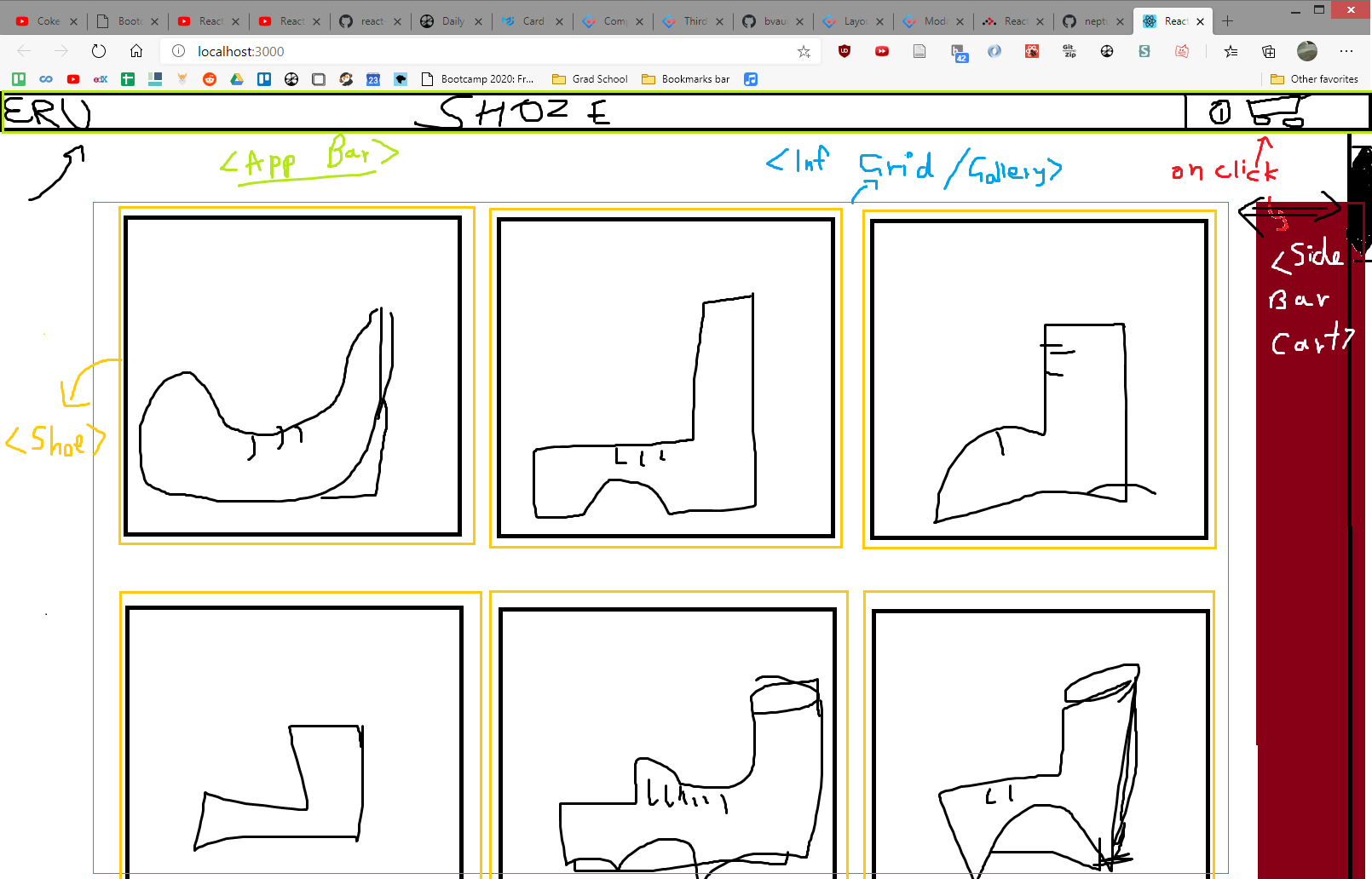
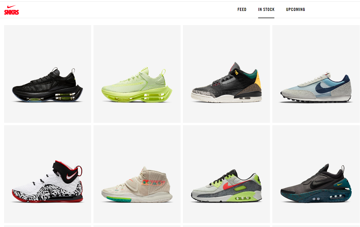
- Main flat display like Nike (Infinite scrolling Grid, add load more button? or keep it autoload? The load more button is for cases where we care about the user being able to access the footer, since we have no footer we dont care.).
- On hover popout card like adidas and rebok
- OnClick modal like puma quickview.
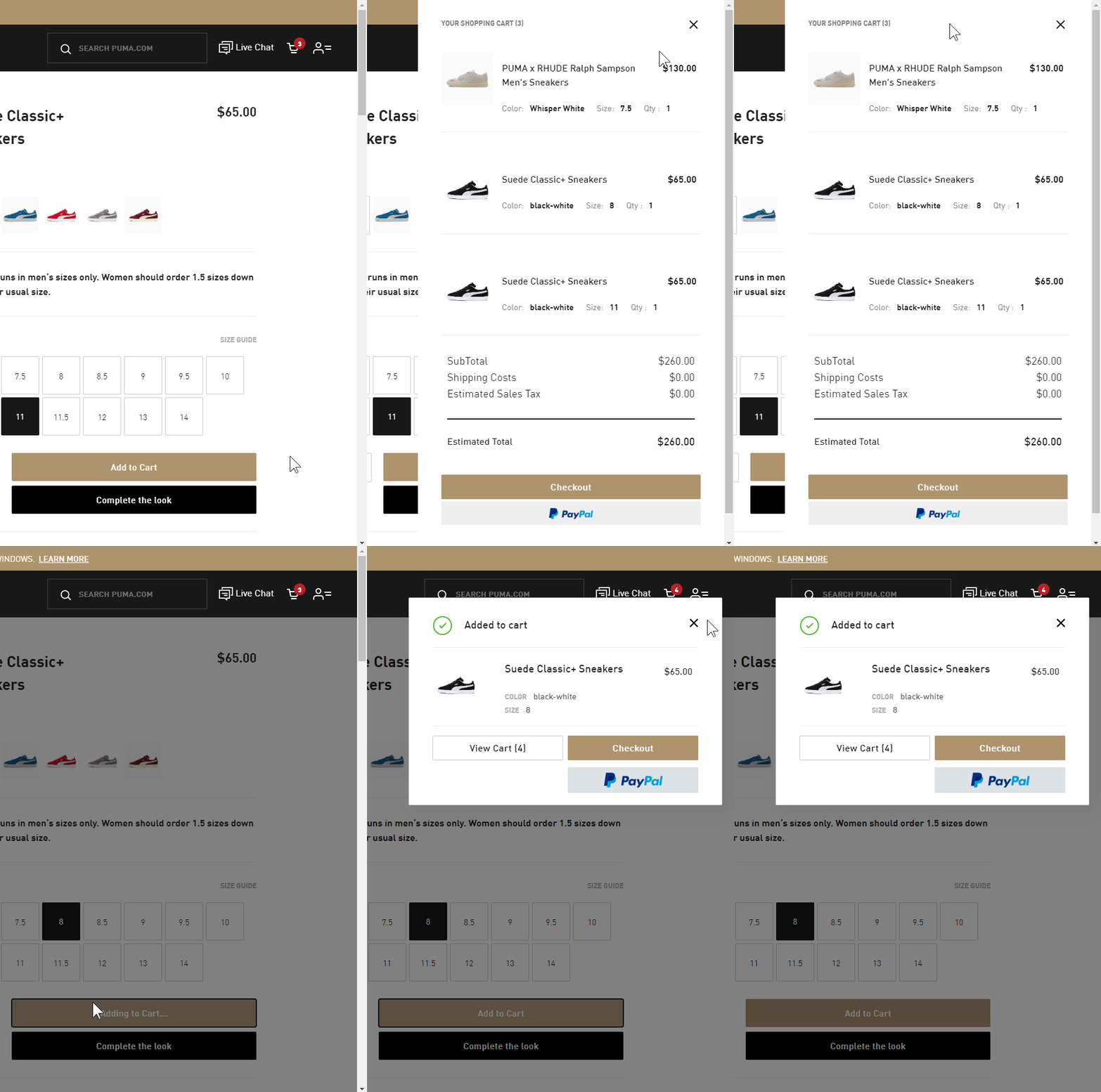
- Cart button sidebar slide in and Add to cart modal show like puma:
- Main flat display like Nike (Infinite scrolling Grid, add load more button? or keep it autoload? The load more button is for cases where we care about the user being able to access the footer, since we have no footer we dont care.).
-
- maybe serve images in next-gen formats like WebP, JPEG2000, JPEGXR??
- Which UI Libraries can we use?
- Ant-Design
- Material UI
- fragmented UI components that fill a single purpose?
- Main List
- Modal: react-skylight
- Infinite scroll grid
- react-toastify notification
- react-burger-menu sidebar
- react-intense superzoom
- react-flexbox-grid can be used for responsive layouts with the xs=12, md=6 lg=4
- We should add the On click modal thing on the 2nd component that only displays when we are on the hover state, this is coz the mobile ppl cant hover and they have to click once to go into the hover state and then click again to get the modal? lol
- random snippets
- Hover component change:
import React, { Component } from "react";
import { render } from "react-dom";

class HoverExample extends Component {
  constructor(props) {
    super(props);
    this.handleMouseHover = this.handleMouseHover.bind(this);
    this.state = {
      isHovering: false
    };
  }

  handleMouseHover() {
    this.setState(this.toggleHoverState);
  }

  toggleHoverState(state) {
    return {
      isHovering: !state.isHovering
    };
  }

  render() {
    return (
      <div>
        {!this.state.isHovering && (
          <div
            onMouseEnter={this.handleMouseHover}
            onMouseLeave={this.handleMouseHover}
          >
            Hover Me
          </div>
        )}
        {this.state.isHovering && (
          <div
            onMouseEnter={this.handleMouseHover}
            onMouseLeave={this.handleMouseHover}
          >
            Hovering right meow!
          </div>
        )}
      </div>
    );
  }
}

render(<HoverExample />, document.getElementById("root"));-
-
Can overlay text on image by using absolute positioning and then spacing it from the margins by fixed amounts.
-
Selecting all img elements with "poop" class is done using
img.poop {}. Selecting all img elements that are inside containers / are descendants of containers with class "poop" is done by.poop img {} -
Object placement along the main flexbox direction is done by first setting everything with
justify-contents:flex-endetc and then usingmargin: autoand its variants likemargin-left: autoon the children for specific placement. Object placement along the cross axis inside flexbox is done by usingalign-self: auto. There is an Amazing demonstration of flexbox alignment on SO -
The hover whitening effect on images is added by simply changing the
opacity: 0.6or something and then making it look smooth by adding atransition: 0.5s ease -
Negative margins allow you to make items overlap. We used this in the Shoe-details modal to make the price get close to the heading name of the shoe by setting
margin-bottom: -1rem;for the header. -
To enable fallbacks with next-gen image formats like webP we use
<picture>elements with multiple<source>elements. However this will not render unless there is also an included<img>element inside it with a basic src like jpeg etc. This sort of enforces backwards compatibility by simply not allowing us to use picture without an img element since some browsers may not support picture. -
Css transition is a way to add an interpolation to a css property. its like a watcher that observes a css property and then when it changes, it displays that change as the transition we defined like
transition: transform 1swill watch the transform property of any css object and if the transform changes then it will change over 1s interpolated by whatever default transition function is there. We used this to make our sidebar smoothly display and hide itself by telling transition to watch the transform property which we change by translateX(200px) and from its standard position. -
Good explanation on w3schools. Css positioning is also pretty nice, we can use fixed,static,relative, absolute and sticky. static is the default and it just goes with normal html flow. relative is also the same as normal but we can assign it different values to offset it from the normal of the static value. Fixed positions the element relative to the viewport and u can read the rest from w3 lol.
-
Add a scroll bar to html elements by simply adding
overflow-y: auto. -
We can add filters on our images with
filter: invert(1)etc. This lets us play with brightness, saturation, hue-rotation etc.
-
-
-
React Strict Mode causes component double rendering when using hooks.
-
DO NOT PUT COMPONENTS INSIDE STATE. I put a list of components to be rendered by the grid into a list and they had messed up closures. Basically whatever the closure was at the time of adding them to state was what they kept regardless of the state that they depended on changing. This was a problem with the Shoe item inside the grid and when I pressed the add to cart button it always resetted app state to what it was when the Shoe component was added to the list state.
-
React setState() is asynchronous. What this means is that if we setState at some point in our component and then a few lines later use that changed state to set another state, it will not work as we expected because what react does is it collects all the setStates and sends them for asynchronous processing at once before the next component render. This is good for performance since if we have multiple setStates that are independent then our component isnt going to keep rerendering after every setstate it encounters. The standard way of dealing with this is to pass a callback to setState so that it sets the dependent state after it has done executing itself. We came across this problem when we added the gender filtering functionality, since we are keeping tracked of how far the user has scrolled down to display infinite pictures through a list state, when we added a gender property we want to filter this list for the appropriate gender values. The thing is that the list only contains the indexes of the shoe array so instead of filtering the list we filter the shoe array, now the problem was that the shoe array was larger than any of our filtered arrays but the list wouldve contained indices that are out of bounds for the filtered array and this would lead to exceptions and errors. This can be fixed by encapsulating the whole component in a try catch and when we get an out of bounds error we simply reset the list to its initial state and let our component rerender. React also has a builtin thing for errors called Error Boundaries but for now they can only be implemented by writing class components. Basically its a wrapper around components that acts as a fallback component when an error is encountered.
-
The other option which we implemented was to add a check in the beggining of the component right after we filter the genders, we check the max value in the list array, if it exceeds the size of any of the filtered male/female arrays then we setState of the list to the initial state and at this point we desire the component to NOT go further and immediately rerender from the beggining but what it was doing was actually passing the setState of the list to async and we were still getting exceptions so we simply added a return statement right after we setState to force the component to stop execution right here and then get rerendered.
-
The useWebAnimation() hook is not capable of working with composite animations yet, what that means is that we can only have one
transformat a time, if I wanted to scale and translate simulatenously, that is not possible because whatever comes afterwards will overwrite the previous transform.
-
-
-
We can fix conflicts when merging multiple branches directly on github, it has an editor which shows the conflicts marked with conflict markers like:
<<<<< branch_name content of the branch_name file content of the branch_name file content of the branch_name file content of the branch_name file ==================== separator ========= content of the master file content of the master file content of the master file content of the master file >>>>> master -
we can then fix these conflicts by replacing the entire code block by what we would want in its place. which can be like copy pasting parts from the branch_name to the part with content of master file and then deleting the code block containing the branch_name and removing the conflict markers and then we will able to resolve the conflict.
-
Cleaning up the merged branches can be directly done on github when we merge them but on the local copies we can delete those branches from local disk that have also been deleted from remote by doing
git remote prune origin. deleting local copies of the merged branches can also be done by simplygit branch -d branch_name. We can first view the merged branches bygit branch --merged. Note that unmerged branches need a-Dtag to delete.
-
- Animate the gender stick figures.
- Add gender icons to main shoe image on grid.(maybe top right of image, position:absolute)
- Implement Cart sidebar
- Compute and show Total in cart sidebar
- Implement Gender Filtering
- Add the dota shop sound on cart sidebar.
- Add a main page / landing page type thing.
- Add transition animation from main page to the store grid/page/route


