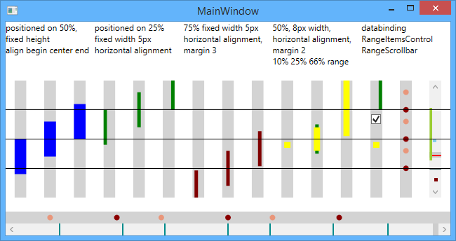
Customized WPF controls, RangePanel with custom vertical/horizontal positioning, RangeItemsControl with bindable ItemsSource and Visual Studio-like scrollbar with markers
Custom arrangment panel (similar to stackpanel or canvas) with vertical or horizontal orientation. Positioning of children is controled by:
-
Bounds set by Minimum and maximum properties (like Minimum and Maximum on scrollbar or trackbar)
-
And three attached properties on each child element
- RangePanel.Position: Position of child in RangePanel, similar to Value in scrollbar or trackbar
- RangePanel.Alignment: (Begin, Center, End) which part of Children is aligned to Position. (See blue bars on screenshot)
- RangePanel.Range: Width (on horizontal panel) or Height (on vertical) of element in relative units (full length is (Maximum - Minimum))
- Minimum 0, Maximum 60, RangePanel.Range 20 => item width will be one third panel width
ItemsControl with RangePanel as ItemsPanel
- ItemsSource and ItemTemplate can be used to visualize data collection
Scrollbar with RangePanel overlay.
- can be used as ScrollBar with markings like the one in Eclipse or Visual studio
- see bottom and right of screenshot
- usable as ItemsControl, support ItemsSource bindings and multi element content
