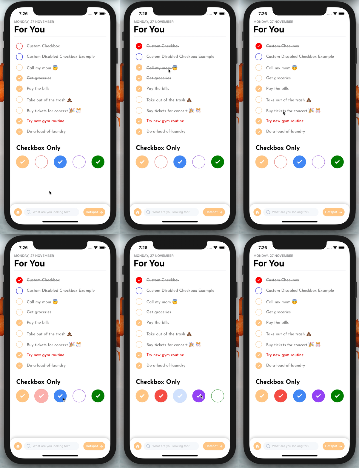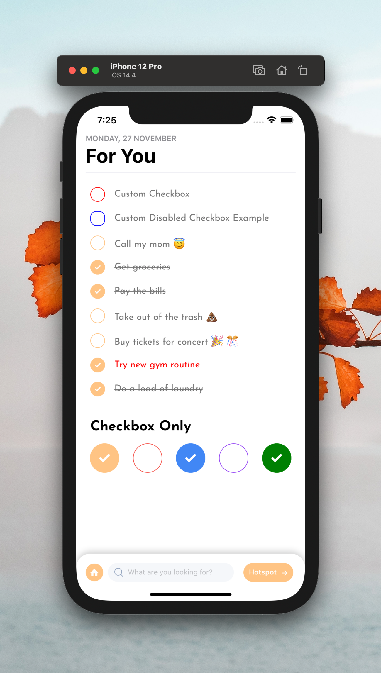
|

|
Add the dependency:
Zero Dependency
npm i react-native-bouncy-checkbox- Typescript
- Zero Dependency
- New and More Customizable Animation
bounceEffectInbounceEffectOutbounceVelocityInbounceVelocityOutbouncinessInbouncinessOut
- Community Supported Stable Version
import BouncyCheckbox from "react-native-bouncy-checkbox";<BouncyCheckbox onPress={(isChecked: boolean) => {}} /><BouncyCheckbox
size={25}
fillColor="red"
unfillColor="#FFFFFF"
text="Custom Checkbox"
iconStyle={{ borderColor: "red" }}
innerIconStyle={{ borderWidth: 2 }}
textStyle={{ fontFamily: "JosefinSans-Regular" }}
onPress={(isChecked: boolean) => {}}
/>| Property | Type | Default | Description |
|---|---|---|---|
| text | string | undefined | set the checkbox's text |
| textComponent | component | undefined | set the checkbox's text by a React Component |
| onPress | function | null | set your own onPress functionality after the bounce effect, callback receives the next isChecked boolean if disableBuiltInState is false |
| disableText | boolean | false | if you want to use checkbox without text, you can enable it |
| size | number | 25 | size of width and height of the checkbox |
| style | style | default | set/override the container style |
| textStyle | style | default | set/override the text style |
| iconStyle | style | default | set/override the outer icon container style |
| innerIconStyle | style | default | set/override the inner icon container style |
| isChecked | boolean | false | set the default checkbox value |
| fillColor | color | #f09f48 | change the checkbox's filled color |
| unfillColor | color | transparent | change the checkbox's un-filled color when it's not checked |
| useNativeDriver | boolean | true | enable/disable the useNativeDriver for animation |
| iconComponent | component | Icon | set your own icon component |
| checkIconImageSource | image | default | set your own check icon image |
| ImageComponent | component | Image | set your own Image component instead of RN's default Image |
| disableBuiltInState | boolean | false | if you want to manually handle the isChecked prop and disable built in handling |
| textContainerStyle | ViewStyle | default | set/override the text container style |
| TouchableComponent | Component | TouchableOpacity | set/override the main TouchableOpacity component with any Touchable Component like Pressable |
| Property | Type | Default | Description |
|---|---|---|---|
| bounceEffectIn | number | 0.9 | change the bounce effect when press in |
| bounceEffectOut | number | 1 | change the bounce effect when press out |
| bounceVelocityIn | number | 0.1 | change the bounce velocity when press in |
| bounceVelocityOut | number | 0.4 | change the bounce velocity when press out |
| bouncinessIn | number | 20 | change the bounciness when press in |
| bouncinessOut | number | 20 | change the bounciness when press out |
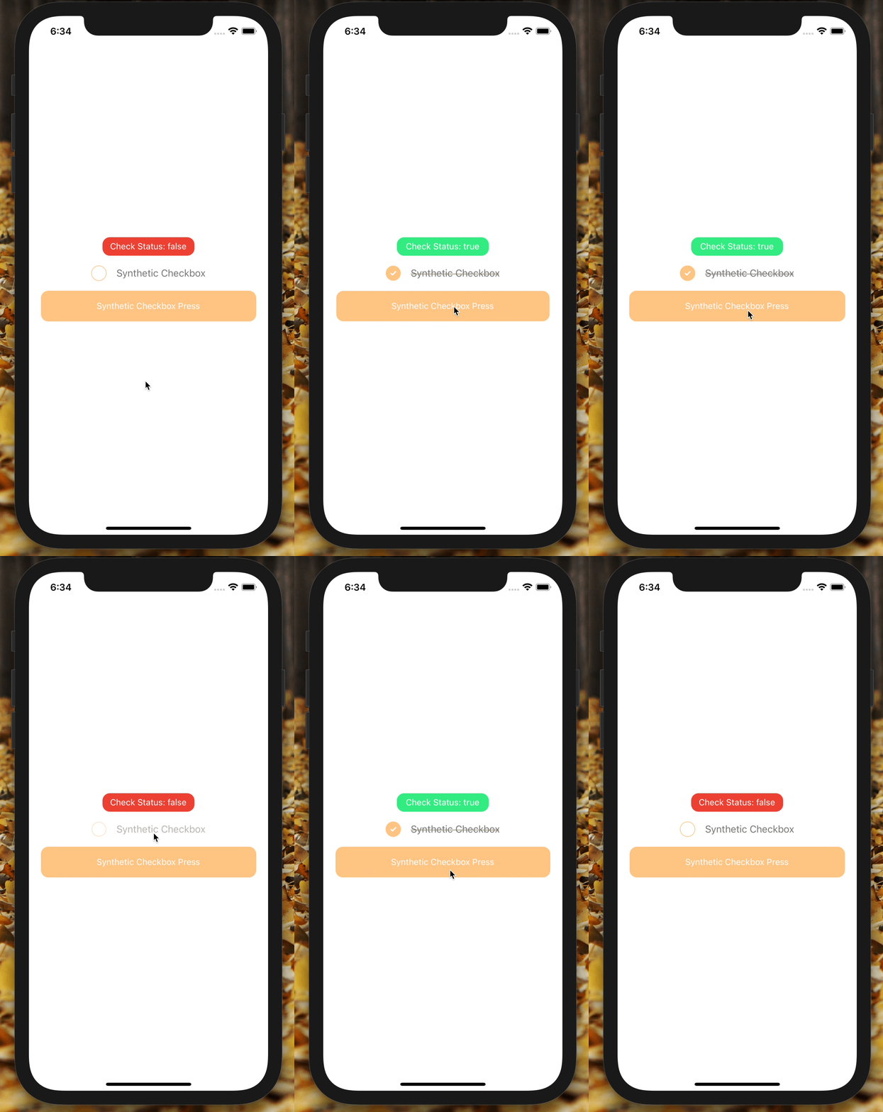
Please check the example-manual-state runable project to how to make it work on a real project.
Becareful while using disableBuiltInState you MUST set the isChecked prop to use your own check state manually. The onPress callback will NOT receive the next isChecked when disableBuiltInState is used.
Here is the basic implementation:
import React from "react";
import {
  SafeAreaView,
  StyleSheet,
  Text,
  TouchableOpacity,
  View,
} from "react-native";
import BouncyCheckbox from "./lib/BouncyCheckbox";
import RNBounceable from "@freakycoder/react-native-bounceable";

const App = () => {
  let bouncyCheckboxRef: BouncyCheckbox | null = null;
  const [checkboxState, setCheckboxState] = React.useState(false);

  return (
    <SafeAreaView
      style={{
        flex: 1,
        alignItems: "center",
        justifyContent: "center",
      }}
    >
      <View
        style={{
          height: 30,
          width: 150,
          alignItems: "center",
          justifyContent: "center",
          borderRadius: 12,
          backgroundColor: checkboxState ? "#34eb83" : "#eb4034",
        }}
      >
        <Text
          style={{ color: "#fff" }}
        >{`Check Status: ${checkboxState.toString()}`}</Text>
      </View>
      <BouncyCheckbox
        style={{ marginTop: 16 }}
        ref={(ref: any) => (bouncyCheckboxRef = ref)}
        isChecked={checkboxState}
        text="Synthetic Checkbox"
        disableBuiltInState
        onPress={() => setCheckboxState(!checkboxState)}
      />
      <RNBounceable
        style={{
          marginTop: 16,
          height: 50,
          width: "90%",
          backgroundColor: "#ffc484",
          borderRadius: 12,
          alignItems: "center",
          justifyContent: "center",
        }}
        onPress={() => bouncyCheckboxRef?.onPress()}
      >
        <Text style={{ color: "#fff" }}>Synthetic Checkbox Press</Text>
      </RNBounceable>
    </SafeAreaView>
  );
};

const styles = StyleSheet.create({});

export default App;We have also this library's checkbox group library as well :) Please take a look
How to disable strikethrough?
- Simply use the
textStyleprop and set thetextDecorationLinetonone
textStyle={{
  textDecorationLine: "none",
}}
How to make square checkbox?
- Simply use the
iconStyleprop and set theborderRadiusto0
innerIconStyle={{
  borderRadius: 0, // to make it a little round increase the value accordingly
}}-
LICENSE -
Typescript Challange! -
Version 2.0.0 is alive 🥳 -
Synthetic Press Functionality -
Disable built-in check state -
React Native Bouncy Checkbox Group Library Extension -
New Animation and More Customizable Animation -
Version 3.0.0 is alive 🚀 - Better Documentation | Separation of Documentation
- Write an article about the lib on Medium
FreakyCoder, kurayogun@gmail.com
React Native Bouncy Checkbox is available under the MIT license. See the LICENSE file for more info.


