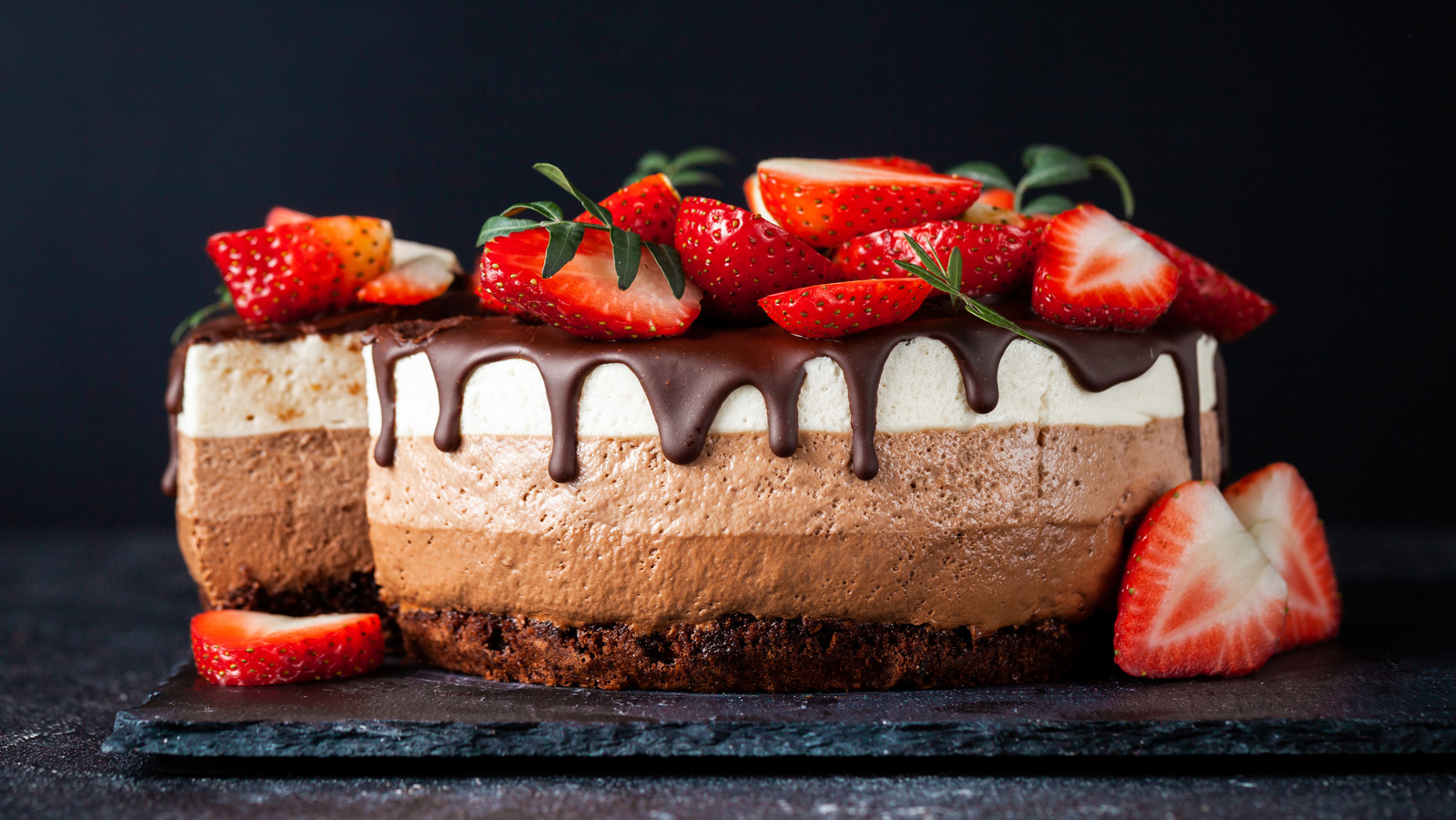
VR-sweets is a site that advertising a local cake maker. The site will be targeted toward lovers of sweets, cakes and other products .
In this section, you should go over the different parts of your project, and describe each in a sentence or so. You will need to explain what value each of the features provides for the user, focusing on who this website is for, what it is that they want to achieve and how your project is the best way to help them achieve these things.
-
Navigation Bar
- Featured on all three pages, the full responsive navigation bar includes links to the Logo, Home page, Gallery and Sign Up page and is identical in each page to allow for easy navigation.
- This section will allow the user to easily navigate from page to page across all devices without having to revert back to the previous page via the ‘back’ button.
-
The landing page image
- The landing includes a photograph with text overlay to allow the user to see exactly which location this site would be applicable to.
-
Section2
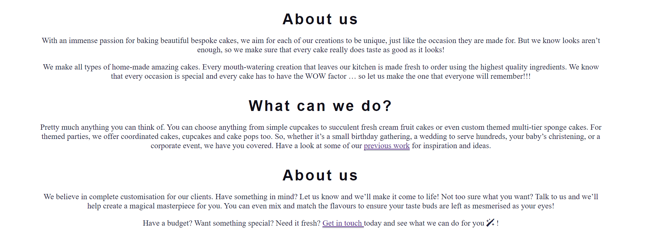
- info section
-
The Footer
- The footer section includes links to the relevant social media sites for Love Running. The links will open to a new tab to allow easy navigation for the user.
- The footer is valuable to the user as it encourages them to keep connected via social media
-
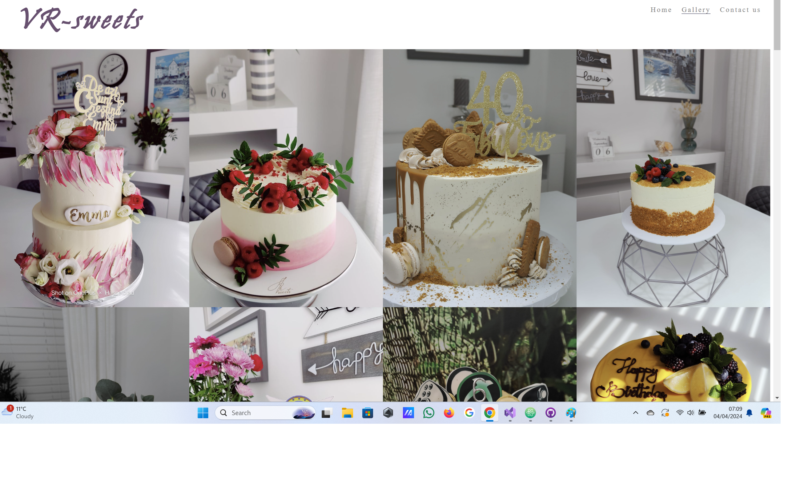
Gallery
- The gallery will provide the user with supporting images to see what the meet ups look like.
- This section is valuable to the user as they will be able to easily identify the types of events the organisation puts together.
-
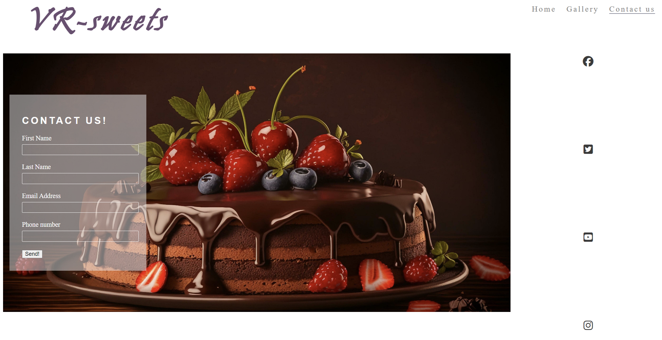
The Sign Up Page
- This page will allow the user to get signed up to Love Running to start their running journey with the community. The user will be able specify if they would like to take part in road, trail or both types of running. The user will be asked to submit their full name and email address.
For some/all of your features, you may choose to reference the specific project files that implement them.
In addition, you may also use this section to discuss plans for additional features to be implemented in the future:
- Another feature idea
In this section, you need to convince the assessor that you have conducted enough testing to legitimately believe that the site works well. Essentially, in this part you will want to go over all of your project’s features and ensure that they all work as intended, with the project providing an easy and straightforward way for the users to achieve their goals.
In addition, you should mention in this section how your project looks and works on different browsers and screen sizes.
You should also mention in this section any interesting bugs or problems you discovered during your testing, even if you haven't addressed them yet.
If this section grows too long, you may want to split it off into a separate file and link to it from here.
-
HTML
-
No errors were returned when passing through the official index.html W3C validator
-
No errors were returned when passing through the official gallery.html W3C validator
-
No errors were returned when passing through the official contact-us.html W3C validator
-
CSS
- 3 errors were found when passing through the official (Jigsaw) validator
You will need to mention unfixed bugs and why they were not fixed. This section should include shortcomings of the frameworks or technologies used. Although time can be a big variable to consider, paucity of time and difficulty understanding implementation is not a valid reason to leave bugs unfixed.
This section should describe the process you went through to deploy the project to a hosting platform (e.g. GitHub)
- The site was deployed to GitHub pages. The steps to deploy are as follows:
- In the GitHub repository, navigate to the Settings tab
- From the source section drop-down menu, select the Master Branch
- Once the master branch has been selected, the page will be automatically refreshed with a detailed ribbon display to indicate the successful deployment.
The live link can be found here - https://uzeasdad.github.io/VR-sweets.v2/
In this section you need to reference where you got your content, media and extra help from. It is common practice to use code from other repositories and tutorials, however, it is important to be very specific about these sources to avoid plagiarism.
You can break the credits section up into Content and Media, depending on what you have included in your project.
- The text for the Home page was taken from Wikipedia Article A
- Instructions on how to implement form validation on the Sign Up page was taken from Specific YouTube Tutorial
- The icons in the footer were taken from Font Awesome
- The photos used on the home and sign up page are from This Open Source site
- The images used for the gallery page were taken from this other open source site
Congratulations on completing your Readme, you have made another big stride in the direction of being a developer!
Below you will find a couple of extra tips that may be helpful when completing your project. Remember that each of these projects will become part of your final portfolio so it’s important to allow enough time to showcase your best work!
-
One of the most basic elements of keeping a healthy commit history is with the commit message. When getting started with your project, read through this article by Chris Beams on How to Write a Git Commit Message
- Make sure to keep the messages in the imperative mood
-
When naming the files in your project directory, make sure to consider meaningful naming of files, point to specific names and sections of content.
- For example, instead of naming an image used ‘image1.png’ consider naming it ‘landing_page_img.png’. This will ensure that there are clear file paths kept.
-
Do some extra research on good and bad coding practices, there are a handful of useful articles to read, consider reviewing the following list when getting started:
Getting started with your Portfolio Projects can be daunting, planning your project can make it a lot easier to tackle, take small steps to reach the final outcome and enjoy the process!


