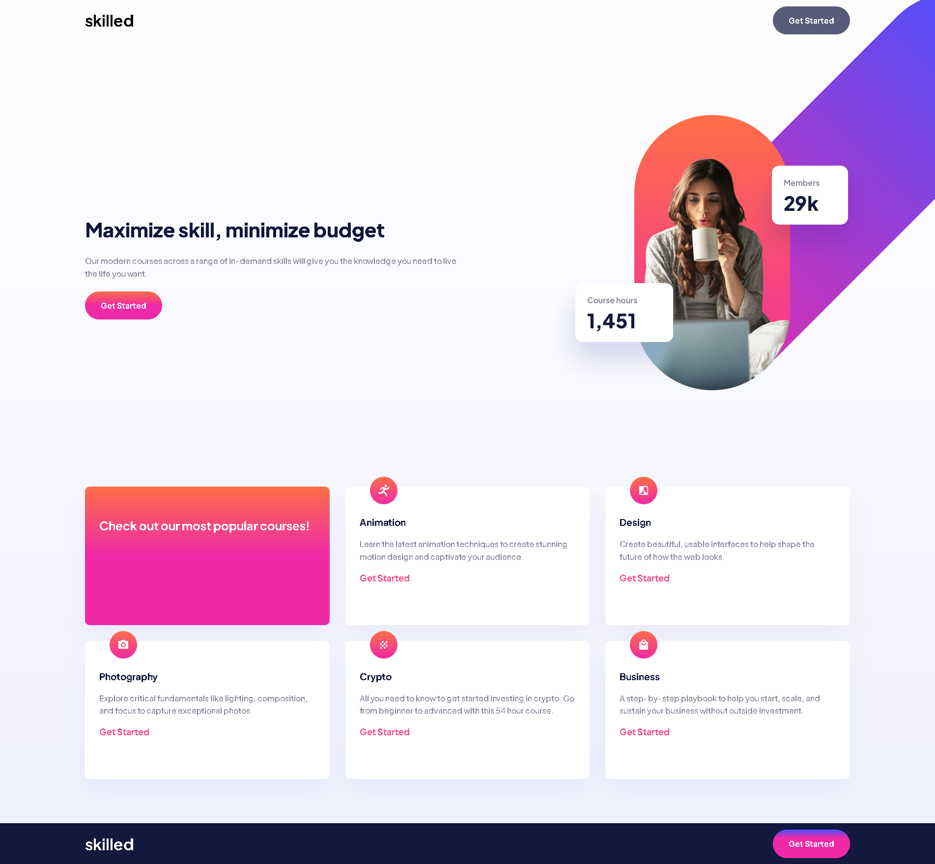
This is a solution to the Skilled e-learning landing page challenge on Frontend Mentor. Frontend Mentor challenges help you improve your coding skills by building realistic projects.
Users should be able to:
- View the optimal layout depending on their device's screen size
- See hover states for interactive elements
- Solution URL: Add solution URL here
- Live Site URL: Add live site URL here
- Semantic HTML5 markup
- CSS custom properties
- Flexbox
- CSS Grid
- Mobile-first workflow
I already knew a little about grid and absolute and relative position, with this project I was able to fix it a little more in my mind.
I need to improve in grid and positions, I think I had a satisfactory result, but it can be improved a lot. I want to focus a lot on the grid as it is very good for positioning elements in the interface.
- Github - VHAlvesS
- Frontend Mentor - @VHAlvesS
- Linkedin - @vitorhasantos
I managed to do the mobile design without much difficulty, but this image in flexWrapper gave me a little headache, I have to improve my understanding of position. I think I got a satisfactory result as I was able to practice a lot with the grid in a real project.
