Vasu Goel
2019-9-25
To create plots that help us better understand trends in world health and economics.The first step to achieve this is to collect appropriate data for which I will be using the ‘gapminder’ dataset containing Health and Income outcomes for 184 countries from 1960 to 2016. (https://rdrr.io/cran/dslabs/man/gapminder.html) provided by the Gapminder Foundation.
The next step is to visualize the data to discover patterns and trends, since data visualization can lead to discoveries which would otherwise be missed if we simply subjected the data to a battery of data analysis tools or procedures. Data visualization is the strongest tool of what we call exploratory data analysis (EDA).
Hans Rosling was the co-founder of the Gapminder Foundation, an organization dedicated to educating the public by using data to dispel common myths about the so-called developing world. The organization uses data to show how actual trends in health and economics contradict the narratives that emanate from sensationalist media coverage of catastrophes, tragedies and other unfortunate events.
Hans Rosling conveyed actual data-based trends in a dramatic way of his own, using effective data visualization. This project is based on two talks that exemplify this approach to education: New Insights on Poverty and The Best Stats You’ve Ever Seen. Specifically, in this section, we use data to attempt to answer the following two questions:
- Is it a fair characterization of today’s world to say it is divided into western rich nations and the developing world in Africa, Asia and Latin America?
- Has income inequality across countries worsened during the last 40 years?
To answer these questions, we will be using the gapminder dataset provided in dslabs. This dataset was created using a number of spreadsheets available from the Gapminder Foundation. We can access the table like this:
library(tidyverse)
library(dslabs)
data(gapminder)
gapminder %>% as_tibble()
## # A tibble: 10,545 x 9
##    country  year infant_mortality life_expectancy fertility population
##    <fct>   <int>            <dbl>           <dbl>     <dbl>      <dbl>
##  1 Albania  1960            115.             62.9      6.19    1636054
##  2 Algeria  1960            148.             47.5      7.65   11124892
##  3 Angola   1960            208              36.0      7.32    5270844
##  4 Antigu…  1960             NA              63.0      4.43      54681
##  5 Argent…  1960             59.9            65.4      3.11   20619075
##  6 Armenia  1960             NA              66.9      4.55    1867396
##  7 Aruba    1960             NA              65.7      4.82      54208
##  8 Austra…  1960             20.3            70.9      3.45   10292328
##  9 Austria  1960             37.3            68.8      2.7     7065525
## 10 Azerba…  1960             NA              61.3      5.57    3897889
## # … with 10,535 more rows, and 3 more variables: gdp <dbl>,
## # continent <fct>, region <fct>There is a preconceived notion that the world is divided into two groups: the western world (Western Europe and North America), characterized by long life spans and small families, versus the developing world (Africa, Asia, and Latin America) characterized by short life spans and large families. But do the data support this dichotomous view?
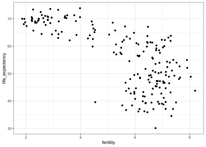
In order to analyze this world view, our first plot is a scatterplot of life expectancy versus fertility rates (average number of children per woman). We start by looking at data from about 50 years ago, when perhaps this view was first cemented in our minds.
ds_theme_set()
filter(gapminder, year == 1962) %>%
  ggplot(aes(fertility, life_expectancy)) +
  geom_point()
Most points fall into two distinct categories: 1. Life expectancy around 70 years and 3 or less children per family. 2. Life expectancy lower then 65 years and more than 5 children per family.
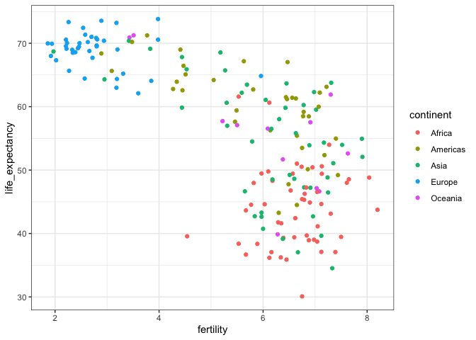
To confirm that indeed these countries are from the regions we expect, we can use color to represent continent.
filter(gapminder, year == 1962) %>%
  ggplot( aes(fertility, life_expectancy, color = continent)) +
  geom_point()
In 1962, “the West versus developing world” view was grounded in some reality. Is this still the case 50 years later?
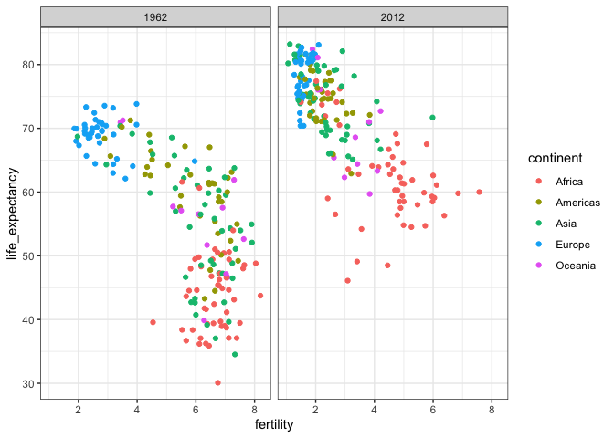
We could easily plot the 2012 data in the same way we did for 1962. To make comparisons, however, side by side plots are preferable. In ggplot2, we can achieve this by faceting variables: we stratify the data by some variable and make the same plot for each strata. We want to simply compare 1962 and 2012.
filter(gapminder, year%in%c(1962, 2012)) %>%
  ggplot(aes(fertility, life_expectancy, col = continent)) +
  geom_point() +
  facet_grid(. ~ year)
This plot clearly shows that the majority of countries have moved from the developing world cluster to the western world one. In 2012, the western versus developing world view no longer makes sense. This is particularly clear when comparing Europe to Asia, the latter of which includes several countries that have made great improvements.
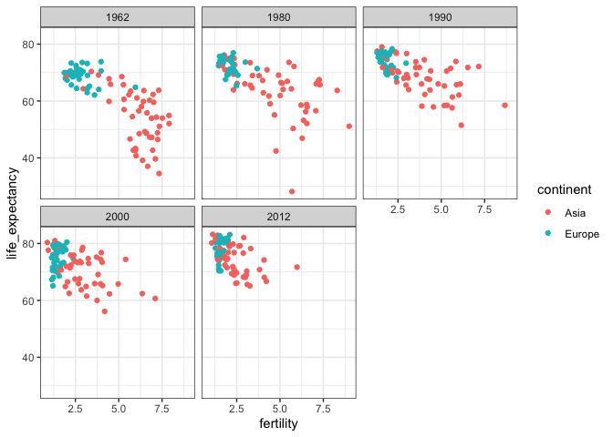
To explore how this transformation happened through the years, we can make the plot for several years. For example, we can add 1970, 1980, 1990, and 2000.
The function facet_wrap permits us to automatically wrap the series of plots so that each display has viewable dimensions:
years <- c(1962, 1980, 1990, 2000, 2012)
continents <- c("Europe", "Asia")
gapminder %>%
  filter(year %in% years & continent %in% continents) %>%
  ggplot( aes(fertility, life_expectancy, col = continent)) +
  geom_point() +
  facet_wrap(~year)
This plot clearly shows how most Asian countries have improved at a much faster rate than European ones.
The visualizations above effectively illustrates that data no longer supports the western versus developing world view. Once we see these plots, new questions emerge. For example, which countries are improving more and which ones less? Was the improvement constant during the last 50 years or was it more accelerated during certain periods? For a closer look that may help answer these questions, we can use time series plots.
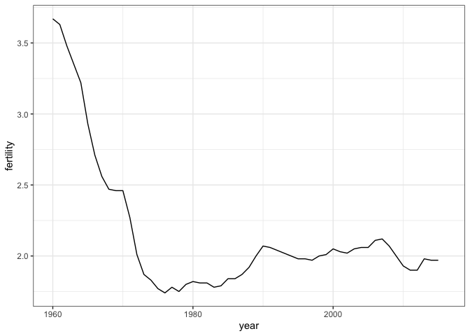
Time series plots have time in the x-axis and an outcome or measurement of interest on the y-axis. For example, here is a trend plot of United States fertility rates:
gapminder %>%
  filter(country == "United States") %>%
  ggplot(aes(year, fertility)) +
  geom_line()
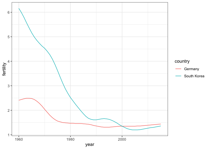
This is particularly helpful when we look at two countries. If we subset the data to include two countries, one from Europe and one from Asia, then adapt the code above:
countries <- c("South Korea","Germany")

gapminder %>% filter(country %in% countries & !is.na(fertility)) %>%
  ggplot(aes(year, fertility, col = country)) +
  geom_line()
The plot clearly shows how South Korea’s fertility rate dropped drastically during the 60s and 70s, and by 1990 had a similar rate to that of Germany.
We now shift our attention to the second question related to the commonly held notion that wealth distribution across the world has become worse during the last decades. When general audiences are asked if poor countries have become poorer and rich countries become richer, the majority answers yes. By using stratification, histograms, smooth densities, and boxplots, we will be able to understand if this is in fact the case.
The gapminder data table includes a column with the countries gross domestic product (GDP). GDP measures the market value of goods and services produced by a country in a year. The GDP per person is often used as a rough summary of a country’s wealth. Here we divide this quantity by 365 to obtain the more interpretable measure dollars per day. We add this variable to the data table:
gapminder <- gapminder %>% mutate(dollars_per_day = gdp/population/365)The GDP values are adjusted for inflation and represent current US dollars, so these values are meant to be comparable across the years. Of course, these are country averages and within each country there is much variability. All the graphs and insights described below relate to country averages and not to individuals.
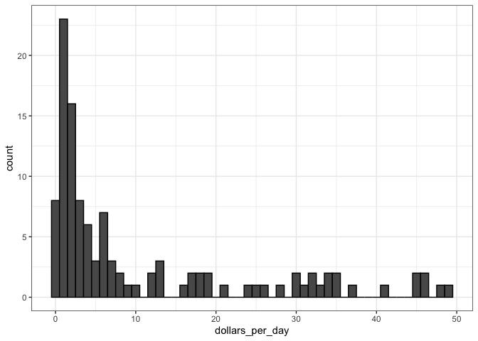
Here is a histogram of per day incomes from 1970:
past_year <- 1970
gapminder %>%
  filter(year == past_year & !is.na(gdp)) %>%
  ggplot(aes(dollars_per_day)) +
  geom_histogram(binwidth = 1, color = "black")
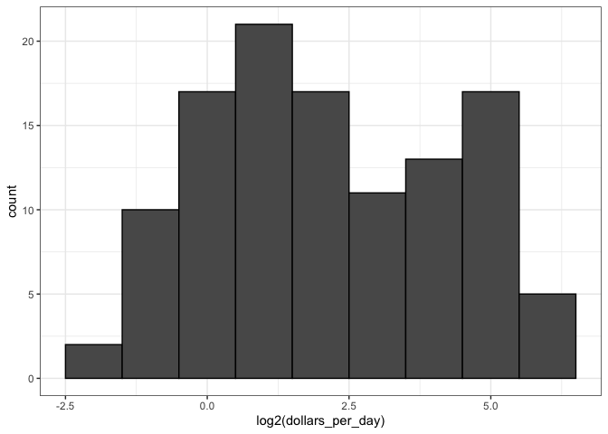
In this plot, we see that for the majority of countries, averages are below $10 a day. However, the majority of the x-axis is dedicated to the 35 countries with averages above $10. So the plot is not very informative about countries with values below $10 a day. It might be more informative to quickly be able to see how many countries have average daily incomes of about $1 (extremely poor), $2 (very poor), $4 (poor), $8 (middle), $16 (well off), $32 (rich), $64 (very rich) per day. These changes are multiplicative and log transformations convert multiplicative changes into additive ones: when using base 2, a doubling of a value turns into an increase by 1. Here is the distribution if we apply a log base 2 transform:
gapminder %>%
  filter(year == past_year & !is.na(gdp)) %>%
  ggplot(aes(log2(dollars_per_day))) +
  geom_histogram(binwidth = 1, color = "black")
In a way this provides a close-up of the mid to lower income countries.
There are two ways we can use log transformations in plots. We can log the values before plotting them or use log scales in the axes. The advantage of using logged scales is that we see the original values on the axes. However, the advantage of showing logged scales is that the original values are displayed in the plot, which are easier to interpret.
If we want to scale the axis with logs, we can use the scale_x_continuous function. Instead of logging the values first, we apply this layer:
gapminder %>%
  filter(year == past_year) %>%
  ggplot(aes(log10(population))) +
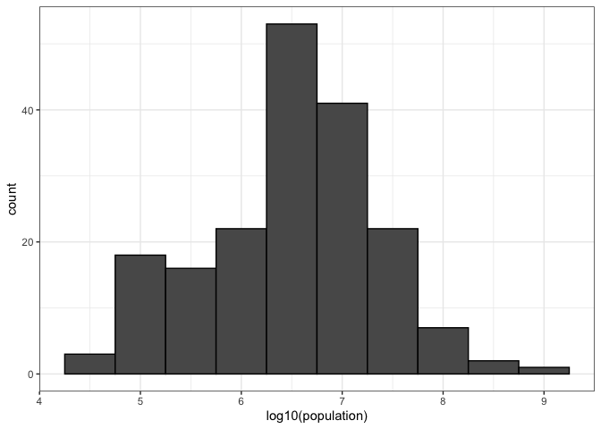
geom_histogram(binwidth = 0.5, color = "black")In the histogram above we see two bumps: one at about 4 and another at about 32. In statistics these bumps are sometimes referred to as modes. The mode of a distribution is the value with the highest frequency. The mode of the normal distribution is the average. When a distribution, like the one above, doesn’t monotonically decrease from the mode, we call the locations where it goes up and down again local modes and say that the distribution has multiple modes.
The histogram above suggests that the 1970 country income distribution has two modes: one at about 2 dollars per day (1 in the log 2 scale) and another at about 32 dollars per day (5 in the log 2 scale). This bimodality is consistent with a dichotomous world made up of countries with average incomes less than $8 (3 in the log 2 scale) a day and countries above that.
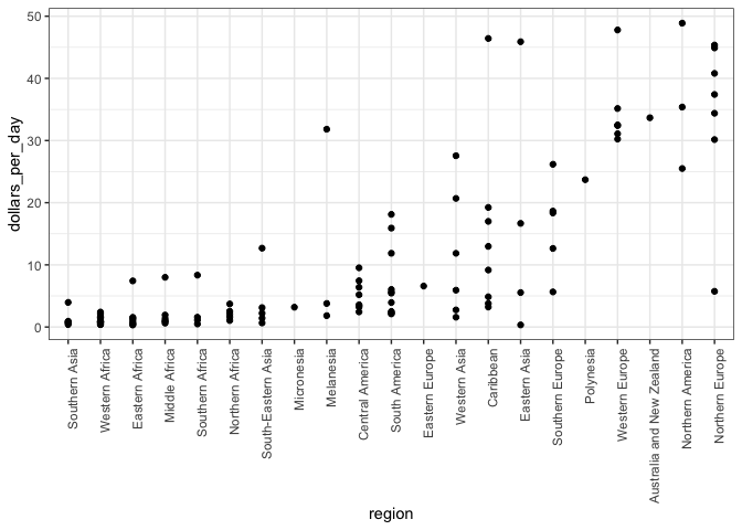
A histogram showed us that the 1970 income distribution values show a dichotomy. However, the histogram does not show us if the two groups of countries are west versus the developing world. Let’s start by quickly examining the data by region.
p <- gapminder %>%
  filter(year == past_year & !is.na(gdp)) %>%
  mutate(region = reorder(region, dollars_per_day, FUN = median)) %>%
  ggplot(aes(region, dollars_per_day)) +
  geom_point() +
  theme(axis.text.x = element_text(angle = 90, hjust = 1))
p
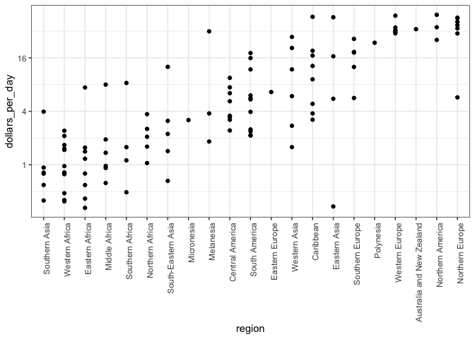
We can already see that there is indeed a “west versus the rest” dichotomy: we see two clear groups, with the rich group composed of North America, Northern and Western Europe, New Zealand and Australia. As with the histogram, if we remake the plot using a log scale. This permits us to better appreciate the differences within the developing world.
p + scale_y_continuous(trans = "log2")The exploratory data analysis above has revealed two characteristics about average income distribution in 1970. Using a histogram, we found a bimodal distribution with the modes relating to poor and rich countries. Then, by examining the data after stratifying by region, we noticed that rich countries were mostly in Europe and North America, along with Australia and New Zealand. This fact and the variability observed in the rest of the countries motivates us to define the following give groups:
gapminder <- gapminder %>%
  mutate(group = case_when(
    region %in% c("Western Europe", "Northern Europe","Southern Europe",
                    "Northern America", "Australia and New Zealand") ~ "West",
    region %in% c("Eastern Asia", "South-Eastern Asia") ~ "East Asia",
    region %in% c("Caribbean", "Central America", "South America") ~ "Latin America",
    continent == "Africa" & region != "Northern Africa" ~ "Sub-Saharan Africa",
    TRUE ~ "Others"))

gapminder <- gapminder %>%
  mutate(group = factor(group,
                        levels = c("Others", "Latin America", "East Asia", "Sub-Saharan Africa", "West")))
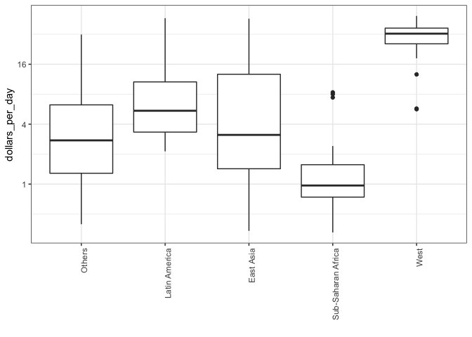
We now want to compare the distribution across these five groups to confirm the “west versus the rest” dichotomy. The number of points in each category is large enough that a summary plot may be useful. We could generate five histograms or five density plots, but it may be more practical to have all the visual summaries in one plot. We therefore start by stacking boxplots next to each other.
p <- gapminder %>%
  filter(year == past_year & !is.na(gdp)) %>%
  ggplot(aes(group, dollars_per_day)) +
  geom_boxplot() +
  theme(axis.text.x = element_text(angle = 90, hjust = 1)) +
  scale_y_continuous(trans = "log2") +
  xlab("")
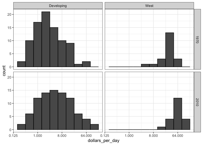
p Data exploration clearly shows that in 1970 there was a “west versus the rest” dichotomy. But does this dichotomy persist? Let’s use __facet_grid__to see how the distributions have changed. To start, we will focus on two groups: the west and the rest. We make four histograms.
past_year <- 1970
present_year <- 2010
country_list_1 <- gapminder %>%
  filter(year == past_year & !is.na(dollars_per_day)) %>%
  pull(country)

country_list_2 <- gapminder %>%
  filter(year == present_year & !is.na(dollars_per_day)) %>%
  pull(country)

country_list <- intersect(country_list_1, country_list_2)

gapminder %>%
  filter(year %in% c(past_year, present_year) & !is.na(gdp) & country %in% country_list) %>%
  mutate(west = ifelse(group == "West", "West", "Developing")) %>%
  ggplot(aes(dollars_per_day)) +
  geom_histogram(binwidth = 1, color = "black") +
  scale_x_continuous(trans = "log2") +
  facet_grid(year ~ west)
We now see that the rich countries have become a bit richer, but percentage-wise, the poor countries appear to have improved more. In particular, we see that the proportion of developing countries earning more than $16 a day increased substantially.
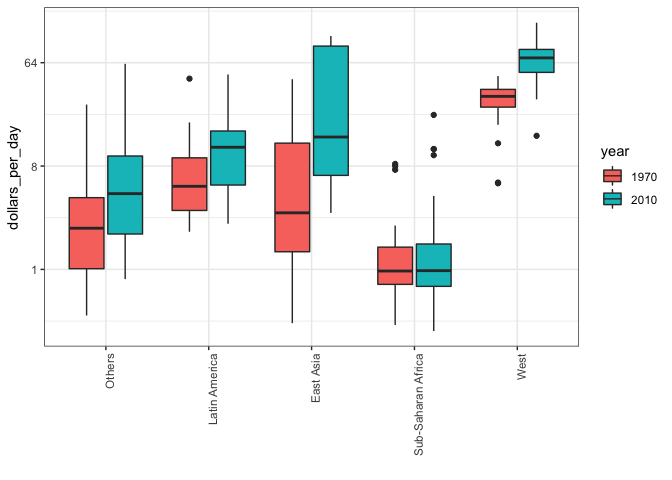
To see which specific regions improved the most, we can remake the boxplots we made above, but now adding the year 2010 and then using facet to compare the two years.
gapminder %>%
  filter(year %in% c(past_year, present_year) & country %in% country_list) %>%
  mutate(year = factor(year)) %>%
  ggplot(aes(group, dollars_per_day, fill = year)) +
  geom_boxplot() +
  theme(axis.text.x = element_text(angle = 90, hjust = 1)) +
  scale_y_continuous(trans = "log2") +
  xlab("")
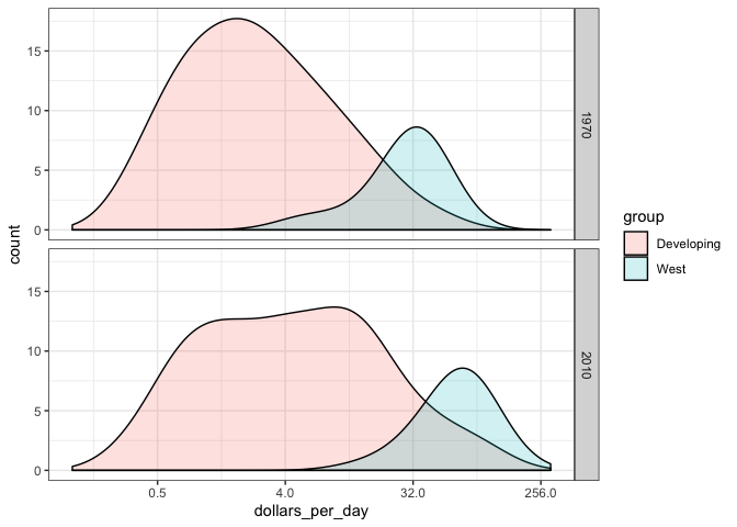
Data exploration suggests that the income gap between rich and poor countries has narrowed considerably during the last 40 years. We used a series of histograms and boxplots to see this. We can use a succinct way to convey this message with just one plot.
p <- gapminder %>%
  filter(year %in% c(past_year, present_year) & country %in% country_list) %>%
  mutate(group = ifelse(group == "West", "West", "Developing")) %>%
  ggplot(aes(dollars_per_day, y = ..count.., fill = group)) +
  scale_x_continuous(trans = "log2", limit = c(0.125, 300))

p + geom_density(alpha = 0.2, bw = 0.75) + facet_grid(year ~ .)
This plot now shows what is happening very clearly. The developing world distribution is changing.
Exploratory Data Analysis confirmed, in 1962, “the West versus developing world” view was grounded in some reality. But it is not the case 50 years later.
Data exploration suggests that the income gap between rich and poor countries has narrowed considerably during the last 40 years.
