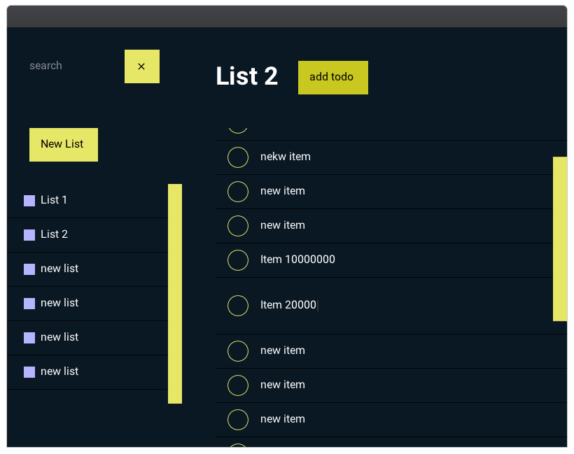
VertexGUI is a Swift framework for writing cross-platform GUI applications.
VertexGUI uses the Skia 2D rendering engine for drawing Widgets and a part of the Fireblade game engine for managing windows on multiple platforms.
Currently Linux, MacOS and Windows are supported. Skia supports more platforms: Android, iOS, ChromeOS. So these platforms can probably be supported by VertexGUI as well with not too much work.
To run the demo application, follow the installation instructions below, clone the repository and in the root directory execute swift run TaskOrganizerDemo.
The code for the demo app can be found in Sources/TaskOrganizerDemo
- Installation
- Simple Code Example
- Feature Overview
- Current Limitations
- Roadmap
- Contribute
- VSCode Setup on Linux
- Dependencies
VertexGUI depends on SDL2 to create windows and receive keyboard and mouse events. SDL2 needs to be present on your system as a binary file. The most convenient way of setting up SDL2 is to use your platform's package manager:
On Ubuntu install it with:
sudo apt-get install libsdl2-dev
on MacOS (via homebrew):
brew install sdl2
for other platforms see: Installing SDL.
Skia is the 2D graphics library used to draw VertexGUI widgets. It needs to be present as a binary as well.
To either download a prebuilt binary or built skia yourself, please follow the instructions written for SkiaKit (SkiaKit is a wrapper library for the Skia c++ API).
This project is under heavy development. I will not create releases until there is some API stability.
Just use the master branch:
dependencies: [
  ...,
  .package(name: "VertexGUI", url: "https://github.com/VertexUI/VertexGUI", .branch("master")),
],
targets: [
  ...,
  .target(name: "SomeTarget", dependencies: ["VertexGUI", ...])
]
A Swift 5.5 toolchain is required.
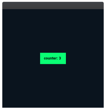
Result:
import VertexGUI

public class MainView: ComposedWidget {
  @State
  private var counter = 0

  @Compose override public var content: ComposedContent {
    Container().with(classes: ["container"]).withContent { [unowned self] in
      Button().onClick {
        counter += 1
      }.withContent {
        Text(ImmutableBinding($counter.immutable, get: { "counter: \($0)" }))
      }
    }
  }

  // you can define themes, so this can also be done in three lines
  override public var style: Style {
    let primaryColor = Color(77, 255, 154, 255)

    return Style("&") {
      (\.$background, Color(10, 20, 30, 255))
    } nested: {

      Style(".container", Container.self) {
        (\.$alignContent, .center)
        (\.$justifyContent, .center)
      }

      Style("Button") {
        (\.$padding, Insets(all: 16))
        (\.$background, primaryColor)
        (\.$foreground, .black)
        (\.$fontWeight, .bold)
      } nested: {

        Style("&:hover") {
          (\.$background, primaryColor.darkened(20))
        }

        Style("&:active") {
          (\.$background, primaryColor.darkened(40))
        }
      }
    }
  }
}
When you press the button, the counter should be incremented.
Some additional setup code is necessary to display the window. You can find all of it in Sources/MinimalDemo
Using Swift's function/result builders.
Container().withContent {
  Button().withContent {
    Text("Hello World")

    $0.iconSlot {
      Icon(identifier: .party)
    }
  }
}

List(items).withContent {
  $0.itemSlot { itemData in
    Text(itemData)
  }
}Create reusable views consiting of multiple Widgets. Pass child Widgets to your custom Widget instances by using slots. Parts of the composition API might be renamed in the future.
class MyCustomView: ComposedWidget, SlotAcceptingWidgetProtocol {

  static let childSlot = Slot(key: "child", data: String.self)
  let childSlotManager = SlotContentManager(MyCustomView.childSlot)

  @Compose override var content: ComposedContent {
    Container().withContent {
      Text("some text 1")

      childSlotManager("the data passed to the child slot definition")

      Button().withContent {
        Text("this Text Widget goes to the default slot of the Button")
      }
    }
  }
}

// use your custom Widget
Container() {
  Text("any other place in your code")

  MyCustomView().withContent {
    $0.childSlot { data in
      // this Text Widget will receive the String
      // passed to the childSlotManager() call above
      Text(data)
    }
  }
}LeafWidgets are directly drawn to the screen. They do not have children.
class MyCustomLeafWidget: LeafWidget {
  override func draw(_ drawingContext: DrawingContext) {
    drawingContext.drawRect(rect: ..., paint: Paint(color: ..., strokeWidth: ...))
    drawingContext.drawLine(...)
    drawingContext.drawText(...)
  }
}Container().with(classes: ["container"]) {
Button().withContent {
Text("Hello World")
}
}
// select by class
Style(".container") {
(\.$background, .white)
// foreground is similar to color in css, color of text = foreground
(\.$foreground, Color(120, 40, 0, 255))
} nested: {
// select by Widget type
Style("Text") {
// inherit is the default for foreground, so this is not necessary
(\.$foreground, .inherit)
(\.$fontWeight, .bold)
}
// & references the parent style, in this case .container and extends it
// the currently supported pseudo classes are :hover and :active
Style("&:hover") {
(\.$background, .black)
}
}class MyCustomWidget {
...
@StyleProperty
public var myCustomStyleProperty: Double = 0.0
...
}
// somewhere else in your code
Style(".class-applied-to-my-custom-widget") {
(\.$myCustomStyleProperty, 1.0)
}Update the content and structure of your Widgets when data changes.
class MyCustomWidget: ComposedWidget {
  @State private var someState: Int = 0
  @ImmutableBinding private var someStateFromTheOutside: String

  public init(_ outsideStateBinding: ImmutableBinding<String>) {
    self._someStateFromTheOutside = outSideStateBinding
  }

  @Compose override var content: ComposedContent {
    Container().withContent { [unowned self] in

      // use Dynamic for changing the structure of a Widget
      Dynamic($someState) {
        if someState == 0 {
          Button().onClick {
            someState += 1
          }.withContent {
            Text("change someState")
          }
        } else {
          Text("someState is not 0")
        }
      }

      // pass a Binding to a child to have it always reflect the latest state
      Text($someStateFromTheOutside.immutable)

      // you can construct proxy bindings
      // in this case the proxy converts the Int property to a String
      Text(ImmutableBinding($someState.immutable, get: { String($0) }))
    }
  }
}This should be changed so that providing dependencies can be done by using a property wrapper as well. Dependencies are resolved by comparing keys (if given) and types.
class MyCustomWidget: ComposedWidget {
  ...

  @Inject(key: <nil or a String>) private var myDependency: String
}

class MyCustomParentWidget: ComposedWidget {
  // API will be changed, so that this dependency can be provided by doing:
  // @Provide(key: <nil or a String>)
  let providedDependency: String = "dependency"

  @Compose override var content: ComposedContent {
    Container().withContent {
      MyCustomWidget()
    }.provide(dependencies: providedDependency)
  }
}The approach is similar to Vuex. Defining mutations and actions as enum cases instead of methods allows for automatic recording where and when which change was made to the state.
class MyAppStore: Store<MyAppState, MyAppMutation, MyAppAction> {
  init() {
    super.init(initialState: MyAppState(
      stateProperty1: "initial"))
  }

  override func perform(mutation: Mutation, state: SetterProxy) {
    switch mutation {
    case let .setStateProperty1(value):
      state.stateProperty1 = value
    }
  }

  override func perform(action: Action) {
    switch action {
    case .doSomeAsynchronousOperation:
      // ... do stuff
      // when finished:
      commit(.setStateProperty1(resultOfOperation))
    }
  }
}

struct MyAppState {
  var stateProperty1: String
}

enum MyAppMutation {
  case .setStateProperty1(String)
}

enum MyAppAction {
  case .doSomeAsynchronousOperation
}
Now you can use the store in your whole app like so:
class TheRootView: ComposedWidget {
  let store = MyAppStore()

  @Compose override var content: ComposedContent {
    Container().provide(dependencies: store).withContent {
      ...
      // can be deeply nested
      MyCustomWidget()
      ...
    }
  }
}

class MyCustomWidget: ComposedWidget {
  @Inject var store: MyAppStore

  @Compose override var content: ComposedContent {
    Container().withContent { [unowned self] in
      // the store exposes reactive bindings
      // to every state property via store.$state
      Text(store.$state.stateProperty1.immutable)

      Dynamic(store.$state.stateProperty1) {
        // ... everything inside here will be rebuilt
        // when stateProperty1 changes
      }

      Button().onClick {
        store.commit(.setStateProperty1("changed by button click"))
      }.withContent {
        Text("change stateProperty1")
      }
    }
  }
}- depends on SDL2 for handling cross platform window management
- a few core Widget types (Container, Button, Text, TextInput, ...) are available
- the graphics api has only been implemented in so far as to be able to create the above demos
- everything is redrawn on every frame
- animations, transitions are not yet supported
- only one layout type is well supported, very similar to CSS flexbox, but does not yet support line breaks
- WebAssembly support
- more core Widgets
- RadioButton
- Checkbox
- Textarea
- ...
- full flexbox layout system
- other layout systems
- absolute
- anchor
- ...
- transitions, animations
- optimize drawing, only redraw on update
The main ways to contribute currently are feature requests, opinions on API design and reporting bugs. There are no guidelines. Just open an issue.
Copied from: github.com/ewconnell/swiftrt
Install the following extensions:
Swift Language (Martin Kase)
CodeLLDB (Vadim Chugunov)
It is very important that settings.json contains the following entry to pickup the correct lldb version from the toolchain. Substituting PathToSwiftToolchain with wherever you installed the toolchain. { "lldb.library": "PathToSwiftToolchain/usr/lib/liblldb.so" }
SourceKit-LSP (Pavel Vasek)
There is a version of the server as part of the toolchain already, so you don't need to build it. Make sure to configure the extension "sourcekit-lsp.serverPath": "PathToSwiftToolchain/usr/bin/sourcekit-lsp".
This package depends on:
GL (OpenGL loader written in Swift): github.com/kelvin13/swift-opengl
CombineX (open source implementation of Apple's Combine framework)
Swim (Image handling): github.com/t-ae/swim.git
Cnanovg (NanoVG wrapper for Swift): github.com/UnGast/Cnanovg.git

