This functionality has been fully released as a native part of Plotly.js (: See release notes here: https://github.com/plotly/plotly.js/releases/tag/v2.18.0
I've been receiving help for the last 5 weeks from fellow developer, Filipe Santiago @filipesantiagoAM, and together we've managed to put together an MVP solution! This still needs some tests and approvals before being merged, but sharing the PR here for public visibility!
Check out the new module branch on this repo for cleaner class-based approach. The motivation for
this refactor was to make the logic more functional and easier to follow, while also making it easier
to test and modify.
NOTE
This logic is in-progress to be added as a native Plotly feature. Projected completion by Q4 of 2022.
I do my best to cover all details, but if you'd like the quick answer (which may sound complicated when out of context), I'll provide a concise summary at the end.
Or even better, go straight to the code! multiAxis.js
However, for the full explanation, please continue below!
NOTE
Further testing and optimization in progress. Watch repo for future updates.
const X_AXIS = ["Jan", "Feb", "Mar", "Apr", "May"]

const Y1_AXIS = [232, 2206, 37, 1629, 190]
y1_min = Math.min(...Y1_AXIS)  // 37
y1_max = Math.max(...Y1_AXIS)  // 2206

const Y2_AXIS = [141.21, 365.24, 265.21, 204.34, 129]
y2_min = Math.min(...Y2_AXIS)  // 129
y2_max = Math.max(...Y2_AXIS)  // 365.24
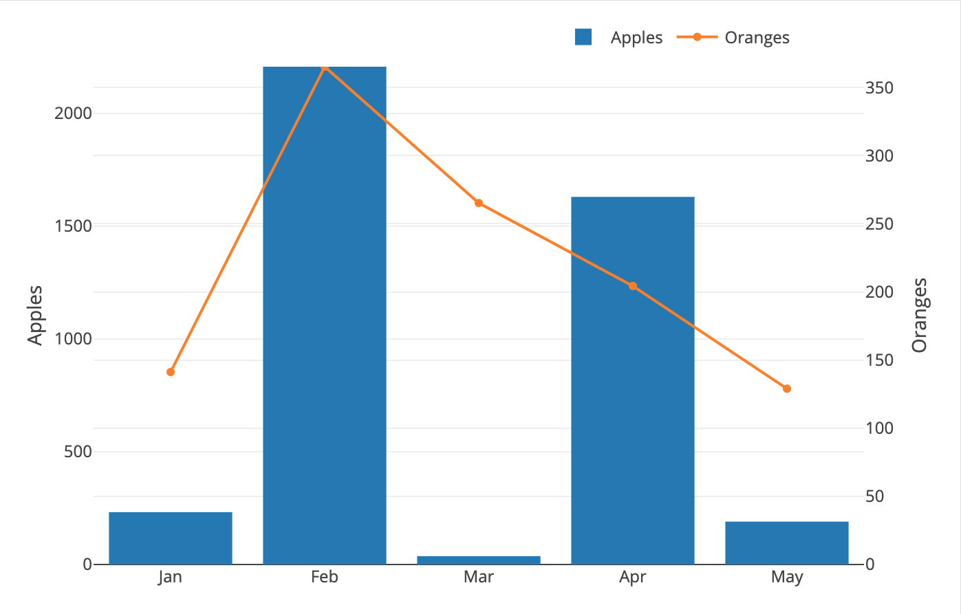
If we plot these axes as-is:
// DATA
let trace1 = {
    name: 'Apples',
    type: 'bar',
    x: X_AXIS,
    y: Y1_AXIS
};
let trace2 = {
    name: 'Oranges',
    type: 'line',
    x: X_AXIS,
    y: Y2_AXIS,
    yaxis: 'y2'
};

let data = [trace1, trace2];

// LAYOUT
let layout = {
    margin: {
        t: 40, r: 70, b: 40, l: 70,
    },
    legend: {
        orientation: 'h',
        x: 0.6,
        y: 1.1
    },

    yaxis: {
        title: 'Apples',
        side: 'left',
        range: [0, y1_max]
    },
    yaxis2: {
        title: 'Oranges',
        side: 'right',
        range: [0, y2_max],
        overlaying: 'y'
    }
}

// CONFIG
let config = {
    displaylogo: false,
    displayModeBar: false
}

// CREATION
Plotly.newPlot( yourDiv, data, layout, config )
We'll get this result:
We want the grid-lines for both axes to match up!
In order for this to happen, both axes would need to have the same grid margins. How do we do this?
Each grid line actually extends from a tick on the y-axis.
So the way that we move these grid lines is by moving the
tick. For this, we use an attribute called dtick (short
for "distance-of-tick" if I had to guess, but your guess is
as good as mine!) that can be accessed in layout.yaxis.
You'll see this in action shortly!
Link to dtick documentation for reference
Now that we know what attribute we need to manipulate, we can answer the question of how we need to manipulate it.
Well if we only need to make our gridline (dtick) margins equal to each other, then we can accomplish this with simple division:
yaxis: {
    title: 'Apples',
    side: 'left',
    range: [0, y1_max],
    dtick: y1_max / 5
},
yaxis2: {
    title: 'Oranges',
    side: 'right',
    range: [0, y2_max],
    overlaying: 'y',
    dtick: y2_max / 5
}
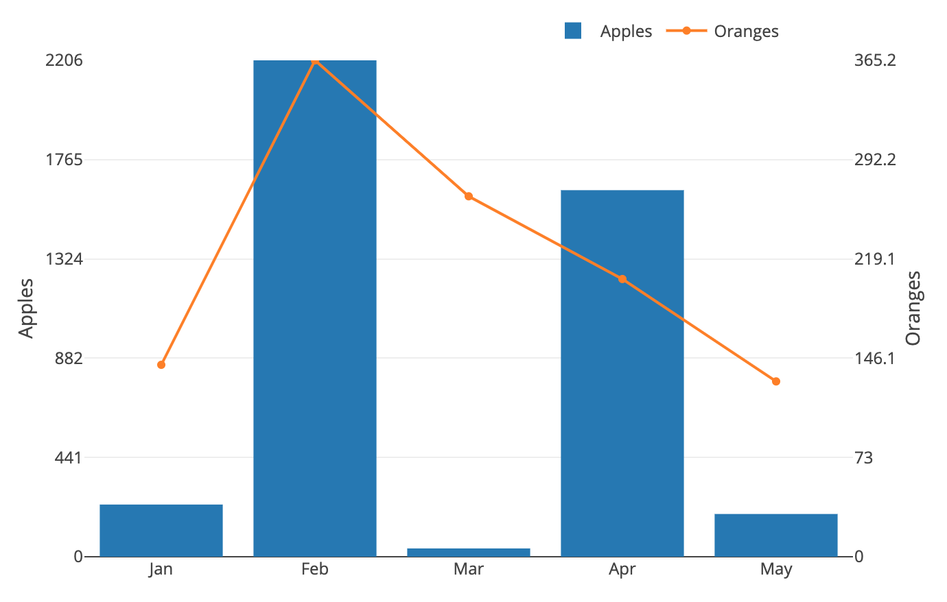
The addittion of these dticks will give us this graph:
Great! Now each y-axis is divided into 5 parts, and our gridlines are in-sync! We can stop now... oh what's that? The voice in your head is telling you it doesn't like the interesting tick values? But they're so unique! Alright, I guess I sort of agree--let's do something about this.
To accomplish this goal, we use the same core logic as the previous example, except that we don't want to use the y_max to calculate our dtick. We want a number that is round and clean, but still representative of the y_max.
For Example (y_max -> clean number we can divide with):
- 436 -> 400
- 23.62 -> 20
- 75341.323 -> 70000
How do we calculate for numbers like this?
- find number of digits in y_max
- find 10^x where x == num of digits in y_max - 1
- find leading digit of y_max and multiply
Here's how we accomplish this with javascript:
y_max = Math.max(...Y_AXIS)  // 37482

y_len = Math.floor(y_max_value).toString().length  // 5
y_pow10_divisor = Math.pow(10, y_len - 1)  // 10000

y_firstdigit = Math.floor(y_max_value / y_pow10_divisor)  // 3

// 10000 * 3 == 30000
y_max_base = y_pow10_divisor * y_firstdigit  // 30000
Now we can take this clean happy number and find a nice dtick:
// 30000 / 5 == 6000
dtick: y_max_base / 5
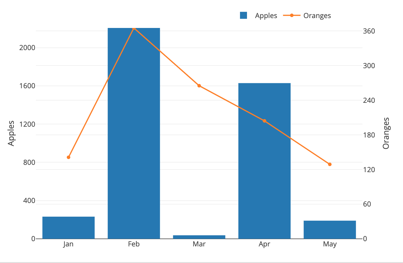
Lets take a look at our new DATA and LAYOUT code and see what it produces.
// DATA
const X_AXIS = ["Jan", "Feb", "Mar", "Apr", "May"]

const Y1_AXIS = [232, 2206, 37, 1629, 190]
y1_min = Math.min(...Y1_AXIS)  // 37
y1_max = Math.max(...Y1_AXIS)  // 2206
y1_len = Math.floor(y1_max).toString().length  // 4
y1_pow10_divisor = Math.pow(10, y1_len - 1)  // 1000
y1_firstdigit = Math.floor(y1_max / y1_pow10_divisor)  // 2
y1_max_base = y1_pow10_divisor * y1_firstdigit  // 2000

y1_dtick = y1_max_base / 5  // 2000 / 5 == 400

const Y2_AXIS = [141.21, 365.24, 265.21, 204.34, 129]
y2_min = Math.min(...Y2_AXIS)  // 129
y2_max = Math.max(...Y2_AXIS)  // 365.24
y2_len = Math.floor(y2_max).toString().length  // 3
y2_pow10_divisor = Math.pow(10, y2_len - 1)  // 100
y2_firstdigit = Math.floor(y2_max / y2_pow10_divisor)  // 3
y2_max_base = y2_pow10_divisor * y2_firstdigit  // 300

y2_dtick = y2_max_base / 5  // 300 / 5 == 60


let trace1 = {
    name: 'Apples',
    type: 'bar',
    x: X_AXIS,
    y: Y1_AXIS
};

let trace2 = {
    name: 'Oranges',
    type: 'line',
    x: X_AXIS,
    y: Y2_AXIS,
    yaxis: 'y2'
};

let data = [trace1, trace2];


// LAYOUT

let layout = {
    margin: {
        t: 40, r: 70, b: 40, l: 70,
    },
    legend: {
        orientation: 'h',
        x: 0.6,
        y: 1.1
    },

    yaxis: {
        title: 'Apples',
        side: 'left',
        range: [0, y1_max],
        dtick: y1_dtick
    },
    yaxis2: {
        title: 'Oranges',
        side: 'right',
        range: [0, y2_max],
        overlaying: 'y',
        dtick: y2_dtick
    }
}
You'll notice that our gridlines are out of sync again; Not to worry, we'll get to that in a second! But now we have something that we can work with: nice, clean tick values that we can control by simply changing our divisor:
y1_dtick = y1_max_base / 5  // 2000 / 5 == 400
y2_dtick = y2_max_base / 5  // 300 / 5 == 60

y1_dtick = y1_max_base / 4  // 2000 / 4 == 500
y2_dtick = y2_max_base / 4  // 300 / 4 == 75

/* Notice in this example that your y1_dtick carries a
remainder. You can avoid this by taking the Math.floor() of
the value or by picking a new divisor */
y1_dtick = y1_max_base / 6  // 2000 / 6 == 333.333
y2_dtick = y2_max_base / 6  // 300 / 6 == 50

/* I recommend assigning your divisor to it's own variable
so you only have to change it's value in one place instead
of two. For example: */
let dtick_divisor = 8
y1_dtick = y1_max_base / dtick_divisor
y2_dtick = y2_max_base / dtick_divisorIf you look at the last graph, you'll notice that y2 seems to have more ticks on the graph, causing the margins to be narrower than y1, and therefore, out-of-sync.
The key to solving this final problem, is all about ratios-- Finding for each y-axis, the ratio of the y_max to the tick-margin (dtick). For example:
let dtick_divisor = 5
y1_dtick = y1_max_base / dtick_divisor  // 2000 / 5 == 400
y2_dtick = y2_max_base / dtick_divisor  // 300 / 5 == 60

y1_dtick_ratio = y1_max / y1_dtick  // 2206 / 400 == 5.515
y2_dtick_ratio = y2_max / y2_dtick  // 365.24 / 60 == 6.0873
In the above example, you can see that the y2_dtick_ratio is GREATER than the y1_dtick_ratio. This tells us that y2 needs MORE ticks (gridlines) to reach its max value--therefore it will have more ticks (gridlines) on the graph, and to fit they must be narrower. A quick review of the last graph, will confirm that this is indeed what's happening--y2's higher dtick ratio is causing it to have narrower grid-margins than y1.
HIGHER dtick ratio == MORE gridlines == NARROWER margin between them
To correct this and make our grid-lines match up, we could shrink the grid-margins for y1 (increase its ratio), or we could enlarge the grid-margins for y2 (reduce its ratio).
Those are our 2 magic options for matching up the grid-lines of both axes:
- Increase smaller ratio to match the larger one
- Reduce larger ratio to match the smaller one
Now's a good time for a vocab reminder. We've been using some pretty key-terms interchangably, so for clarification:
tick-distance==tick-margins==grid-margins==dtick
These terms all represent the same thing.
Remeber that the dtick ratio is a function of y_max and the tick-distance:
dtick_ratio = y_max / y_dtick
So if we want to raise or lower one of the ratios, we again have two options:
- adjust the y_max
- adjust the dtick
y_max refers to the max value from the axis data at the beginning of the program--this value should never change. Up until now we haven't had to think about this because our max value has always been equal to our range max.
But now that we want to adjust the max, we would create a new variable called
y_range_maxwhich we could raise or lower and then use in our layout.yaxis.range variable instead of y_max:yaxis: { range: [0, y_range_max] }
Now we can have our preserved y_max value, and another one to adjust our range with: y_range_max.
Out of our two options, we don't want to adjust the dtick, because we did special operations to find our nice, clean, rounded tick values--we don't want to mess them up! So that leaves us with one option: if we want to adjust an axis' dtick ratio, we must raise or lower its RANGE MAX. Furthermore, we know that if we choose to lower the range max of an axis, we may end up cutting off some of its data from the top of the graph. So really, we only have one safe method for altering a dtick ratio. By INCREASING THE RANGE MAX OF ITS AXIS.
So let's remind ourselves with what our options are to match up the grid-lines:
- Increase smaller ratio to match the larger one
- Reduce larger ratio to match the smaller one
Which we now know means:
-
RAISE RANGE MAX of the axis with the smaller dtick ratio
- This will RAISE its dtick ratio
-
LOWER RANGE MAX of the axis with the larger dtick ratio
- This will LOWER its dtick ratio
And as we just said, we never want to lower a range max, so the answer we're all looking for is in #1
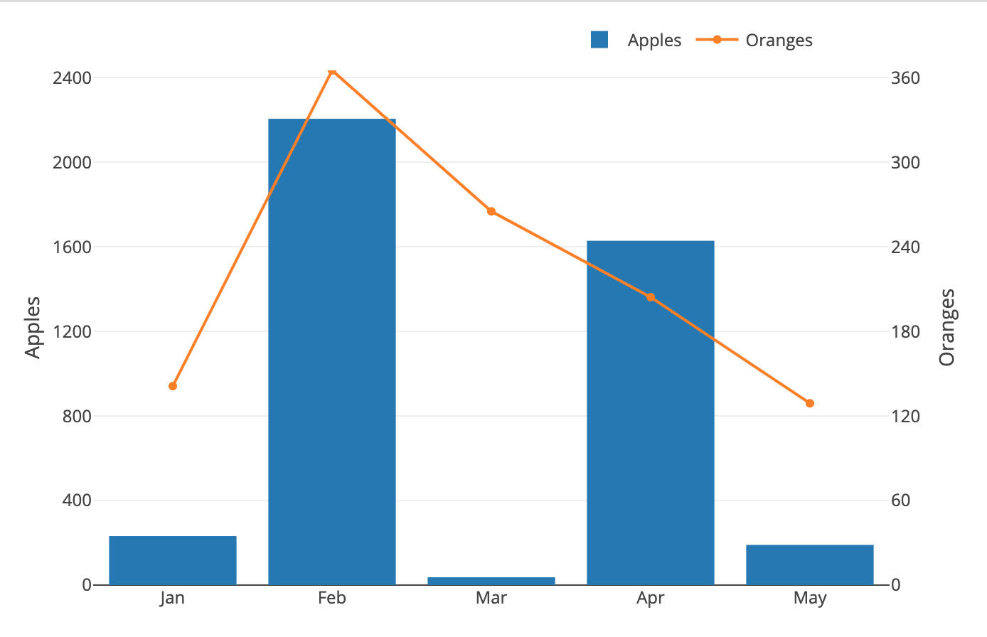
FINALLY! Let's see how this looks in our code, and render another graph.
// Finding initial ratios for comparison
y1_dtick_ratio = y1_max_value / y1_dtick  // 5.515
y2_dtick_ratio = y2_max_value / y2_dtick  // 6.0873333333333335

// Capture the larger of the two ratios
global_dtick_ratio = Math.max(y1_dtick_ratio, y2_dtick_ratio)

/* This is how we raise the range max of the axis with a
smaller ratio. Since we don't know if the global_dtick_ratio
is from y1 or y2, we will perform the operation on both axes
--one range will stay the same, one will increase
accordingly */

// INCREASED: y1_max was == 2206 -> y1_range_max is == 2434
y1_range_max = global_dtick_ratio * y1_dtick  // 6.0873 * 400 == 2434.9333
// SAME: y2_max was == 365.24 -> y2_range_max is == 365.24
y2_range_max = global_dtick_ratio * y2_dtick  // 6.0873 * 60 == 365.2400


yaxis: {
    title: 'Apples',
    side: 'left',
    range: [0, y1_range_max],
    dtick: y1_dtick
},
yaxis2: {
    title: 'Oranges',
    side: 'right',
    range: [0, y2_range_max],
    overlaying: 'y',
    dtick: y2_dtick,
    // zeroline: false,
    // showgrid: false

    /* Once you're confident that your axis grid are aligned
    to satisfaction, you can set those last two to false to
    clean up any resulting line overlap */
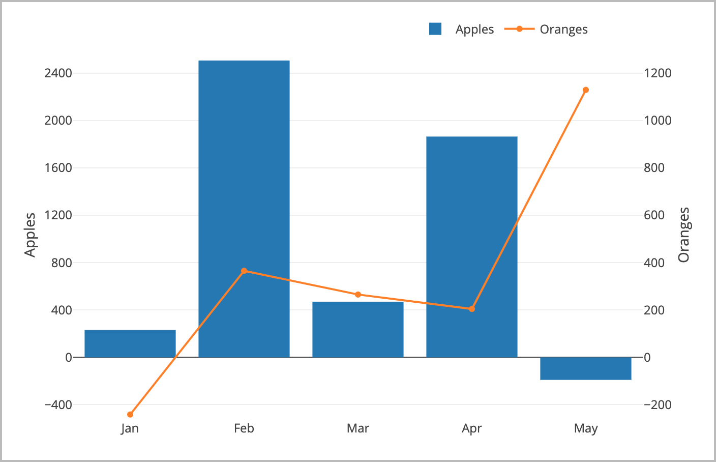
}If you've tinkered enough with the above code, you may have realized that it
doesn't exactly play nicely with negative data values.
The ability to incorporate and proportionally display negative values, is one
that we'll have to define addittional logic for. These additions are commented
pretty well in the source code of multiAxes.js, so we'll keep it short and
sweet here!
Two Major Changes:
- Instead of using y_max (0-maxValue) to calculate our initial d_ticks, we have to use y_range (minValue-MaxValue). This allows us to calculate margins that take the entire graph into consideration, and not just the positive values.
- We must find both the global_negative and global_positive ratios so that we can independently scale our range minimums and range maximums
The code increase from these changes is considerable, so I'll leave them in
multiAxes.js for you to look over! However, the graphs
we'll be able to render now are far more dynamic.
How do you make the grid-lines for multiples y-axes match up with eachother?
- calculate y-axis ranges
- round range to a nice number
- divide rounded-range by number of gridlines you want (this gives you your dtick value)
- divide your dtick value by the range to get the dtick ratio
- do this for all axes and take the greatest dtick ratio to be the global dtick ratio
- adjust the range maximums and minimums of all other axes so that they also have the global ratio
- once all of your axes have the same dtick_ratio, they will have the same number of gridlines, and therefor their gridlines will all be in-line with each other
