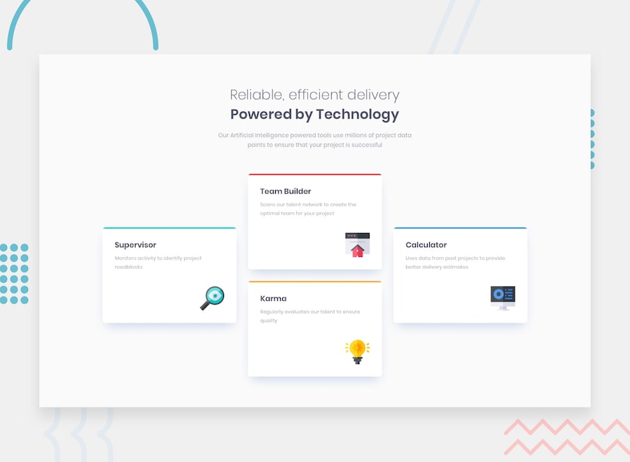
Thanks for checking out this front-end coding challenge.
Frontend Mentor challenges allow you to improve your skills in a real-life workflow.
To do this challenge, you need a basic understanding of HTML and CSS.
Your challenge is to build out this feature section and get it looking as close to the design as possible.
You can use any tools you like to help you complete the challenge. So if you've got something you'd like to practice, feel free to give it a go.
Your users should:
- View the optimal layout for the site depending on their device's screen size
Want some support on the challenge? Join our Slack community and ask questions in the #help channel.
Your task is to build out the project to the designs inside the /design folder. You will find both a mobile and a desktop version of the design to work to.
The designs are in JPG static format. This will mean that you'll need to use your best judgment for styles such as font-size, padding and margin. This should help train your eye to perceive differences in spacings and sizes.
If you would like the Sketch file in order to inspect the design in more detail it is available to purchase here.
You will find all the required assets in the /images folder. The assets are already optimized.
There is also a style-guide.md file, which contains the information you'll need, such as color palette and fonts.
Practice using version control by creating your own GitHub repository for this challenge. This has the added benefit of being able to publish the site for free on GitHub Pages. Find out more about GitHub Pages here: https://pages.github.com.
Another great tool you could use to get your website live is Netlify. They offer a very simple and intuitive way of deploying a site for free and linking the live version to your Git repository.
Also, you could try building this project in a team. This is a great way to practice collaborative coding.
Feel free to use any workflow that you feel comfortable with. Below is a suggested process, but do not feel like you need to follow these steps:
- Initialize your project as a public repository on GitHub. This will make it easier to share your code with the community if you need some help. If you're not sure how to do this, have a read through of this Try Git resource.
- Configure your repository to publish your code to GitHub Pages or Netlify.
- Look through the designs to start planning out how you'll tackle the project. This step is crucial to help you think ahead for CSS classes that you could create to make reusable styles.
- Before adding any styles, structure your content with HTML. Writing your HTML first can help focus your attention on creating well-structured content.
- Write out the base styles for your project, including general content styles, such as
font-familyandfont-size. - Start adding styles to the top of the page and work down. Only move on to the next section once you're happy you've completed the area you're working on.
There are multiple places you can share your solution:
- Submit it on the platform so that other users will see your solution on the site. Other users will be able to give you feedback, which could help improve your code for the next project.
- Share your repository and live URL in the #finished-projects channel of the Slack community.
- Tweet @frontendmentor and mention @frontendmentor including the repo and live URLs in the tweet. We'd love to take a look at what you've built and help share it around.
Feedback is always welcome, so if you have any to give on this challenge please email hi[at]frontendmentor[dot]io.
This challenge is completely free. Please share it with anyone who will find it useful for practice.
Have fun building! 🚀
