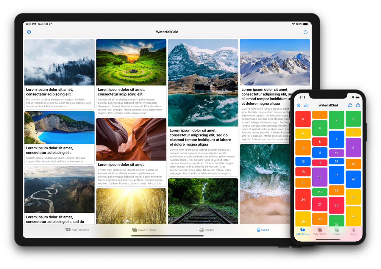
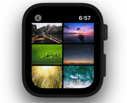
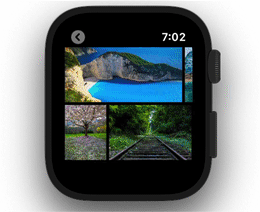
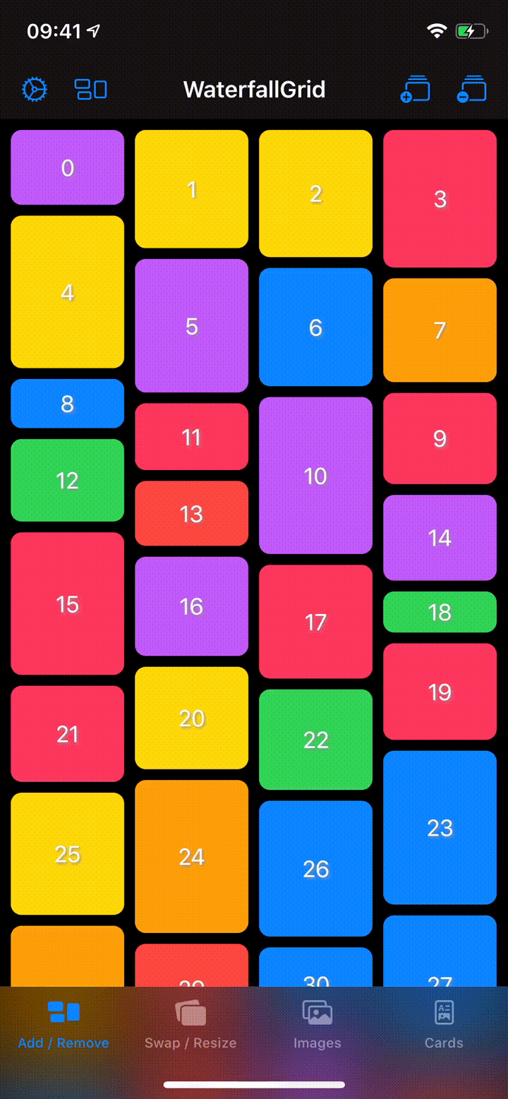
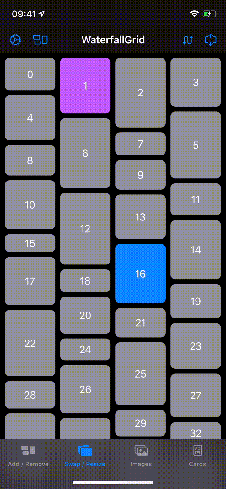
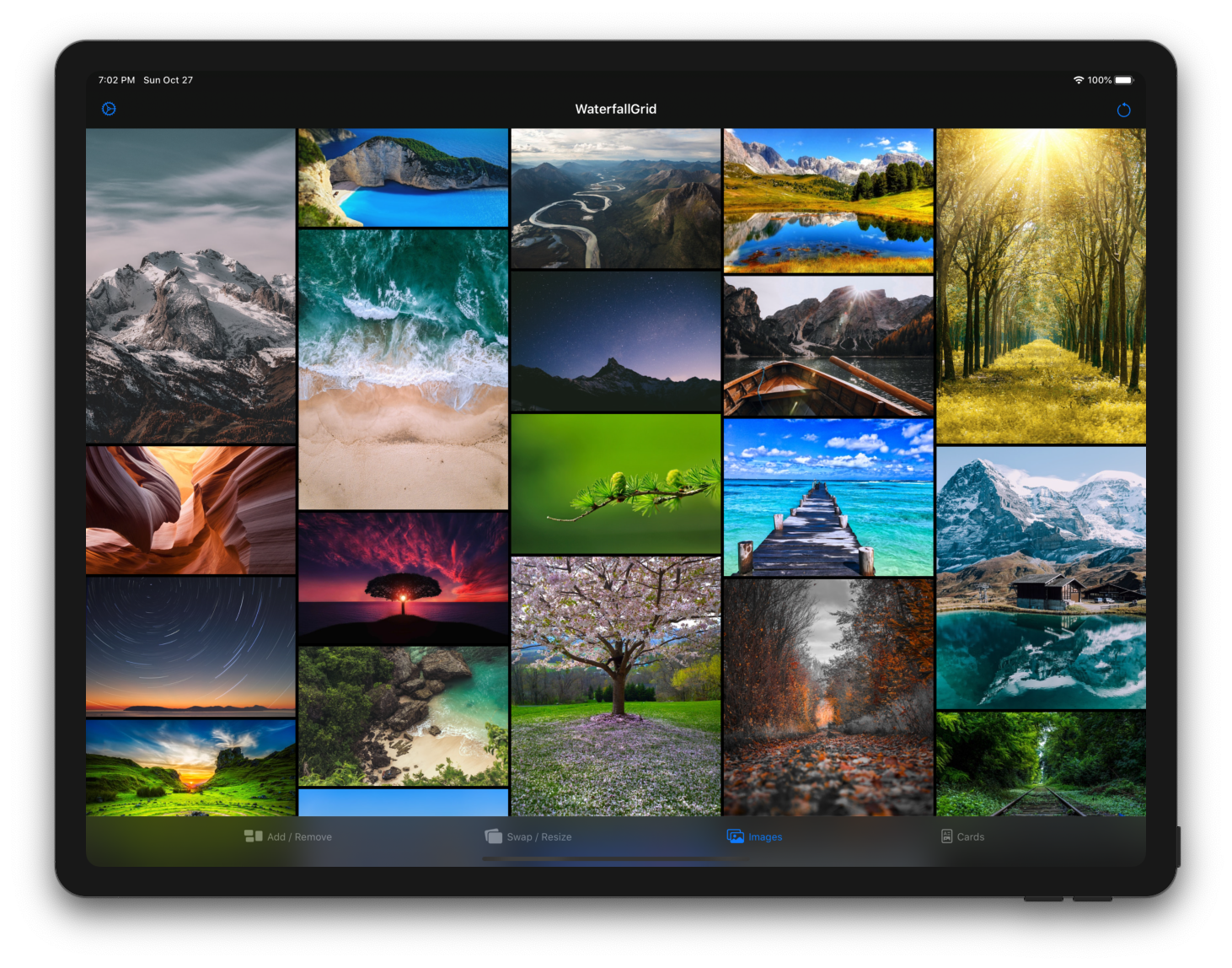
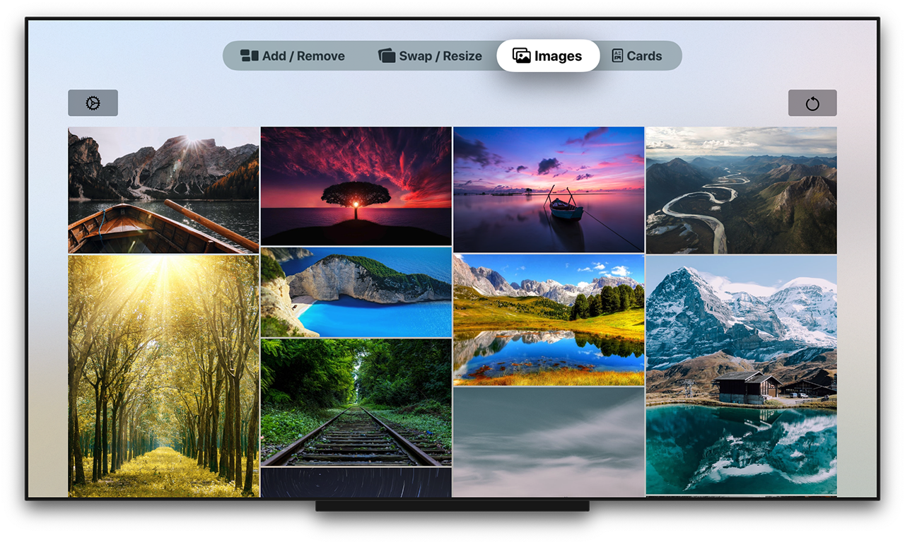
WaterfallGrid
A waterfall grid layout view for SwiftUI.


Features
- Irregular grid of content.
- Columns number different per device orientation.
- Spacing and grid padding customizable.
- Horizontal or vertical scroll direction.
- Items update can be animated.
Requirements
- iOS 13.0+ / macOS 10.15+ / tvOS 13.0+ / watchOS 6.0+
- Xcode 11.0+
- Swift 5.1+
Installation
Swift Package Manager
The Swift Package Manager is a tool for automating the distribution of Swift code and is integrated into the swift compiler.
Once you have your Swift package set up, adding WaterfallGrid as a dependency is as easy as adding it to the dependencies value of your Package.swift.
dependencies: [
  .package(url: "https://github.com/paololeonardi/WaterfallGrid.git", from: "0.4.0")
]
CocoaPods
You can install WaterfallGrid via CocoaPods by adding the following line to your Podfile:
pod 'WaterfallGrid', '~> 0.4.0'Run the pod install command to download the library
and integrate it into your Xcode project.
Usage
Initialization
You can create a grid that displays the elements of collection by passing your collection of data and a closure that provides a view for each element in the collection. The grid transforms each element in the collection into a child view by using the supplied closure.
WaterfallGrid works with identifiable data (like SwiftUI.List). You can make your data identifiable in one of two ways: by passing along with your data a key path to a property that uniquely identifies each element, or by making your data type conform to the Identifiable protocol.
Example 1
A grid of views of type Image from a collection of data identified by a key path.
WaterfallGrid((0..<10), id: \.self) { index in
  Image("image\(index)")
    .resizable()
    .aspectRatio(contentMode: .fit)
}
Example 2
A grid of views of type RectangleView from a collection of Identifiable data.
WaterfallGrid(rectangles) { rectangle in
  RectangleView(rectangle: rectangle)
}
or, for simple cases like this, just:
WaterfallGrid(rectangles, content: RectangleView.init)Grid Style
To customise the appearance of the grid call the gridStyle function and pass the parameters you want to customise.
Columns
WaterfallGrid(cards) { card in
  CardView(card: card)
}
.gridStyle(columns: 2)WaterfallGrid(cards, content: CardView.init)
.gridStyle(
columnsInPortrait: 2,
columnsInLandscape: 3
)Spacing and Padding
WaterfallGrid(rectangles, content: RectangleView.init)
.gridStyle(
  spacing: 8,
  padding: EdgeInsets(top: 16, leading: 8, bottom: 16, trailing: 8)
)
Animation
WaterfallGrid(rectangles, content: RectangleView.init)
.gridStyle(
  animation: .easeInOut(duration: 0.5)
)
Scroll Behaviour
Scroll direction & Indicators
WaterfallGrid(rectangles, content: RectangleView.init)
.scrollOptions(
  direction: .horizontal,
  showsIndicators: true
)
A Complete Example
WaterfallGrid(cards) { card in
  CardView(card: card)
}
.gridStyle(
  columnsInPortrait: 2,
  columnsInLandscape: 3,
  spacing: 8,
  padding: EdgeInsets(top: 16, leading: 8, bottom: 16, trailing: 8),
  animation: .easeInOut(duration: 0.5)
)
.scrollOptions(
  direction: .horizontal,
  showsIndicators: true
)
Sample App
Explore the WaterfallGridSample app for some more detailed and interactive examples.

Versioning
For the versions available, see the releases on this repository.
Contributing
Contributions are more than welcome. Please create a GitHub issue before submitting a pull request to plan and discuss implementation.
Author
Credits
WaterfallGrid was ispired by the following projects:
- QGrid - https://github.com/Q-Mobile/QGrid
- Grid - https://github.com/SwiftUIExtensions/Grid
- The SwiftUI Lab - https://swiftui-lab.com
License
WaterfallGrid is available under the MIT license. See the LICENSE file for more info.