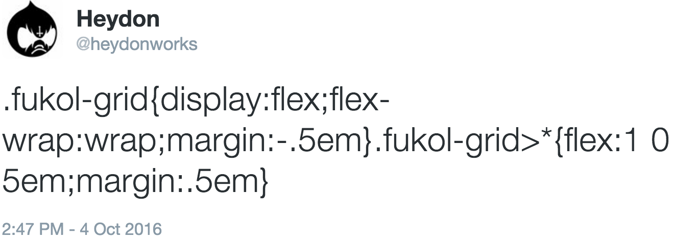
Fukol™ is a lightweight, breakpoint free, completely responsive, element query driven*, progressive enhancement based CSS grid framework. It exists in this README.md file, in the section titled The CSS (below). It is 93 bytes minified, fitting comfortably inside a tweet:
Just edit the lines marked 'edit me!' to your requirements and write an HTML structure like the one illustrated in the section titled The HTML (also below).
(* Not really, but kind of. See 3 under Notes, below.)
.fukol-grid {
  display: flex; /* 1 */
  flex-wrap: wrap; /* 2 */
  margin: -0.5em; /* 5 (edit me!) */
}

.fukol-grid > * {
  flex: 1 0 5em; /* 3 (edit me!) */
  margin: 0.5em; /* 4 (edit me!) */
}<div class="fukol"> <!-- 6 -->
<ul class="fukol-grid">
<li><!-- grid cell/item/child/whatever --></li>
<li><!-- grid cell/item/child/whatever --></li>
<li><!-- grid cell/item/child/whatever --></li>
<li><!-- grid cell/item/child/whatever --></li>
<li><!-- grid cell/item/child/whatever --></li>
<li><!-- grid cell/item/child/whatever --></li>
<li><!-- grid cell/item/child/whatever --></li>
<li><!-- grid cell/item/child/whatever --></li>
</ul>
</div>- Fukol™ is a Flexbox based grid system. Even Opera Mini supports Flexbox. Older user agents that don't support Flexbox ignore the
display: flexdeclaration, degrading to a single column layout. No harm done. - This line determines how items are handled. The
wrapvalue means items will start a new row if there's not enough room on the current one. - This is the 'element query' part. Instead of setting an arbitrary number of columns and using breakpoints, we decide roughly how wide we want the item to be (
5emin the example — the flex basis) and make sure items can grow to use the available space (1) but not shrink (0). So only change the5emvalue and leave1 0as it is. - This is for gutters. A
0.5emmargin here means gutters of1em(the margins double up). - This should always be a negative version of 4. It compensates for the margins created by the items. It makes sure the outside of the
.fukol-gridcontainer remains flush horizontally and no additional margin is added to the vertical flow. - The
class="fukol"container in the HTML snippet enables you to add positive margins around the grid — not possible with just.fukol-gridbecause this uses negative margins (see 5). It also suppresses horizontal scrolling issues which occur under certain circumstances.
Sometimes you want certain items to be narrower or wider. Maybe you want the fifth item to always be approximately twice the size of a regular item (where space permits). If the regular flex-basis is 5em, then…
.fukol-grid > *:nth-child(5) {
  flex-basis: 10em;
}
Don't worry, flexbox will make sure there aren't any gaps.
You can choose a percentage based width for individual items, but remember to adjust for the gutter margin with by subtracting it using calc. For example, to make the first item 100% in width when the gutter width is 1em, use:
.fukol-grid > *:first-child {
  flex-basis: calc(100% - 1em);
}
Warning: Internet Explorer does not respect box-sizing on flex-basis items. In which case, if you use percentage widths, you cannot pad the flex item directly. You will need to insert child nodes inside flex items and pad them instead.
<div class="fukol"> <!-- 6 -->
  <ul class="fukol-grid">
    <li>
      <div><!-- pad this --></div>
    </li>
  </ul>
</div>Flexbox supports rtl already. Just add dir="rtl" to the .fukol-grid element and the flex direction will automatically be reversed.
- How do I install Fukol™? Is it on bower/npm? You install it by copy/pasting it from this
README.mdfile. See the The CSS section above. - How do I pronounce Fukol? Fukol is pronounced "the square root of fuck all".
- Is Fukol™ the answer to all my grid system hopes and dreams? No. Fukol™ is just a servicable solution, written with very little code.
- Why are there a load of old dicks in the Fukol™ logo? Are you some sort of misogynist? No, fuck the patriarchy. There are a load of old dicks in Fukol™'s logo because grid systems are a load of old dicks.
- Is there a Sass version? Yes: inside your head.
That's it.


