A simple utility class to add a background, an icon and a label to a RecyclerView item while swiping it left or right.
Get it via Gradle
implementation 'it.xabaras.android:recyclerview-swipedecorator:1.2.2'or Maven
<dependency>
  <groupId>it.xabaras.android</groupId>
  <artifactId>recyclerview-swipedecorator</artifactId>
  <version>1.2.2</version>
  <type>pom</type>
</dependency>
Or download the latest AAR and add it to your project's libraries.
Here is a non-comprehensive guide to RecyclerViewSwipeDecorator for any further information you can reference the library javadoc, the sources and/or the sample app sources.
Create an ItemTouchHelper.SimpleCallback, instantiate an ItemTouchHelper with this callback and attach it to your RecyclerView
ItemTouchHelper.SimpleCallback callback = new ItemTouchHelper.SimpleCallback(0, ItemTouchHelper.RIGHT | ItemTouchHelper.LEFT) {
    @Override
    public boolean onMove(RecyclerView recyclerView, RecyclerView.ViewHolder viewHolder, RecyclerView.ViewHolder target) {
        return false;
    }

    @Override
    public void onSwiped(RecyclerView.ViewHolder viewHolder, int direction) {
        // Take action for the swiped item
    }
};
ItemTouchHelper itemTouchHelper = new ItemTouchHelper(callback);
itemTouchHelper.attachToRecyclerView(recyclerView);
Override the onChildDrawn method of your SimpleCallback object
@Override
public void onChildDraw (Canvas c, RecyclerView recyclerView, RecyclerView.ViewHolder viewHolder,float dX, float dY,int actionState, boolean isCurrentlyActive){
    super.onChildDraw(c, recyclerView, viewHolder, dX, dY, actionState, isCurrentlyActive);
}
Create a RecyclerViewSwipeDecorator using the RecyclerViewSwipeDecoratorBuilder and call the decorate() method
public void onChildDraw (Canvas c, RecyclerView recyclerView, RecyclerView.ViewHolder viewHolder,float dX, float dY,int actionState, boolean isCurrentlyActive){

    new RecyclerViewSwipeDecorator.Builder(c, recyclerView, viewHolder, dX, dY, actionState, isCurrentlyActive)
            .addBackgroundColor(ContextCompat.getColor(MainActivity.this, R.color.my_background))
            .addActionIcon(R.drawable.my_icon)
            .create()
            .decorate();

    super.onChildDraw(c, recyclerView, viewHolder, dX, dY, actionState, isCurrentlyActive);
}You can choose different background/icon combinations for left and right swipe directions by using direction specific methods in the Builder object. If you want you can add a label for each swiping direction or setting the icon tint.
A method to set the action icon margin from the view left/right bound it available too.
Add a background color to both swiping directions
Add an action icon to both swiping directions
Set the tint color for either (left/right) action icons
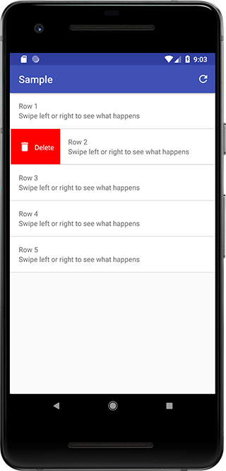
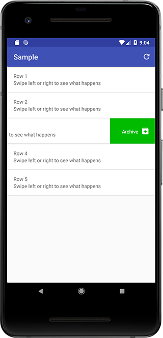
Add a background color to the view while swiping right.
Add an action icon while swiping right (it's suggested to use 24dp square vector drawables.).
Set the tint color for action icon shown while swiping right
Add a background color to the view while swiping left.
Add an action icon while swiping left (it's suggested to use 24dp square vector drawables.).
Set the tint color for action icon shown while swiping left
##### public Builder setIconHorizontalMargin(int iconHorizontalMargin) #####
[Deprecated] Set icon horizontal margin from left/right bound of the view (default is 16dp).
Set icon horizontal margin from left/right bound of the view (default is 16dp). N.B. unit is a TypedValue (e.g. TypedValue.COMPLEX_UNIT_DIP)
Add a label to be shown while swiping right
Set the color of the label to be shown while swiping right
Set the size of the label to be shown while swiping right N.B. unit is a TypedValue (e.g. TypedValue.COMPLEX_UNIT_SP)
Set the Typeface of the label to be shown while swiping right
Add a label to be shown while swiping left
Set the color of the label to be shown while swiping left
Set the size of the label to be shown while swiping left N.B. unit is a TypedValue (e.g. TypedValue.COMPLEX_UNIT_SP)
Set the Typeface of the label to be shown while swiping left