Tab Indicator is a powerful bottom navigation widget, It provides some configuration options and good control the appearance and operational requirements.
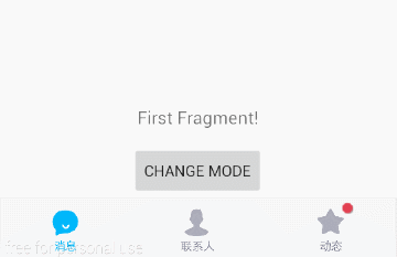
simple example

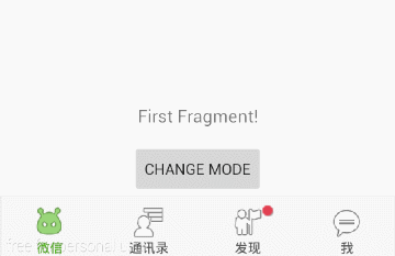
Page navigation example
Enhanced Page navigation example
If you are building with Gradle, simply add the following line to the dependencies section of your build.gradle file:
compile 'com.kevin:tabindicator:1.0.2'
To add the LoopView to your application, specify com.kevin.tabindicator.TabIndicator in your layout XML.
<com.kevin.tabindicator.TabIndicator
    android:id="@+id/tab_indicator_act_ti"
    android:layout_width="match_parent"
    android:layout_height="60dp"
    android:background="@drawable/tabbg"
    kevin:tabSelectedColor="#3F51B5"
    kevin:tabSelectedIcons="@array/qq_selected_icon"
    kevin:tabTextSize="12sp"
    kevin:tabUnselectedColor="#555555"
    kevin:tabUnselectedIcons="@array/qq_normal_icon" />
TabIndicator mTabIndicator = (TabIndicator) this.findViewById(R.id.tab_indicator_act_ti);
mTabIndicator.setOnTabSelectedListener(new TabPageIndicatorEx.OnTabSelectedListener() {

    @Override
    public void onTabSelected(int index) {
        mTextView.setText("Page"+(index+1));
        }
    });
If you decide to use TabIndicator as a view, you can define it in your xml layout like this:
<declare-styleable name="TabIndicator">
    <!-- Icon array, application in a single icon gradient -->
    <attr name="tabIcons" format="reference" />
    <!-- Selected icon array -->
    <attr name="tabSelectedIcons" format="reference" />
    <!-- unselected icon array -->
    <attr name="tabUnselectedIcons" format="reference" />
    <!-- Text array -->
    <attr name="tabLabels" format="reference" />
    <!-- Selected color -->
    <attr name="tabSelectedColor" format="reference|color" />
    <!-- unselected color -->
    <attr name="tabUnselectedColor" format="reference|color" />
    <!-- Text font size -->
    <attr name="tabTextSize" format="dimension" />
    <!-- The item padding -->
    <attr name="tabItemPadding" format="dimension" />
    <!-- Whether the gradient switch -->
    <attr name="tabGradualChange" format="boolean" />
    <!-- Indicator size -->
    <attr name="TabIndicatorSize" format="dimension" />
</declare-styleable>
// set ViewPager
mTabPageIndicatorEx.setViewPager(mViewPager);
// Setting specifies the position indicator to show whether or not the point
mTabPageIndicatorEx.setIndicateDisplay(2, true);
// Monitor switch settings
mTabPageIndicatorEx.setOnTabSelectedListener(new TabPageIndicatorEx.OnTabSelectedListener() {

    @Override
    public void onTabSelected(int index) {
            mViewPager.setCurrentItem(index, false);
    }
});
Copyright 2015 Kevin zhou

Licensed under the Apache License, Version 2.0 (the "License");
you may not use this file except in compliance with the License.
You may obtain a copy of the License at

   http://www.apache.org/licenses/LICENSE-2.0

Unless required by applicable law or agreed to in writing, software
distributed under the License is distributed on an "AS IS" BASIS,
WITHOUT WARRANTIES OR CONDITIONS OF ANY KIND, either express or implied.
See the License for the specific language governing permissions and
limitations under the License.