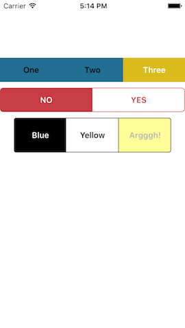
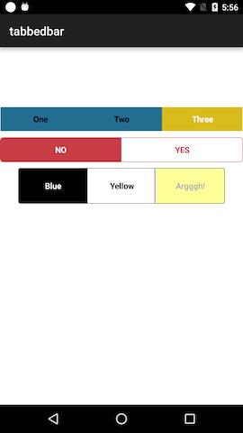
#Tabbed Bar Widget
Cross-platform segmented control (TabbedBar) widget for Appcelerator Titanium apps, by @skypanther
This is an Alloy widgetized version of my old segmented control component with some updated code and options.
Note: This widget uses a custom component on both iOS and Android. In other words, it does not fall back to Ti.UI.iOS.TabbedBar.
Installation and usage
Recommended
$ gittio install com.skypanther.segmentedcontrol###Manual method (works, but why not use gittio?):
- Download this repo (git clone, zip, whatever)
- Copy the widgets/com.skypanther.segmentedcontrol to your project's widgets folder
- Update your app/config.json to add:
"dependencies": {
    "com.skypanther.segmentedcontrol": "1.0.1"
}
In your XML file, add the widget:
<Widget src="com.skypanther.segmentedcontrol" id="tbar" top="100"/>Add styling as desired in your tss:
"#tbar": {
	borderRadius: 6,
	borderColor: "#C73C45",
	selectedButtonColor: "#C73C45",
	unselectedButtonColor: "#fff",
	selectedButtonTextColor: "#fff",
	unselectedButtonTextColor: "#C73C45",
	index: 0,
	withDividers: true,
	font: {
		fontWeight: 'bold',
		fontSize: '15'
	}
}
Initialize it in the controller:
$.tbar1.init(['One', 'Two', 'Three'], callback);

function callback(e) {
	alert('You clicked button ' + (e.index+1));
}
Styling options
You can set these style options in the TSS or in your XML tag.
| Property | Description | Default |
|---|---|---|
selectedButtonColor |
background color of the selected button |
#d9bc1b (yellow) |
unselectedButtonColor |
background color of buttons that are not selected |
#226e92 (blue) |
selectedButtonTextColor |
color of text on the selected button |
#fff |
unselectedButtonTextColor |
color of text on unselected buttons |
#000 |
disabledTextColor |
color of text on a disabled button |
#aaa (light grey) |
disabledButtonBackgroundColor |
background color of a disabled button |
#444 (dark grey) |
font |
font properties of the button labels |
{fontFamily: 'Avenir-Light', fontSize: 11} (ios){fontWeight: 'normal', fontSize: '15dp'} (android) |
withDividers |
whether to add dividers between button (color matches selected backgroundcolor) | false |
Additionally, most other properties you set on the widget (via its xml tag or id/class selectors) will be passed down to the widget's components.
Methods
| Method | Notes |
|---|---|
init(labels, callback) |
You must call this method to initialize the control, passing to it an array of labels and a function to be called when a button is tapped. That function will receive an object whose index property is the number of the button that was tapped |
select(num) |
Selects the button specified |
setIndex(num) |
Synonym for select() |
deselect(num) |
Deselects (unselects) the button specified |
enable() |
Enables click events for the whole control |
disable() |
Disables click events for the whole control |
deselectAll() |
Deselects all the buttons in the control |
disableButton(num) |
Disables the specified button, making it unclickable while the rest remain clickable |
enableButton(num) |
Enables the specified button, making it clickable. |
disableAllButtons() |
Disable all buttons, making them all unclickable. Essentially the same as disable() |
enableAllButtons() |
Enable all buttons, making them all clickable unless you have called disable(). In that case, you'd need to call enable() |
History
- 16-Feb-2016: Ver 1.0.3 resolves last button in set not filling entire area on iPhone 6s+
- 08-Feb-2016: Ver 1.0.2 resolves issue where selecting/setIndexing a button didn't deselect the other buttons
- 05-Feb-2016: Ver 1.0.1 resolves layout issues on larger iOS devices when using percentage-based widths
- 29-Jan-2016: Initial release of the widget-ized version of my old Classic-style component
- Ancient history, like 2011, initial release with a few interim releases thereafter
Limitations
- I have not tested this with more than 3 buttons. Too many and it will surely fail.
- I haven't tested it on a tablet. Layout might be screwed up.
- I'm pretty sure it won't handle rotation of the device well.
- It doesn't support anything fancy, like icons instead of text on the buttons. Note: it will support icon fonts for your text labels, so you can achieve a similar effect.
Contributions are welcome!
#License / Copyright
© 2016 Tim Poulsen
MIT licensed

