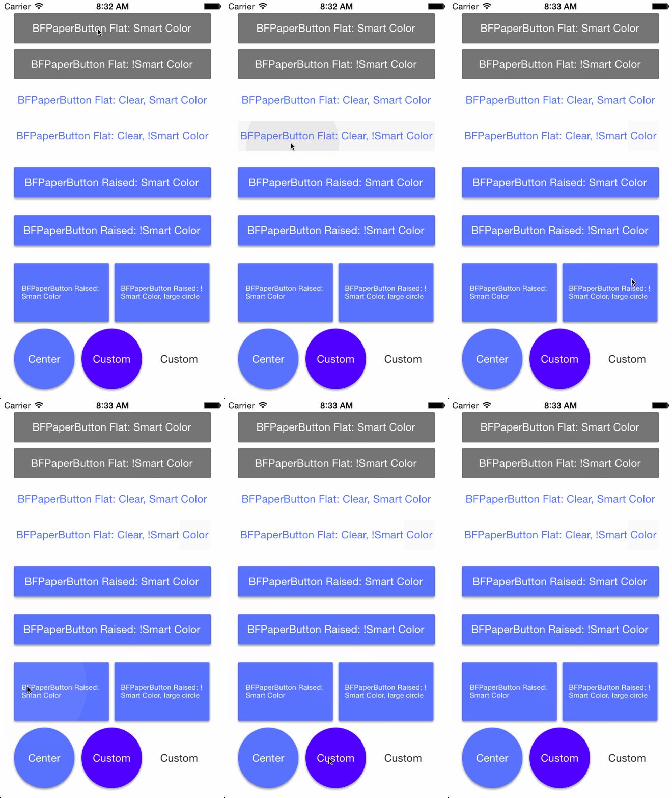
A flat button inspired by Google Material Design's Paper theme.
BFPaperButton is a subclass of UIButton that behaves much like the new paper buttons from Google's Material Design Labs. All animation are asynchronous and are performed on sublayers. BFPaperButtons work right away with pleasing default behaviors, however they can be easily customized! The corner radius, tap-circle color, background fade color, and tap-circle diameter are all readily customizable via public properties.
BFPaperButtons come in 2 flavors, Flat or Raised. Flat BFPaperButtons have no shadow and will remain flat through all animations. Flat buttons can be transparent, in which case the background will also fade a little when tapped. Raised BFPaperButtons have a drop shadow that animates along with a tap, giving it the feeling of raising up with your touch. Raised BFPaperButtons do not look good with a clear background color since it will expose their shadow layer underneath.
By default, BFPaperButtons use "Smart Color" which will match the tap-circle and background fade colors to the color of the titleLabel.
You can turn off Smart Color by setting the property, .usesSmartColor to NO. If you disable Smart Color, a gray color will be used by default for both the tap-circle and the background color fade.
You can set your own colors via: .tapCircleColor and .backgroundFadeColor. Note that setting these disables Smart Color.
Note that setting the button type to Custom in the Storyboard is required to prevent the title from fading out on UIControlStateHighlighted.
CGFloat cornerRadius
The corner radius which propagates through to the sub layers.
BOOL usesSmartColor
A flag to set YES to use Smart Color, or NO to use a custom color scheme. While Smart Color is the default (usesSmartColor = YES), customization is cool too.
UIColor *tapCircleColor
The UIColor to use for the circle which appears where you tap. NOTE: Setting this defeats the "Smart Color" ability of the tap circle. Alpha values less than 1 are recommended.
UIColor *backgroundFadeColor
The UIColor to fade clear backgrounds to. NOTE: Setting this defeats the "Smart Color" ability of the background fade. An alpha value of 1 is recommended, as the fade is a constant (clearBGFadeConstant) defined in the BFPaperButton.m. This bothers me too.
CGFloat tapCircleDiameter
The CGFloat value representing the Diameter of the tap-circle. By default it will be calculated to almost be big enough to cover up the whole background. Any value less than zero will result in default being used. Three pleasing sizes, bfPaperButton_tapCircleDiameterSmall, bfPaperButton_tapCircleDiameterMedium, and bfPaperButton_tapCircleDiameterLarge are also available for use.
BOOL rippleFromTapLocation
A flag to set to YES to have the tap-circle ripple from point of touch. If this is set to NO, the tap-circle will always ripple from the center of the button. Default is YES.
BOOL rippleBeyondBounds
A flag to set to YES to have the tap-circle ripple beyond the bounds of the button. If this is set to NO, the tap-circle will be clipped to the button's bounds. Default is NO.
BOOL isRaised
A flag to set to YES to CHANGE a flat button to raised, or set to NO to CHANGE a raised button to flat. If you used one of the provided custom initializers, you should probably leave this parameter alone. If you instantiated via storyboard or IB and want to change from riased to flat, this is the parameter for you!
####RAISED Has a shadow, so a clear background will look silly. It has only a tap-circle color. No background-fade.
####FLAT Has no shadow, therefore clear backgrounds look fine. If the background is clear, it also has a background-fade color to help visualize the button and its frame.
####SMART COLOR Will use the titleLabel's font color to pick a tap circle color and, if the background is clear, will also pick a lighter background fade color.
####NON SMART COLOR Will use a translucent gray tap-circle and, if the background is clear, a lighter translucent gray background-fade color.
Add the BFPaperButton header and implementation file to your project. (.h & .m)
BFPaperButton *flatPaperButton = [[BFPaperButton alloc] initWithFrame:rect raised:NO];BFPaperButton *raisedPaperButton = [[BFPaperButton alloc] initWithFrame:rect raised:YES];(Taken directly from example project.)
BFPaperButton *bfFlatSmart = [[BFPaperButton alloc] initWithFrame:CGRectMake(20, 20, 280, 43) raised:NO];
[bfFlatSmart setTitle:@"BFPaperButton Flat: Smart Color" forState:UIControlStateNormal];
bfFlatSmart.backgroundColor = [UIColor paperColorGray600];	// This is from the included cocoapod "UIColor+BFPaperColors".
[bfFlatSmart setTitleColor:[UIColor whiteColor] forState:UIControlStateNormal];
[bfFlatSmart setTitleColor:[UIColor whiteColor] forState:UIControlStateHighlighted];
[bfFlatSmart addTarget:self action:@selector(buttonWasPressed:) forControlEvents:UIControlEventTouchUpInside];
[self.view addSubview:bfFlatSmart];(Taken directly from example project.)
BFPaperButton *circle2 = [[BFPaperButton alloc] initWithFrame:CGRectMake(116, 468, 86, 86) raised:YES];
[circle2 setTitle:@"Custom" forState:UIControlStateNormal];
[circle2 setTitleColor:[UIColor whiteColor] forState:UIControlStateNormal];
[circle2 setTitleColor:[UIColor whiteColor] forState:UIControlStateHighlighted];
[circle2 addTarget:self action:@selector(buttonWasPressed:) forControlEvents:UIControlEventTouchUpInside];
circle2.backgroundColor = [UIColor colorWithRed:0.3 green:0 blue:1 alpha:1];
circle2.tapCircleColor = [UIColor colorWithRed:1 green:0 blue:1 alpha:0.6];  // Setting this color overrides "Smart Color".
circle2.cornerRadius = circle2.frame.size.width / 2;
circle2.rippleFromTapLocation = NO;
circle2.rippleBeyondBounds = YES;
circle2.tapCircleDiameter = MAX(circle2.frame.size.width, circle2.frame.size.height) * 1.3;
[self.view addSubview:circle2];CocoaPods are the best way to manage library dependencies in Objective-C projects. Learn more at http://cocoapods.org
Add this to your podfile to add BFPaperButton to your project.
platform :ios, '7.0'
pod 'BFPaperButton', '~> 1.5.6'BFPaperButton uses the MIT License:
Please see included LICENSE file.

