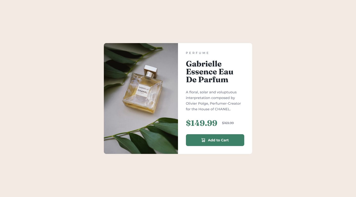
It's my first completed frontend mentor challenge - this one can be found here: Product preview card component challenge on Frontend Mentor.
Goals:
- Code a fully responsive page
- Add active states to the button to indicate interaction.
Screenshots of the finished challenge:
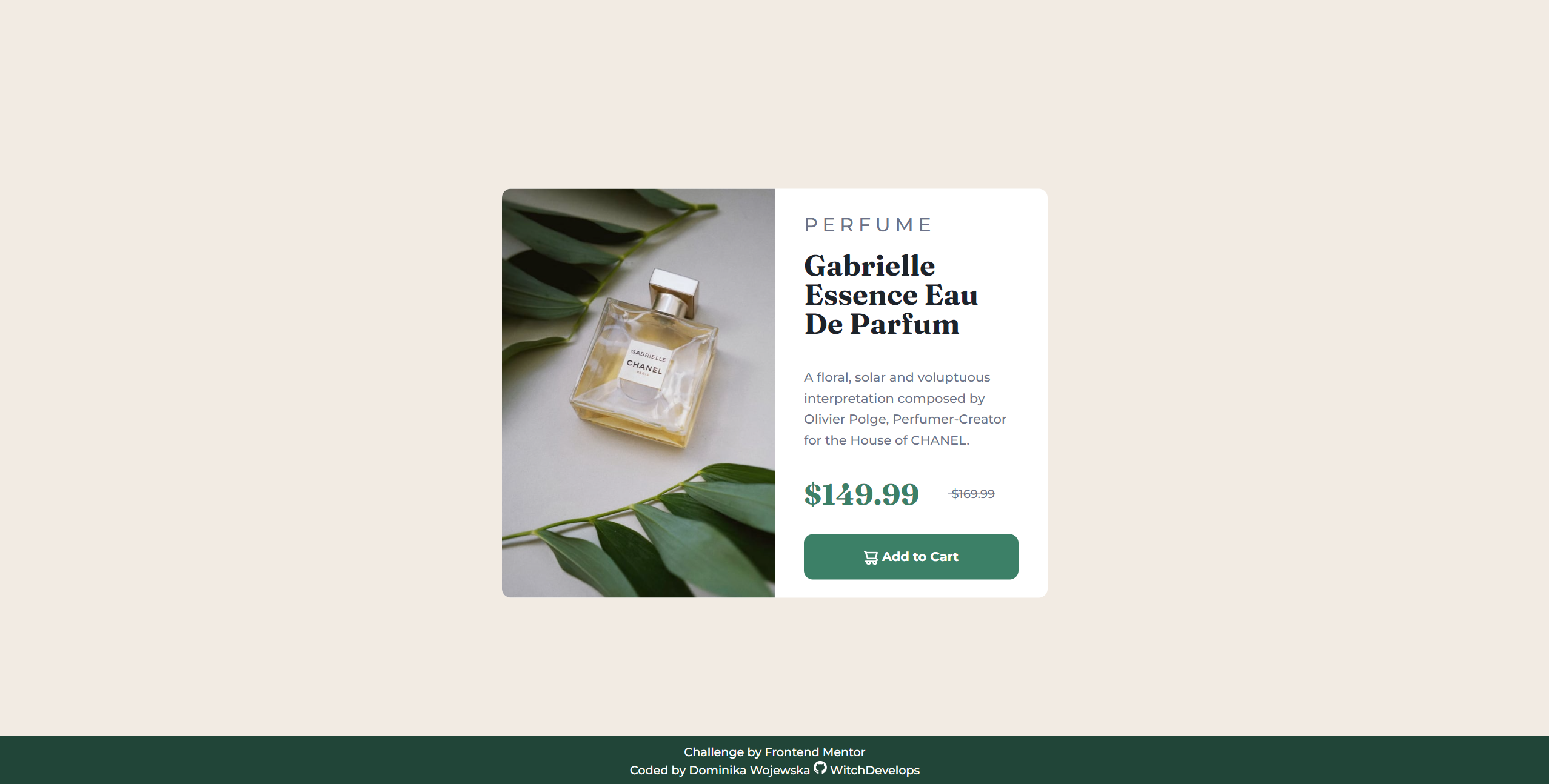
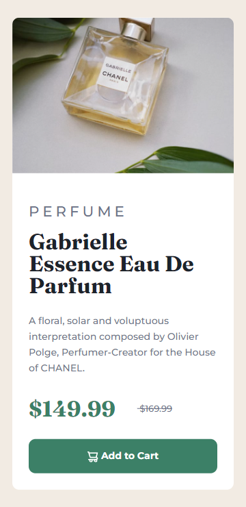
Live solution can be viewed here: https://witchdevelops.github.io/product-card/
- semantic HTML5 markup
- CSS custom properties
- Flexbox
- Mobile-first workflow
- Responsive web design principles
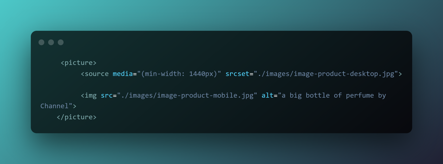
I learned about the picture tag! It allows to provide a set of alternative images and let the browser decide which image to serve, based on provided requirements (like viewport width and resolution). It's very useful, as it helps to optimize the experience for the end user.
Here is a code snippet that illustrates this:
It tells the browser to serve a bigger image on wider screens, with having a fallback image for older browsers and smaller screen sizes. I will definitely use it more in the future.
