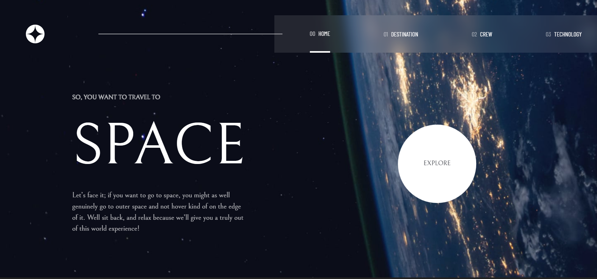
This is a solution to the Space tourism website challenge on Frontend Mentor. Frontend Mentor challenges help you improve your coding skills by building realistic projects.
Users should be able to:
- View the optimal layout for each of the website's pages depending on their device's screen size
- See hover states for all interactive elements on the page
- View each page and be able to toggle between the tabs to see new information
- Semantic HTML5 markup
- CSS custom properties
- Flexbox
- CSS Grid
- Mobile-first workflow
- React - JS library
- Tailwindcss
- Animate.css library
- Aos(Animate on scroll package)
- React-Router
This was a frontend mentor project and was one of my exciting ones using react. I used tailwindcss and it's crazy how I could build a whole component without needing a css file. For the explore button on the home page, I had to use the Animate.css library to create the animation I needed and also the animate on scroll package(Aos) was installed to create a smooth scrolling effect on mobile devices. My major challenge while creating this website was to implement an active navlink indicator. I tried googling but to no avail. I opted to youtube where I found the solution using the NavLink component provided from react-router-dom
import { NavLink} from 'react-router-dom';This was also my first time practicing with an already made design on figma. I learnt a ton. And Oh! I shouldn't also forget the fact that I used git for version control. I deleted a file once by mistake. Git came to the rescue!!
Right now, I want to focus on building more projects to improve my css skills; using tailwindcss ofcourse. I would also like to start solving algorithm challenges, maybe starting with leetcode problems.
- Animate.css library - This helped me to create animations without needing to code it from scratch. I used it for the explore button on the home page and also on the navbar when viewed on a mobile screen
- Animate on Scroll - This is an amazing package to create a smooth scrolling effect on mobile devices. It also works well on laptop and tablet sizes
