react-native-wheel-datepicker
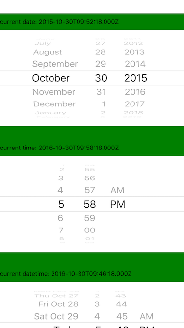
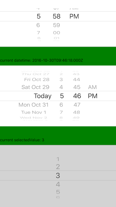
A iOS style picker and datepicker components for ReactNative.
- Original repository by @lesliesam: react-native-wheel-picker.
- Fork by @wusuopu who added the real cross platform behavior and datepicker react-native-wheel-picker.
This is the third fork of repository and its targeted to support and maintain current code. I asked github team to make it my own as is all pull requests goes directly to @lesliesam original repository but it seems to be no longer maintained.
Introduction
Cross platform Picker component for React-native.
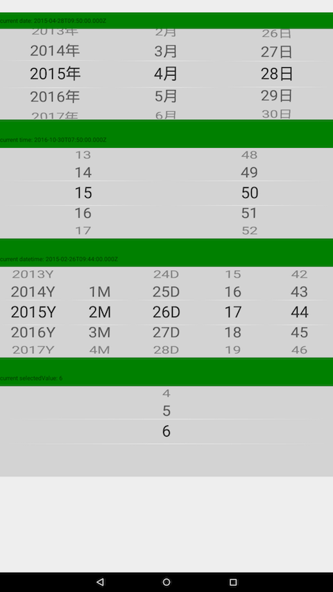
Since picker is originally supported by iOS while Android only supports a ugly Spinner component. If you want to have the same user behaviour, you can use this.
The android component is based on wheel-picker which runs super fast and smoothly. It also supports curved effect which make it exactly the same looking and feel as the ios picker.
How to use
Run command
For apps using RN 0.32 or higher, please run
npm i react-native-wheel-datepicker --save
For apps using RN 0.31 or less, please run
npm install --save --save-exact react-native-wheel-datepicker@1.9.0
Configration:
react-native link react-native-wheel-datepicker
Ingegration with CustomDatePickerIOS
By default, package provides default DatePickerIOS on the iOS side to simplify usage on both platforms.
You can install react-native-custom-datepicker-ios package if you need textColor functionality on IOS platform.
Just install:
npm i react-native-custom-datepicker-ios
// or
yarn add react-native-custom-datepicker-ios
link dependencies:
react-native link react-native-custom-datepicker-ios
And register CustomDatePickerIOS inside react-native-wheel-datepicker package.
import { registerCustomDatePickerIOS } from 'react-native-wheel-datepicker';
import CustomDatePickerIOS from 'react-native-custom-datepicker-ios';

registerCustomDatePickerIOS(CustomDatePickerIOS);
Then you can use textColored components for both platforms inside render function!
import { DatePicker } from 'react-native-wheel-datepicker';

// ...
render() {
  return (
    <DatePicker
      mode="date"
      textColor="green"
    />
  )
}
Example code
import { Picker, DatePicker, AreaPicker } from 'react-native-wheel-datepicker';

// use DatePicker
<DatePicker
  mode="date"
/>

// use Picker
<Picker
  style={{ flex: 1 }}
  selectedValue={1}
  pickerData={[1, 2, 3, 4, 5, 6]}
  onValueChange={value => this.setState({ value })}
/>

// use AreaPicker
<AreaPicker
  areaJson={AreaJson}
  onPickerCancel={() => { }}
  onPickerConfirm={(value) => {
      alert(JSON.stringify(value));
  }}
  ref={ref => this.AreaPicker = ref} />


