https://rpubs.com/Nishapaudel/DESeq2_sex_wise_dfs
https://sbc.shef.ac.uk/workshops/2020-02-13-rnaseq-r/rna-seq-de.nb.html
https://mkempenaar.github.io/gene_expression_analysis/chapter-3.html#loading-data
https://github.com/frankRuehle/systemsbio
to Everyone To follow Dr. Cédric Scherer:
-
webpage: https://cedricscherer.com
-
link tree: https://linktr.ee/cedscherer Slides
Additional Course Resources
- Script: https://github.com/z3tt/exciting-extensions/blob/main/script.R
- Asap typeface: https://fonts.google.com/specimen/Asap
About Me
- my webpage: https://cedricscherer.com
- My link tree: https://linktr.ee/cedscherer
new pallette color
https://jakubnowosad.com/rcartocolor/
https://r-graph-gallery.com/38-rcolorbrewers-palettes.html
Yan Holtz Talk -----> https://github.com/holtzy/Talk
repo r awesome-ggplot2 https://github.com/erikgahner/awesome-ggplot2
Thematic Maps with R https://rcarto.github.io/RUG_HDSI/#/title-slide
SDS 375 Schedule Spring 2023 https://wilkelab.org/SDS375/schedule.html https://twitter.com/RosanaFerrero
create and share beautiful images of your source code with carbon at: https://carbon.now.sh/
or create a new repository on the command line
echo "# house_design" >> README.md
git init
git add README.md
git commit -m "first commit"
git branch -M main
git remote add origin https://github.com/Yedomon/house_design.git
git push -u origin main
…or push an existing repository from the command line
git remote add origin https://github.com/Yedomon/house_design.git
git branch -M main
git push -u origin main
…or push an existing repository from the command line
git remote add origin https://github.com/Yedomon/house_design.git
git branch -M main
git push -u origin main
Deploy in github.io or netflix https://www.freecodecamp.org/news/publish-your-website-netlify-github/
How To Make A Personal Website with Hugo -- https://matteocourthoud.github.io/post/website/
Configure git with Rstudio --- https://gist.github.com/Z3tt/3dab3535007acf108391649766409421
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
14.10.2023
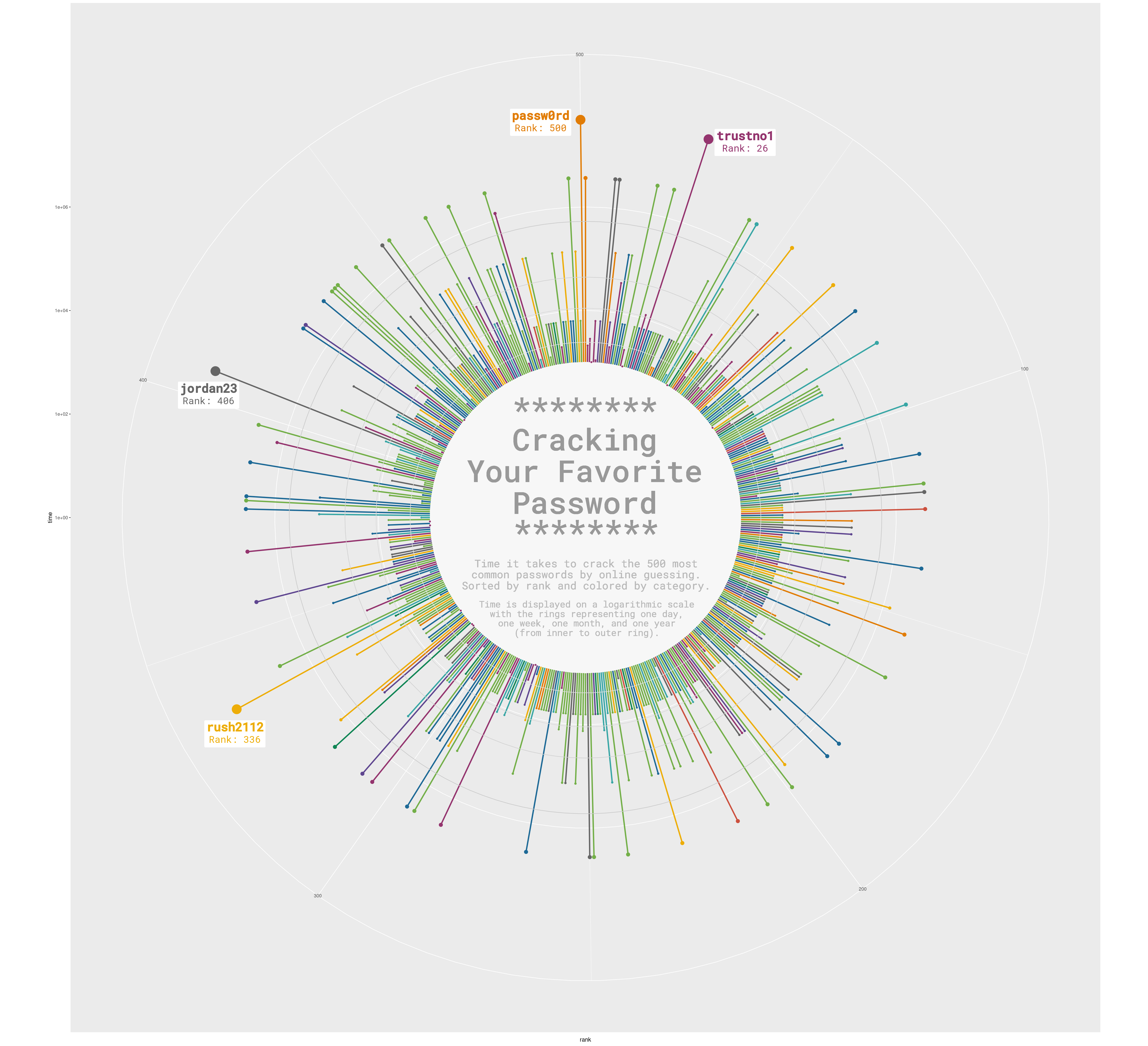
Here we go for this week #TidyTuesday about human and veterinary medecines. I visualized the companies holding the most authorizations in Europe.
HD graphic and #RStats code: http://bit.ly/3TmUKa8 Data from European Medicines Agency.

10.03.2023
https://twitter.com/tanya_shapiro/status/1634214864435462146
Liked the look of this lollipop chart by The Economist. I wanted to see if I could recreate it with ggplot.
Right: Plot by The Economist Left: Recreation in ggplot
Code: https://bit.ly/3ZAsWRK or https://github.com/tashapiro/tanya-data-viz/blob/main/recreate-economist-lollipop/recreate-economist-plot.R

webR 0.1.0 has been released
https://docs.r-wasm.org/webr/latest/
https://www.tidyverse.org/blog/2023/03/webr-0-1-0/
https://www.dataviz-inspiration.com/ for somme inspiration
line graph with highligthed specific line ----> https://r-graph-gallery.com/web-line-chart-small-multiple-all-group-greyed-out.html

Tutorial R https://dblogr.com/tag/r-tutorial/ gwas https://dblogr.com/academic/gwas_tutorial/
Create and share beautiful images of your source code with carbon
Alexander Wireko Kena | easyplotlabelr | gencoder | genetica
Creating your personal website using Quarto
Wikipedia data, but make it 𝘴𝘦𝘹𝘺
Tables are underestimated. With R packages like {gt} and {reactable}, you can do A LOT.
My latest table - Grand Slam Tennis Legends 🎾
GitHub Code: https://bit.ly/3fIN4zv

smplot: An R Package for Easy and Elegant Data Visualization
Use ggbreak to Effectively Utilize Plotting Space to Deal With Large Datasets and Outliers
e-chart for R | github | youtube
New palette color | Tweet | Github

get some colors hints usefull for paper and inkscape
https://github.com/karthik/wesanderson #install it and plot and grab the color code
First Steps in Learning the Use of Git & GitHub in RStudio https://youtu.be/jN6tvgt3GK8 via @YouTube #rstats #rstudio
https://twitter.com/rmarkdown/status/1581000522546307072
CV in R

https://www.anabellelaurent.com/slides/rladies_pagedown/cvwithpagedown#1
https://fontawesome.com/v4/icon/globe
https://fontawesome.com/search?q=award&o=r
https://bookdown.org/yihui/rmarkdown/document-templates.html?version=2022.07.0%2B548&mode=desktop
Today 28 July 2022
I perform a buble plot based on KOBAS-i result
the script and data are here

Today 5 July 2022
Faire n bonCV avec R
J'ai aime le plus simple c'est celui de Eric Scott
Mais j'aime bien celui de Lorena Abad
Today 23 May 2022

Today 12 May 2022

Today 11 May 2022
I discovered IdeoViz a greta too to plot in linear way the density or any genomic variable. But the question is how to do it?
We need basiccally four major steps
To install this package, start R (version "4.2") and enter:
if (!require("BiocManager", quietly = TRUE))
    install.packages("BiocManager")

BiocManager::install("IdeoViz")
library(IdeoViz)
library(RColorBrewer) # For coloring
To make ideo data you just need to create a dataframe table like this:
 chrom chromStart chromEnd   name gieStain
  chr1          0  2300000 p36.33     gneg
  chr1    2300000  5300000 p36.32   gpos25
  chr1    5300000  7100000 p36.31     gneg
  chr1    7100000  9200000 p36.23   gpos25
  chr1    9200000 12600000 p36.22     gneg
  chr1   12600000 16100000 p36.21   gpos50
The first three columns are enough if you don't have the citoband info.
Basically we need to prepare a file containing
- seqnames : chr1
- ranges: 1-100000 the bin
- group1: GC content density value for example
- group2: Snp coverage for example
To do so import in R each GC and snp content coverage files
# fileA = "GC.coverage"
# fileB = "snp.coverage"

A = read.table(fileA, as.is = T, sep="\t", header=F)
B = read.table(fileB, as.is = T, sep="\t", header=F)
Then create the genomic range object by usiong Granges function
data = GRanges(A$V1, IRanges(start = A$V2, end = A$V3) )
mcols(data)$group1 = scale(B$V4) - 2
mcols(data)$group2 = scale(A$V4) + 2
with
- A$V1 : the chromosome ID info
- IRanges(start = A$V2, end = A$V3): the bin start and end of the bin
- mcols(data)$group1 = scale(B$V4) - 2 : create GC content info named group1 by scaleing the value - 2 | or simply keep your own value
- cols(data)$group2 = scale(A$V4) + 2 : create GC content info named group1 by scaleing the value + 2 | or simply keep your own value
plotOnIdeo(chrom = seqlevels(data),
           ideoTable = ideo,
           values_GR = data,
           value_cols = colnames(mcols(data)),
           col = c('orange', 'blue'),
           addScale = F,
           val_range=c(-5,5),
           plotType='lines',
           plot_title = paste("Differrence between", gsub(".coverage","",fileA), gsub(".coverage","",fileB), "bin",windows_size),
           cex.axis = 0.8,
           chromName_cex = 0.6,
           vertical = T)
References
The code chunk example 1 fit well my work
###################################################
### code chunk number 2: example1
###################################################
ideo <- getIdeo("hg18")
head(ideo)
plotOnIdeo(chrom=seqlevels(binned_multiSeries), # which chrom to plot?
           ideoTable=ideo, # ideogram name
           values_GR=binned_multiSeries, # data goes here
           value_cols=colnames(mcols(binned_multiSeries)), # col to plot
           col=brewer.pal(n=5, 'Spectral'), # colours
           val_range=c(0,10), # set y-axis range
           ylab="array intensities",
           plot_title="Trendline example")
tweet | Create beautiful documents with Quarto and R | video | Create beautiful documents with Quarto and R
RStudio Community Table Gallery
How to use Fonts and Icons in ggplot by @rappa753 | tweet | link
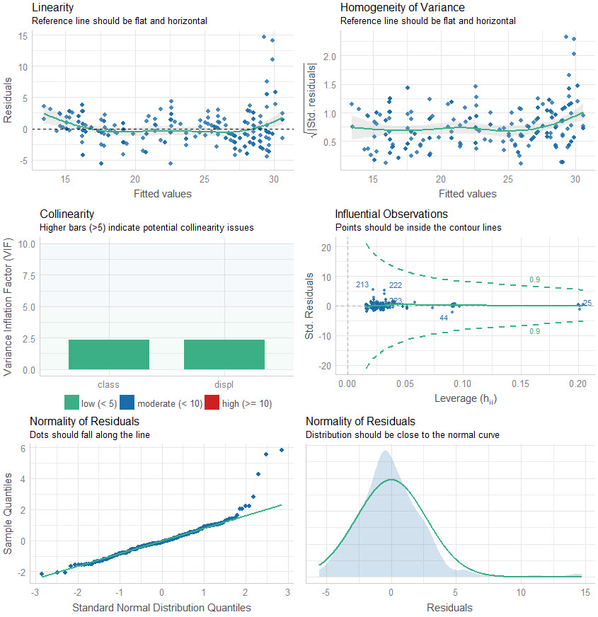
easystats: Quickly investigate model performance
How to use Fonts and Icons in ggplot
Hi all,
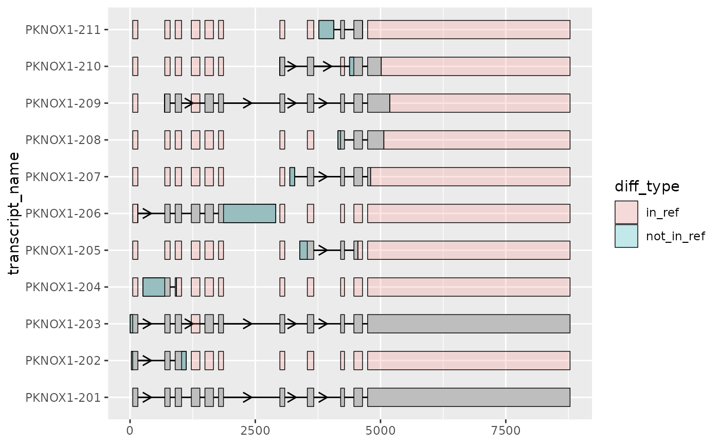
As a follow to the talk at the Iso-Seq social club today and for those of you that weren’t able to make it, we wanted to introduce ggtranscript.
GitHub: https://github.com/dzhang32/ggtranscript
Documentation: https://dzhang32.github.io/ggtranscript/
ggtranscript is a R package that makes it easy to visualise transcript structures and annotation (such as IsoSeq data). We hope you find it useful! As ggtranscript is currently in development, we would appreciate any feedback. For example, if there’s any additional functionality you would find useful, we would be happy to try implementing.
Best,
Emil and David
echarty github echarty website
Tania Shapiro Tweet | Inspi1 | Inspi2

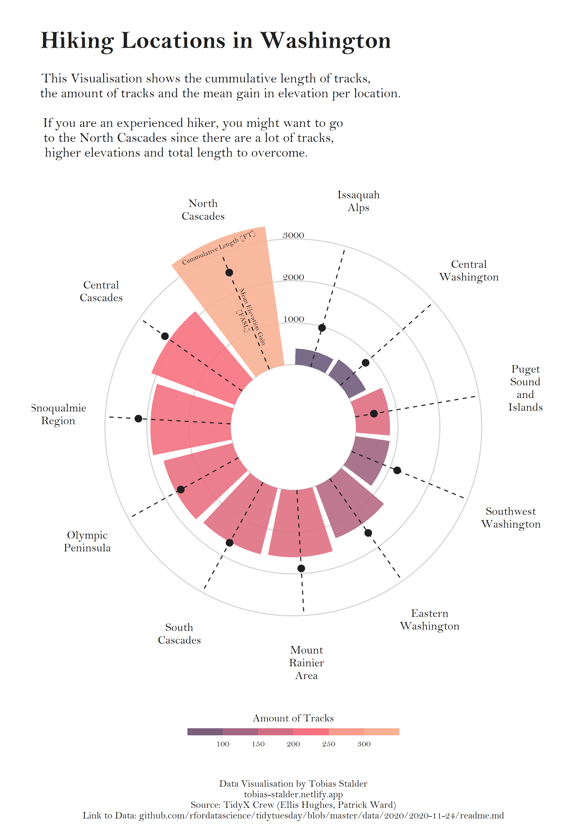
[ELEGANT CIRCULAR BAR PLOT](https://www.r-graph-gallery.com/web-circular-barplot-with-R-and-ggplot2.html
The data set was like this:
> head(data_exp)
   Feature_GID Time        Exp        Genes high
1 Sto11g362400   T0 -0.4531269 Sto11g362400  sto
2 Sto08g235580   T0 -0.5096497 Sto08g235580  sto
3 Sto05g126830   T0 -0.3566379 Sto05g126830  sto
4 Sto03g086740   T0 -0.4585065 Sto03g086740  sto
5 Sto06g193230   T0 -0.3875058 Sto06g193230  sto
6 Sto13g408840   T0 -0.5491300 Sto13g408840  sto
The following code was employed
# check the working directory

getwd()


# Package

library(ggplot2)
library(dplyr)


# data import


data_exp = read.csv("clustering-MJ-05.csv", sep = ",", h = T)

View(data_exp)


names(data_exp)


data_highlight =  data_exp  %>%
    filter(high == "sto")


View(data_highlight)


# Plot line graph

#data_exp$Time = with(data_exp, reorder(T0,T1,T3,T6,T24))

ggplot() +
  geom_line(aes(x = Time, y = Exp,  group= Feature_GID), colour = alpha("grey", 0.4), data = data_exp) +
  geom_line(aes(x = Time, y = Exp, group= Feature_GID, color = Genes), size = 1, data = data_highlight) +
  scale_x_discrete(limits = c("T0", "T1", "T3", "T6", "T24")) +
  theme_bw()


Lollipop plots with ggplot2 in R

Tanya Shapiro | Code Doctor Who is the best

Tania Shapiro | Code Peloton Active Days Calendar

Tania Shapiro | Code Peloton Data Summary | Online Source

Tania Shapiro | Code Nobel Prize

Tania Shapiro | Code Spider

Introducing portfoliodown: The Data Science Portfolio Website | Example
https://shaziaruybal.com/publications/

FACETTING
How to facet_wrap with special order and number of column or row
Abdou Majid tweet | Data | Code
# Load libraries ----------------------------------------------------------
library(tidyverse)
library(ggtext)
library(patchwork)

# Data Reading and Wrangling ----------------------------------------------
matches <- readr::read_csv('https://raw.githubusercontent.com/rfordatascience/tidytuesday/master/data/2021/2021-11-30/matches.csv')

# Countries Flags Links
countries_flags <- tribble(
  ~country, ~flag_path,
  "England", "https://a.espncdn.com/i/teamlogos/cricket/500/1.png",
  "India", "https://a1.espncdn.com/combiner/i?img=/i/teamlogos/cricket/500/6.png",
  "New Zealand","https://a1.espncdn.com/combiner/i?img=/i/teamlogos/cricket/500/5.png",
  "Pakistan", "https://a.espncdn.com/i/teamlogos/cricket/500/7.png",
  "South Africa", "https://a.espncdn.com/i/teamlogos/cricket/500/3.png",
  "Sri Lanka", "https://a.espncdn.com/i/teamlogos/cricket/500/8.png",
  "West Indies", "https://a.espncdn.com/i/teamlogos/cricket/500/4.png",
  "Zimbabwe", "https://a.espncdn.com/i/teamlogos/countries/500/zim.png",
  "Australia", "https://a1.espncdn.com/combiner/i?img=/i/teamlogos/cricket/500/2.png",
  "Bangladesh",  "https://a.espncdn.com/i/teamlogos/cricket/500/25.png",
  "Kenya", "https://a.espncdn.com/i/teamlogos/countries/500/ken.png",
  "Netherlands", "https://a.espncdn.com/i/teamlogos/countries/500/ned.png"
)

# Compute Teams Average Score for each year
teams_scorings <- matches %>%
  pivot_longer(c(team1, team2), names_to = "Teams_names", values_to = "Teams") %>%
  mutate(
    score = case_when(Teams_names == "team1" ~ score_team1,
                      TRUE ~ score_team2),
    year = lubridate::year(parse_date(match_date, format = "%b %d, %Y"))
  )  %>%
  select(Teams, score, year) %>%
  group_by(Teams, year) %>%
  summarise(mean_score = mean(score)) %>%
  ungroup()

# Retrieve most common teams
top_12 <- teams_scorings %>%
  count(Teams) %>%
  slice_max(order_by = n, n = 12) %>%
  pull(Teams)

# Establish yearly ranking
scorings_rankings <- teams_scorings %>%
  drop_na() %>%
  filter(Teams %in% top_12) %>%
  complete(Teams, year, fill = list(mean_score = 0)) %>%
  group_by(year) %>%
  mutate(
    rk = rank(desc(mean_score),ties.method = "first")
  ) %>%
  ungroup() %>%
  left_join(countries_flags, by = c("Teams" = "country")) %>%
  arrange(Teams)  %>%
  mutate(
    fancy_strip = glue::glue("<img src='{flag_path}' width='45' height='45'><br>{str_to_upper(Teams)}"),
    fancy_strip = fct_inorder(fancy_strip)
  )

scorings_rankings_alt <- scorings_rankings %>%
  mutate(Teams_alt = fancy_strip) %>%
  select(-fancy_strip)


top_12_confrontations <- matches %>%
  complete(team1, team2) %>%
  mutate(is_played = !is.na(match_date)) %>%
  rowwise() %>%
  mutate(pair = sort(c(team1, team2)) %>% paste0(collapse = ",")) %>%
  count(pair, wt = is_played, sort = T) %>%
  separate(pair, into = c("Team1","Team2"), sep =",") %>%
  filter(if_all(.cols =c(Team1, Team2),  ~ . %in% top_12))

# Graphic -----------------------------------------------------------------
# Yearly Rankings Plot
(scoring_rk_plot <- ggplot() +
   geom_line(data = scorings_rankings_alt,
             aes(year, rk, group = Teams_alt), size = 1.5, color = "grey65") +
   geom_point(data = scorings_rankings_alt, aes(year, rk), fill = "white" , color = "grey65", shape = 21,size = 2, stroke = 1) +
   geom_line(data = scorings_rankings, aes(year, rk, group = fancy_strip), size = 3.5, color = "#B10DC9") +
   geom_point(data = scorings_rankings, aes(year, rk), size = 5, stroke = 2,shape = 21, color = "#B10DC9", fill = "white") +
   labs(
     x = NULL,
     title = "International Cricket Council",
     subtitle = "<b>Ranking of the average scores of the best nations<br> between 1996 and 2005</b>"
   ) +
   scale_y_reverse(
     name = NULL,
     breaks = 1:12
   ) +

   scale_x_continuous(
     breaks = 1996:2005,
     position = "top"
   ) +
   facet_wrap(vars(fancy_strip), strip.position = "bottom") +
   coord_cartesian() +
   theme_minimal() +
   theme(
     panel.grid = element_blank(),
     panel.spacing.x = unit(0.5, "cm"),
     panel.spacing.y = unit(1, "cm"),
     strip.text = element_markdown(size = rel(2), color = "white", family =  "Verlag", face = "bold"),
     strip.background = element_rect(fill = "#111111", color = NA),
     axis.text = element_text(size = rel(1.15),color = "#111111", family =  "Verlag")
   )
)

# Confrontations Heatmap
(confrontations_plot <- top_12_confrontations %>%
    ggplot(aes(fct_rev(str_to_upper(Team1)), str_to_upper(Team2), fill = n)) +
    geom_tile(height = 1, width = 1, color = "white") +
    # TODO , color = after_scale(prismat) After scale
    geom_text(data = filter(top_12_confrontations, Team1 != Team2),
              aes(label = n,
                  color = after_scale(prismatic::best_contrast(fill))),
              size = 10, family = "Gotham Bold") +
    labs(
      x = NULL,
      y = NULL,

      subtitle = "<b>Most common confrontations</b><br>
      <i>
      <span>The India–Pakistan cricket rivalry took place **58** times over the period.</span><br>
      <span>**35** wins for Team **Pakistan**, **23** for Team **India**.</span>
      </i>"
    ) +
    scale_x_discrete(position = "top") +
    colorspace::scale_fill_continuous_sequential(
      palette = "RdPu",
      name = "nb of matches",
      breaks = seq(0,60, by = 10),
      guide = guide_coloursteps(
        barwidth = unit(15, "cm"),
        barheight = unit(1.5, "cm"),
        title.position = "top",
        title.hjust = .5
      )
    ) +
    coord_equal() +
    theme_minimal() +
    theme(
      axis.text = element_text(size = rel(2.25), family = "Verlag", face = "bold", color = "#111111"),
      axis.text.x = element_text(angle = 60, hjust = 0),
      legend.direction = "horizontal",
      legend.position = c(.35, .15),
      legend.title = element_text(size = rel(4.5), family = "Verlag"),
      legend.text = element_text(size = rel(3.5),  family = "Verlag"),
      legend.background = element_rect(fill = "#dcdcdc", color = NA),
      panel.grid.major.x = element_blank(),
      panel.grid.major.y = element_line(color = "grey25", linetype = "dotted")
    )
)

# Combine Plots
(combine_plot <- (scoring_rk_plot / confrontations_plot) +
    plot_layout(
      ncol = 1,
      heights = c(.9,1)
    ) +
    plot_annotation(
      caption = "Data from  from ESPN Cricinfo by way of Hassanasir.\n Tidytuesday Week-49 2021 · Abdoul ISSA BIDA."
    ) &
    theme(
      text = element_text(family = "Gotham Book", color = "#111111"),
      plot.title = element_markdown(size = rel(7.5), family = "Gotham Bold" , hjust = .5, margin = margin(t = 10, b = 5)),
      plot.subtitle = element_markdown(size = rel(4.5), family = "Mercury", margin = margin(t = 15, b = 15), hjust = .5, lineheight = 1.25),
      plot.background = element_rect(fill = "#dddddd", color = NA),
      plot.margin = margin(t= 1, r = 1, b = 1, unit = "cm"),
      plot.caption = element_text(size = rel(2.5), hjust = .5, margin = margin(b = .5, unit = "cm"))
    )
)

# Saving ------------------------------------------------------------------
path <- here::here("2021_w49", "tidytuesday_2021_w49")
ggsave(filename = glue::glue("{path}.pdf"), width = 27.5, height = 35.5, device = cairo_pdf)

pdftools::pdf_convert(
  pdf = glue::glue("{path}.pdf"),
  filenames = glue::glue("{path}.png"),
  dpi = 640
)
Output

Memory limits issue
I followed to the help page of memory.limit and found out that on my computer R by default can use up to ~ 1.5 GB of RAM and that the user can increase this limit. Using the following code,
>memory.limit()
[1] 1535.875
> memory.limit(size=1800)
helped me to solve my problem.
From alignment to tree construction
We need MAFFT, trimAL and IQTree
vi run_phylo.sh

#!/bin/bash

set -e

##############################################################################
# The following  script was designed for a specific working directory.
# For reproduction, please proceed to an adaptation of your working directory.
##############################################################################

# Created on Thursday November 042020.

# Author: Yedomon Ange Bovys Zoclanclounon | National Institute of Agricultural Science | Rep. Korea

# Version:1

cd /NABIC/HOME/yedomon1/lea_genes/01_data/genome

#---Variable declaration

genes=si_lea_genes.pepno.asterisk.renamedfasta

#---multiple sequence alignment

source activate mafft_env
mafft --maxiterate 1000 --localpair --thread 96 $genes > ${genes}.mafft
source deactivate mafft_env

#---alignment trimming
source activate trimal_env
trimal -automated1 -in ${genes}.mafft -out ${genes}.mafft.trimal
source deactivate trimal_env

#---Maximum Likehood tree construction with automatic model selection for each gene
source activate iqtree_env
iqtree -s ${genes}.mafft.trimal -nt AUTO
source deactivate iqtree_env

#--End

$ /usr/bin/time -o out.time.ram.txt -v bash run_phylo_lea_in.sh &> log.si_lea &
Use ggvendiagram.
Nota Bene: When all columns have the same length ======> that is fine. But when the lengths are different proceed by creatin a separated dataframe tha should be convert into vector. Then merge thos vector into a list. Then rename it by providing the category name as described in the following script.
##########################################Summary##############################

# Step 1: LOAD LIBRARIES

library(ggVennDiagram)
library(ggplot2)


# sTEP 2: LOAD DATA FRAMES OF EACH SET SEPARATELY TO AVOID EMPTY CELL ISSUE

T1_data = read.csv("t1_test.csv", sep = ",")
T3_data = read.csv("t3_test.csv", sep = ",")
T6_data = read.csv("t6_test.csv", sep = ",")
T24_data = read.csv("t24_test.csv", sep = ",")


# STEP 3: CHANGE DATFRAME INTO VECTOR FORMAT


t1 = T1_data$T1
t3 = T3_data$T3
t6 = T6_data$T6
t24 = T24_data$T24


# STEP 4: MAKE LIST FORMAT OF OUR DATASET

data_list = list(t1, t3, t6, t24)


# STEP 5: RUN DEFAULT COMMAND


ggVennDiagram(data_list)


# STEP 6: RENAME CATEGORY

data_list_renamed = list(T1 = t1, T3 = t3, T6 = t6, T24 = t24)


# STEP 7:RE RUN

ggVennDiagram(data_list_renamed)


# STEP 8: CUSTUMIZATION


ggVennDiagram(data_list_renamed, edge_size= 0, edge_lty = 0) +
  scale_fill_gradient(low="white",high = "#333366")
scale_x_discrete(limits = c("trt1", "ctrl", "trt2"))

scale_y_discrete(limits = c("trt1", "ctrl", "trt2"))
The current script is as follows
g = ggplot(GO_all, aes(x = GOName, y = Time, color = `PValue` )) +
  geom_point(data=GO_all,aes(x = GOName, y = Time, size = `FoldChange`), alpha=.7)+
  coord_flip()+
  theme_bw()+
  theme(axis.ticks.length=unit(-0.1, "cm"),
        axis.text.x = element_text(margin=margin(5,5,0,5,"pt")),
        axis.text.y = element_text(margin=margin(5,5,5,5,"pt")),
        axis.text = element_text(color = "black"),
        panel.grid.minor = element_blank(),
        legend.title.align=0.5)+
  xlab("Processes")+
  ylab("Time")+
  labs(color="P Value", size="Fold Change")+ #Replace by your variable names; \n allow a new line for text
  scale_color_gradient(low="green",high="red",limits=c(0, NA)) +
  guides(colour = guide_colourbar(order = 1),
            size = guide_legend(order=2))
here
guides(colour = guide_colourbar(order = 1),
            size = guide_legend(order=2))
helps to set color first and size in second position.
Ref: Source is here
Pheatmap Draws Pretty Heatmaps

Example case
# Package

library(pheatmap)


# Data

data_set = read.csv("pheatmap-Zscore01.csv", h = T, sep = ",", row.names = 1)


# Make a matrix

data_matrix = as.matrix(data_set)


# Scale the data


data_matrix_scaled = scale(data_matrix)


# Render the heatmap

pheatmap(data_matrix)


pheatmap(data_matrix,
         cluster_rows =  FALSE,
         cluster_cols = FALSE,
         show_rownames = FALSE,
         scale = "row",
         angle_col = "0")
markdown images in a row” Code Answer’s
grid style
Solarized dark | Solarized Ocean
:-------------------------:|:-------------------------:
 | 
Images side by side
<p float="left">
  <img src="/img1.png" width="100" />
  <img src="/img2.png" width="100" />
  <img src="/img3.png" width="100" />
</p>
Gantt chart
Beautiful Gantt charts with ggplot2
Building a data-driven CV with R
#------------------------------------------------------------------------
require(pacman)
pacman::p_load(RColorBrewer, ggspatial, raster,colorspace, ggpubr, sf,openxlsx)
#------------------------------------------------------------------------
Peru               <- getData('GADM', country='Peru', level=1) %>% st_as_sf()
Cuencas_peru       <- st_read ("SHP/Cuencas_peru.shp")
Rio_libe           <- st_read ("SHP/RIOS_LA_LIBERTAD_geogpsperu_SuyoPomalia_931381206.shp")
Rio_caja           <- st_read ("SHP/RIOS_CAJAMARCA_geogpsperu_SuyoPomalia_931381206.shp")
Cuencas_peru       <- st_transform(Cuencas_peru ,crs = st_crs("+proj=longlat +datum=WGS84 +no_defs"))
Rio_caja           <- st_transform(Rio_caja ,crs = st_crs("+proj=longlat +datum=WGS84 +no_defs"))
Rio_libe           <- st_transform(Rio_libe  ,crs = st_crs("+proj=longlat +datum=WGS84 +no_defs"))
Cuenca_Chicama     <- subset(Cuencas_peru , NOMB_UH_N5  == "Chicama")
Cuencas_rios1      <- st_intersection(Rio_caja, Cuenca_Chicama)
Cuencas_rios       <- st_intersection(Rio_libe, Cuenca_Chicama)
Cuencas_peru_c     <- cbind(Cuencas_peru, st_coordinates(st_centroid(Cuencas_peru$geometry)))

dem = raster("raster/ASTGTM_S08W080_dem.tif")
dem2 = raster("raster/ASTGTM_S08W079_dem.tif")
DEM_total<- raster::merge(dem, dem2,dem)

Cuenca_Chicama_alt     <- crop(DEM_total, Cuenca_Chicama)
Cuenca_Chicama_alt     <- Cuenca_Chicama_alt   <- mask(Cuenca_Chicama_alt  , Cuenca_Chicama)
plot(Cuenca_Chicama_alt )

dem.p          <-  rasterToPoints(Cuenca_Chicama_alt )
df             <-  data.frame(dem.p)
colnames(df) = c("lon", "lat", "alt")

aps            = terrain(Cuenca_Chicama_alt , opt = "aspect", unit= "degrees")
dem.pa          <-  rasterToPoints(aps  )
df_a            <-  data.frame(dem.pa)
#------------------------------------------------------------------------
Data     <- read.xlsx("Excel/Embrete.xlsx", sheet="Hoja2")
Data[1,1] <- "MAPA DE ELEVACION DE \nLA CUENCA, \nChicama"
Data[2,1] <- "Elaboradpor: \nGorky Florez Castillo"
Data[3,1] <- "Escala: Indicadas"
Data[4,1] <- "Sistemas de Coordenadas UTM \nZona 18S \nDatum:WGS84"
colnames(Data ) <- c("Mapa elaborado \nen  RStudio")
Tabla.p <- ggtexttable(Data, rows = NULL,theme =ttheme( base_size =6, "lBlackWhite"))

Data1     <- read.xlsx("Excel/Embrete.xlsx", sheet="Hoja1")
Tabla.p1 <- ggtexttable(Data1, rows = NULL,theme =ttheme( base_size =6, "mBlue"))
#-----------------------------------------------------------------------

A <-ggplot()+
  geom_raster(data = df, aes(lon,lat,fill = alt),alpha=0.75) +
  geom_raster(data = df_a, aes(x=x, y=y, alpha=aspect),fill="gray20")+
  scale_alpha(guide=FALSE,range = c(0,1.00))   +
  scale_fill_distiller(palette   = "RdYlBu",name="Elevacion \n(m.s.n.m)",
                       labels = c("[1 - 270] ","[270-400]", "[400-700]", "[700-1200]", "[1200-1700]",
                                  "[1700-2200]", "[2200-3500]", "[3500-3700]", "[3700-4100]", "[4100-4286]"),
                       breaks = c(0, 270, 400,700,1200,1700,2200,3500,3700,4100))+
  theme_bw()+coord_equal()+
  guides(fill = guide_legend(title.position = "top",direction = "vertical",
                             title.theme = element_text(angle = 0, size = 9, colour = "black"),
                             barheight = .5, barwidth = .95,
                             title.hjust = 0.5, raster = FALSE,
                             title = 'Elevacion \n(m.s.n.m)'))+
  geom_sf(data=Cuencas_rios, color="blue", size=0.3)+
  geom_sf(data=Cuencas_rios1, color="blue", size=0.3)+
  scale_x_continuous(name=expression(paste("Longitude (",degree,")"))) +
  scale_y_continuous(name=expression(paste("Latitude (",degree,")")))+
  annotation_north_arrow(location="tl",which_north="true",style=north_arrow_fancy_orienteering ())+
  ggspatial::annotation_scale(location = "br",bar_cols = c("grey60", "white"), text_family = "ArcherPro Book")+
  theme(legend.position = c(0.85,0.20),
        panel.grid.major = element_line(color = gray(.5),
                                        linetype = "dashed", size = 0.5),
        legend.background = element_blank(),
        plot.title=element_text(color="#666666", size=12, vjust=1.25,  family="Raleway",  hjust = 0.5),
        legend.box.just = "left",
        legend.text = element_text(size=9,face=2),
        legend.title = element_text(size=9,face=2))+
  guides(fill = guide_legend(nrow = 5, ncol=2))+
  annotation_custom(ggplotGrob(Tabla.p ),
                    xmin = -79.2, xmax = -79,ymin = -8.2,ymax = -8)+
  annotate(geom = "text", x = -78.7, y = -8.18,
           label = "Quieres desarrollar mapas de este tipo \n inscribete a \nAPRENDE R DESDE CERO PARA SIG ",
           fontface = "italic", color = "black", size = 3)

B <-ggplot()+
  geom_sf(data= Peru, fill="white")+
  geom_sf(data= Cuenca_Chicama, fill="red")+
  theme_minimal() +
  theme(
    axis.line = element_blank(),
    axis.text = element_blank(),
    axis.title = element_blank(),
    axis.ticks = element_blank(),
    panel.background = element_rect(colour= "black", size= 1))+
  annotation_north_arrow(location="tr",which_north="true",style=north_arrow_fancy_orienteering (),
                         height = unit(0.8, "cm"),# tamaño altura
                         width = unit(0.8, "cm"))+
  ggspatial::annotation_scale(location = "bl",bar_cols = c("grey60", "white"), text_family = "ArcherPro Book")+
  annotate(geom = "text", x = -78, y = -17,
           label = "Mapa de Macrolocalizacion",
           fontface = "italic", color = "black", size = 3)

C <-ggplot()+
  geom_sf(data= Peru, fill=NA)+
  geom_sf(data= Cuenca_Chicama, fill="gray")+
  theme_minimal() +
  theme(
    axis.line = element_blank(),
    axis.text = element_blank(),
    axis.title = element_blank(),
    axis.ticks = element_blank(),
    panel.background = element_rect(colour= "black", size= 1))+
  annotation_north_arrow(location="tr",which_north="true",style=north_arrow_fancy_orienteering (),
                         height = unit(0.8, "cm"),# tamaño altura
                         width = unit(0.8, "cm"))+
  ggspatial::annotation_scale(location = "bl",bar_cols = c("grey60", "white"), text_family = "ArcherPro Book")+
  annotate(geom = "text", x = -78.8, y = -8,
           label = "Mapa Departamental",
           fontface = "italic", color = "black", size = 2)+
  annotate(geom = "text", x = -78.8, y = -7.6,
           label = "Mapa Departamental",
           fontface = "italic", color = "black", size = 2)+
  coord_sf(xlim = c( -79.3,-78.1 ), ylim = c( -8.5,-6.9),expand = FALSE)


D <-ggplot()+
  geom_raster(data = df, aes(lon,lat,fill = alt), show.legend = F)+
  scale_fill_distiller(palette   = "RdYlBu",name="Elevacion \n(m.s.n.m)",
                       labels = c("[1 - 270] ","[270-400]", "[400-700]", "[700-1200]", "[1200-1700]",
                                  "[1700-2200]", "[2200-3500]", "[3500-3700]", "[3700-4100]", "[4100-4286]"),
                       breaks = c(0, 270, 400,700,1200,1700,2200,3500,3700,4100))+
  theme_bw()+coord_equal()+
  guides(fill = guide_legend(title.position = "top",direction = "vertical",
                             title.theme = element_text(angle = 0, size = 9, colour = "black"),
                             barheight = .5, barwidth = .95,
                             title.hjust = 0.5, raster = FALSE,
                             title = 'Elevacion \n(m.s.n.m)'))+
  scale_x_continuous(name=expression(paste("Longitude (",degree,")"))) +
  scale_y_continuous(name=expression(paste("Latitude (",degree,")")))+
  annotation_north_arrow(location="tl",which_north="true",style=north_arrow_fancy_orienteering ())+
  ggspatial::annotation_scale(location = "br",bar_cols = c("grey60", "white"), text_family = "ArcherPro Book")+
  theme(legend.position = c(0.65,0.15),
        panel.grid.major = element_line(color = gray(.5),
                                        linetype = "dashed", size = 0.5),
        legend.background = element_blank(),
        plot.title=element_text(color="#666666", size=12, vjust=1.25,  family="Raleway",  hjust = 0.5),
        legend.box.just = "left",
        legend.key.size = unit(0.3, "cm"), #alto de cuadrados de referencia
        legend.key.width = unit(0.3,"cm"), #ancho de cuadrados de referencia
        legend.text = element_text(size=8,face=2),
        legend.title = element_text(size=8,face=2))+
  guides(fill = guide_legend(nrow = 5, ncol=2))


E <-ggplot()+
  geom_raster(data = df, aes(lon,lat,fill = alt), show.legend = F) +
  geom_raster(data = df_a, aes(x=x, y=y, alpha=aspect), show.legend = F)+
  scale_fill_gradientn(colours = RColorBrewer::brewer.pal(n = 8, name = "Greys"),
                       na.value = 'white')+
  scale_x_continuous(name=expression(paste("Longitude (",degree,")"))) +
  scale_y_continuous(name=expression(paste("Latitude (",degree,")")))+
  annotation_north_arrow(location="tl",which_north="true",style=north_arrow_fancy_orienteering ())+
  ggspatial::annotation_scale(location = "bl",bar_cols = c("grey60", "white"), text_family = "ArcherPro Book")+
  theme_bw()


Fa <-ggplot() +
  coord_equal(xlim = c(0, 28), ylim = c(0, 20), expand = FALSE) +
  annotation_custom(ggplotGrob(A), xmin = 0, xmax = 20, ymin = 4, ymax = 20)+
  annotation_custom(ggplotGrob(B), xmin = 19.5, xmax = 23.5, ymin = 13.5, ymax = 20) +
  annotation_custom(ggplotGrob(C), xmin = 23.5, xmax = 28, ymin = 13.5, ymax = 20) +
  annotation_custom(ggplotGrob(D), xmin = 19.5, xmax = 28, ymin = 8, ymax = 14) +
  annotation_custom(ggplotGrob(E), xmin = 19.5, xmax = 28, ymin = 2, ymax = 8) +
  annotation_custom(ggplotGrob(Tabla.p1 ),
                    xmin = 4, xmax = 10,ymin = 0,ymax = 4)+
  theme_bw()+
  labs(title="MAPA DE ELEVACIONES CUENCA CHICAMA",
       subtitle="Elevacion con aspecto con ggplot",
       caption="Fuente: https://www.geogpsperu.com/2018/08/descargar-imagenes-aster-gdem-aster.html",
       color=NULL)


ggsave(plot = Fa ,"Mpas/Chicama_elevacion.png", units = "cm", width = 30,height = 22, dpi = 900)
Output

Mapa de elevación, precipitacion y temperatura de Calabria en R El modelo es totalmente reproducible solo basta de ejecutar el siguiente script o también anexo el github que lo contiene.
library(tidyverse)
library(raster)
library(openxlsx)
library(sf)
library(ggspatial)
library(gridExtra)
library(ggrepel)
library(ggplot2)
library(colorspace)
library(cowplot)
Italia      <- getData('GADM', country='ITALY', level=2) %>% st_as_sf()
Calabria    <- subset(Italia, NAME_1  == "Calabria")
ITALY_Alt   <- getData("alt", country='ITALY', mask=TRUE)
Calabria_c  <- cbind(Calabria, st_coordinates(st_centroid(Calabria$geometry)))
Calabria_ch   <- crop(ITALY_Alt, Calabria)
Calabria_ch     <- Calabria_ch  <- mask(Calabria_ch , Calabria)
plot(Calabria_ch )
dem.p          <-  rasterToPoints(Calabria_ch )
df             <-  data.frame(dem.p)
colnames(df) = c("lon", "lat", "alt")
summary(df$alt)
cortes <- c(0,500, 1000,1500,1800,  2101)
A<- ggplot()+
  geom_sf(data= Italia, fill="white")+
  geom_raster(data = df, aes(x=lon, y=lat, fill = alt) )+
  scale_fill_distiller(palette   = "RdYlGn",
                       na.value = 'white',breaks = cortes ,
                       labels = c("[0 - 499] ","[500 - 999]","[1000-1499]", "[1500-1799]", "[1800-1999]", "[2000-2101]"))+
  theme_bw()+
  scale_x_continuous(name=expression(paste("Longitude (",degree,")"))) +
  scale_y_continuous(name=expression(paste("Latitude (",degree,")")))+
  annotation_north_arrow(location="tl",which_north="true",style=north_arrow_fancy_orienteering ())+
  ggspatial::annotation_scale(location = "br",bar_cols = c("grey60", "white"), text_family = "ArcherPro Book")+
  guides(fill = guide_legend(title.position = "right",direction = "vertical",
                             title.theme = element_text(angle = 90, size = 9, colour = "black"),
                             barheight = .5, barwidth = .95,
                             title.hjust = 0.5, raster = FALSE,
                             title = 'Elevation \n(m.s.n.m)'))+
  geom_sf(data= Calabria, fill=NA)+
  geom_point(data = Calabria_c, aes(x=X, y=Y),color = "red") +
  geom_text_repel(data = Calabria_c, aes(x=X, y=Y, label = NAME_2),
                       size = 3.5,box.padding = 9, segment.angle = 30, fontface = "bold")+
  theme(legend.position = c(0.85,0.20),
       panel.grid.major = element_line(color = gray(.5),
                                       linetype = "dashed", size = 0.5),
       legend.background = element_blank(),
       legend.text = element_text(size=7,face=2),
       legend.title = element_text(size=7,face=2),
       panel.background = element_rect(fill = "aliceblue"))+
  coord_sf(xlim = c(15.2,17.9), ylim = c(37.8,40.3),expand = FALSE)+
  labs(title = "A)",# añadir titulo
       caption = "Muestra elaborada por @Gorky ")
B <- ggplot()+
  geom_sf(data= Italia, fill="white")+
  geom_sf(data= Calabria, fill="red")+
  theme_minimal() +
  theme(
    axis.line = element_blank(),
    axis.text = element_blank(),
    axis.title = element_blank(),
    axis.ticks = element_blank(),
    panel.background = element_rect(colour= "black", size= 1))
W <-ggdraw() + draw_plot(A) + draw_plot(B, x = 0.77, y = 0.67, width = .25, height = .25)
#------------------------------------------------------------------------
Bio_pre     <-getData("worldclim", var = "prec",res=0.5,lon=15, lat=40)
Bio_tem     <-getData("worldclim", var = "tmean",res=0.5,lon=15, lat=40)
plot(Bio_tem[[2]] )
Precipitación_anual   <- crop(Bio_pre[[2]], Calabria)
Precipitación_anual   <- Precipitación_anual  <- mask(Precipitación_anual , Calabria)
plot(Precipitación_anual)
dem.pre          <-  rasterToPoints(Precipitación_anual )
df_pre             <-  data.frame(dem.pre)
colnames(df_pre) = c("lon", "lat", "prec")
summary(df_pre$prec)
Temperatura_anual   <- crop(Bio_tem[[2]] , Calabria)
Temperatura_anual  <- Temperatura_anual  <- mask(Temperatura_anual , Calabria)
plot(Temperatura_anual)
dem.tem          <-  rasterToPoints(Temperatura_anual )
df_tem             <-  data.frame(dem.tem)
colnames(df_tem) = c("lon", "lat", "tem")
summary(df_tem$tem)
C <-ggplot()+
    geom_sf(data= Italia, fill="white")+
    geom_raster(data = df_pre, aes(x=lon, y=lat, fill = prec) )+
    scale_fill_gradientn(colours = RColorBrewer::brewer.pal(n = 8, name = "GnBu"),
                         na.value = 'white', breaks = c(60,80,100,114),
                         labels = c("[51 - 59] ","[60 - 79]","[80-99]", "[100-114]"))+
    guides(fill = guide_legend(title.position = "top",direction = "vertical",
           title.theme = element_text(angle = 0, size = 9, colour = "black"),
           barheight = .5, barwidth = .95,
           title.hjust = 0.5, raster = FALSE,
           title = 'Precipitation\n(mm)'))+
    geom_sf(data= Calabria, fill=NA)+
    geom_point(data = Calabria_c, aes(x=X, y=Y),color = "red") +
    geom_text_repel(data = Calabria_c, aes(x=X, y=Y, label = NAME_2),
    size = 3.5,box.padding = 9, segment.angle = 30, fontface = "bold")+
    theme_bw()+
    scale_x_continuous(name=expression(paste("Longitude (",degree,")"))) +
   scale_y_continuous(name=expression(paste("Latitude (",degree,")")))+
    annotation_north_arrow(location="tl",which_north="true",style=north_arrow_fancy_orienteering ())+
    ggspatial::annotation_scale(location = "br",bar_cols = c("grey60", "white"), text_family = "ArcherPro Book")+
    coord_sf(xlim = c(15.2,17.9), ylim = c(37.8,40.3),expand = FALSE)+
    theme(legend.position = c(0.85,0.20),
    panel.grid.major = element_line(color = gray(.5),
          linetype = "dashed", size = 0.5),
     legend.background = element_blank(),
     legend.text = element_text(size=7,face=2),
     legend.title = element_text(size=7,face=2),
     panel.background = element_rect(fill = "aliceblue"))+
     labs(title = "😎",# añadir titulo
          caption = "Muestra elaborada por @Gorky ")
D <-ggplot()+
  geom_sf(data= Italia, fill="white")+
  geom_raster(data = df_tem, aes(x=lon, y=lat, fill = tem) )+
  scale_fill_gradientn(colours = RColorBrewer::brewer.pal(n = 8, name = "Spectral"),
                       na.value = 'white', breaks = c(-30, 0, 30,60,90,129),
                       labels = c("[-10 - -29] ","[-30 - 0]","[0 - 29]", "[30 - 59]",
                                  "[60 - 89]", "[90 - 129]"))+
  guides(fill = guide_legend(title.position = "top",direction = "vertical",
                             title.theme = element_text(angle = 0, size = 9, colour = "black"),
                             barheight = .5, barwidth = .95,
                             title.hjust = 0.5, raster = FALSE,
                             title = 'Temperature \n(°C)'))+
  geom_sf(data= Calabria, fill=NA)+
  geom_point(data = Calabria_c, aes(x=X, y=Y),color = "red") +
  geom_text_repel(data = Calabria_c, aes(x=X, y=Y, label = NAME_2),
                  size = 3.5,box.padding = 9, segment.angle = 30, fontface = "bold")+
  theme_bw()+
  scale_x_continuous(name=expression(paste("Longitude (",degree,")"))) +
  scale_y_continuous(name=expression(paste("Latitude (",degree,")")))+
  annotation_north_arrow(location="tl",which_north="true",style=north_arrow_fancy_orienteering ())+
  ggspatial::annotation_scale(location = "br",bar_cols = c("grey60", "white"), text_family = "ArcherPro Book")+
  coord_sf(xlim = c(15.2,17.9), ylim = c(37.8,40.3),expand = FALSE)+
  theme(legend.position = c(0.85,0.20),
        panel.grid.major = element_line(color = gray(.5),
                                        linetype = "dashed", size = 0.5),
        legend.background = element_blank(),
        legend.text = element_text(size=7,face=2),
        legend.title = element_text(size=7,face=2),
        panel.background = element_rect(fill = "aliceblue"))+
  labs(title = "C)",# añadir titulo
       caption = "Muestra elaborada por @Gorky ")
Ww <-ggdraw() + draw_plot(C) + draw_plot(B, x = 0.77, y = 0.67, width = .25, height = .25)
Www <-ggdraw() + draw_plot(D) + draw_plot(B, x = 0.77, y = 0.67, width = .25, height = .25)
ggsave(plot = W ,"Mpas/Italy_elevacion.png", units = "cm", width = 21,height = 29, dpi = 900)
ggsave(plot = Ww ,"Mpas/Italy_elevacion.png.png", units = "cm", width = 21,height = 29, dpi = 900)
ggsave(plot = Www ,"Mpas/Italy_Temperatura.png", units = "cm", width = 21,height = 29, dpi = 900)
Italy_precipitation

Italy_elevacion

Italy_Temperatura

Incluir subplot en mapa con ggplot
07 agust 2021
ggally correlation
# Data imporatation

data_f2 = read.csv("F2_Plants_groupingnodes.csv", h = T, sep = ",")

View(data_f2)


# Package

library(GGally)


# Run

ggpairs(data_f2, columns = 2:5)

ggpairs(data_f2, columns = 2:5, ggplot2::aes(colour=Type))
output

data is here
map guy R github

code
# Mapa de Ubicacion de tipo de bosque de Inotawa
#------------------------------------------------------------------------
require(pacman)
pacman::p_load(ggplot2,rgdal,ggspatial, raster, cowplot, egg, rnaturalearth, sf,hddtools,ggsn,ggpubr, yarrr,
               tibble,ggrepel,rnaturalearthdata  )
#-----------------------------------------------------------------------------------
#Cargar los datos Shp
Peru_n          <- getData('GADM', country='Peru', level=0) %>% st_as_sf()       # Extracion del paiz
Sur_America     <- st_read ("Data shp/SurAmerica.shp")
Tipo_Bosque     <-st_read("Data shp/Tipo_de_Bosque.shp")
Rios            <-st_read("Data shp/Rios.shp")
Agricola        <-st_read("Data shp/Agricola.shp")
Ino             <-st_read("Data shp/Inotawa.shp")
Ino2            <-st_read("Data shp/Inotawa2.shp")
SurAmerica_utm  <- st_transform(Sur_America,crs = st_crs("+proj=longlat +datum=WGS84 +no_defs"))
Tipo_Bosque     <- st_transform(Tipo_Bosque,crs = st_crs("+proj=longlat +datum=WGS84 +no_defs"))
Rios            <- st_transform(Rios,crs = st_crs("+proj=longlat +datum=WGS84 +no_defs"))
Agricola        <- st_transform(Agricola,crs = st_crs("+proj=longlat +datum=WGS84 +no_defs"))
Ino             <- st_transform(Ino,crs = st_crs("+proj=longlat +datum=WGS84 +no_defs"))
Ino2            <- st_transform(Ino2,crs = st_crs("+proj=longlat +datum=WGS84 +no_defs"))
Marco_Tipo_Bosq = st_as_sfc(st_bbox(Tipo_Bosque ))


#-----------------------------------------------------------------------------------
#                        Colores para el panel
col <- c('#ffffff','#eaf1e7','#d4e2cf','#bfd4b8','#abc5a1','#96b78a',
         '#81a974','#6c9b5f','#588d4a','#428034','#28711d','#006400')
library(cartography)
col1 = carto.pal(pal1 = "green.pal", n1 = 15)
map.colors <- c(col,col1)
#-----------------------------------------------------------------------------------

MDD <-ggplot()+
  geom_sf(data= SurAmerica_utm, col = "grey80", fill = "grey80") +
  geom_sf(data= Peru_n, fill= NA, col="black")+
  geom_sf(data = Marco_Tipo_Bosq , fill=NA, color ="red")+
  theme(panel.grid.major = element_blank(),
        panel.grid.minor = element_blank(),
        panel.background = element_blank(),
        panel.margin = unit(c(0,0,0,0), "cm"),
        plot.margin = unit(c(0,0,0,0), "cm"),
        axis.title = element_blank(),
        axis.text = element_blank(),
        axis.ticks = element_blank(),
        legend.position = "none",
        panel.border = element_rect(linetype = "dashed", color = "grey20", fill = NA, size = 0.4))

MDD_bosque <-ggplot() +
  geom_sf(data = Tipo_Bosque,aes(fill = Simbolo),  alpha = 1, linetype = 1 )  +
  scale_fill_manual(values = map.colors)+
  ylab("Latitude") +
  xlab("Longitude") +
  annotate(geom = "text", x = -71, y = -9.5, label = "Tipo de Bosque en \nMadre de Dios", fontface = "italic", color = "black", size = 4)+
  ggspatial::annotation_scale(location = "bl",bar_cols = c("grey60", "white"), text_family = "ArcherPro Book")+
  annotation_north_arrow(location = "bl", which_north = "true",
                         pad_x = unit(0.75, "in"), pad_y = unit(0.5, "in"),
                         style = north_arrow_fancy_orienteering) +
  coord_sf(xlim = c(-73,-67.6), ylim = c(-13.5,-9),expand = FALSE)+
  theme(panel.grid.major = element_blank(),
        panel.grid.minor = element_blank(),
        panel.background = element_rect(fill = "white"),
        panel.border = element_rect(linetype = "solid", color = "black", fill = NA),
        legend.background = element_blank(),
        legend.key = element_blank(),
        legend.key.size = unit(0.3, "cm"), #alto de cuadrados de referencia
        legend.key.width = unit(0.3,"cm"), #ancho de cuadrados de referencia
        legend.title =element_text(size=10, face = "bold"), #tamaño de titulo de leyenda
        legend.text =element_text(size=8, face = "bold"),
        legend.position = c(.89, .25),
        axis.title = element_text(size = 11),
        plot.title = element_text(size = 16))+
        labs(fill = "Tipo de Bosque")+
        guides(fill = guide_legend(nrow = 28, ncol=1))


Ino_bosque <-ggplot() +
  geom_sf(data = Tipo_Bosque,aes(fill =CobVeg2013),  alpha = 1, linetype = 1, show.legend = FALSE )+
  scale_fill_manual(values = map.colors)+
  geom_sf(data=Agricola, fill=NA, color="Black")+
  geom_sf(data=Rios, fill=NA, color="blue")+
  geom_sf(data=Ino, fill=NA, color="red")+
  geom_sf(data=Ino2, fill=NA, color="red")+
  annotation_scale() +
  annotation_north_arrow(location="br",which_north="true",style=north_arrow_nautical ())+
  annotate(geom = "text", x = -69.285, y = -12.835, label = "Bosque de terraza baja", fontface = "italic", color = "black", size = 2)+
  annotate(geom = "text", x = -69.282, y = -12.810, label = "Bosque de terraza \nalta con castaña", fontface = "italic", color = "black", size = 2)+
  annotate(geom = "text", x = -69.302, y = -12.815, label = "Bosque de terraza baja", fontface = "italic", color = "black", size = 2)+
  annotate(geom = "text", x = -69.295, y = -12.832, label = "Rios", fontface = "italic", color = "black", size = 2)+
  annotate(geom = "text", x = -69.285, y = -12.820, label = "Inotawa", fontface = "italic", color = "red", size = 3)+
  annotate(geom = "text", x = -69.300, y = -12.813, label = "Inotawa", fontface = "italic", color = "red", size = 3)+
  coord_sf(xlim = c(-69.310,-69.275), ylim = c(-12.845,-12.805),expand = FALSE)+
  theme(panel.grid.major = element_blank(),
        panel.grid.minor = element_blank(),
        panel.background = element_blank(),
        panel.margin = unit(c(0,0,0,0), "cm"),
        plot.margin = unit(c(0,0,0,0), "cm"),
        axis.title = element_blank(),
        axis.text = element_blank(),
        axis.ticks = element_blank(),
        legend.position = "none",
        panel.border = element_rect(linetype = "dashed", color = "grey20", fill = NA, size = 0.4))
# conviértalo en un grob para insertarlo más tarde
MDD.grob        <- ggplotGrob(MDD)
Ino_bosque.grob <- ggplotGrob(Ino_bosque)

long.Dispersion<- c(-69.310, -69.275, -69.275, -69.310)
lat.Dispersion <- c(-12.845,-12.845, -12.805, -12.805)
group <- c(1, 1, 1, 1)
latlong.Dispersion <- data.frame(long.Dispersion, lat.Dispersion, group)

map.bound <- MDD_bosque +
          geom_polygon(data= latlong.Dispersion , aes(long.Dispersion, lat.Dispersion, group=group), fill = NA, color = "red",
               linetype = "dashed", size = 1, alpha = 0.8)

map.bound.inset <- map.bound +
  annotation_custom(grob= MDD.grob, xmin = -73, xmax = -72, ymin =-10, ymax=-9) +
  annotation_custom(grob= Ino_bosque.grob, xmin = -70, xmax = -68, ymin =-11, ymax=-9)

map.final <- map.bound.inset +
  geom_segment(aes(x=-72.62, xend=-72, y=-9.4, yend=-11),  linetype = "dashed", color = "grey20", size = 0.3) +
  geom_segment(aes(x=-72.6, xend=-70.7, y=-9.4, yend=-10), linetype = "dashed", color = "grey20", size = 0.3) +
  geom_segment(aes(x=-46, xend=-69, y=-13, yend=-30), linetype = "dashed", color = "grey20", size = 0.3) +
  geom_segment(aes(x=-69.3, xend=-69.8, y=-12.8, yend=-11), linetype = "dashed", color = "red", size = 1)+
  geom_segment(aes(x=-69.3, xend=-68.2, y=-12.8, yend=-11), linetype = "dashed", color = "red", size = 1)
#------------------------------------------------------------------------
ggsave(plot = map.final  ,"Mapas exportados/Tipo de bosque en Inotawa.png", units = "cm",
       width = 29,height = 21, dpi = 900)

code is here
get discrete palette by package and name
filename <- system.file("external/rlogo.grd", package="raster")

brick(filename)


nlayers(b)
Today 23 june 2021
Inkscape
Make a curve : Use Bezier to draw and Shit + A to make a curve at a specific point
Then fill with a color of your choice by selecting Fill bounded area
Then harmonize the area and stroke color
Then move the filled shape to the place you want
Then Click End key to put in in backfront
Dr Tovignan...Please check this answer
Introductive note
A geographic information system (GIS) is a system that creates, manages, analyzes, and maps all types of data. GIS connects data to a map, integrating location data (where things are) with all types of descriptive information (what things are like there). Numerous data format are available in GIS. An exhaustive list can be found here.
First session
In the first session, we dealt with the ESRI Shapefile, a widely used GIS data format. The shapefile format is a geospatial vector data format for geographic information system (GIS) software. Using this vector format, we learnt how to manipulate this data, how to add additionnal information and visualize it.
Second session
In the second session, we will dive into another GIS file format called Raster format. Raster data is made up of pixels (also referred to as grid cells). They are usually regularly spaced and square but they don’t have to be. Rasters have pixels that are associated with a value (continuous) or class (discrete). The main objective of this second session is to introduce the raster data manipulation in R and how to unravel the information that it contains.
Summary
In summary, we introduced how to handle a vector data in the last session. We will introduce the raster data type in the next one.
Application note
Rater data are frequently used to store environmental and climatic data including: rainfall, forest distribution and/or coverage, water, agriculture, land, vegetation, wild animal tracking and management, marine species management, iceberg evolution tracking etc...
Thank you.
Make a website easily with wowchemy hugo theme
Ridgeline Plots in R (3 Examples)
Bubble Chart in R-ggplot & Plotly

xarigan tuto 1 | tuto 2 | tuto 3 | tuto 4 | Code couleur
import raster file in r
https://www.neonscience.org/resources/learning-hub/tutorials/dc-raster-data-r
https://datacarpentry.org/organization-geospatial/01-intro-raster-data/index.html
https://desktop.arcgis.com/en/arcmap/10.3/manage-data/raster-and-images/what-is-raster-data.htm
http://www.worldclim.com/bioclim
https://worldclim.org/data/v1.4/formats.html
https://worldclim.org/data/bioclim.html
https://emilypiche.github.io/BIO381/raster.html
# downloading the bioclimatic variables from worldclim at a resolution of 30 seconds (.5 minutes)
r <- getData("worldclim", var="bio", res=0.5, lon=-72, lat=44)
# lets also get the elevational data associated with the climate data
alt <- getData("worldclim", var="alt", res=.5, lon=-72, lat=44)
Introduce yourself online using blogdown and Hugo Apèro
Using Tidyverse for Genomics - Workshop animated by Dr. Janani Ravi Video | Blog
15 Tips to Customize lines in ggplot2 with element_line()


The blog
Main code
library(dplyr)
library(ggplot2)
library(extrafont)
devtools::install_github('bart6114/artyfarty')
library(artyfarty)
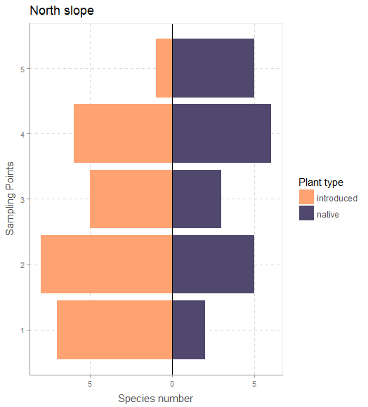
vegSurvey <- vegSurvey %>% mutate(sppInv= ifelse(veg_Type =="native",spp,spp*-1))
# plot for only the North slope
vegSurvey %>% filter(slope=="North") %>%
ggplot(aes(x=sampling_point, y=sppInv, fill=veg_Type))+
geom_bar(stat="identity",position="identity")+
xlab("sampling point")+ylab("number of species")+
scale_fill_manual(name="Plant type",values = c("#FFA373","#50486D"))+
coord_flip()+ggtitle("North slope")+
geom_hline(yintercept=0)+
xlab("Sampling Points")+
ylab("Species number")+
scale_y_continuous(breaks = pretty(vegSurvey$sppInv),labels = abs(pretty(vegSurvey$sppInv)))+
theme_scientific()
Output
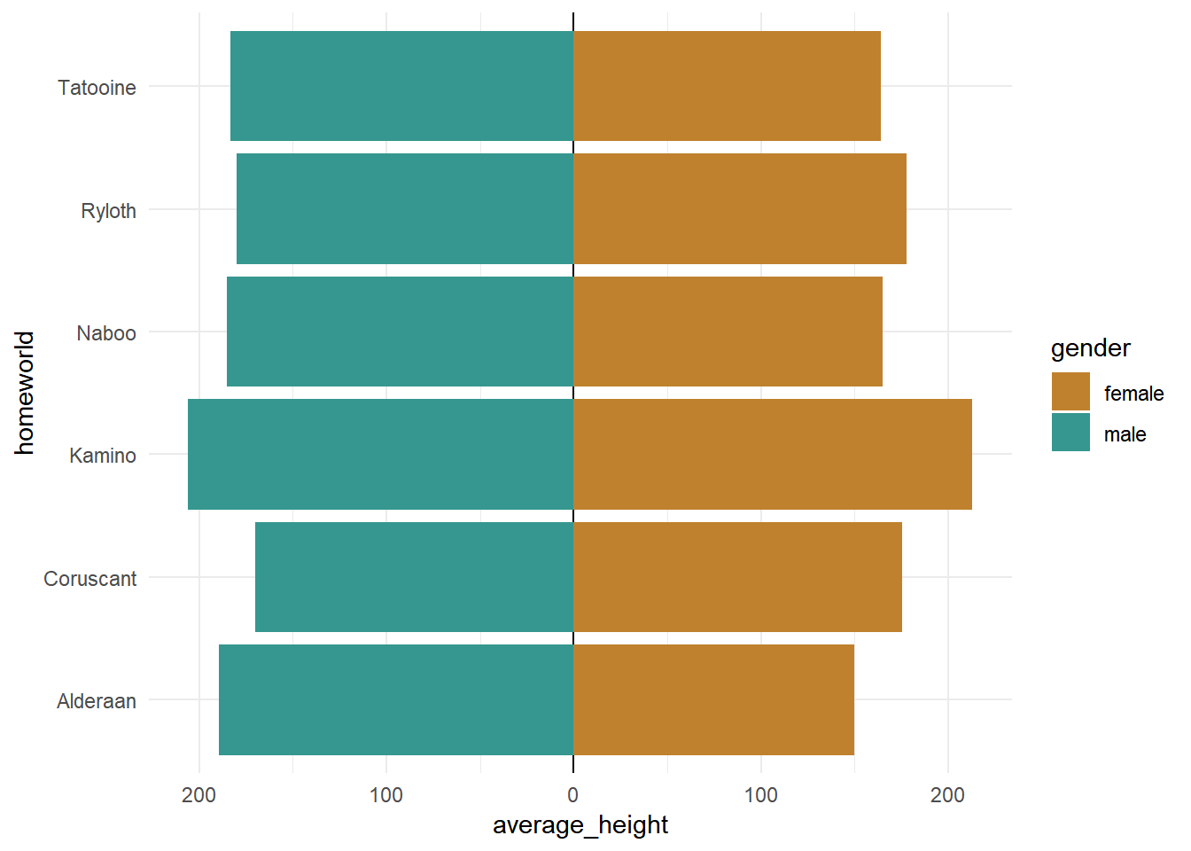
A second more details tutorials
The blog post
The code:
## calculate breaks values
breaks_values <- pretty(starwars_chars$average_height)


## create plot
starwars_chars %>%
  ggplot(aes(x = homeworld, y = average_height, fill = gender))+
  geom_hline(yintercept = 0)+
  geom_bar(stat = "identity")+
  coord_flip()+
  scale_y_continuous(breaks = breaks_values,
                     labels = abs(breaks_values))+
  theme_minimal()+
  scale_fill_manual(values = c("#bf812d", "#35978f"))
Output
-
Multiple views on how to choose a visualization | Medium post | Indrajeet Patil POST


-
Graph color choice example from 2020 | The citation advantage of linking publications to research data
Hi Dear Yury Zablotski. Thanks again for this amazing tutorial. I was able to set up and deploy my blog website. However I encountered this issue when writing a blog today.
See:
Error in read_xml.character(rss_path) :
  Input is not proper UTF-8, indicate encoding !
Bytes: 0xE9 0x76 0x72 0x2E [9]
Calls: <Anonymous> ... write_feed_xml -> <Anonymous> -> read_xml.character
Furthermore : Warning messages:
1: In (function (category = "LC_ALL", locale = "")  :
  the OS request to specify the location to "en_US.UTF-8" could not be honored
2: In (function (category = "LC_ALL", locale = "")  :
  the OS request to specify the location to "en_US.UTF-8" could not be honored
3: In (function (category = "LC_ALL", locale = "")  :
  the OS request to specify the location to "en_US.UTF-8" could not be honored
Execution stopped
Here is the github link for the site ---> https://github.com/Yedomon/My-website
Here is the deployed website ---> https://yedomon.netlify.app/
Thank you.
sma analysis to get slope and elevation p value

#####

install.packages("smatr")


### load

library(smatr)
b = sma(longev~lma+rain, type="shift", data=leaf.low.soilp) # change type shift to elevation or elev.test=1 or slope.test=1 I do not know
summary(b)


#ggplot2 style
fit1=lm(longev~lma+rain,data=leaf.low.soilp)
summary(fit1)

equation1=function(x){coef(fit1)[2]*x+coef(fit1)[1]}
equation2=function(x){coef(fit1)[2]*x+coef(fit1)[1]+coef(fit1)[3]}

ggplot(leaf.low.soilp,aes(y=longev,x=lma,color=rain))+geom_point()+
  stat_function(fun=equation1,geom="line",color=scales::hue_pal()(2)[1])+
  stat_function(fun=equation2,geom="line",color=scales::hue_pal()(2)[2])


## ggPredict style

ggPredict(fit1,se=TRUE,interactive=FALSE) +
  theme_minimal()+
  theme(legend.position = "top")+
  labs(x="lma in cm", y = "longev in cm") +
  annotate('text', x = 70, y = 4, label = 'p-value < 0.01)') +
  scale_fill_manual(values = c("#D16103", "#C3D7A4", "#52854C"))+
  scale_color_manual(values = c("#D16103", "#C3D7A4", "#52854C"))

# color selection [here](https://www.datanovia.com/en/fr/blog/couleurs-ggplot-meilleures-astuces-que-vous-allez-adorer/)
-
ggiraphExtra | Multiple regression model without interaction | ggPredict | Link
-
a great alternative here with ggpubr
-
correlation with ggstatplot r documentation | PPT
-
ggstatsplot | raison d'etre |PPT
summary of tests The central tendency measure displayed will depend on the statistics:
| Type | Measure | Function used |
|---|---|---|
| Parametric | mean | [parameters::describe_distribution](https://easystats.github.io/parameters/reference/describe_distribution.html) |
| Non-parametric | median | [parameters::describe_distribution](https://easystats.github.io/parameters/reference/describe_distribution.html) |
| Robust | trimmed mean | [parameters::describe_distribution](https://easystats.github.io/parameters/reference/describe_distribution.html) |
| Bayesian | MAP estimate | [parameters::describe_distribution](https://easystats.github.io/parameters/reference/describe_distribution.html) |
Following (between-subjects) tests are carried out for each type of analyses-
| Type | No. of groups | Test | Function used |
|---|---|---|---|
| Parametric | > 2 | Fisher’s or Welch’s one-way ANOVA | [stats::oneway.test](https://rdrr.io/r/stats/oneway.test.html) |
| Non-parametric | > 2 | Kruskal–Wallis one-way ANOVA | [stats::kruskal.test](https://rdrr.io/r/stats/kruskal.test.html) |
| Robust | > 2 | Heteroscedastic one-way ANOVA for trimmed means | [WRS2::t1way](https://rdrr.io/pkg/WRS2/man/t1way.html) |
| Bayes Factor | > 2 | Fisher’s ANOVA | [BayesFactor::anovaBF](https://rdrr.io/pkg/BayesFactor/man/anovaBF.html) |
| Parametric | 2 | Student’s or Welch’s t-test | `[stats::t.t |