use aplot to reproduce oncoplot
GuangchuangYu opened this issue · 11 comments
Dear Professor:
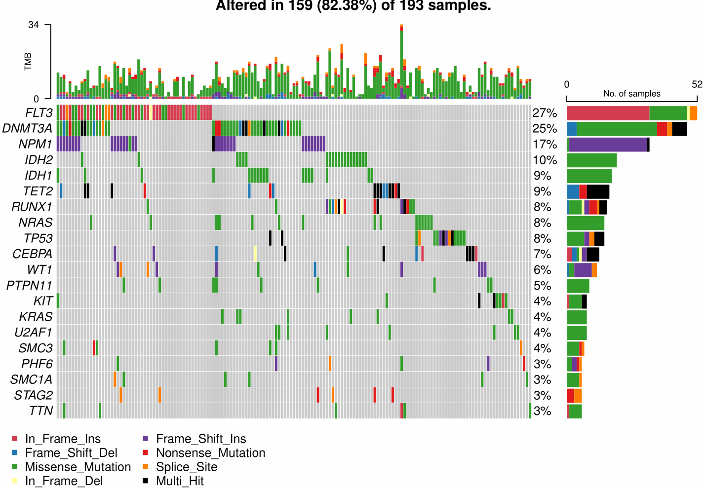
After looking up the source code of maftools::oncoplot() function, I tried to reproduce the simple version oncoplot using ggplot and aplot. The following is the reference visualization.
By comparing my plot with the reference, the main difference was the blank space between left two plots due to axis of right plot. As aplot were based on patchwork, it is seemly difficult to solve the problem. thomasp85/patchwork#110, https://stackoverflow.com/questions/62304750/ignore-x-label-alignment-with-multiple-plots-in-patchwork-is-this-possible.
Below are my codes and plots. Can you provide some advice?
library(tidyverse)
library(maftools)
laml.maf <- system.file("extdata", "tcga_laml.maf.gz", package = "maftools")
laml.clin <- system.file('extdata', 'tcga_laml_annot.tsv', package = 'maftools')
laml <- read.maf(maf = laml.maf, clinicalData = laml.clin)
maf = laml
oncoplot(maf = laml)- step1: data preparation were based on maftools package
genes = getGeneSummary(x = maf)[1:20, Hugo_Symbol]  # Top20 genes
om = maftools:::createOncoMatrix(m = maf, g = genes)
numMat = om$numericMatrix  # gene/sample ~ frequency
mat_origin = om$oncoMatrix # gene/sample ~ variant type
vc_col = maftools:::get_vcColors(websafe = FALSE) # maftools color setting- step2: the left-top subplot
samp_sum = getSampleSummary(x = maf) %>%
  as.data.frame() %>%
  dplyr::select(!total) %>%
  tibble::column_to_rownames("Tumor_Sample_Barcode")
top_bar_data = t(samp_sum[colnames(numMat),, drop = FALSE])
dim(top_bar_data)
# [1]   7 159
type_cols_1 = c("#FF7F00FF","#E31A1CFF","#33A02CFF","#D53E4FFF","#FFFF99FF","#6A3D9AFF","#1F78B4FF")
type_levels_1 = names(vc_col)[match(type_cols_1,vc_col)]
p_top = top_bar_data %>%
  reshape2::melt() %>%
  dplyr::rename(Type=Var1, Sample=Var2, Freq=value) %>%
  dplyr::mutate(Type=factor(Type, levels = type_levels_1)) %>%
  ggplot(aes(x=Sample,y=Freq,fill=Type)) +
  geom_col(position="stack") +
  scale_fill_manual(values = type_cols_1) +
  theme_void() +
  theme(legend.position = "none") +
  theme(plot.margin = unit(c(1, 0, 1, 2), "lines"),
        axis.line.y = element_line(color="black",linewidth=0.6),
        axis.ticks.length.y.left = unit(6, "pt"),
        axis.text.y.left = element_text(hjust = -0.3),
        axis.ticks.y.left = element_line(linewidth=0.6),
        axis.title.y.left = element_text(angle = 90, size = 13,
                                         margin = margin(r = -50, unit = "pt"))
        ) +
  scale_y_continuous(expand=c(0,0), breaks = c(0, max(colSums(top_bar_data)))) +
ylab("TMB")- step2: the left-bottom main plot
type_levels_2=c("Multi_Hit","Splice_Site","Nonsense_Mutation","Frame_Shift_Ins","In_Frame_Del",
              "Missense_Mutation","Frame_Shift_Del","In_Frame_Ins","Non_mut")
type_cols_2 = vc_col[type_levels_2]
type_cols_2[is.na(type_cols_2)] = "#bdbdbd"
names(type_cols_2)[9] = "Non_mut"

totSamps = as.numeric(maf@summary[3, summary])
percent_alt = paste0(round(100 * (apply(numMat, 1, function(x) length(x[x != 0]))/totSamps)), "%")

# To add annotation on right y axis: https://github.com/tidyverse/ggplot2/issues/3171
guide_axis_label_trans <- function(label_trans = identity, ...) {
  axis_guide <- guide_axis(...)
  axis_guide$label_trans <- rlang::as_function(label_trans)
  class(axis_guide) <- c("guide_axis_trans", class(axis_guide))
  axis_guide
}
guide_train.guide_axis_trans <- function(x, ...) {
  trained <- NextMethod()
  trained$key$.label <- x$label_trans(trained$key$.label)
  trained
}

p_main = mat_origin[rev(rownames(mat_origin)),] %>%
  reshape2::melt() %>%
  dplyr::rename(Gene=Var1, Sample=Var2, Type=value) %>%
  dplyr::mutate(Type2 = ifelse(Type=="","Non_mut",Type)) %>%
  dplyr::mutate(Type2 = factor(Type2, levels = type_levels_2)) %>%
  ggplot(aes(x=Sample, y=Gene, fill=Type2)) +
  geom_tile(colour="white") +
  scale_fill_manual(name = NULL,values = type_cols_2,
                    breaks = rev(setdiff(type_levels_2,"Non_mut"))) +
  theme_void() +
  theme(legend.position = "bottom") +
  theme(axis.text.y.left = element_text(hjust = 0.95),
        axis.text.y.right = element_text(hjust = 0.05),
        plot.margin = unit(c(0, 0, 3, 0), "lines")) +
guides(y.sec = guide_axis_label_trans(~str_pad(rev(percent_alt),5,side = "right")))- step3: the right-bottom subplot
type_levels_3=c("Multi_Hit","Splice_Site","Nonsense_Mutation","Frame_Shift_Ins","In_Frame_Del",
                "Missense_Mutation","Frame_Shift_Del","In_Frame_Ins")
type_cols_3= c(vc_col[type_levels_3])

p_right = mat_origin[rev(rownames(mat_origin)),] %>%
  reshape2::melt() %>%
  dplyr::rename(Gene=Var1, Sample=Var2, Type=value) %>%
  dplyr::filter(Type!="") %>%
  dplyr::mutate(Type = factor(Type, levels = type_levels_3)) %>%
  ggplot(aes(x=Gene,fill=Type)) +
  geom_bar(position="stack") +
  scale_fill_manual(values = type_cols_3) +
  scale_y_continuous(expand=c(0,0), breaks = c(0, 52),position = "right") +
  coord_flip() +
  theme_void() +
  theme(legend.position = "none") +
  theme(plot.margin = unit(c(2, 1, 0, 1), "lines"),
        axis.line.x = element_line(color="black",linewidth=0.6),
        axis.ticks.length.x.top  = unit(6, "pt"),
        axis.ticks.x.top = element_line(linewidth = 0.6),
        axis.text.x.top = element_text(vjust = 1),
        axis.title.x.top = element_text(size=13,margin = margin(t = -10, unit = "pt"))) +
  ylab("No. of samples")

#  move the x axis from top to bottom
p_right2 = mat_origin[rev(rownames(mat_origin)),] %>%
  reshape2::melt() %>%
  dplyr::rename(Gene=Var1, Sample=Var2, Type=value) %>%
  dplyr::filter(Type!="") %>%
  dplyr::mutate(Type = factor(Type, levels = type_levels_3)) %>%
  ggplot(aes(x=Gene,fill=Type)) +
  geom_bar(position="stack") +
  scale_fill_manual(values = type_cols_3) +
  scale_y_continuous(expand=c(0,0), breaks = c(0, 52)) +
  coord_flip() +
  theme_void() +
  theme(legend.position = "none") +
  theme(plot.margin = unit(c(2, 1, 0, 1), "lines"),
        axis.line.x = element_line(color="black",linewidth=0.6),
        axis.ticks.length.x.bottom  = unit(6, "pt"),
        axis.ticks.x.bottom = element_line(linewidth = 0.6),
        axis.text.x.bottom = element_text(vjust = 1),
        axis.title.x.bottom = element_text(size=13,margin = margin(t = -10, unit = "pt"))) +
ylab("No. of samples")- step4:merge plot
library(aplot)
options(aplot_guides = "keep")
p_merge = p_main %>%
  insert_right(p_right, width = 0.2) %>%
  insert_top(p_top, height = 0.2)

p_merge2 = p_main %>%
  insert_right(p_right2, width = 0.2) %>%
  insert_top(p_top, height = 0.2)

ggsave(p_merge, file="../aplot_v1.pdf", width = 8, height = 6)  # the first
ggsave(p_merge2, file="../aplot_v2.pdf", width = 8, height = 6) # the second 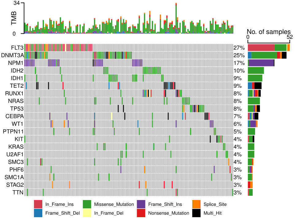

thanks and see my prototype YuLab-SMU/aplot@90bbb37.
see my wechat post: ggplot2版本的更好用的oncoplot来了, and thanks @lishensuo
see my wechat post: ggplot2版本的更好用的oncoplot来了, and thanks @lishensuo
Its my pleasure and I also study a lot during the exploration. I will continue to investigate other issues when possible. ^.^
Dear Professer Yu,
I would like to share my code for visulizing the MAF object using the "ggplot" and "aplot" packages as well.
The code is as follows:
load('GBM_maf.Rdata')
load('signature.Rdata')

library(dplyr)
library(stringr)
library(maftools)
library(data.table)
library(RColorBrewer)
library(tibble)
library(magrittr)
library(tidyr)
library(ggplot2)


GBM_maf <- GBM_maf %>%
  arrange(Tumor_Sample_Barcode) %>%
  filter(as.integer(substring(Tumor_Sample_Barcode, 14, 15))< 10) %>%
  mutate(ID=paste0(substring(Tumor_Sample_Barcode,1,12),Hugo_Symbol,Variant_Classification)) %>%
  distinct(ID,.keep_all = TRUE) %>%
  mutate(Tumor_Sample_Barcode = str_replace_all(substring(Tumor_Sample_Barcode,1,12), "\\-", "_"))


clinical = ca %>% rownames_to_column("Tumor_Sample_Barcode") %>%
  filter(Risk_level == "High") %>%
  mutate(Tumor_Sample_Barcode = str_replace_all(Tumor_Sample_Barcode, "-", "_"))

GBM_maf_n = merge(GBM_maf, clinical, by = 'Tumor_Sample_Barcode', all.y = TRUE)

maf1 = read.maf(
  maf = GBM_maf_n,
  clinicalData = clinical,
  isTCGA = TRUE
)


maf = maf1@data %>% as.data.frame() %>%
  dplyr::select(Tumor_Sample_Barcode, Hugo_Symbol, Variant_Classification) %>%
  set_colnames(c("Tumor_Sample_Barcode","Gene","Type"))%>%
  #filter(Type!="Nonsense_Mutation")%>%
  mutate(Type=Hmisc::capitalize(tolower(gsub("_"," ",Type))))

table(maf$Type)

# Frame_Shift_Del        Frame_Shift_Ins           In_Frame_Del           In_Frame_Ins      Missense_Mutation
# 151                    246                     34                      4                   9792
# Nonsense_Mutation       Nonstop_Mutation            Splice_Site Translation_Start_Site
# 796                      7                    170                      8


clin = dplyr::select(clinical, Therapy, Race, Gender, Age)


top = maf %>% dplyr::group_by(Gene) %>%
  dplyr::summarise(n = n()) %>%
  dplyr::arrange(desc(n)) %>%
  dplyr::top_n(20)


samples <- subset(maf, Gene %in% top$Gene) %>%
  count(Tumor_Sample_Barcode) %>% arrange(desc(n)) %>%
  rename(num = n)

# Tumor_Sample_Barcode <- setdiff(clin$Tumor_Sample_Barcode, samples$Tumor_Sample_Barcode)
# num=rep(0,length(Tumor_Sample_Barcode))
# new=cbind(Tumor_Sample_Barcode ,num)%>%as.data.frame()
# samples=rbind(samples,new)
df <- inner_join(maf, top)

# 获取要添加的行名
#Tumor_Sample_Barcode <- setdiff(clin$Tumor_Sample_Barcode, df$Tumor_Sample_Barcode)

# 计算所需的矩阵维度
#new_matrix_dim <- length(Tumor_Sample_Barcode) * (ncol(df)-1)

# 创建包含NA值的矩阵
#new_matrix <- cbind(Tumor_Sample_Barcode,matrix(NA, nrow = length(Tumor_Sample_Barcode), ncol = (ncol(df)-1), dimnames = list(Tumor_Sample_Barcode, colnames(df)[-1])))

#df=rbind(df,as.data.frame(new_matrix ))

write.table(df, "High_anno.txt", sep="\t", col.names=TRUE, row.names = FALSE, append = FALSE, quote = FALSE)

df <- df %>% replace_na(list(Gene = top$Gene[1]))%>%
  mutate(Gene = factor(Gene, levels = rev(top$Gene)),
         Sample = factor(Tumor_Sample_Barcode, levels = samples$Tumor_Sample_Barcode)) %>%
  inner_join(samples) %>%
  mutate(ID=paste0(Tumor_Sample_Barcode,Gene,Type))%>%
  arrange(ID)
# 首先,我们需要处理数据,使得每个基因和患者的组合只有一个主要的突变类型,其他的突变类型都被标记为"其他"

df$ID=paste0(df$Tumor_Sample_Barcode,df$Gene)
df$Duplicated=duplicated(df$ID)


# 创建一个包含所有可能的样本和基因的组合的数据框
grid_data <- expand.grid(Sample = unique(df$Sample), Gene = unique(df$Gene))

df <- df %>%
  group_by(Sample, Gene) %>%
  mutate(point_count = n())


df_double<- subset(df, point_count == 2)
df_multiple <- subset(df, point_count > 2)

df_multiple <-df_multiple%>%
  mutate(Typ=factor(Type,levels=unique(maf$Type))) %>%
  mutate(Sample_adjusted = as.numeric(Sample) + (-0.5 + row_number())  / point_count-0.5)


df_multiple <- df_multiple

p1 <- ggplot() +
  geom_tile(data = grid_data, aes(x = Sample, y = Gene), fill = "grey95", color = "white") +
  geom_tile(data=subset(df, Duplicated == "FALSE"),aes(x = Sample, y = Gene, fill = factor(Type, levels = unique(maf$Type))), color = "white") +
  geom_point(data = df_double, aes(x = Sample, y = Gene,color=factor(Type, levels = unique(maf$Type)))) +
  geom_point(data = df_multiple, aes(x = Sample_adjusted, y = Gene,color=factor(Type, levels = unique(maf$Type)))) +
  scale_fill_brewer(palette = "Set2", name="Mutation type", guide = guide_legend(nrow = 3),na.translate=FALSE) +
  scale_color_brewer(palette = "Set2",na.translate=FALSE) +
  guides(color = FALSE) +
  scale_y_discrete(position = "right") +
  theme_bw()+
  theme(panel.border =  element_blank(),
        panel.grid = element_blank(),
        axis.text.x = element_blank(),
        axis.text.y.left = element_text(size = 4),
        axis.ticks = element_blank(),
        legend.title = element_text(face="bold"),
        axis.title = element_blank(),
        legend.position = "bottom")

print(p1)


# 样本的突变基因数目条形图
p2 <- ggplot(df) +
  geom_bar(aes(x = Sample, fill = factor(Type, levels = unique(maf$Type)))) +
  # 使用 expand 删除数据与轴之间的空隙
  scale_fill_brewer(palette = "Set2",na.translate=FALSE) +
  scale_y_continuous(breaks = seq(0, 35, 5), limits = c(0, 35),
                     expand = expansion(mult = 0, add = 0)) +
  ylab("Frequency of mutation") +
  theme(
    legend.position = "none",
    panel.background = element_blank(),
    axis.ticks.x = element_blank(),
    axis.title.y = element_text(colour = "black",face="bold"),
    axis.title.x = element_blank(),
    axis.text.x = element_blank(),
    axis.ticks.length.y.left = unit(.25, "cm"),
    axis.line.y.left = element_line(colour = "black"),
  )

p2
# 突变基因的突变频数条形图
p3 <- ggplot(na.omit(df)) +
  geom_bar(aes(y = Gene, fill = factor(Type, levels = unique(maf$Type)))) +
  scale_x_continuous(position = "top", breaks = seq(0, 35,5),
                     limits = c(0, 35),
                     expand = expansion(mult = 0, add = 0)) +
  scale_fill_brewer(palette = "Set2") +
  xlab("Frequency of mutation") +
  theme(
    legend.position = "none",
    panel.background = element_blank(),
    axis.ticks.y = element_blank(),
    axis.title.y = element_blank(),
    axis.title.x = element_text(colour = "black",face="bold"),

    axis.text.y = element_blank(),
    axis.ticks.length.x.top = unit(.25, "cm"),
    axis.line.x.top = element_line(colour = "black")
  )

p3

library(aplot)
ca=clinical[match(samples$Tumor_Sample_Barcode,clinical$Tumor_Sample_Barcode,),]%>%
  dplyr::select(Tumor_Sample_Barcode,Gender, Race,Age, Therapy,Risk_level)%>%
  dplyr::rename( `Risk score level`="Risk_level")

cad= gather(ca,Gender, Race,Age, Therapy,`Risk score level`, key='anno', value='type')


Gender_colors= c("#D53E4F","#66C2A5")
names(Gender_colors) = c(unique(clinical$Gender)[1], unique(clinical$Gender)[2])

Race_colors= c("#FFBB78FF", "#8C564BFF")
names(Race_colors) = c(unique(clinical$Race)[1], unique(clinical$Race)[2])


Therapy_colors= c("#FF9896FF","#9467BDFF")
names(Therapy_colors) = c(levels(clinical$'Therapy')[1], levels(clinical$'Therapy')[2])
library(aplot)
pc <- ggplot(cad, aes(Tumor_Sample_Barcode, y=factor(anno,levels=c("Risk score level","Gender","Age","Race","Therapy")),
                      fill=factor(type,levels=c(levels(ca$`Risk score level`),
                                                levels(ca$Gender),
                                                levels(ca$Age),
                                                levels(ca$Race),
                                                levels(ca$Therapy)
                      )))) +
  scale_y_discrete(position="right") +
  geom_tile()+
  theme_minimal()+
  scale_fill_manual(name="Risk score level",values=c(
    '#00A087FF',
    #'#FF9439',
    "#D53E4F","#66C2A5",
    "#1F77B4FF",  "#2CA02CFF",
    "#FFBB78FF", "#8C564BFF",
    "#FF9896FF","#9467BDFF"))+
  theme(panel.grid = element_blank(),
        axis.text.x =element_blank(),
        axis.text.y =element_text(color="black",face="bold"),
        legend.title = element_text(color="black",face="bold"),
        legend.position = "bottom"
  )+ #rev(text_col)
  xlab(NULL) +
  ylab(NULL)+
  guides(fill=guide_legend(nrow = 2))

pc

options(aplot_guides = "collect")
p1 %>%
  insert_top(pc,height = 0.1) %>%
  insert_top(p2,height = 0.2) %>%
  insert_right(p3,width = 0.25)
The code will generate a figure like this
It would be better if you can tell me how to place the legend to the bottom. Thank you for your help in advance.

@jijitoutou Can you provide the data to reproduce this figure?
@jijitoutou Can you provide the data to reproduce this figure?
老师,我不太会用github,可以把用到的资料发邮箱提供给你吗?
@lishensuo you can add your name to the author list if you want to, see https://github.com/YuLab-SMU/aplotExtra/blob/main/DESCRIPTION.
The package is now on CRAN.
Thank you, professor. Its my pleasure !
好的,余老师。我已经将MAF可视化的代码和测试数据发送到这个邮箱了。请注意查收。
另外我还新增了aplot包和ggplot包对富集分析(STRING数据库完成)的代码。
如果您看过图片之后觉得还可以,也可将aplot包和ggplot包对富集分析可视化的代码加入到此R包中。