This repository hosts the dashboard for the stock price data from the vega-dataset. The background and purposes of this dashboard can be found in our proposal.
Link to Deployed app at Heroku
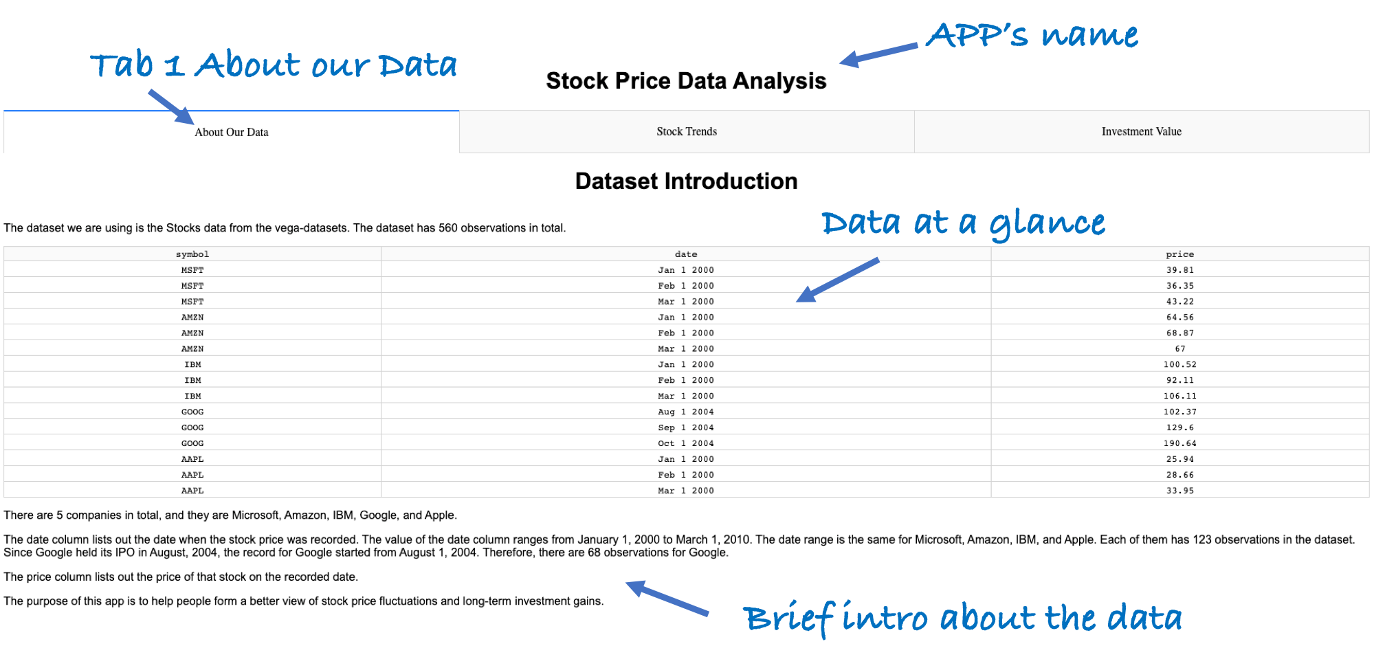
The APP is called Stock Price Data Analysis. It has three tabs and two sets of charts for users to visualize: monthly historical stock price, and investment value of five tech companies from 2000 to 2010.
-
The first tab briefly introduces our dataset and the purposes of our APP.
-
The second tab is called "Stock trends". It shows the historical stock prices of five tech companies: Microsoft, Amazon, IBM, Google, and Apple, from 2000 to 2010. The first chart shows the changes in stock prices of the five companies over the ten-year period. There is a drop-down window that allows the user to choose a specific stock. After selection, the chart will display the historical price trend of that stock. There is also a range slider bar down the graph that allows users to select the particular time range that they want to explore. The slider bar itself basically shows the entire trend(s) of the stock(s) selected. The graph will change accordingly to display the trend(s) in that time period.
Depending on the stock(s) selected in the above chart, the chart below will change correspondingly to show the monthly percentage price changes for the selected company.
-
The third tab is called "Investment Value". It shows the changes in “hypothetical” investment value over time. The chart shows that “hypothetically”, if the user invested $10,000 in each of the 5 tech companies in August 2004 (when Google held its IPO), how much would have their investment been in later days? There is also a slider bar that allows users to select the time range, and the graph will change accordingly. In the graph below, there are explanations why Google has the highest stock price, but Apple has the highest investment value.


