Yet another markdown previewer for neovim
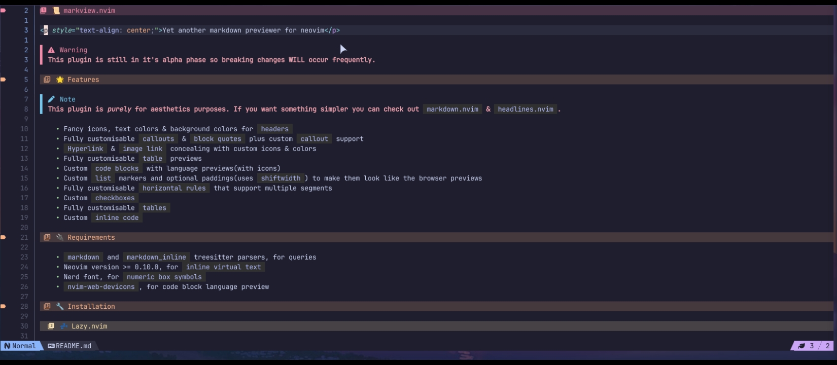
Warning
This plugin is still in it's alpha phase so breaking changes WILL occur frequently.
Note
This plugin was created mainly for personal use and is purely for aesthetics purposes. If you want something simpler you can check out markdown.nvim & headlines.nvim.
- Fancy icons, text colors & background colors for
headers - Fully customisable
callouts&block quotesplus customcalloutsupport Hyperlink&image linkconcealing with custom icons & colors- Fully customisable
tablepreviews - Custom
code blockswith language previews(with icons) - Custom
listmarkers and optional paddings(usesshiftwidth) to make them look like the browser previews - Fully customisable
horizontal rulesthat support multiple segments - Custom
checkboxes - Fully customisable
tables - Custom
inline code
markdownandmarkdown_inlinetreesitter parsers, for queries- Neovim version >= 0.10.0, for
inline virtual text - Nerd font, for
numeric box symbols nvim-web-devicons, for code block language preview
-- For plugin.lua users
{
    "OXY2DEV/markview.nvim",
    dependencies = {
        "nvim-tree/nvim-web-devicons", -- Used by the code bloxks
    },

    config = function ()
        require("markview").setup();
    end
}

-- For plugins/markview.lua users
return {
    "OXY2DEV/markview.nvim",
    dependencies = {
        "nvim-tree/nvim-web-devicons", -- Used by the code bloxks
    },

    config = function ()
        require("markview").setup();
    end
}require("mini.deps").add({
source = "OXY2DEV/markview.nvim",
depends = {
"nvim-tree/nvim-web-devicons", -- Used by the code bloxks
}
})Use the setup() function to set the various options.
require("markview").setup({
    highlight_groups = {},


    header = {},

    code_block = {},
    inline_code = {},

    block_quote = {},

    horizontal_rule = {},

    hyperlink = {},
    image = {},

    table = {},

    list_item = {},
    checkbox = {}
})
All the options have individual configuration tables. As such, they are explained in their own sections.
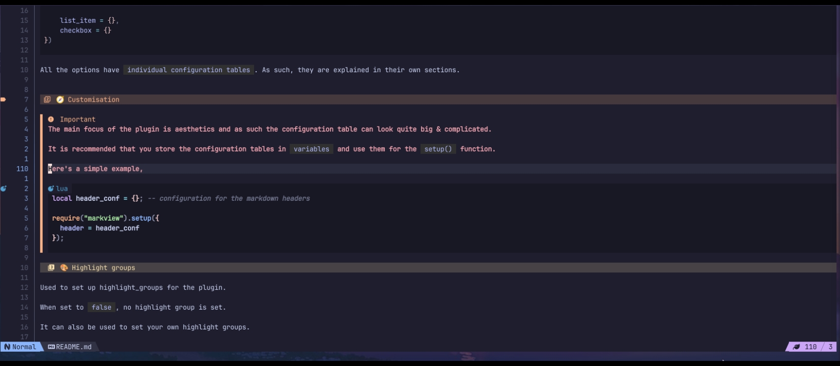
Important
The main focus of the plugin is aesthetics and as such the configuration table can look quite big & complicated.
It is recommended that you store the configuration tables in variables and use them for the setup() function.
Here's a simple example,
local header_conf = {}; -- configuration for the markdown headers

require("markview").setup({
  header = header_conf
});Used to set up highlight_groups for the plugin.
When set to false, no highlight group is set.
It can also be used to set your own highlight groups.
require("markview").setup({
    highlight_groups = {
        {
	    	group_name = "markview_h1",
		    value = { bg = "#453244", fg = "#f38ba8" }
        }
    }
})
The items in it should have 2 properties,
group_name, highlight group namevalue, the value to set for that highlight group(see{val}innvim_set_hl())
Note
The list is NOT merged with the default highlight groups.
Configuration table for the markdown headers.
It is a list containing tables that have the following options.
header = {
    {
        style = "padded_icon",

        line_hl = "markview_h1",

        -- This uses nerd font symbol by default and is therefore not shown here
        sign = "", sign_hl = "rainbow1",

        -- This uses nerd font symbol by default and is therefore not shown here
        icon = "", icon_hl = "markview_h1_icon",
        icon_width = 1
    }
}
The index of a table in the list is used to determine what is used for a specific header. So, for the 6th header the 6th item in the list is used.
If the list has less than 6 items then the internal tbl_clamp() function is used to find the last table.
Here's what all of the options do.
style, Changes how the headers are shownline_hl, Sets the highlight group for coloring the line itselfsign, Optional symbol for the sign columnsign_hl, Sets the highlight group for thesignicon, The icon used for the headericon_hl, The highlight group for the icon
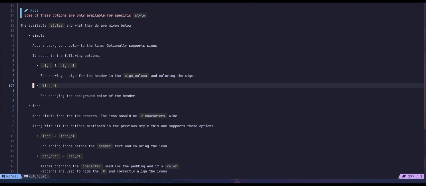
Note
Some of these options are only available for specific style.
The available styles and what they do are given below,
-
simple
Adds a background color to the line. Optionally supports signs.
It supports the following options,
-
sign&sign_hlFor showing a sign for the header in the
sign_columnand coloring the sign. -
line_hlFor changing the background color of the header.
-
-
icon
Adds simple icon for the headers. The icon should be
2 characterswide.Along with all the options mentioned in the previous style this one supports these options.
-
icon&icon_hlFor adding icons before the
headertext and coloring the icon. -
pad_char&pad_hlAllows changing the
characterused for the padding and it'scolor. Paddings are used to hide the#and correctly align the icons.
-
-
padded_icon
Like
iconbut adds padding to the icon and allows more control over how they are shown.Along with all the options mentioned in the previous styles this one supports the following option.
-
icon_widthChanges where the icon is positioned. By default, the
icon'scharacter width is used. But can be changed to something else if you need.
-
Tip
If you are using the padded_icon style then you can use the icon_width property to change how many spaces are added before the icon.
The number of spaces added before the icon is calculated with the following equation.
position_x = position_of_the_header + header_level - icon_width;Configuration table for code blocks in markdown.
code_block = {
    style = "language",
    block_hl = "code_block",

    pad_char = " ",
    language_hl = "Bold",
}
Here's what all of them do
style, Changes how code blocks are shownblock_hl, Used to change the background of the blockpad_char, Character used as paddinglanguage_hl, Highlight group for the code blocks language
Note
Some of these options are only available for specific style.
The available styles and what they do are given below
-
simple
Only adds the background and hides the top & bottom texts
This style has the following options available,
block_hl
-
padded
Adds padding on the left side of the code.
Along with the options from the previous style it also supports,
pad_char
-
language
Shows the language's file icon and name(the one in the code block) and adds padding.
Along with the options from the previous style it also supports,
language_hl
Note
This plugin changes how inline codes are concealed.
Configuration table for the inline codes in markdown.
inline_code = {
    before = " ", after = " ",

    hl = "inline_code_blocks"
}
Here's what all the options do,
before, the text to add before the item. Preferably a single characterafter, likebeforebut added after the itemhl, used to color the entire item along withbefore&after
Configuration table for callouts and block quotes.
bloxk_quote = {
    default = {
        border = "▌", border_hl = { "Glow_1", "Glow_2", "Glow_3", "Glow_4", "Glow_5", "Glow_6" }
    },

    callouts = {
        {
            match_string = "[!NOTE]",

            callout_preview = "Note",
            callout_preview_hl = "rainbow5",

            border = "▌", border_hl = "rainbow5"
        }
    }
}
Here's what all the options do,
-
default, used to configure normalblock quotes -
callouts, a list of configuration table for variouscallouts. Each table has the following optionsmatch_string, the string used to match the calloutcallout_preview, the text to show for the calloutcallout_preview_hl, highlight group forcallout_previewborder, string used as the border for the calloutborder_hl, highlight group forborder
Configuration table for the horizontal rules
horizontal_rule = {
    style = "simple",
    border_char = "─",
    border_hl = "Comment",

    segments = {},
    segments_hl = {}
}
Here's what all the options do,
style, allows you to switch between using a character(s) or 3 segments for the horizontal ruleborder_char, character(s) used to make the border, Preferably a single characterborder_hl, highlight group forborder_charorsegmentssegments, allows setting up left border character, right border character and a middle section for the line, only the 2nd item of the list isn't repeated.segments_hl, highlight group for thesegments, when nilborder_hlis used
Note
You can use segments and segments_hl to create fancy lines too(like in obsidian, though a bit more restrictive).
Configuration table for the link previews.
hyperlink = {
    icon = "",
    hl = "Label"
}
Here's what all the options do,
icon, text to add before the link texthl, highlight group for the text andicon
Configuration table for the images.
image = {
    icon = "",
    hl = "Label"
}
Here's what all the options do,
icon, text to add before the link texthl, highlight group for the text andicon
Configuration table for markdown table.
Warning
Still an experimental feature, expect bugs.
table = {
    table_chars = {
        "╭", "─", "╮", "┬",
        "├", "│", "┤", "┼",
        "╰", "─", "╯", "┴"
    },
    table_hls = { "rainbow1" },

    use_virt_lines = false
}
Here's what all the options do,
table_chars, characters to create the table itselftable_hls, highlight group for thetable_chars, the item's index is used for selecting the highlight group, the last non-nil value is used if the item is niluse_virt_lines, will make the plugin useoverlayvirtual text for the top and bottom border, instead of virtual lines, may reduce cursor jumps
Important
The property name is subject to change
Configuration table for the unordered lists.
list_item = {
    marker_plus = {
        add_padding = true,

        marker = "•",
        marker_hl = "rainbow2"
    },
    marker_minus = {},
    marker_star = {},
}
Here's what all the options do,
-
marker_plus,marker_minus&marker_starSets individual configuration for the various styles of listsThey have the following sub options,
-
add_paddingAdds a padding(equal toshiftwidthif set to nil) -
markerText to use as the marker. Preferably a single character -
marker_hlHighlight group formarker
-
Configuration table for checkboxes.
checkbox = {
    checked = {
        marker = " ✔ ", marker_hl = "@markup.list.checked"
    },
    unchecked = {
        marker = " ✔ ", marker_hl = "@markup.list.checked"
    }
}
Here's what all the options do,
-
checked&uncheckedIndividual configuration table for the different checkbox statesThey have the following sub options,
marker, the text to replace the checkbox. Preferably 3 charactersmarker_hl, highlight group formarker


