A flutter package to easily added dotted borders around widgets.
To use this package, add dotted_border as a dependency in your pubspec.yaml file.
Wrap DottedBorder widget around the child widget
DottedBorder(
    color: Colors.black,
    strokeWidth: 1,
    child: FlutterLogo(size: 148),
)This package supports the following border types at the moment
- RectBorder
- RRectBorder
- CircleBorder
- OvalBorder
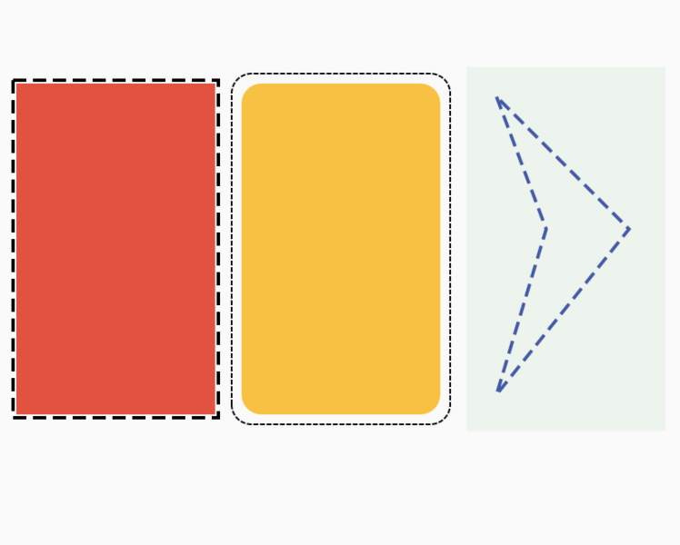
return DottedBorder(
  borderType: BorderType.RRect,
  radius: Radius.circular(12),
  padding: EdgeInsets.all(6),
  child: ClipRRect(
    borderRadius: BorderRadius.all(Radius.circular(12)),
    child: Container(
      height: 200,
      width: 120,
      color: Colors.amber,
    ),
  ),
);Now you can also specify the Dash Sequence by passing in an Array of Doubles
DottedBorder(
    dashPattern: [6, 3, 2, 3],
    child: ...
);
The above code block will render a dashed border with the following pattern:
- 6 pixel wide dash
- 3 pixel wide space
- 2 pixel wide dash
- 3 pixel wide space
You can also specify any path as the customPath property when initializing the DottedBorderWidget, and it will draw it for you using the provided dash pattern.
Path customPath = Path()
  ..moveTo(20, 20)
  ..lineTo(50, 100)
  ..lineTo(20, 200)
  ..lineTo(100, 100)
  ..lineTo(20, 20);

return DottedBorder(
  customPath: customPath,
  color: Colors.indigo,
  dashPattern: [8, 4],
  strokeWidth: 2,
  child: Container(
    height: 220,
    width: 120,
    color: Colors.green.withAlpha(20),
  ),
);PR submitted by Tarekk Mohamed Abdalla
You can set a StrokeCap to the border line endings. It can take three values
- StrokeCap.Round
- StrokeCap.Square
- StrokeCap.Butt

