
During the Graduate program application season, the most annoying period of time is when you have submitted the application (an evil face should be presented here).
The is because whatever happens next cannot be solved by hard working and efforts. People cannot directly contact the admission board to monitor the reviewing processes of their applications, they do not know how the professors in the admission board view and think of their resumes and personal statements. The natural reactions of humans now is to acquire more information from people who are doing the same thing, in this case, applying to the same program or university.
This is where you find this: The GradCafe
Or to be more specific:
The Result section in GradCafe
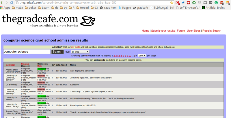
Now you can know the situations of your commrades: they may have been interviewed, accepted or rejected. These information may relieve your anxiety; however, most of the time, they just make you more anxious and depressed, because your peers have got responses, but you did not. As you may have noticed, the GradCafe did a great job collecting these crown jewel data. However, they did not really organize and analyze it to provide information which may really put your mind at ease: when do most people got the response from the board? When is the earliest response and when is the latest? So here comes my project, behold: the coffee maker!. This project allows you to input the Universities and program you are applying to, then scrap the data of these information from the GradCafe, in the end, a series of analysis will give you information such as when is the earliest response from this school, when is the latest response, when do most people get response.
Python 3.6.x
Python package: BeautifulSoup
Python package: urllib
R 3.6.4
R package: tidyr
R package: ggplot2
Use Python's IDLE to open the file Main.
Enter the University name, here i enter 'UIUC' (Can be blank).

Enter the Program name 'Computer Science'(Can be blank).

they cannot be both blank, enter something
Then a notice will pop up, confirming your entries (the spaces in your entries are replaced by +).
Enter 'y' if you want to proceed. If you enter 'n' the program will go back and ask you to enter the University name.
After the process is finished, the program will ask if you want to rename the data file, enter 'y' then you have a chance to rename the file, in this case, i name it as 'UIUC_CS' You do not need to add the suffix '.csv', it has been taken care of by the program.

Now you will have your data, which looks like this:

The example file has been uploaded and can be accessed here
Then you should execute the provided Rscript 'Analyzer_Graph.R' (i will add a function to 'main' which ask you if you want to execute Rscript and run it automatically). A graph called 'FrequencyAnalysis' will be exported to the script directory.

More analytic graphs will be added and updated!
Remove the picture output of 'Frequency Analysis.png'.
Add output 'FrequencyAnalysis_EachYear_boxplot.png', which express the decision dates each year by boxplot.

Add output 'FrequencyAnalysis_PHD_MASTER.png', which use different color to show you when PhD degree applicants and Master degree applicants get response.

Add output 'FrequencyAnalysis_Decision.png', which use different color to show your what kind of response are sent out in different period of time. Warning: this may cause anxiety, nausea, depression, cardiac arrest, etc. Please view under the advice of your physicians.

Update histogram pattern.
Histogram bar from different categories (PhD/Masters, Accept/Rejects, etc) will now be displayed as separate bars.

