This is a collection of my data visualizations, mostly made with Python.
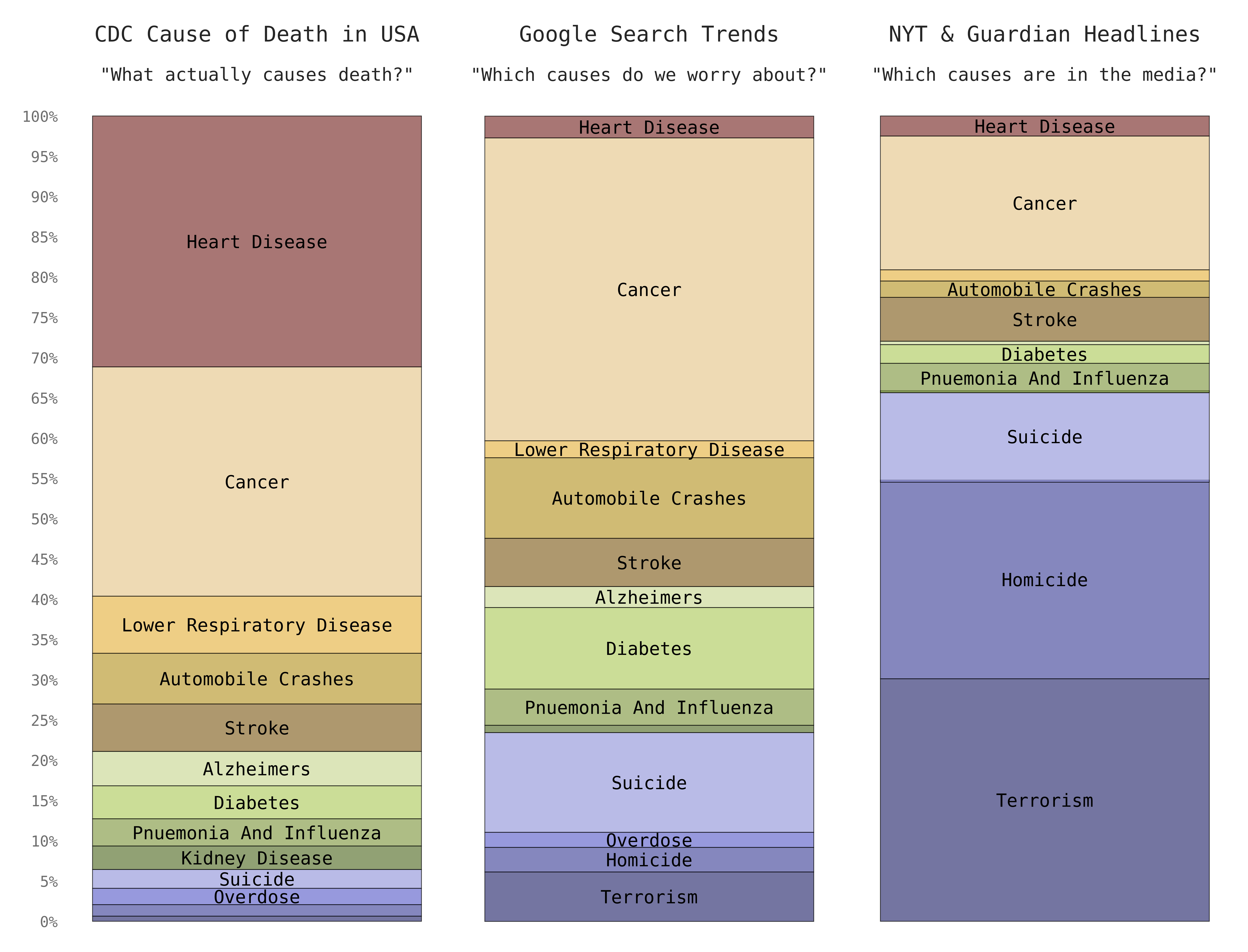
This animation is an expansion on the excellent write up by Hasan Al-Jamaly, Maximillian Siemers, Owen Shen, and Nicole Stone for a project in Brad Voytek's UCSD course. The writeup can be found here: https://owenshen24.github.io/charting-death/
Here's a static version updated for publishing in an upcoming data viz book by Spanner Books:
Code: bar_cod.py
Data: Death: Reality vs. Reported
The parts that stand out to me are the two big bumps 9 months after Pearl Harbor and 9 months after the war ended in Sep 1945. Those bumps are so big that the full chart pretty much only shows Baby Boomers.
Code: birth_heatmap.py
Birth data: Human Mortality Database
Population data: US Census Bureau
Population data (aggregated): USA_Population_of_States_US_Census_Intercensal_Tables_1917-2017.csv
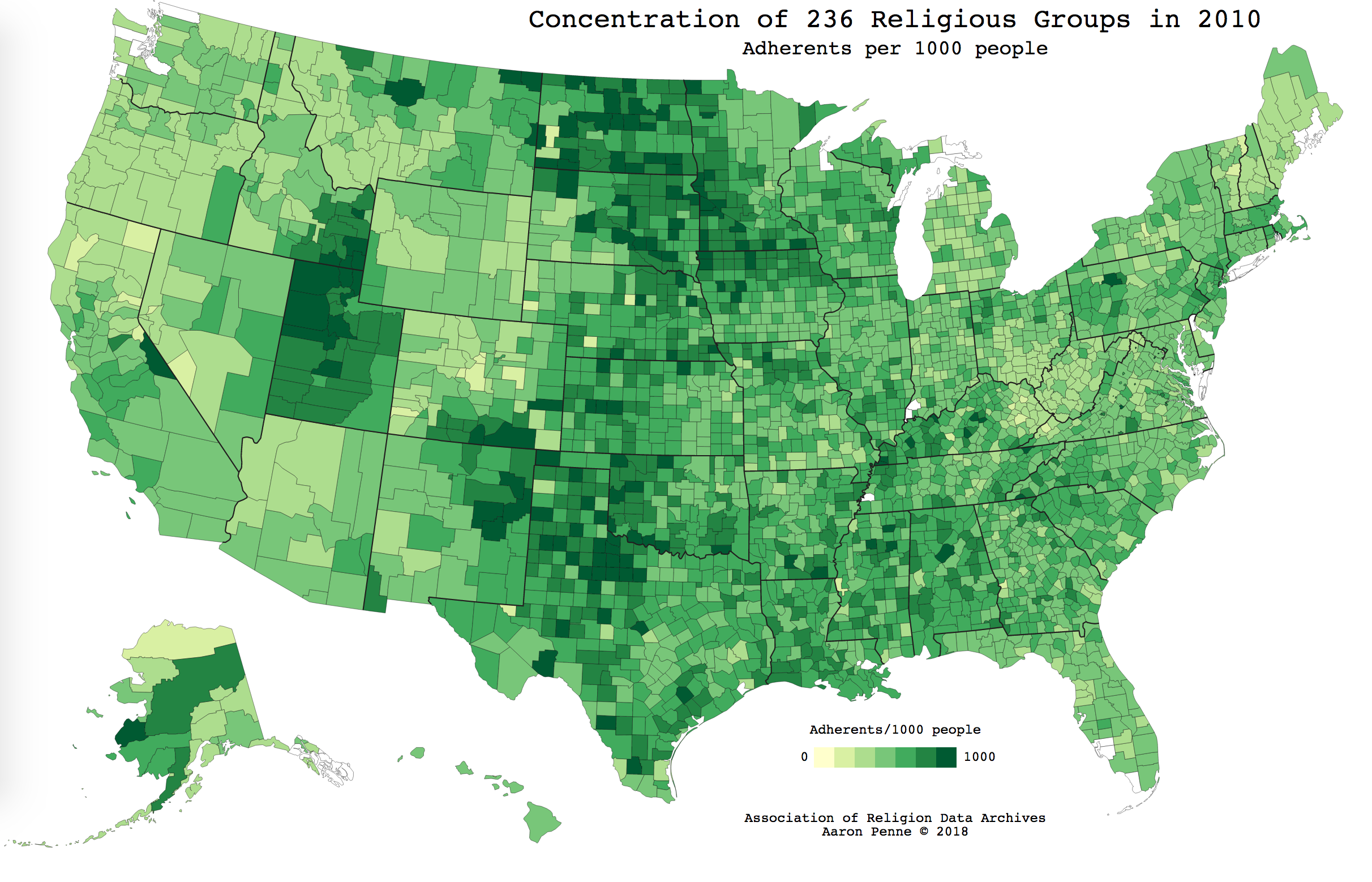
This was created as an example of 'coloring in' a premade SVG file. The SVG map of US counties was obtained from Wikimedia
Code: religion_county.py
Data: The Association of Religion Data Archives
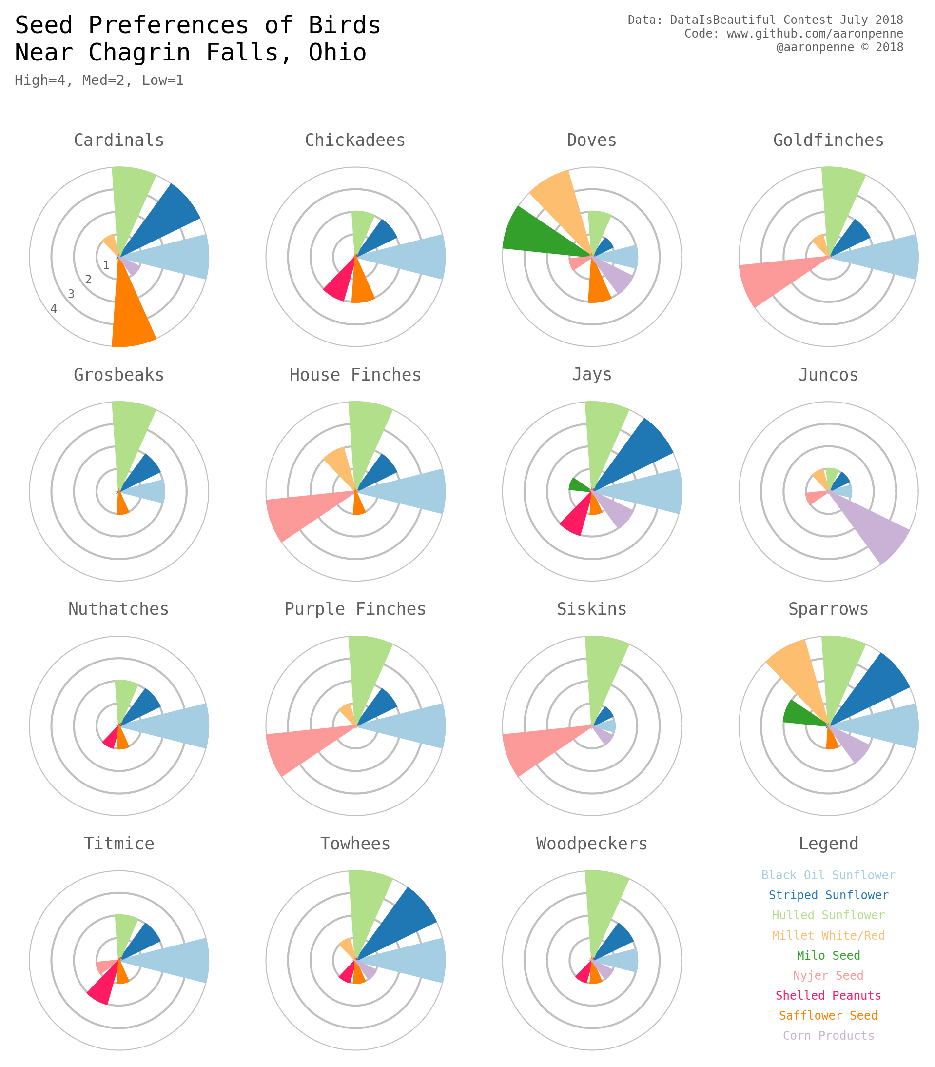
The July 2018 r/DataIsBeautiful competition was based around improving a grid heatmap type of chart. If this was for work, those would be regular bar charts, but this was an exercise in coercing matplotlib into plotting bar charts on polar coordinates.
Code: polar_multiples.py
Data: Hardcoded from this image
'users_here' counts were scraped every 10 minutes from a few subreddits over the past couple weeks. Each subreddit has 3 charts: raw line chart, box plot by day of week, and box plot by 30 minute bins. Using this data, you could time posts, chat at peak times, etc. The janky but working scraper is here. More charts for 15 or so subreddits are here.
Code: traffic.py
Data: Scraped every 10 minutes with simple script.
Code: hyg_scatter.py
Data: HYG Stellar Database v3
Contest: r/DataIsBeautiful DataViz Battle 2018-03
Code: ssm_violin.py
Code: ssm_joy.py
Data: Pew Research Center via DataViz Battle Feb 2018
Contest: r/DataIsBeautiful DataViz Battle 2018-02
Contest entry: Reddit post - Honorable Mention
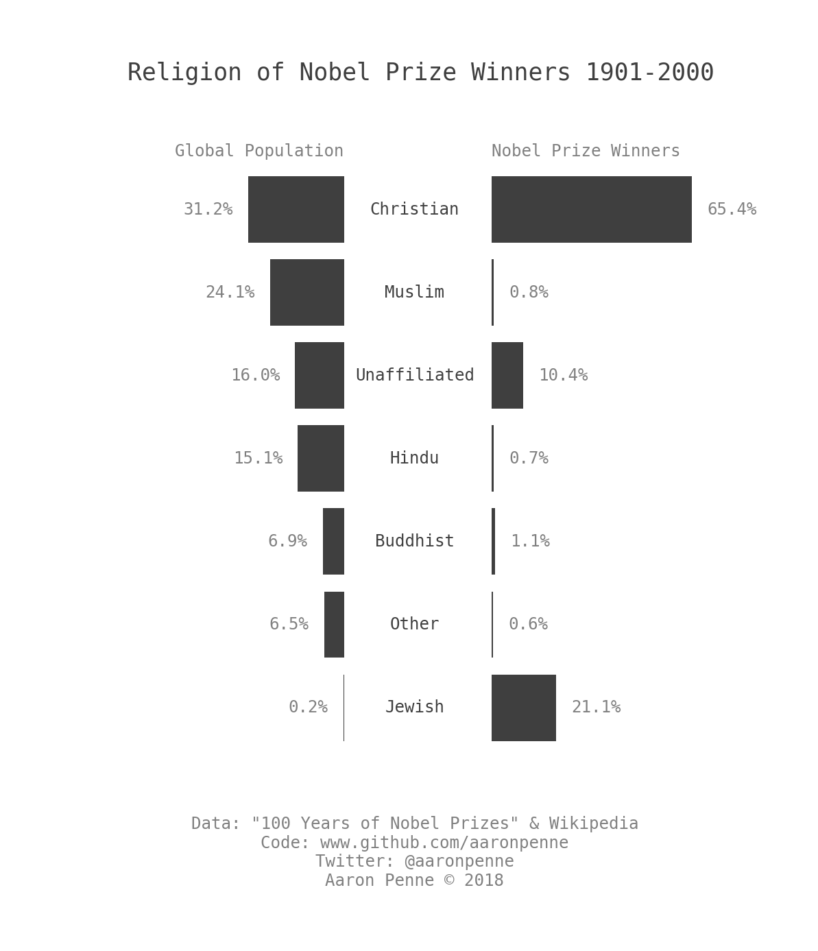
This bar chart was an exercise in replotting the 3D exploded pie chart that appeared here. Data is the same, but augmented with population data to show how certain religions are over/under represented.
Code: nobel_pop_bar.py
Data: Nobel Prize data and Global Population data from Wikipedia
This GIF is shortened from the full dataset of 18 years to only 2 years due to file size restrictions. Full resolution videos from 2000-2018 are on YouTube.
- Normalized Difference Vegetation Index (NDVI) animation: https://youtu.be/OK_HI3sjbtI
- Enhanced Vegetation Index (EVI) animation: https://youtu.be/UytH99Zc2L8
All credit for the imagery products go to the NASA MODIS Science Team. I only collected the images into animations and annotated them.
Code: modis_vegetation.py
Data: NASA MODIS Sensor on Terra Satellite LP DAAC
Code: dot_pairs_ceo_compensation.py
Data: Reddit post by u/k0m0d0z0
Code: pop_joy.py
Data (raw): https://census.gov/data/tables/time-series/demo/popest/pre-1980-state.html
Data (manually aggregated/cleaned): USA_Population_of_States_US_Census_Intercensal_Tables_1917-2017.csv


