After the challenge was over on April 30th, I wanted to make a summary of the twitter activity related to my tweets on the #30DayChartChallenge. Here is the summary in four charts. All of this analysis was done using the wonderful rtweet package.
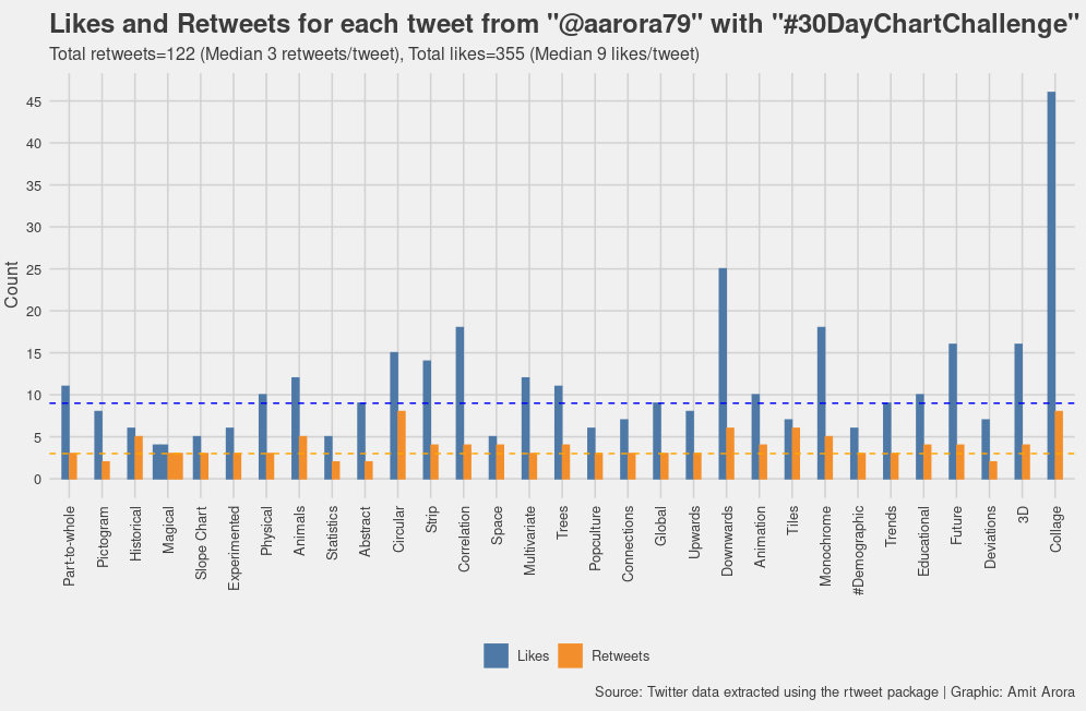
The tweet with final collage with all the data visualizations I made was the most liked tweet, followed by the downwards category chart which showed my weight loss journey, I guess personal stories do strike a chord. It is one of my favorite charts as well.
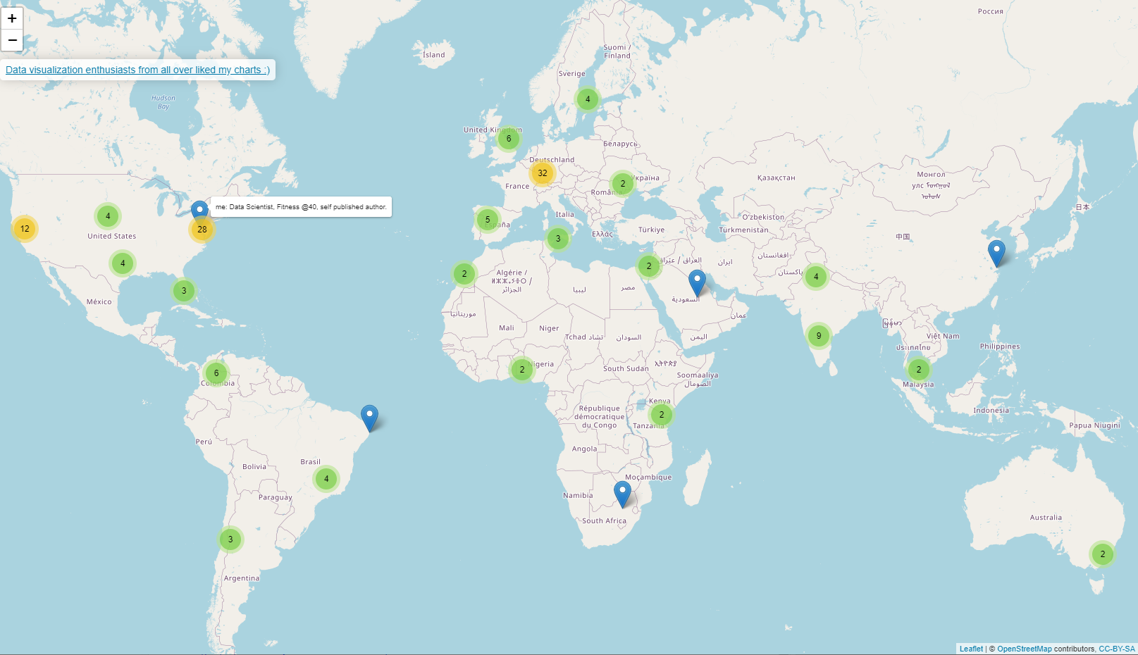
I was very curious right from the start as to where these tweets were being viewed and and by whom. Since the twitter APIs do not yet provide an easy direct way to find out the user id/screen name of who all liked or retweeted a particular tweet so I did this manually by clicking on each tweet and then copy pasting the raw text from the pop-up window and then parsing it. Seems like my tweets were liked in all continents except Antartica. Most of the liked came from the U.S. east coast and central Europe. This is ofcourse based on the location that people specified in their twitter profile, but in several cases it was not an actual location so this map does not have all the locations.
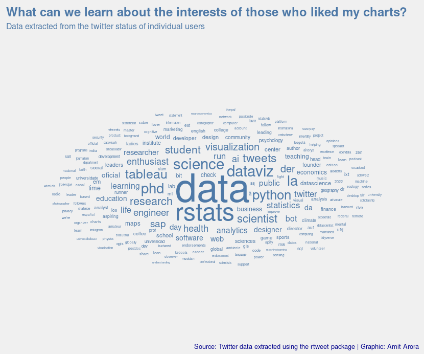
Here is a word cloud created from the status messages of the people who liked the charts. Not surprisingly, data and data visualizations along with rstats stands out. Was pleasantly surprised to see "Phd" feature prominently in the list.
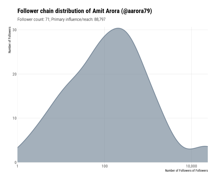
I think I had a grand total of 44 followers before the challenge started, now I have 70+. Was curious to see how far could my tweets reach. Found this excellent visualization on twitter influence on this recipe book https://rud.is/books/21-recipes/, this chart is created using code from this page.
A waffle chart of squares with 10 rows and 42 columns showing the breakdown of number of days taken to lose 61lbs of weight in my weight loss journey over the past 15 months. I went from 253lb to 192lb. Each group of tens is a category i.e. the 190lb's is a category, the 200lb's is a category and so on and so forth. Each box represents 1 day spent in that weight group (a.k.a. category). The plot is able to show that it becomes progressively harder to lose weight, for example while I was in the 240s for only 18 days, I was in the 230s for almost double that time and then same for the 220s. The data is here https://github.com/aarora79/30DayChartChallenge/blob/main/01-part-to-whole/bodyweight.csv.
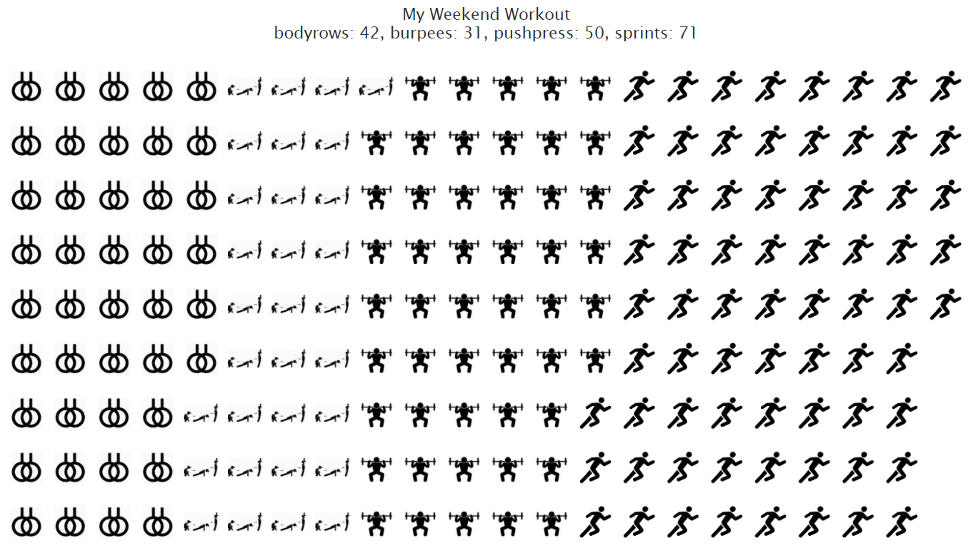
A pictogram for a workout I did one weekend. Made using highcharter package and icons found on the web. Each drawing of the icon equals one rep of the exercise. There were four exercises: bodyrows, burpees, pushpresses and sprints. The data is here https://github.com/aarora79/30DayChartChallenge/blob/main/02-pictogram/workout.csv.
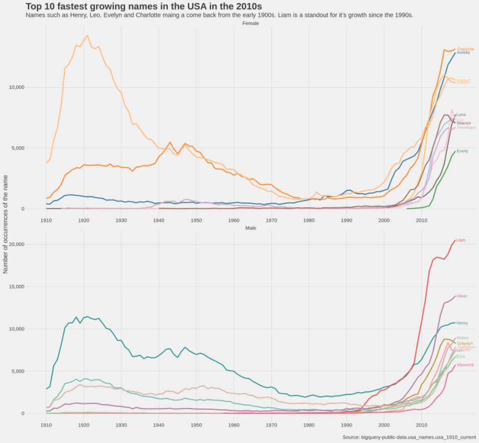
A historical chart showing how the names gaining popularity in the decade of [2010, 2020)have fared historically. We determine the top 10 male and female names and draw a timeseries chart of how popular these names have been historically since the 1910s. The data for this analysis is available in BigQuery public dataset collection (usa_names) and is not being checked in as part of this repo. We find that same of the names gaining fastest in popularity were also popular in the early 1900s. Names such as EVelyn and Charlotte for females and Henry and Leo are back in favor. A name that stands out is 'Liam' for its very distinct rise (that still continues) since the 1990s.
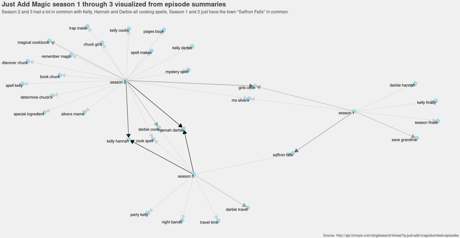
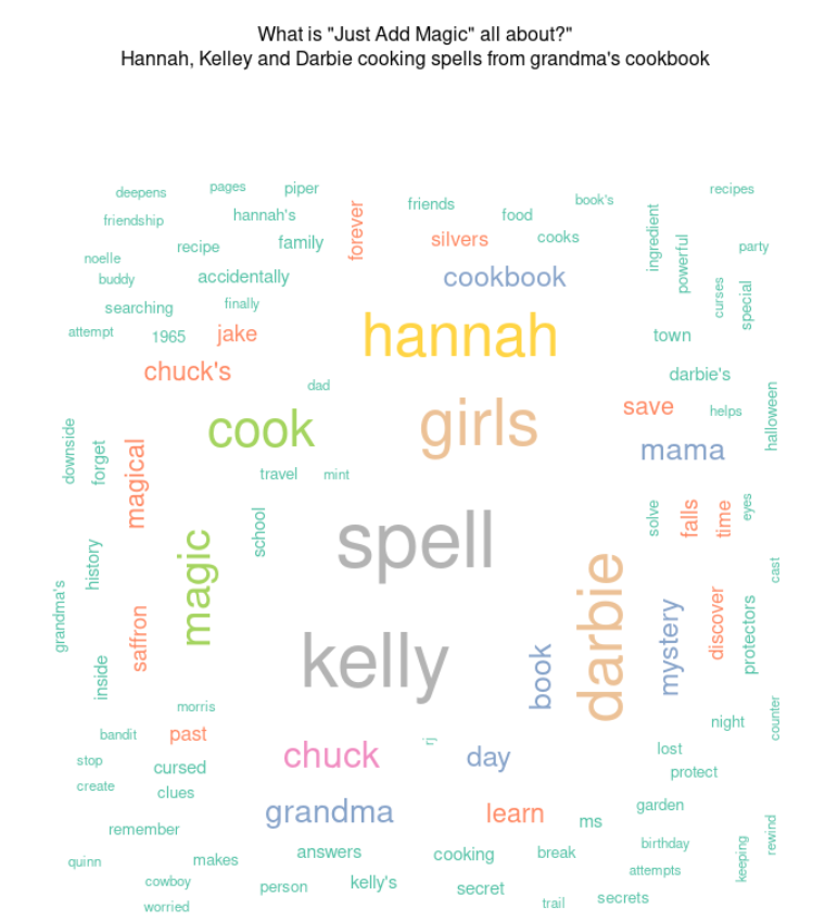
A couple of charts about the TV Series "Just Add Magic". The wordcloud shows it is about three friends who cook spells from their grandma's cookbook. The network graph shows summarizes the season using bigrams from episode summaries. Season 1 and 3 have little in common except for "Saffron Falls" the place where the show takes place, Season 2 and 3 have the common theme of the girls cooking spells.
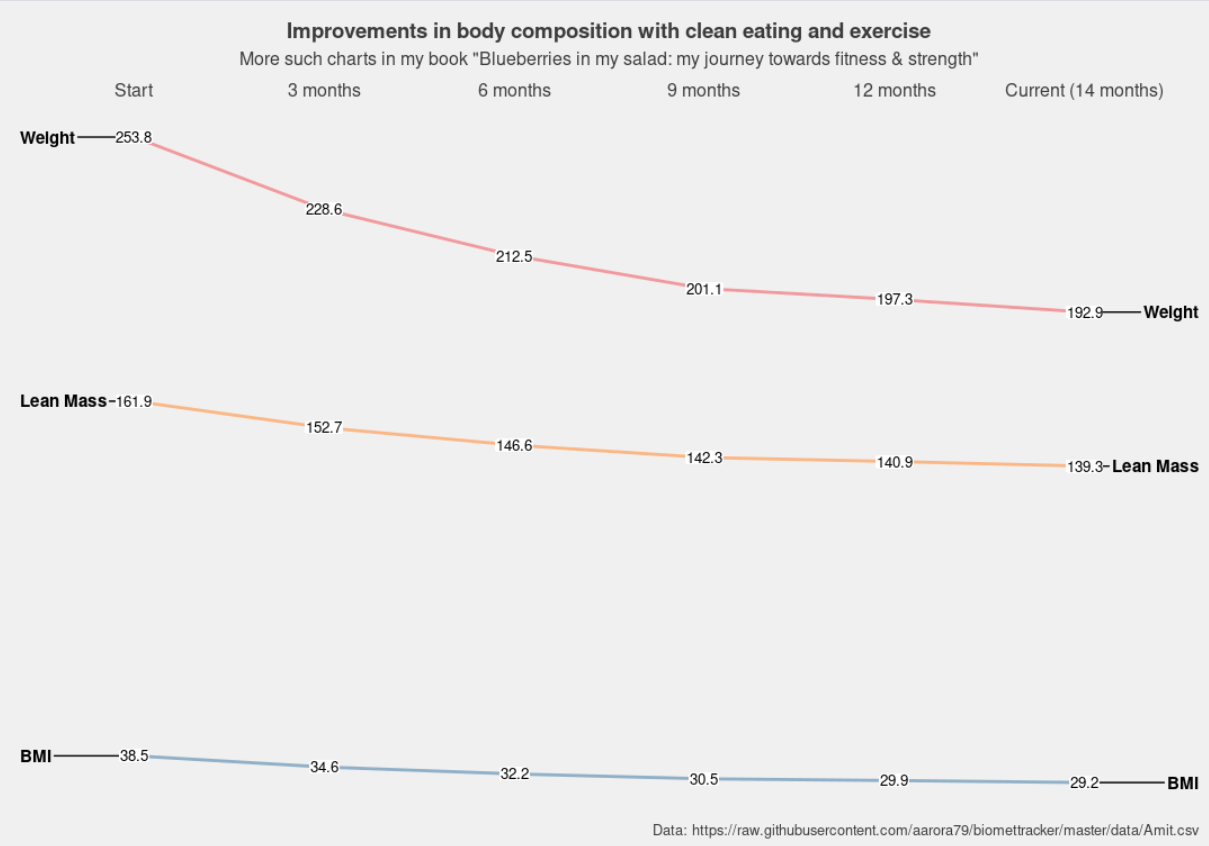
A slope chart showing body composition changes (weight, lean mass, BMI) with diet and exercise of a 14 month period. More such charts and data in my book "Blueberries In My Salad: My Journey Towards Fitness & Strength" (Amazon: https://www.amazon.com/Blueberries-My-Salad-Journey-Strength-ebook/dp/B08KPMGT4W, LeanPub: https://leanpub.com/blueberries-in-my-salad/c/4Pe65eVXFLx3). Please show some love to a first time author :-).
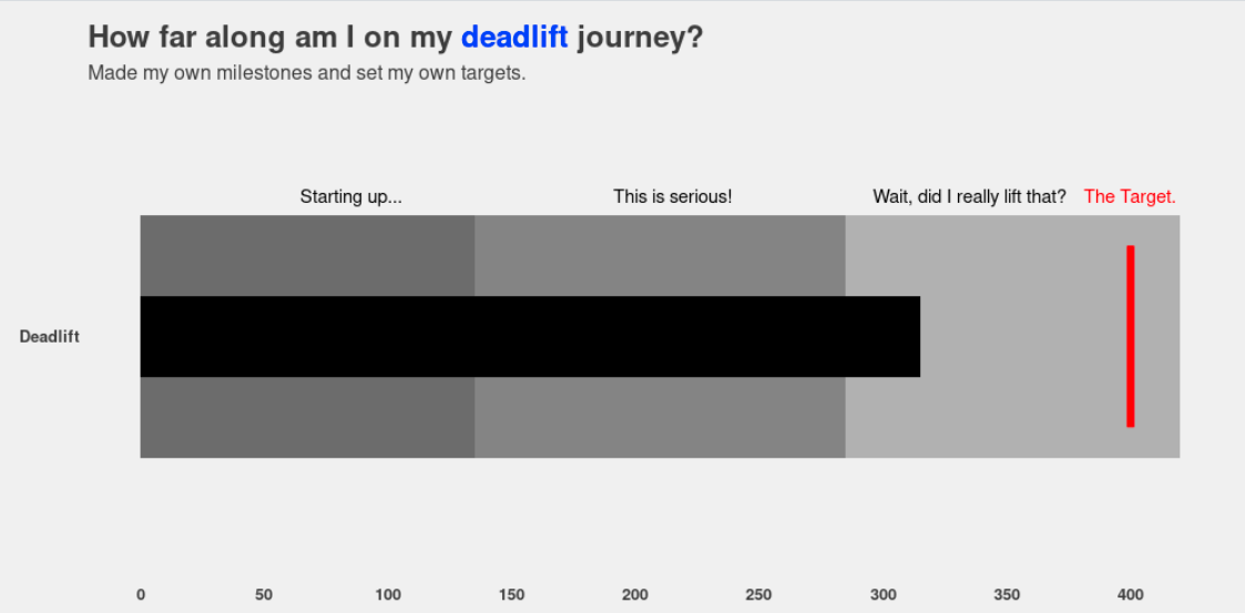
Experimented with a bullet chart for the first time (thank you: https://themockup.blog/posts/2020-11-29-bullet-chart-variants-in-r/). The chart shows my progress towards my deadlift target (what it does not show: took 15 months to get to a 315lb deadlift).
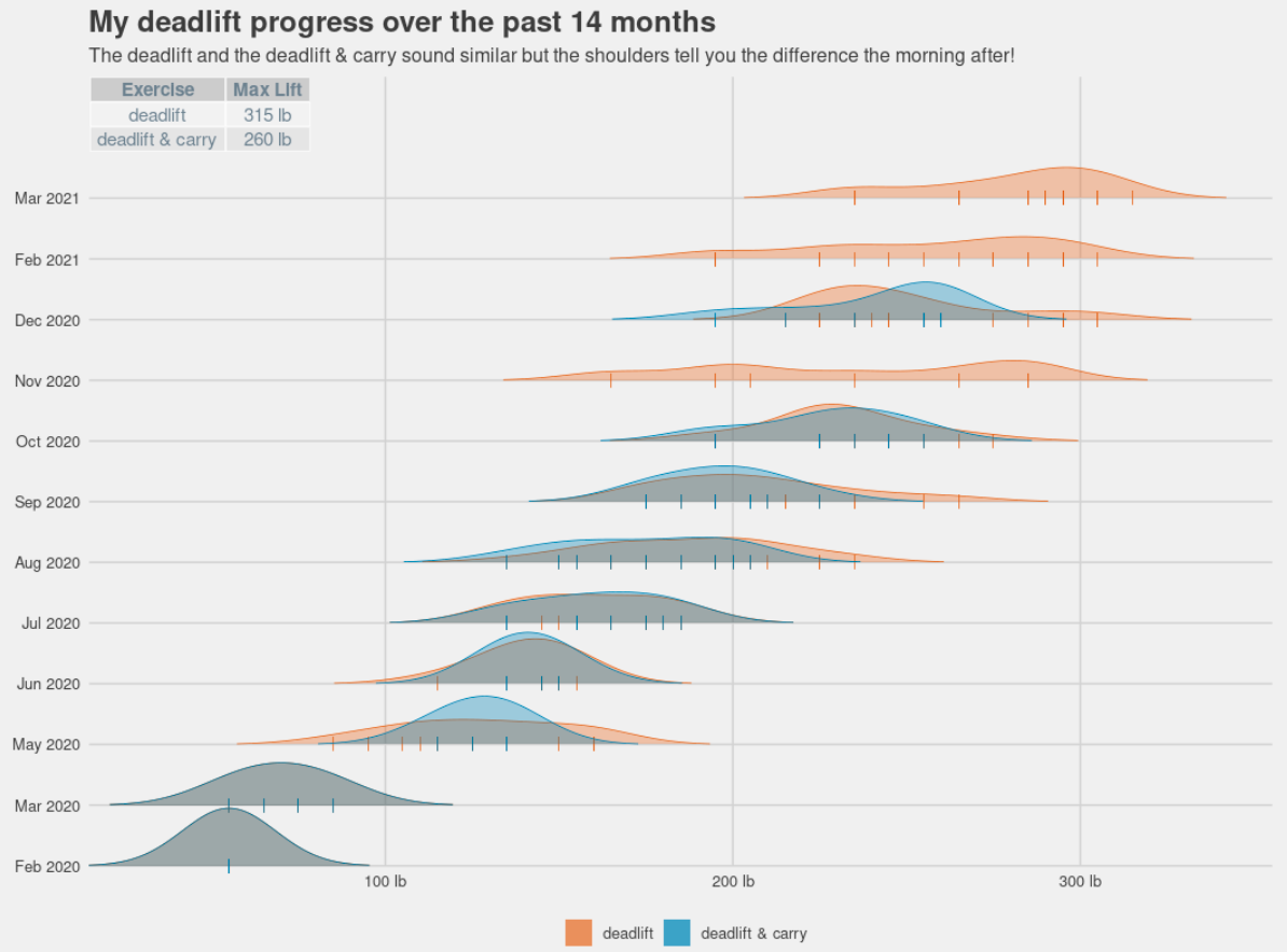
What is more physical than lifting 300lb off the ground or carrying 250lb for 30 steps? Here is a chart showing the distribution of the pounds I deadlifted over the past 14 months. Made using the wonderful ggridges package.
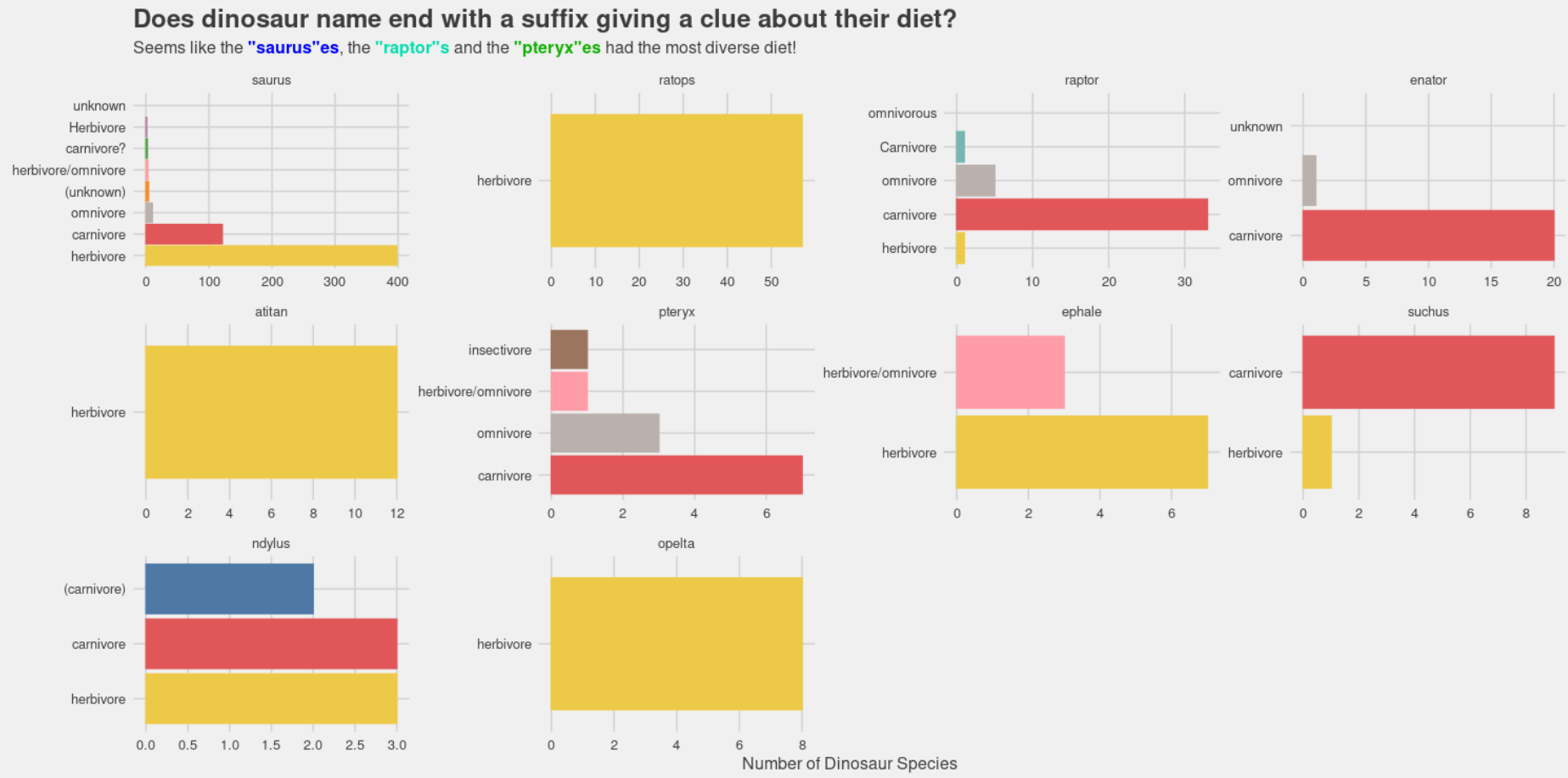
Do the last 5 letters of a dinosaur species name give a clue about their diet? This simple bar chart faceted by the suffix helps answer this question. Seems like the most common suffix "sauras" has the most diverse diet as a species, followed by raptor's and pteryx'es.
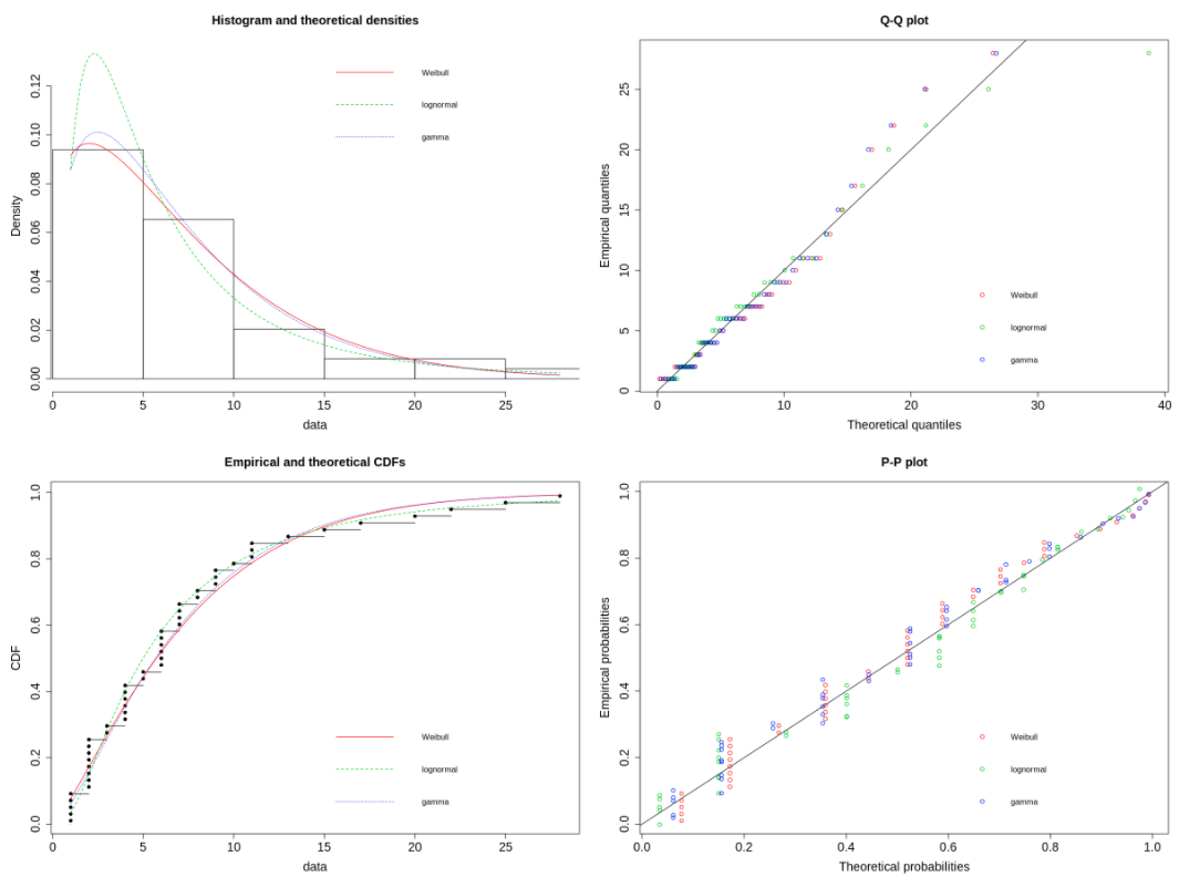
An attempt to model number of days spend at each weight during my weight loss journey. Start with visualizing the the data (number of days spent at each weight) using histogram, density plot and empirical CDF and then observe that the distribution looks like a long tailed distribution. Model the distribution using the "fitdistrplus" package as a Weibull, Gamma and Log Normal distribution. Plot the goodness of fit plots. Seems like the Log Normal fits the empirical distribution the best as observed from the CDF plots. For a change, plot the charts in base R rather than ggplot2.
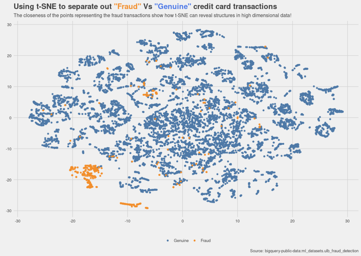
Using a t-SNE plot to see if it can separate out classes in a high dimensional imbalanced dataset. The dataset used here contains anonymized credit card transactions made over 2 days in September 2013 by European cardholders, with 492 frauds out of 284,807 transactions. It is available as part of the BigQuery public datasets, please see bigquery-public-data:ml_datasets.ulb_fraud_detection.
The closeness of the points representing the fraud transactions show how t-SNE can reveal structures in high dimensional data!
Data originally from: Andrea Dal Pozzolo, Olivier Caelen, Reid A. Johnson and Gianluca Bontempi. Calibrating Probability with Undersampling for Unbalanced Classification. In Symposium on Computational Intelligence and Data Mining (CIDM), IEEE, 2015.
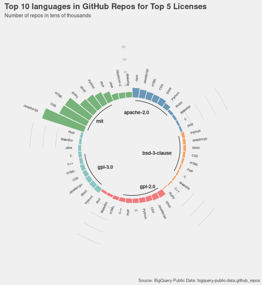
Which licenses are most commonly used for which languages in open source repositories in GitHub? We try to find the answer by looking at the top 10 languages corresponding to the top 5 open source licenses used in GitHub. C/C++ find a place in the top 10 list for all licenses except for MIT, and also MIT seems to be the license of choice for most of the open source repositories with Javascript, CSS, HTML and other web programming languages forming the bulk of the repos.
Data Source: BigQuery Public Data: bigquery-public-data.github_repos
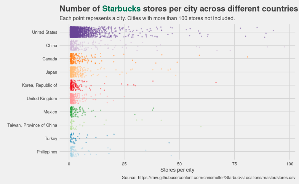
Visualizing the number of Starbucks stores per city across the top 10 countries with the most Starbucks stores (as of 2017) using a strip plot. Each point represents a city and the x-axis represents number of stores in a city. The U.S. has the most Starbucks stores by a long margin and also the most cities with more than 25 stores per city. Other than the Canada, Mexico and the U.K. all other countries are in Asia, nothing in Europe (this data is from an old dataset).
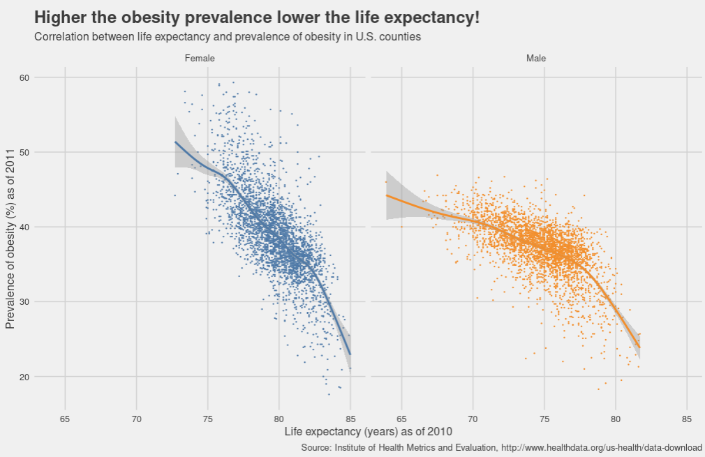
Higher the prevalence of obesity in a population, lower the life expectancy. Each point in this chart represents a U.S, county, data from Institute for Health Metrics and Evaluation (IHME), this link. A simple scatter plot with trend line is able to show the clear negative correlation.
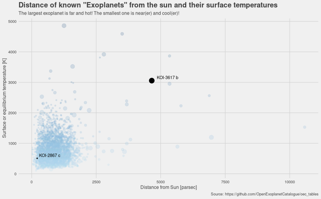
Exploring the Exoplanets. There are lots of them! Most of the Exoplanets are within 2500 parsec distance of the sun and surface temperature less than 2000 Kelvin. The largest Exoplanet KOI-3617 b is far away and hot, the smallest Exoplanet KOI-2867 c is close(er) and cool(er).
Data source: Open Exoplanet Catalogue Tables
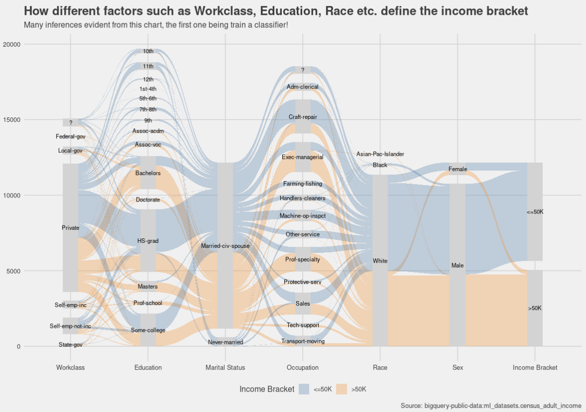
The census income dataset contains a number of categorical variables that lend themselves beautifully to train a classifier model. This chart explores relationship in multivariate data using parallel coordinates.
Data source: Bigquery Public Datasets, Census Income, bigquery-public-data:ml_datasets.census_adult_income
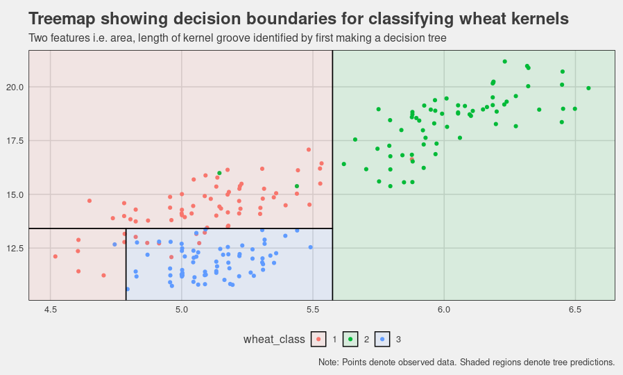
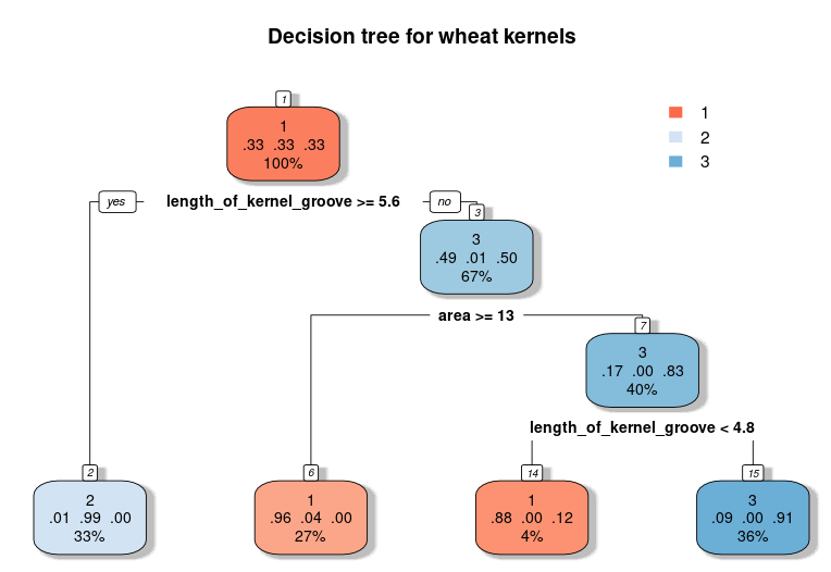
Classify wheat kernels using a decision tree. A decision tree chart that using only two features i.e. area and length of the kernel groove we can achieve pretty good classification. A treemap is used to plot the decision boundary of a classifier built using these two features.
Data source: https://raw.githubusercontent.com/jbrownlee/Datasets/master/wheat-seeds.csv
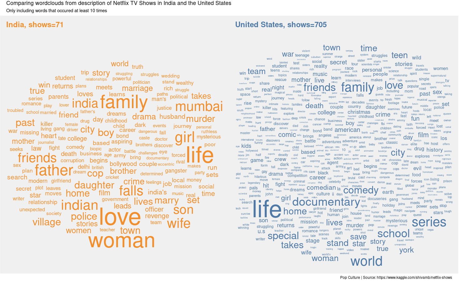
Use wordcloud to get an idea of Netflix TV show content in India and the US. Some common themes such as family, friends, life and love occur in shows in both countries. A lot of words pointing to many different genres occur in the Netflix shows in the U.S., not so much in India. Used the ggwordcloud and patchwork packages for the first time. Data source: https://www.kaggle.com/shivamb/netflix-shows
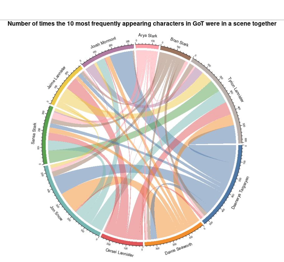
Use a chord diagram to visualize the number of times the 10 most frequently appearing characters in GoT appear together in a scene. Interestingly Tyrion has a lot of scenes with the top 10 characters, while Arya has very few. Jon and Daenerys have a lot of scenes but Daenerys primarily has scenes with Jorah, Jon and Tyrian. The siblings Cersei, Jamie and Tyrian have a lot of scenes with each other but the siblings Sansa, Arya and Bran have much fewer which makes sense based on the story.
Data source: https://raw.githubusercontent.com/jeffreylancaster/game-of-thrones/master/data/episodes.json
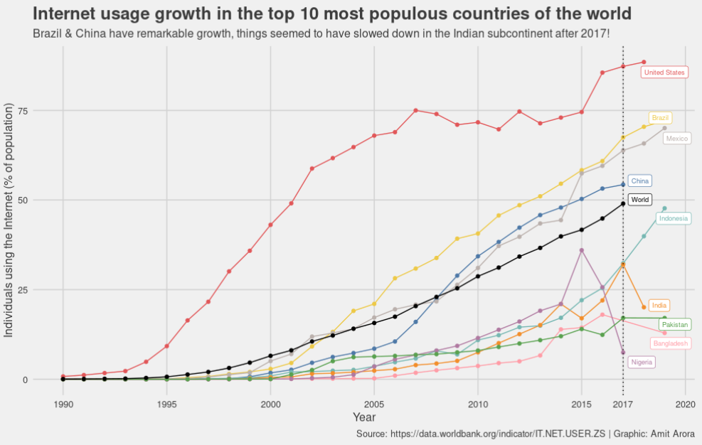
Visualizing internet usage as a percentage of population for the top 10 most populous countries. The world average since the late 1990s is almost linear, with the Americas being above the average and the Asian countries except China and the one African country in the list (Nigeria) being below the world average. Brazil and China have seen a remarkable growth in Internet usage. For some reason after 2017 the internet usage in the Indian subcontinent either decreased or stagnated.
Data source: https://data.worldbank.org/indicator/IT.NET.USER.ZS
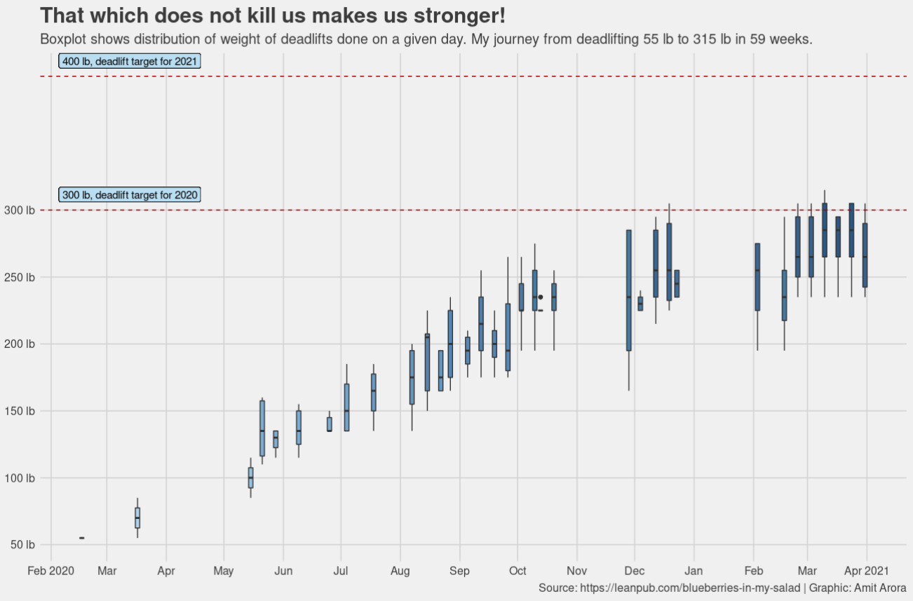
My deadlift journey from 0 (almost) to 315 lb (still continuing). A timeseries of box plot for deadlifts done over the last 15 months. Journey to 315 lb was'nt easy but the path to 400 lb is a different game altogether. More such charts in my book Blueberries in my salad: my journey towards fitness & strength.
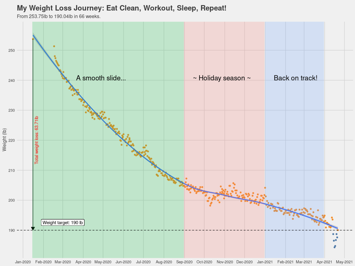
My weight loss journey from 253lb to 190lb (still continuing). Spread across 15 months, the downwards trending line chart reflects weight measurement done every single day, lays bare all the ups and downs. Consistency rather than intensity! More such charts in my book Blueberries in my salad: my journey towards fitness & strength.
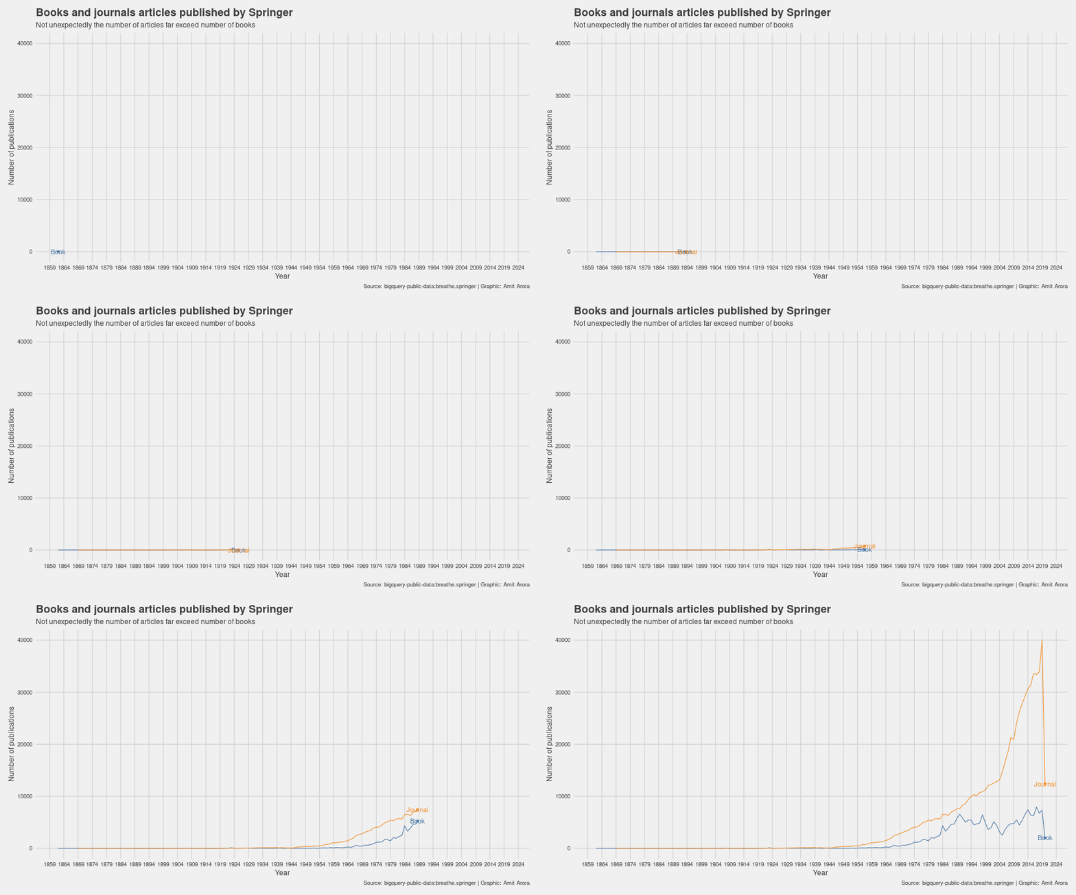
The number of books and journal articles published by Springer over more than 150 years as an animation. Not unexpectedly, the number of journal articles far exceed the number of books. Simple chart, just learning about gganimate.
Data Source: bigquery-public-data:breathe.springer
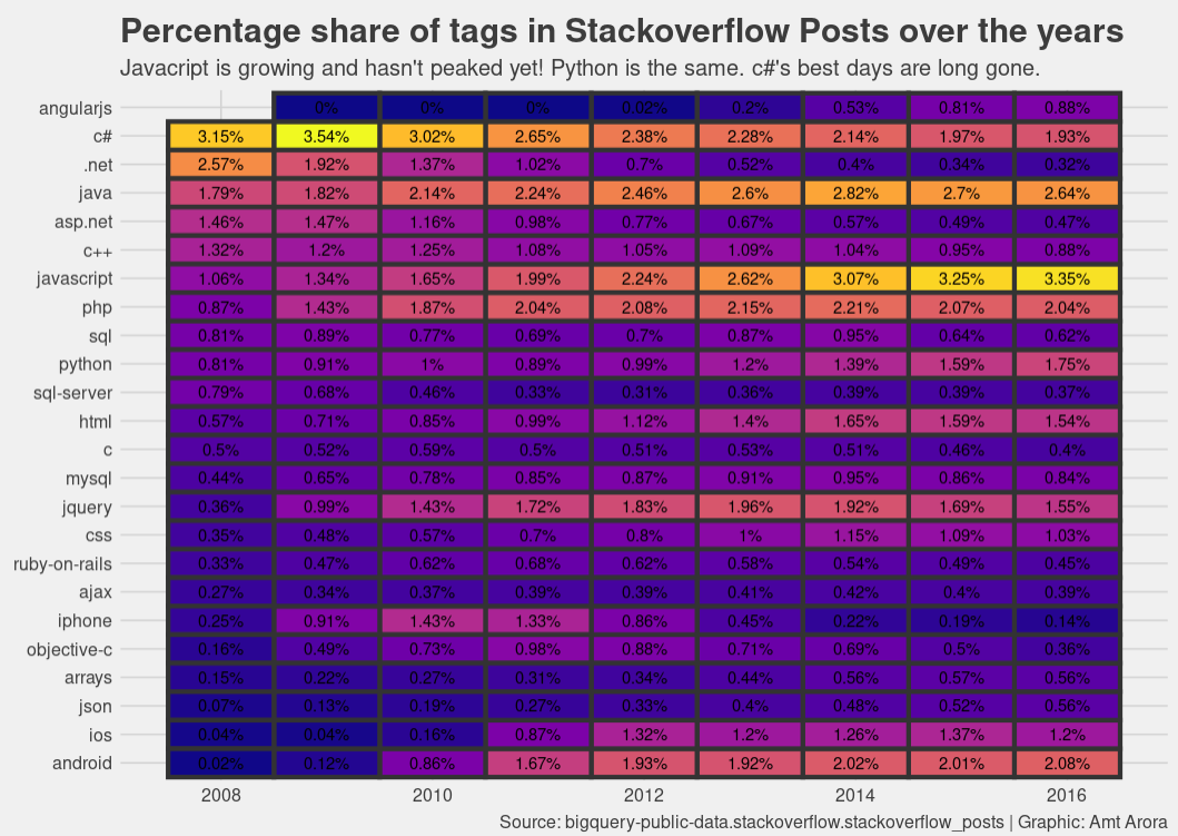
Percentage of tags seen in Stackoverflow posts over the years. Javascript is growing and growing, same for Python, other web technologies are also quite common, Android is growing slowing and steadily. c# is past its glory days, C, C++ are declining.
Data Source: bigquery-public-data.stackoverflow.stackoverflow_posts
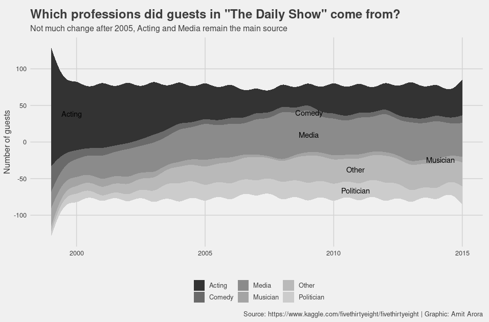
Which professions did guests in "The Daily Show" come from? Not much change after 2005, acting and media remain the mainstays.
Data Source: https://www.kaggle.com/fivethirtyeight/fivethirtyeight
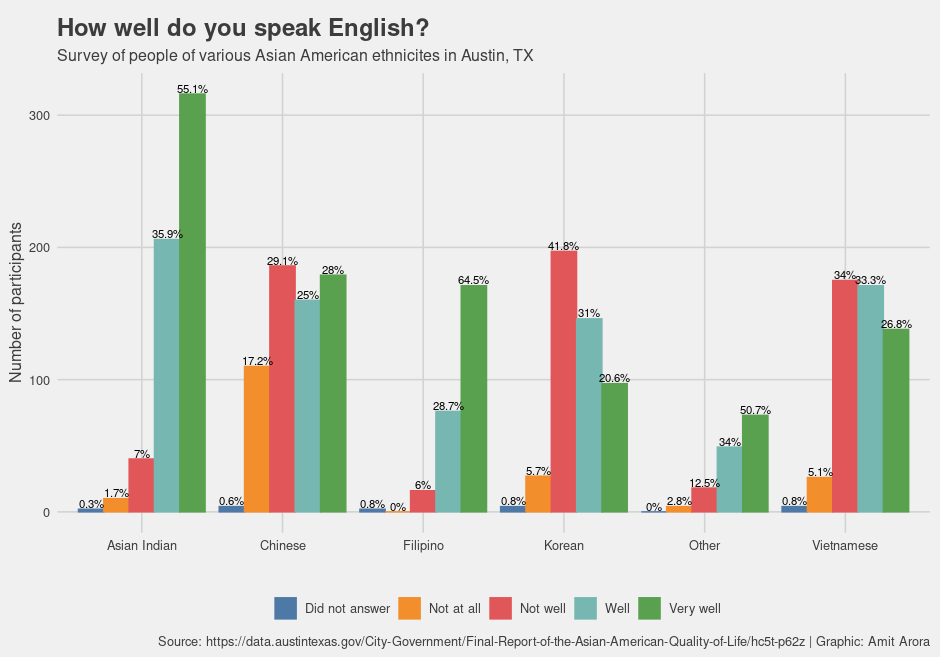
How well do people of different Asian American communities speak English? Here is the data from a survey conducted in Austin, Texas. Filipinos had the highest percentage (64.5%) of people who identified as speaking "very well" followed by Asian Indians (55.1%).
Data Source: https://data.austintexas.gov/City-Government/Final-Report-of-the-Asian-American-Quality-of-Life/hc5t-p62z
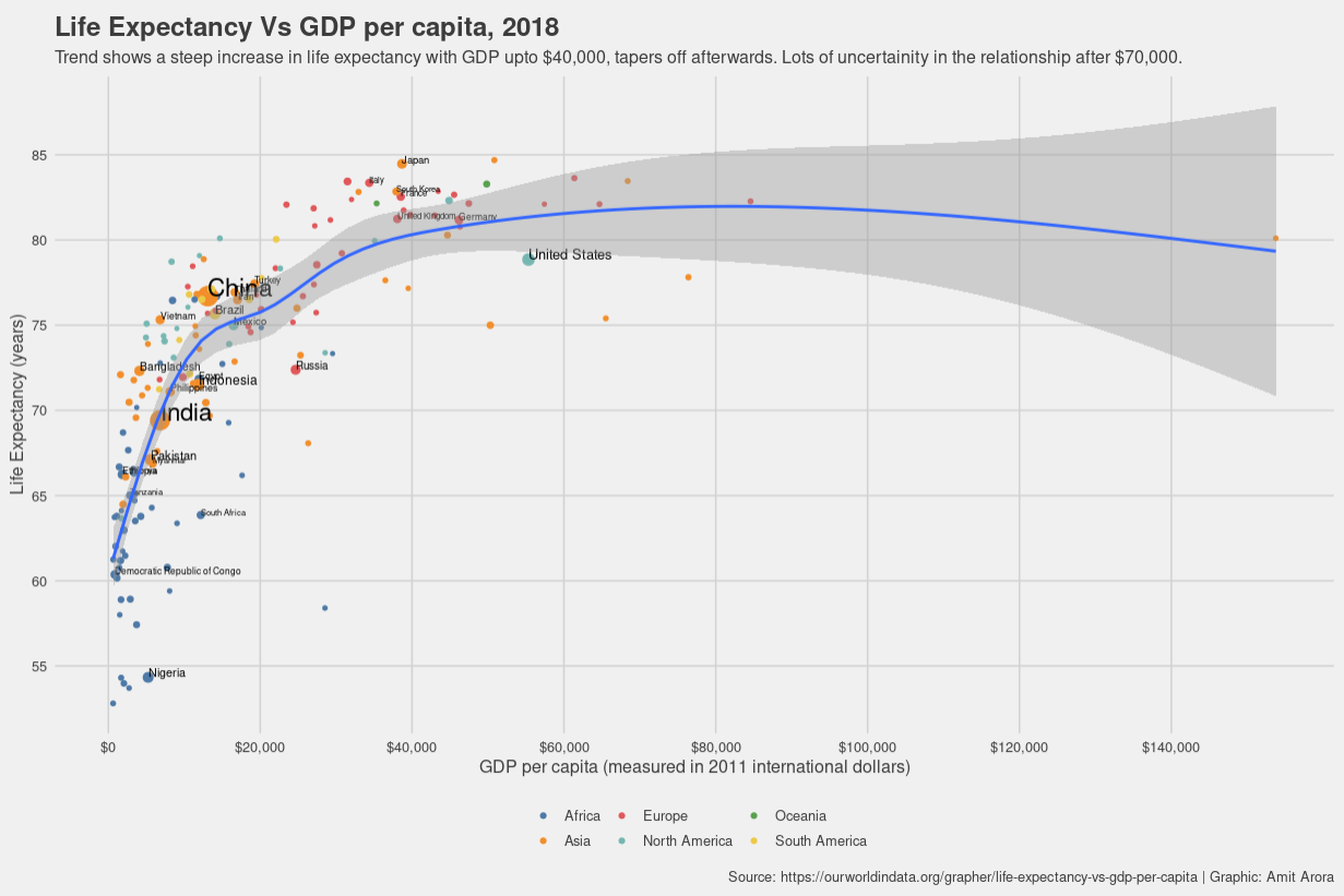
Steep increase in life expectancy with GDP per capita (at least upto $40,000). Lots of uncertainity $70,000 and above. Countries with population of more than 50 millions are labeled. Trend seems to be Africa, Asia, North America, Europe and Oceania, with South American countries somewhere between Asia and Europe. The United States stands out as an exception.
Data Source: https://ourworldindata.org/grapher/life-expectancy-vs-gdp-per-capita
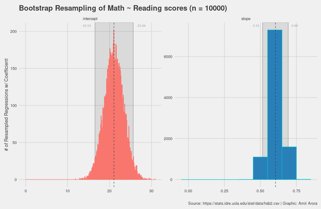
Histogram of coefficients of a linear model. Use bootstrap for determining the 95% confidence interval of the coefficients of Math ~ Reading model created from a dataset containing scores of 200 students.
Data Source: https://stats.idre.ucla.edu/stat/data/hsb2.csv
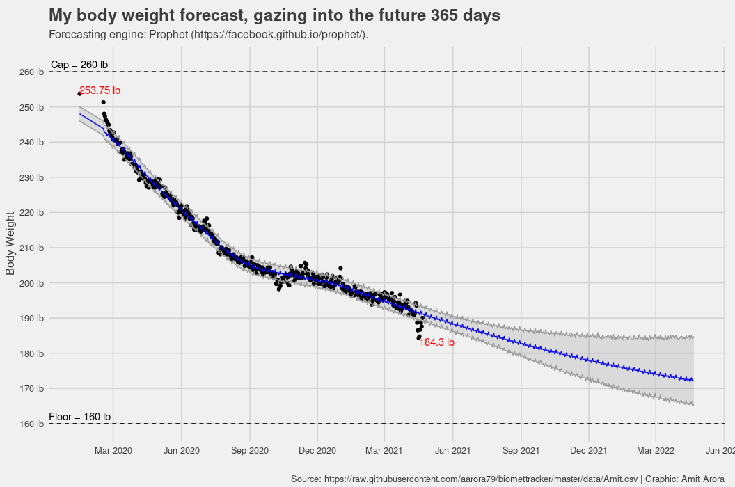
Forecasting body weight using FB Prophet package. Used the logistic growth model to incorporate a floor and a cap. Just like with any timeseries forecast, the uncertainty increases as we look further into the future.
Data Source: https://raw.githubusercontent.com/aarora79/biomettracker/master/data/Amit.csv
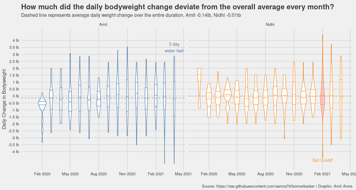
How much did the day to day bodyweight change deviate from the overall average for Amit and Nidhi? Violin plot showing the distribution of the changes for each month. Months with the maximum spread of the data are called out individually.
Data Source: https://github.com/aarora79/biomettracker
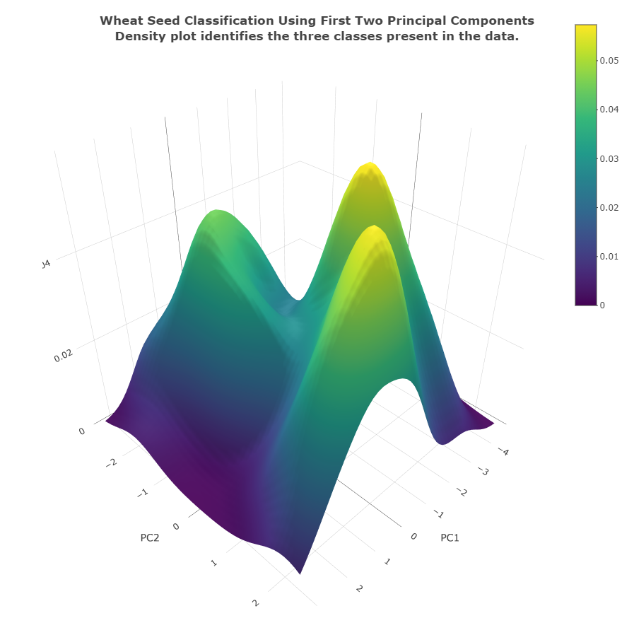
Wheat seed classification using Principal Components. A Kernel Density Estimate of the first two principal components shows that the three classes can be easily separated out.
Data source: https://raw.githubusercontent.com/jbrownlee/Datasets/master/wheat-seeds.csv
