Visualize changes in classified time series data with interactive Sankey plots in Google Earth Engine
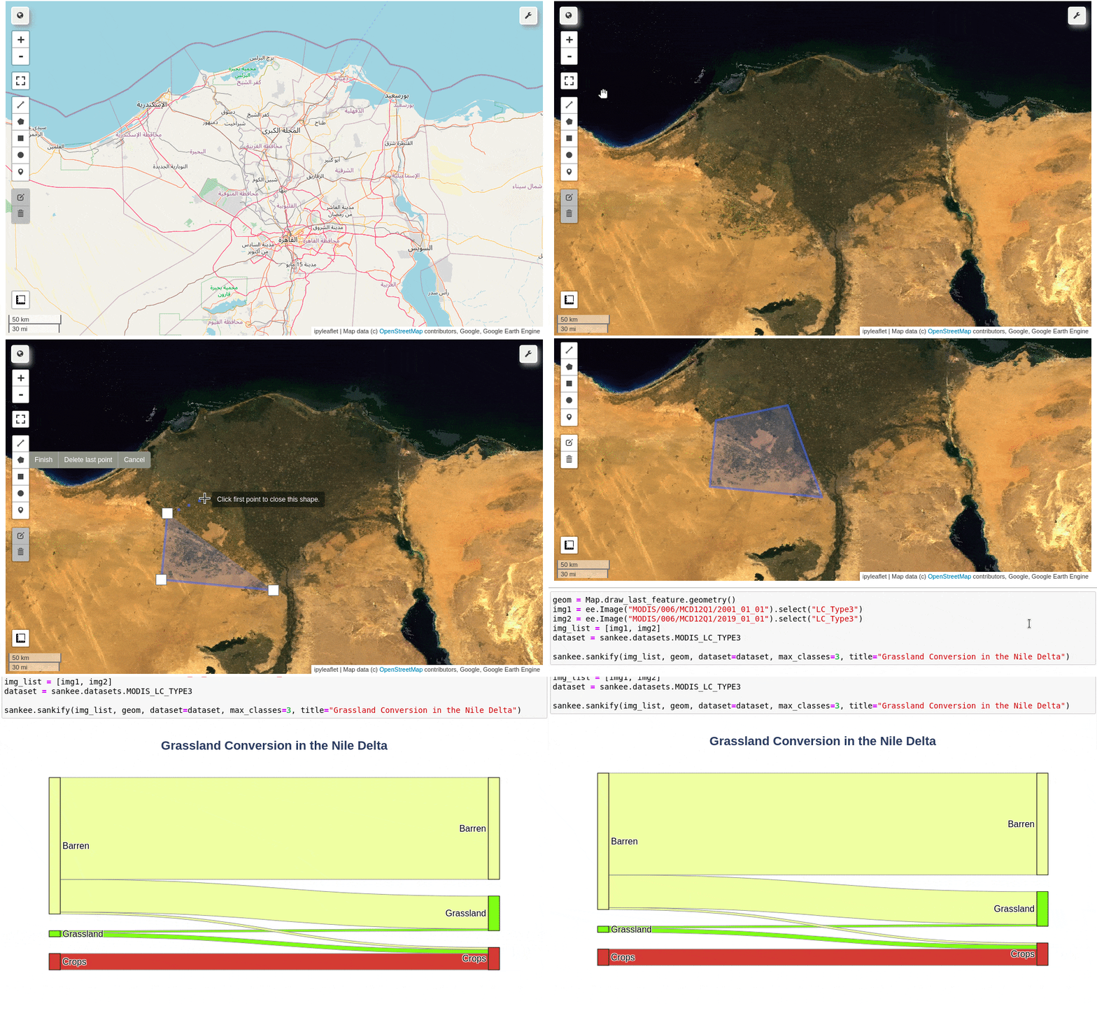
Use Earth Engine to visualize changes in land cover, plant health, burn severity, or any other time series of classified imagery with interactive Sankey plots. Use a library of built-in datasets for convenience or define your own custom datasets for flexibility.
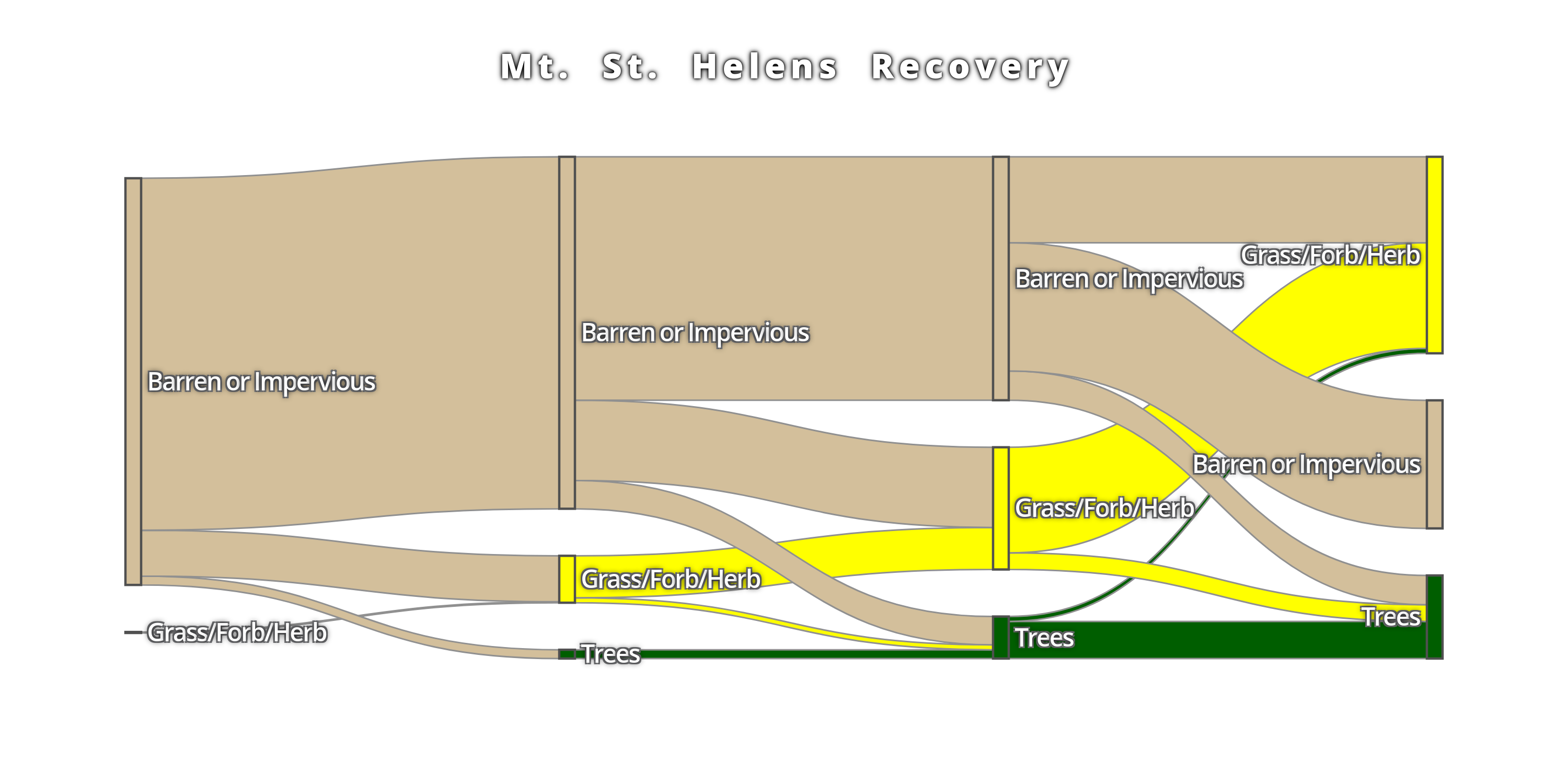
pip install sankeeconda install -c conda-forge sankeeVisualize annual changes in land cover using popular LULC datasets with a couple lines of code. Just choose a dataset, an area of interest, and a list of years to generate a Sankey diagram from a premade dataset. Below, we can look at 30 years of vegetation recovery in the area devastated by the Mt. St. Helens eruption.
import sankee
import ee

ee.Initialize()

sankee.datasets.LCMS_LC.sankify(
  years=[1990, 2000, 2010, 2020],
  region=ee.Geometry.Point([-122.192688, 46.25917]).buffer(2000),
  max_classes=3,
  title="Mt. St. Helens Recovery"
)
Check out the example notebook for an interactive demo.
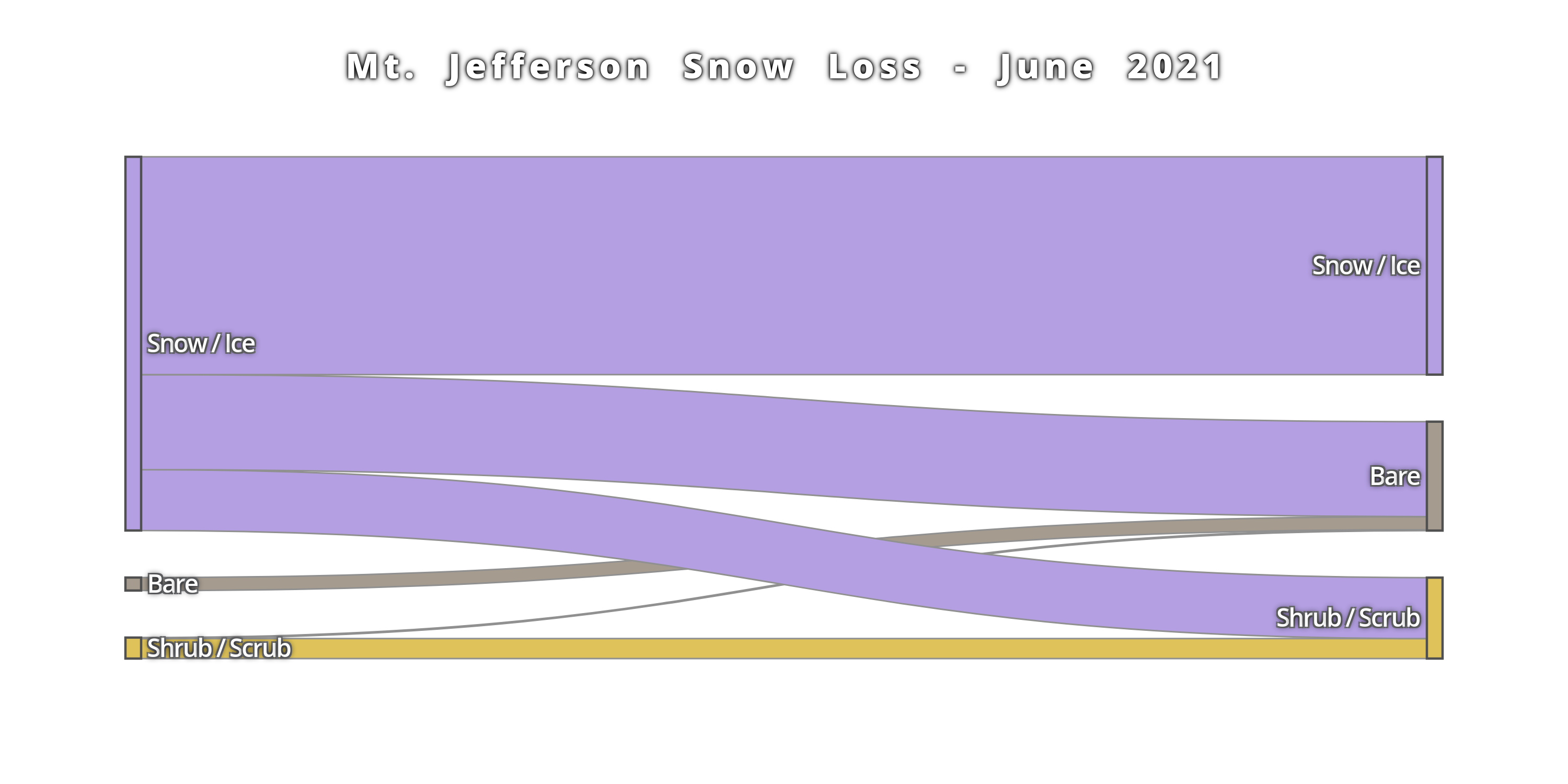
Any classified images can be used by defining the dataset parameters (which pixel values correspond to which labels and colors). For example, we can look at classified Dynamic World scenes just two weeks apart that show substantial snow loss on Mountain Jefferson during the 2021 Heat Dome in the Pacific Northwest.
import sankee
import ee

ee.Initialize()

# Load a set of classified images
img_list = [
    ee.Image("GOOGLE/DYNAMICWORLD/V1/20210616T185919_20210616T190431_T10TEQ"),
    ee.Image("GOOGLE/DYNAMICWORLD/V1/20210706T185919_20210706T190638_T10TEQ")
]

# Which band contains the classified data?
band = "label"

# What labels correspond to which pixel values?
labels = {
    0: "Water", 1: "Trees", 2: "Grass", 3: "Flooded", 4: "Crops",
    5: "Shrub / Scrub", 6: "Build", 7: "Bare", 8: "Snow / Ice",
}

# What colors should be applied to which pixel values?
palette = {
    0: "#419BDF", 1: "#397D49", 2: "#88B053", 3: "#7A87C6", 4: "#E49635",
    5: "#DFC35A", 6: "#C4281B", 7: "#A59B8F", 8: "#B39FE1"
}

plot = sankee.sankify(
    image_list=img_list,
    band=band,
    labels=labels,
    palette=palette,
    region=ee.Geometry.Point([-121.80183, 44.67655]).buffer(3000),
    max_classes=3,
    title="Mt. Jefferson Snow Loss - June 2021"
)sankee premade datasets are usable through the geemap interactive GUI. Check out the documentation and video tutorials by @giswqs.
If you find bugs or have feature requests, please open an issue!


